April 19th, 2024 by AnyChart Team
 This week’s DataViz Weekly showcases a quartet of compelling data-driven stories, each powered by the adept use of data visualization techniques. These narratives not only inform but inspire, perhaps sparking creative concepts for your upcoming projects.
Here are the visual stories featured in this issue:
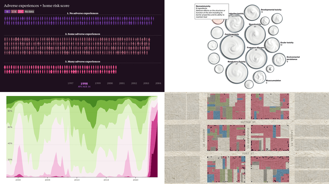
- Unraveling the hold of historical mortgage rates in the U.S. — The Upshot
- Retelling the transformation of San Francisco’s Japantown after Roosevelt’s Executive Order 9066 — The San Francisco Chronicle
- Revealing hidden risks in common fragrances — Bloomberg
- Exploring the persistent shadows of teen adversity — The Pudding
Read more »
April 18th, 2024 by Taylor Brooks
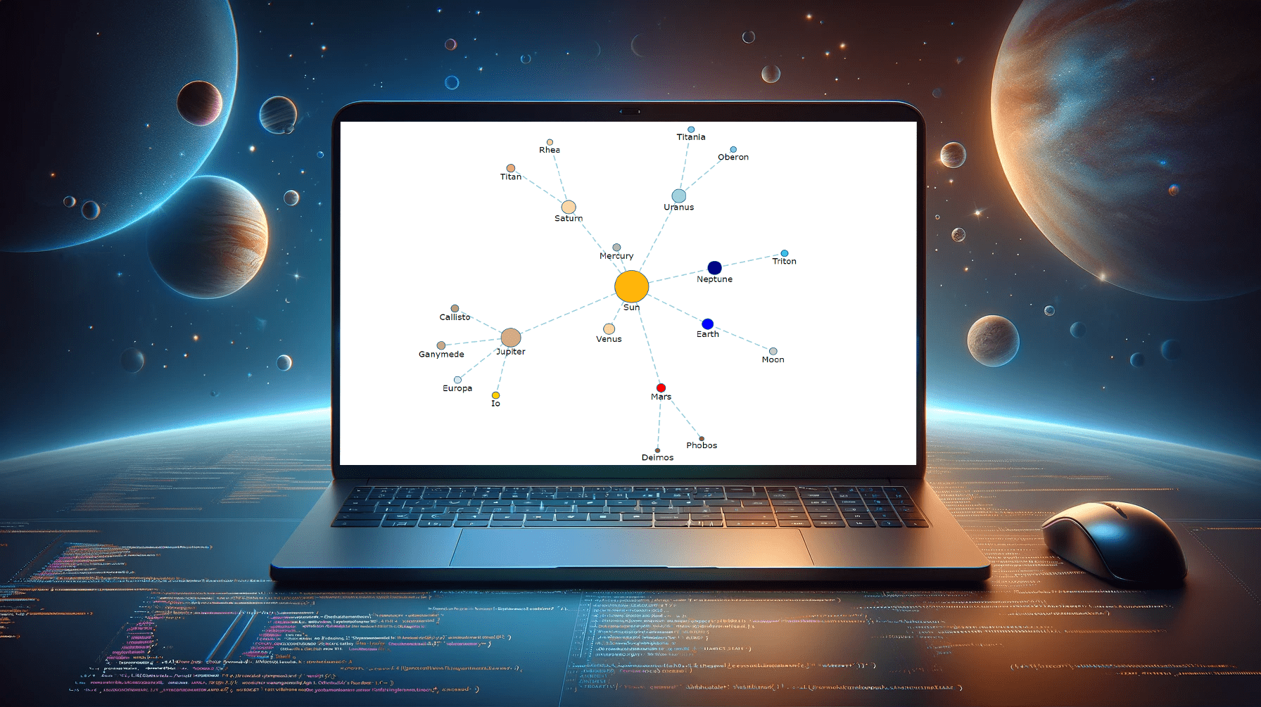 Creating a vibrant network graph in JavaScript might seem like crafting a digital cosmos: intricate, fascinating, yet entirely within reach. Whether you’re aiming to illustrate the complex interconnections within a galaxy, a social network, or the internal hierarchy of a multinational corporation, network graphs serve as a powerful tool to bring data to life, revealing hidden patterns and insights through visual representation.
Let’s embark on a journey to demystify the process, guiding you step-by-step on how to construct your very own network graph, with the Solar System as our illustrative example.
Read the JS charting tutorial »
April 12th, 2024 by AnyChart Team
Welcome back to DataViz Weekly! We’re thrilled to restart our series, presenting each Friday a carefully curated selection of recent data visualizations that have caught our eye from around the web. These charts and maps serve as excellent examples of how data can be transformed into insightful and engaging graphical representations for understanding complex issues.
This time, we feature:
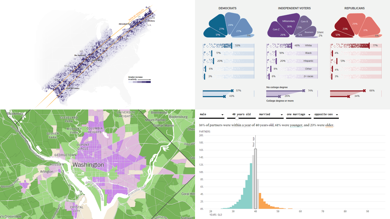
- Eclipse traffic and movements — The New York Times
- America’s access to natural spaces — The Washington Post
- Marital age patterns — FlowingData
- Profiling independent voters — Reuters
Join us as we take a closer look at these visualizations and check them out for a dose of inspiration.
Read more »
April 3rd, 2024 by AnyChart Team
 Listening to our community is foundational to our development efforts. In response to feedback from some of our customers, we’ve just added new features to the Decomposition Tree extension for Qlik Sense, aimed at enriching data insights. Here’s a quick overview.
Read more at qlik.anychart.com »
March 25th, 2024 by AnyChart Team
 An important note for Qlikkies: Are you ready to elevate your dashboards? Dive into our latest Qlik tutorial — discover the power of the Decomposition Tree and learn how to create it in Qlik Sense in about no time!
Learn more and watch the tutorial at qlik.anychart.com »
March 6th, 2024 by AnyChart Team
 Hey Qlikkies! Still burying insights under layers of charts and sheets? It’s time to break free from wrestling with complex datasets and win the hearts of your business users!
Join our exclusive webinar and meet the Decomposition Tree — a new powerhouse visualization that’s taken Power BI by storm and now graces Qlik Sense. This game-changer slices through data complexity, offering root cause analysis on a single sheet. Drilling down into the heart of any value with superhero speed has never been easier! No more juggling overcomplicated visuals — just instant insights, effortlessly.
Learn more and register »
March 4th, 2024 by Nick Gogin
 Building an interactive calendar chart from scratch may initially seem daunting and time-consuming. However, I'm here to show you it's not only manageable but straightforward once you know the steps. Whether you're developing a scheduling application, tracking events, or looking to enhance your web page with a sleek calendar graphic, this tutorial is designed specifically for you. I'll guide you through the steps to create impressive interactive calendar charts using JavaScript, simplifying what may seem complex.
We'll delve into this process using a JavaScript charting library. As a support engineer at AnyChart, and with our JS library recently named best in data visualization, it was a natural choice to use our tool for this tutorial. What about the example data? Other tutorials! There's a treasure trove of JS charting tutorials on our blog, and it occurred to me that compiling these tutorials into a calendar chart would serve as a unique, engaging, and practical example for this guide.
Therefore, the calendar chart created by the end of this tutorial will offer a concise overview of all tutorials published on the AnyChart blog over the last four years, enabling you to quickly discover the ones that interest you the most. All aboard, fellow web developers and data enthusiasts!
Read the JS charting tutorial »
February 19th, 2024 by AnyChart Team
 We are delighted to announce that AnyChart has won the prestigious 2024 DEVIES Awards in the Data Analytics & Visualization category, marking our victory for the second consecutive year!
The award celebrates our JavaScript charting library, continuously acknowledged as the world’s leading data visualization solution for developers. As AnyChart JS forms the cornerstone of our broader product line, this recognition once again highlights the technological excellence and innovation inherent in our entire suite of offerings, including the extensions for Qlik Sense.
Read more »
- Categories: AnyChart charting component, AnyGantt, AnyMap, AnyStock, Big Data, Blogroll, Business Intelligence, Dashboards, Financial charts, Gantt Chart, HTML5, JavaScript, News, Oracle Apex, Qlik, Stock charts, Success stories
- No Comments »
February 1st, 2024 by AnyChart Team
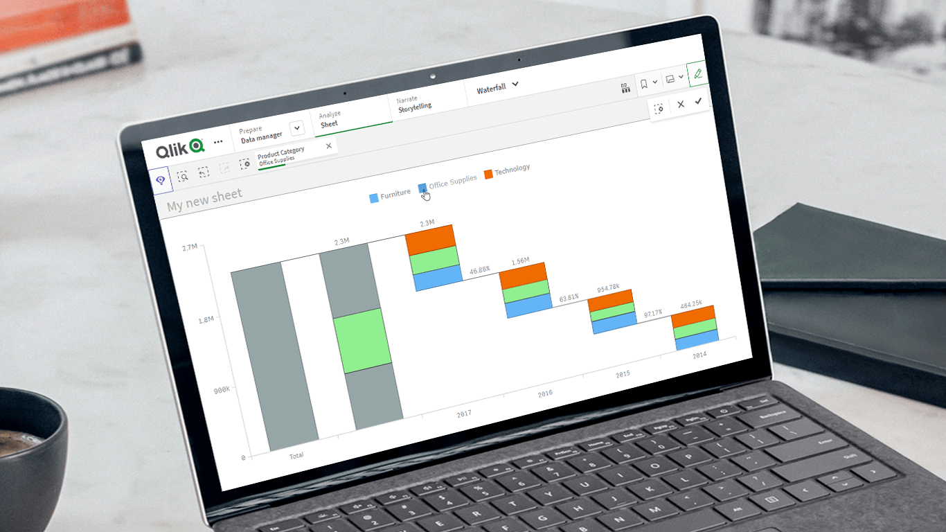 Unveiling the latest updates to our Waterfall Charts for Qlik Sense! In line with our commitment to empowering users to do more with Qlik, we’ve just added a set of new helpful features and improvements to our Waterfall Advanced and Waterfall Classic extensions. These enhancements are designed to further facilitate extracting valuable insights using stacked waterfall visualizations. Check out what’s in store!
Read more at qlik.anychart.com »
January 30th, 2024 by AnyChart Team
 Hey Qlikkies! Ever feel overwhelmed by complex datasets, endless sheets, and constant requests from business users? The solution is here — join our exclusive webinar on February 8th and meet the Decomposition Tree, a new rockstar chart in Qlik Sense that’s worth a dozen! Enabling users to slice and dice metrics as they please, this game-changing visualization unlocks root cause analysis and ad-hoc exploration of complex datasets on the spot.
Learn more and register »