 Lately, we’ve come across a number of compelling new data visualizations on climate change and related topics. And we’ll tell you about some of the most interesting ones right now! Check out the new DataViz Weekly roundup.
- Fingerprints of climate change in 2020 — Reuters
- Global warming in European municipalities — EDJNet
- Top greenhouse gas emitters — WRI
- Future of U.S. fossil fuel-fired electricity — Emily Grubert
Data Visualization Weekly: January 8, 2021 — January 15, 2021
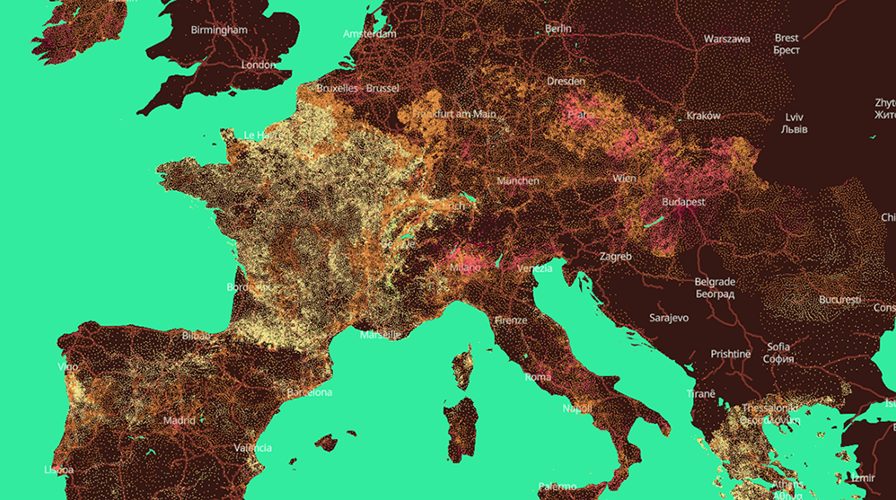
Fingerprints of Climate Change in 2020
Last year, we saw a lot of extreme weather events around the globe: devastating wildfires here, unprecedented hurricanes there, and many more. Scientists say that while they had multiple causes, climate change was a major one. Moreover, some events could even hardly be possible without it.
In a special graphics feature, Reuters provides a look at the fingerprints of human-caused climate change in our weather, showing where we were in 2020. There, you will find visualizations representing:
- how last year’s temperatures were different from the 1981-2010 averages (based on data from the Copernicus Climate Change Service),
- active fire hotspots in the United States, Australia, and Russia over the course of 2020 (NASA data),
- heavy storms in 1960-2020 (NOAA data),
- Arctic sea ice extent in 1979-2020 (National Snow and Ice Data Center data),
- carbon dioxide emissions in 1960-2020 (Global Carbon Project data), and
- seasonal temperature cycles in 1980-2020 relative to the 1980–2015 average (NASA data).
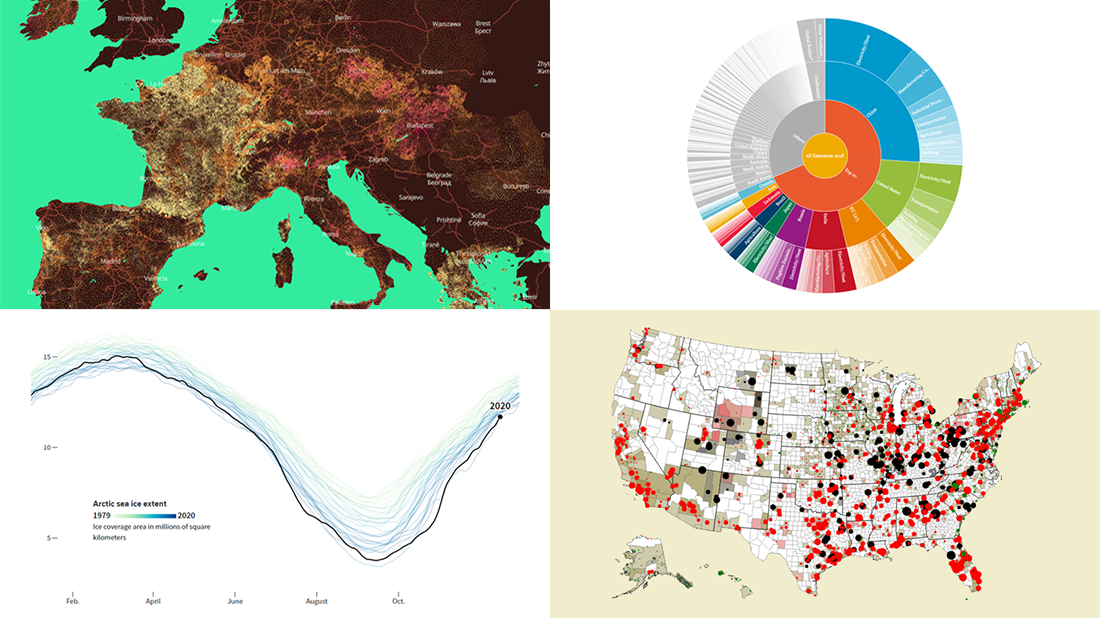
Global Warming in European Municipalities
In case you did not notice, global warming is happening right there in your backyard. In Europe, for example, there are many places where temperatures have grown by over 2°C for about half a century. Now, we can explore the impact in detail thanks to a brand new interactive map published by European Data Journalism Network (EDJNet).
The map allows you to understand the temperature rise in more than 100,000 municipalities across Europe, visualizing how mean temperatures of 2009-2018 compared with those of 1961-1970. Hover over a dot to find out the exact change value for that location. Click on it to view much more details in charts.
The analysis is based on UERRA data made available by Copernicus and the European Centre for Medium-Range Weather Forecasts (ECMWF).
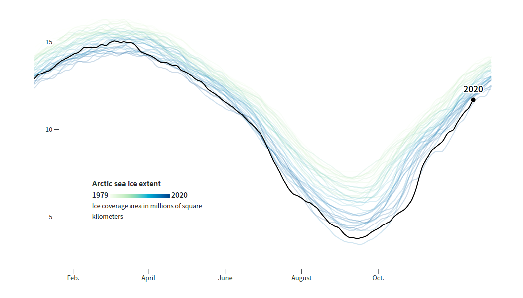
Top Greenhouse Gas Emitters
More than two-thirds of global greenhouse gas emissions come from the top ten emitters: China (26.1%), the United States (12.67%), the European Union (7.52%), India (7.08%), Russia (5.36%), Japan (2.5%), Brazil (2.19%), Indonesia (2.03%), Iran (1.74%), and Canada (1.52%). That is clearly shown in a compelling interactive sunburst chart recently shared by World Resources Institute (WRI), which nicely represents the latest data on GHG emissions by country, also displaying individual economic sectors’ contributions.
Hover over the data points to see the values and click on them to drill down to lower levels. Don’t miss out on checking out the time-series charts right there as they provide a good opportunity to explore historical emissions data from Climate Watch, WRI’s climate data platform, including how top GHG emitters have changed.
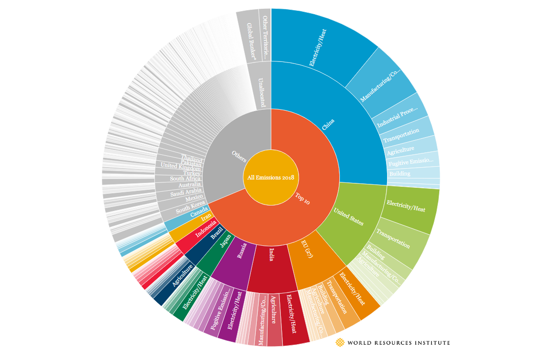
Future of U.S. Fossil Fuel-Fired Electricity
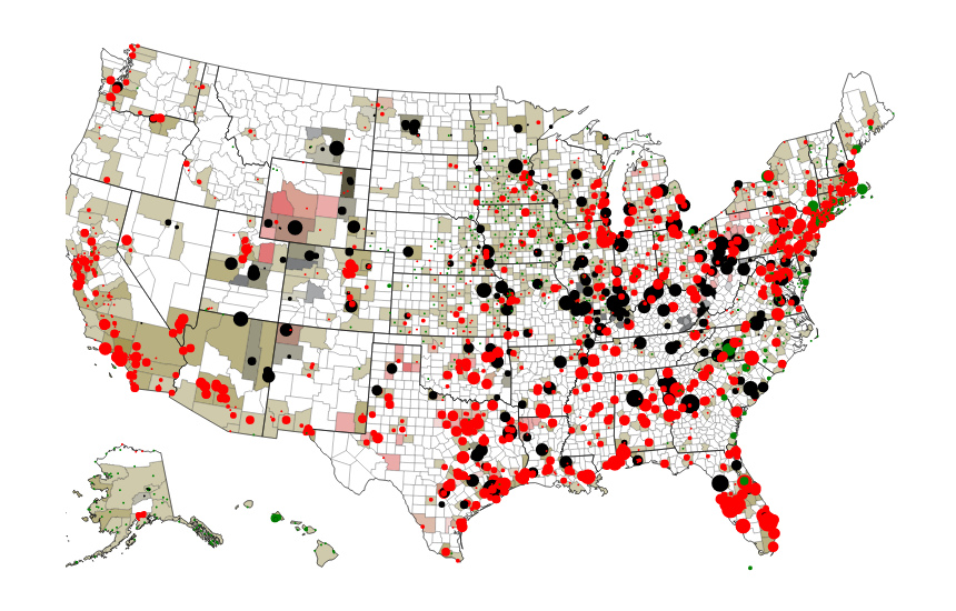
While the incoming Biden administration has already announced a goal of complete decarbonization of the U.S. energy sector by 2035, meeting the deadline would eliminate only 15% of fossil capacity-years and 20% of job-years, which is seen as unusually low from a global perspective. That’s according to the recent findings of Emily Grubert from Georgia Tech’s School of Civil and Environmental Engineering, which were made public in her article on Science Magazine. The thing is, she says, many U.S. fossil fuel plants are quite old, so “the target of decarbonization by 2035 would not require us to shut most of these plants down earlier than their typical lifespans.”
Emily Grubert also created an interactive map that shows the locations of fossil fuel-fired electricity generators along with their estimated lifespans. Move the time slider on the right to visualize conditions for a certain year, through 2035 and far beyond.
***
We hope you liked these new climate data visualizations. Stay tuned for the best data viz examples from around the Web!
- Categories: Data Visualization Weekly
- No Comments »