Interactive JS Map by AnyChart and More
February 28th, 2016 by Margaret Skomorokh
Here is a quick recap of the visualizations that we have shared with you this week on AnyChart Facebook Page and Twitter (including an interactive JS map by AnyChart):
- Categories: AnyChart Charting Component, AnyMap, HTML5, JavaScript, News
- No Comments »
ACME Corp. Prices – JS Dashboard by AnyChart
February 21st, 2016 by Margaret Skomorokh
A dashboard is a set of charts, which is usually created when you need to show a lot of different information about one particular subject. It can contain as many charts (of the same type or of different types) as it is necessary.
As you can see from the title of this interactive JS dashboard, it shows information about the stock prices of ACME Corporation for the given period. The dashboard contains two charts: the first one is a combination of three chart types (Japanese Candlestick, Range Area, and Spline) and the second one is a simple Column chart.
The Japanese Candlestick series in the upper chart shows us the open, high, low, and closing prices of ACME Stocks for each trading day within the mentioned period. Each vertical line represents the range between the highest and the lowest prices during the trading period, and the body represents the opening and the closing trades. While in classical Candlesticks the rise and fall of a stock price are coded with a white-colored and a black-colored body, in this dashboard light blue and dark blue colors are used.
Besides the Candlestick series, there are Range Area and Spline series in the first chart. The second chart contains a Column series showing the change in the volume of stocks sold.
As you can see, AnyChart is a powerful and flexible tool, allowing you to create sophisticated data visualizations like this JS dashboard. AnyChart offers a wide range of features and chart types, so you can easily implement any visual solution and communicate your data in the best way possible.
By the way, we have recently updated the roadmaps of AnyChart, AnyStock, and AnyMap. Check out all these great features that are coming soon!
- Categories: AnyChart Charting Component, AnyMap, AnyStock, Dashboards, HTML5, JavaScript
- No Comments »
Edward Tufte in San Francisco (meets AnyChart)
February 18th, 2016 by Margaret SkomorokhEdward Tufte one-day course in San Francisco
Edward Tufte, which was once called “The Leonardo da Vinci of data”, is a statistician and artist, a professor emeritus of political science, statistics, and computer science at Yale University, and an author of 4 classic books on data visualization. In December 2015, Mr. Tufte read his one-day course in data visualization (Presenting Data and Information) in San Francisco. We were there and enjoyed it a lot! See our short report about this event, along with some photos we took during the lecture.

In this picture Edward Tufte shows a most remarkable book – Euclid’s Geometry (1570) with pop-up 3D models:

And here is an image of Russian army command center, which was used by Mr. Tufte to express his disapproval of 3D Pie charts. He said that a country that uses 3D Pie charts in its’ command center will lose any war. However, we believe that, if used properly, 3D Charts can be a decent tool for data visualization – that is why we have added them in AnyChart JavaScript Charts Library.

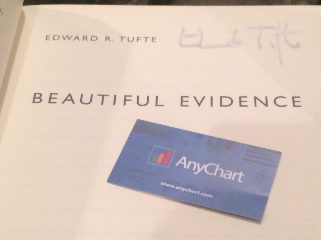
After the lecture, we were lucky to get our books signed by the author and talk to him. Mr. Tufte remembered us because AnyChart implemented Sparkline Charts – a type of charts he invented. He suggested that we use AnyChart to create some of the challenging data visualizations mentioned in his books. Challenge accepted, coming soon!
Our short but intensive conversation with Mr. Tufte was followed by discussing Sparklines in Twitter:
@EdwardTufte Thank you for very interesting day-a lot to think about! You've asked about our sparklines – https://t.co/G0VwY308NZ Thank you!
— AnyChart (@AnyChart) December 17, 2015
So we ended up getting a boxed set of four books: Beautiful Evidence, Visual Explanations: Images and Quantities, Evidence and Narrative, Envisioning Information, and The Visual Display of Quantitative Information.

- Categories: AnyChart Charting Component, News, Tufte
- No Comments »