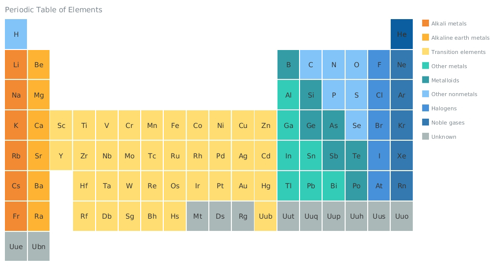
This week we have posted on AnyChart Facebook Page and in Twitter a few cool data visualizations and, of course, a sample from our gallery – an HTML5 Heat Map by AnyChart representing the periodic table of elements:
- The Cold Hard Math of How Trump Can Win, and How Rubio Can Stop Him — What will it take for Donald J. Trump — or Marco Rubio or Ted Cruz — to win the Republican nomination? The Upshot has built an interactive delegate calculator simulating how the race might unfold after the Super Tuesday.
- Forget Me Nots — With digital storage getting cheaper and cheaper we have gone from a default of forgetting to a default of digitally assisted remembering. Should we or should we not revisit our digital memories? Allison, the creator of the Forget Me Nots project, used 1,924 emails of ex-boyfriends to create three data visualizations exploring this question.
- A Day in the Life of Americans — This fascinating data visualization posted on FlowingData simulates a single day for 1,000 Americans representative of the population — to the minute. Looking at all these colored dots running back and forth is not only pleasant, but it is also quite thought-provoking.
- Periodic Table of Elements by AnyChart. A heat map is a graphical representation of data where the individual values contained in a matrix are represented as colors. This particular HTML5 heat map is our version of the periodic table (a tabular arrangement of the chemical elements, ordered by their atomic number, electron configurations, and recurring chemical properties).
At first glance, it looks quite minimalistic: the information you see is limited to the symbols of elements and color of boxes. However, the table is interactive, and if you hover any box, a label with additional information will appear. So, clever use of interactivity allows to create simple yet enlightening visualizations — and with AnyChart it is very easy!
- Categories: AnyChart Charting Component, HTML5, JavaScript, News
- No Comments »
