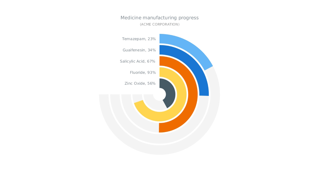
Have you seen data visualizations (including an HTML5 Gauge by AnyChart) that we have shared this week on AnyChart Facebook Page and in Twitter? Here is a quick recap of these posts:
- The Speed of a Unicorn – Do you believe in magic? And do you know where the fastest unicorns live? To find out, check out this interactive data visualization by Fleximize. (Unicorns are rare beasts of the business world, startup companies that are valued at $1B or more. Once considered the stuff of myth, there are now over 180.)
- How Machines Destroy (And Create!) Jobs, In 4 Graphs – For hundreds of years, people have been talking about machines taking jobs from people. Less often discussed: machines creating new jobs. See 4 graphs on NPR demonstrating how machines influence the job market. All in all, technology gives, and technology takes.
- Vienna electorate poster – This elegant data-driven infographic illustrates Vienna’s electorate gap related to the increasing number of foreign nationals who are usually ineligible to vote in citywide or national elections. How did the share of foreign nationals in Vienna evolve since 1971? What are the changes of the total population in relation to changes in the electorate since 2002? Are there any significant differences by age? The poster provides answers to these questions – district by district.
- Solid Gauge (an HTML5 gauge by AnyChart) – Is it a Pie Chart? Is it a bar chart? No! It is an interesting way to use Circular Gauge by AnyChart to show manufacturing process. Circular Gauge is a visual representation of a measuring device with radial axes that sweep any angle from 0 to 360 degrees and pointers (Needles, Knobs, Markers) that indicate values. Circular Gauges can look like speedometers, clocks, compasses, volume controls, or any other similar tools.
- Categories: AnyChart Charting Component, HTML5, JavaScript, News
- No Comments »
