Have you seen the visualizations that we have shared with you this week on AnyChart Facebook Page and in Twitter, and have you checked out our JS map on August’s projection? Here is a quick recap.
- 15 Books with More Characters than You Can Keep Track Of: – This nice infographic by lovereading.co.uk tells about 15 epic books crowded with characters. According to it, there are 131 named characters in Harry Potter and the Philosopher’s Stone, 218 in a Game of Thrones, 463 in The Stand, and 600 in War and Peace. Yes, sometimes it’s hard to track of all of them:)
- On Rocky Beginnings – According to an MIT study, the average office worker produces 5GB worth of data each day. The Quantified Selfie project shows that such data can tell a lot about living humans behind them and can even be used for self-exploration. This interactive data visualization is story of new beginnings in New York City through one person’s music consumption.
- The Changing American Diet – In this interactive simulation by FlowingData, you can see what Americans ate on an average day, for the past several decades, and how the diet was changing, year by year. Click the link and witness the epic battle between butter and margarine!
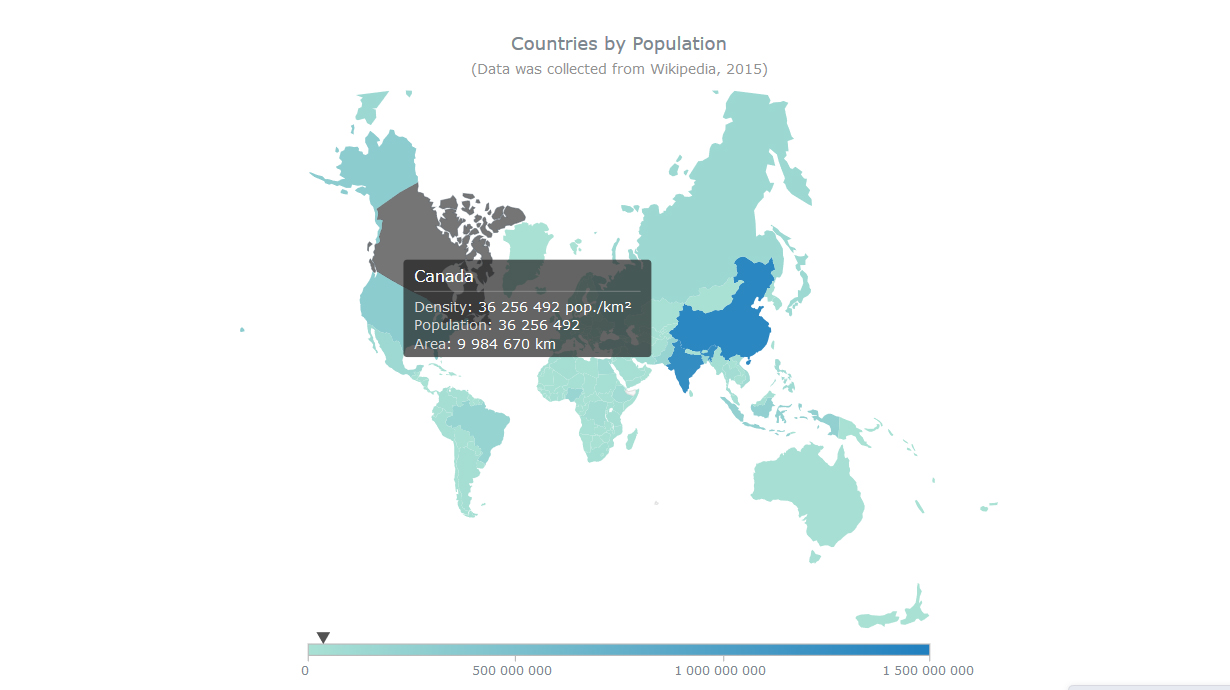
- Countries by Population on August’s Projection – this interactive JS map by AnyChart was created using Map Projections: a new feature that was added in AnyMap 7.10.0. Now you can show any map on one of the following common projections: Aitoff, August, Bonne, Eckert1, Eckert3, Equirectangular, Fahey, Hammer, Mercator, Orthographic, Robinson, Wagner6, and Wsg84 (the map you see here is on August’s projection). Please be careful when you change the projection – be aware of how map projections work and when it is appropriate to use them.
- Categories: AnyChart Charting Component, AnyMap, HTML5, JavaScript, News
- No Comments »
