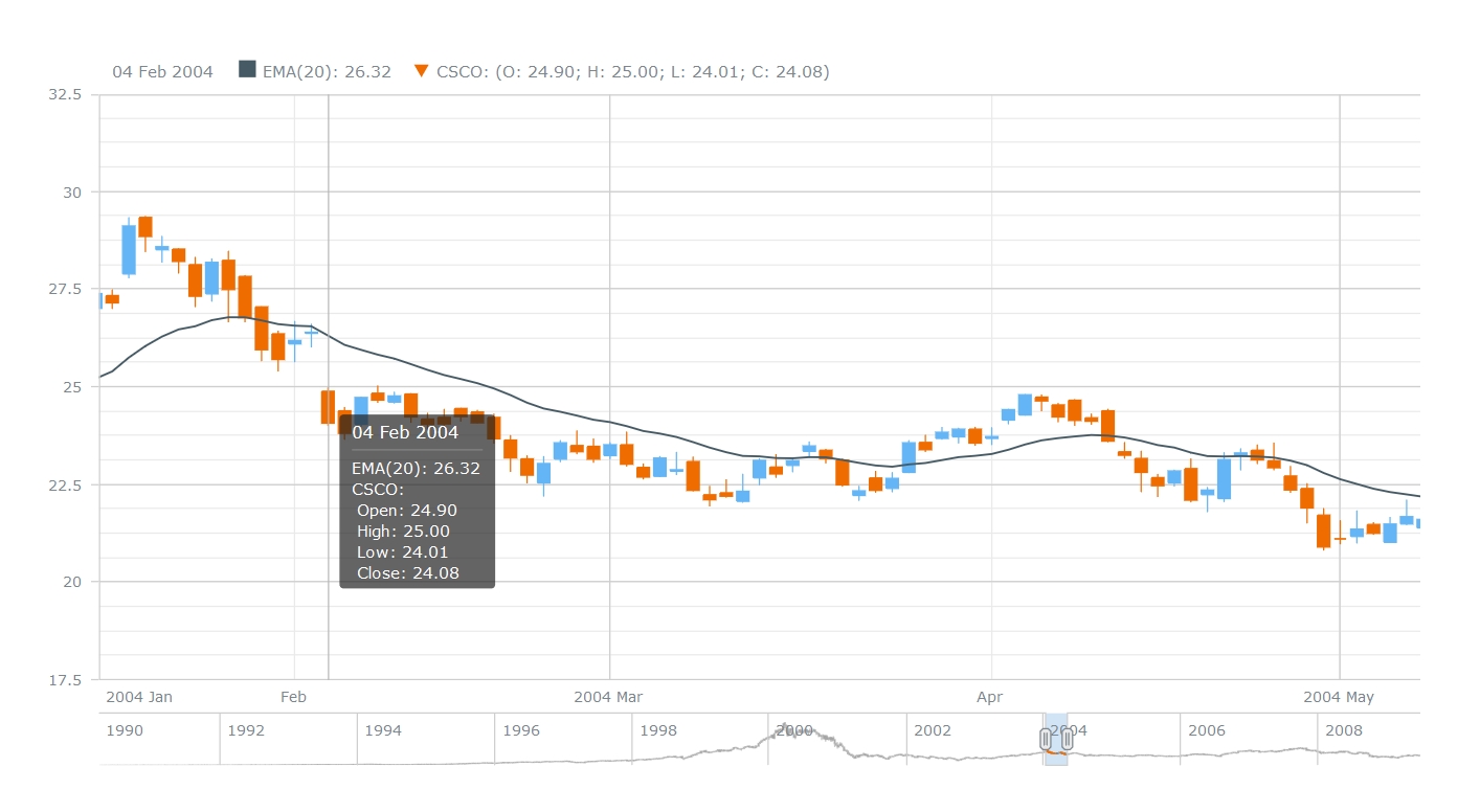
Last week we have shared with you on AnyChart Facebook Page and in Twitter the following data visualizations (including a JS Candlestick chart by AnyStock):
- Explore the world with Tim Peake – Use this map to explore ESA astronaut Tim Peake’s stunning photos of Earth, taken from the International Space Station during his six month mission (created by Esri UK). You will find photos of London, Ethiopia, New Orleans, and many other places, all of them looking great from space!
- ThermalPlot – Multi-attribute time-series data plays a vital role in many different domains. An important task when making sense of such data is to provide users with an overview to identify items that show an interesting development over time. However, this is not well supported by existing visualization techniques. ThermalPlot is a technique allowing to visualize multi-attribute time-series data using a thermal metaphor, which helps users to find items that are important (Team: Johannes Kepler Universität, St. Pölten University of Applied Sciences).
- Understanding Millenial Moviegoers – This infographic by the theatrical analytics company Movio reveals the truth about millennial moviegoing. There are some bad news for art-house and indie filmmakers hoping to get young people into the theater: according to these data, the younger millennials are 45% less inclined to see a drama and 52% less interested in an indie film.
- JS Candlestick Chart by AnyStock – A Japanese Candlestick chart is a combination of a line chart and a bar chart used primarily to describe price movements of an equity over time, where each bar represents the range of price movement over a given time interval. It is mostly used in technical analysis of equity and currency price patterns. The interactive Candlestick chart you see here was created using AnyStock – a JavaScript-based financial charting solution by AnyChart.
- Categories: AnyChart Charting Component, AnyStock, Financial Charts, HTML5, JavaScript, News
- No Comments »
