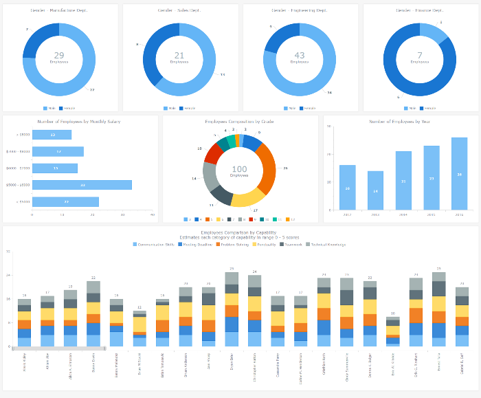
An HR dashboard is a powerful BI solution that can mightily facilitate making right, data-driven decisions about the workforce in your company – from recruiting and training courses to compensations and job promotions. Smart visualization of all relevant staff-related data, with all charts and graphs on a single page, allows your Human Resources Department to see various metrics at-a-glance. As a result, HR managers are given the power to easily identify trends, outliers, and relationships when it comes to reports and data analysis, and to make sure each decision is well-timed and will drive even more success for your enterprise.
After all, it is the employees that are the most valuable asset.
To inspire and show you how easy it gets to implement this approach with the help of AnyChart JS Charts library, we added an interactive JavaScript-based Human Resources Dashboard to the Business Solutions section of our website as a new HTML5 business dashboard sample with the full source code. It nicely visualizes various employee related data, including demographics, payrolls, performance measurements, and so on. Of course, you are welcome to fork this sample and use our HR Dashboard fully or partially to create your own solution.
Now let’s have a closer look at this interactive HTML5 dashboard, including its composition and some peculiar features.
Charts and Interactivity
The HR Dashboard we are showcasing consists of eight interactive JavaScript (HTML5) charts. There are five donut (doughnut) charts, one bar chart, one column (vertical bar) chart, and one stacked column chart in the sample. Each JS graph is provided with sticky tooltips to highlight the most important data and display additional information for a better analysis.
As stylized pie charts with a hole in the center, donut charts are very helpful when you need to show a simple composition. That is why we picked this chart type for displaying the workforce demographics as the breakdown of staff by gender in each department – manufacture, sales, engineering, and finance. The fifth donut chart shows the composition of the whole staff by employee grade, 3rd to 12th.
Clicking on any slice of each donut chart makes it exploded, or pulled out. This feature is useful for emphasizing some data that might be especially important. The donut hole size can be easily customized, just as everything else in AnyChart, so we made it sufficient to display and highlight the total numbers of employees, by department and overall.
Column charts proved to be good at visualizing the headcount growth in the past few years. However, to display the number of employees by monthly salary, we chose bar charts instead. The main reason is that some series have quite long descriptions that look much better near horizontal bars.
Finally, to provide visibility on an individual level, the stacked column chart at the bottom of the HR Dashboard displays skills and abilities of each employee based on scores on a five-point scale. It also allows HR managers to compare employees by their overall qualification. We imagined that there are 100 employees in some fictional company and switched on the Scroller UI to facilitate navigation. As a result, HR executives and managers can easily identify and compare each employee’s absolute and relative strengths and weaknesses. This is essential when considering new appointments, organizing training courses, and so on to contribute to the overall (or some certain project’s) productivity.
HR Dashboard Features
Just like all the JS/HTML5 charts and samples powered by AnyChart, this Human Resources Dashboard is very simple to integrate into any website or app. The reasons are as follows.
First, the amount of code required to create such an HTML5 dashboard with AnyChart JS Charts library is very small, and the code is easy-to-understand.
Second, any JavaScript dashboard powered by AnyChart can be customized literally in any way with ease, to meet your needs and preferences.
Third, replacing our sample data by your own data requires really small efforts. As a result, you can get a beautiful, helpful business dashboard up and running very quickly.
Another great feature is that the appearance of this JS dashboard is neatly tuned up so the visualization looks great on all screens you might have (or imagine), including those of the following:
- extra small devices (smartphones),
- small devices (tablets),
- medium devices (desktops), and
- large devices (desktops, video wall panels, projectors, etc.).
So, we hope you like the HR Dashboard sample we showcased and find it useful for inspiration!
In conclusion, we are glad to remind you that this JavaScript/HTML5 dashboard is distributed under the Apache License 2.0. Actually, so do the other business solution samples, too. This makes you allowed to use them from top to bottom, changing or keeping any elements. Please feel free to fork this sample on GitHub just like any other dashboard and solution sample by AnyChart from our repository. You are also welcome to raise issues and pull requests if you feel anything should be fixed or improved.
Happy dashboarding with AnyChart JS Charts!
- Categories: AnyChart Charting Component, Business Intelligence, Dashboards, HTML5, JavaScript, News
- No Comments »
