In today’s world of data, a well-designed web analytics dashboard is a must-have for everyone who is managing a website, a web app, or a number of various web projects. You get tons of statistics about traffic, and you should make them work and help you make right decisions.
How much traffic are you getting? Who are your visitors? Where are they coming from? And maybe even most important – is your marketing strategy working well? It gets much easier and takes significantly less time to answer all these questions when the data is visualized. Here comes an interactive analytics dashboard that allows you to have your data organized, see everything at-a-glance, and pay sufficient attention to all metrics that are important to you.
First-class dashboarding experience is one of the biggest advantages of our interactive data visualization solutions. JavaScript graphs, maps, and stock charts powered by AnyChart can be easily put on a single, effective, interactive HTML5 dashboard, making your traffic data analytics even more powerful and insightful. And here is another great example – Web Audience Dashboard, freshly made by the team of AnyChart for your inspiration.
Look at this:

(large image / interactive version)
And now we definitely should take note of some composition and development features of this dashboard.
Web Analytics Dashboard: Composition
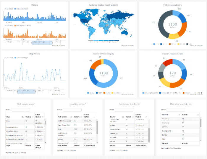
In this HTML5 dashboard sample, we use six JS charts, one JS map, and four conventional data tables. Now, let’s see what they are displaying.
The top left visualizations are spline area charts that show how many new and overall daily visitors your website or web app has had until now. The scroller allows you to keep full control over what range of time is visible now and then (just drag the thumbs of the scroller to modify the view). You can easily notice trends, as well as identify peaks and valleys. The only regular line chart included in this dashboard actually plays the same role as the first spline area chart, but focuses on blog visitors.
The interactive choropleth map in our web analytics dashboard sample tells you about the location of your visitors. According to a color palette and theme we have picked for this geographical data visualization – the more traffic comes from a country, the bluer its area is.
The three donut charts deliver you even more insights on the composition of your audience, including the breakdown of your visitors by age, type of device, and – applied to mobile users only – smartphone model.
Finally, the four data tables reflect what pages are more popular than others (and to what extent), top sources of your website and blog visits, and the search keywords that send most traffic to your site.
Web Analytics Dashboard: Development
If you are searching for a solution that would allow you at any time to quickly study your traffic (audience), compare data over time, and match the facts and figures revealed with your marketing objectives – look no further! AnyChart JS Charts framework gives you the power to create an interactive, cross-platform, ultimately responsive, HTML5-based web analytics dashboard quickly and easily. Check out our documentation and especially the Maps and Charts in One Dashboard article
For example, you are even welcome to take this ready-to-use dashboard sample, distributed under Apache 2.0 license just like all our samples for business solutions, and customize it in any way you and your data require.
Feel free to fork the dashboard from our repository on GitHub as well as pull requests and raise issues whenever you think we can improve anything in particular. The comments section in this article is also at your service, of course – we will be glad to hear from you.
Have a nice dashboard!
- Categories: AnyChart Charting Component, AnyMap, Business Intelligence, Dashboards, HTML5, JavaScript, Tips and Tricks
- No Comments »