 Choosing the right chart types for data analysis and reporting solutions is always a challenge. In fact, there are so many data visualization options out there that it can be really complicated to determine which one to use in a certain situation. And you cannot afford to make a mistake here, because applying data to an inappropriate type of chart will very likely end up causing confusion and even wrong business decisions.
To help you cope with this issue better (and faster), we have developed an information resource named Chartopedia, and it is a pleasure for us to introduce it to you today.
Encyclopedia of Chart Types
Chartopedia is a free encyclopedia of chart types, designed to guide you in picking the best presentation form for each data visualization task you are working on. Here you can find helpful information on 50+ major chart types, including their descriptions, missions, examples, and more. All these are supported in AnyChart’s interactive data visualization solutions – powerful JavaScript (HTML5) charting libraries AnyChart, AnyMap, AnyStock, and AnyGantt.
For instance, Chartopedia contains articles about each of the listed conventional charts (area, bar, bubble, donut, funnel, heatmap, line, pie, radar, etc.), range, stacked and stepped charts, as well as gauges (linear and circular), maps (bubble, choropleth, connector, dot, flow, and seat), financial and stock graphs, and Gantt charts.
Selecting Chart Types by Purpose
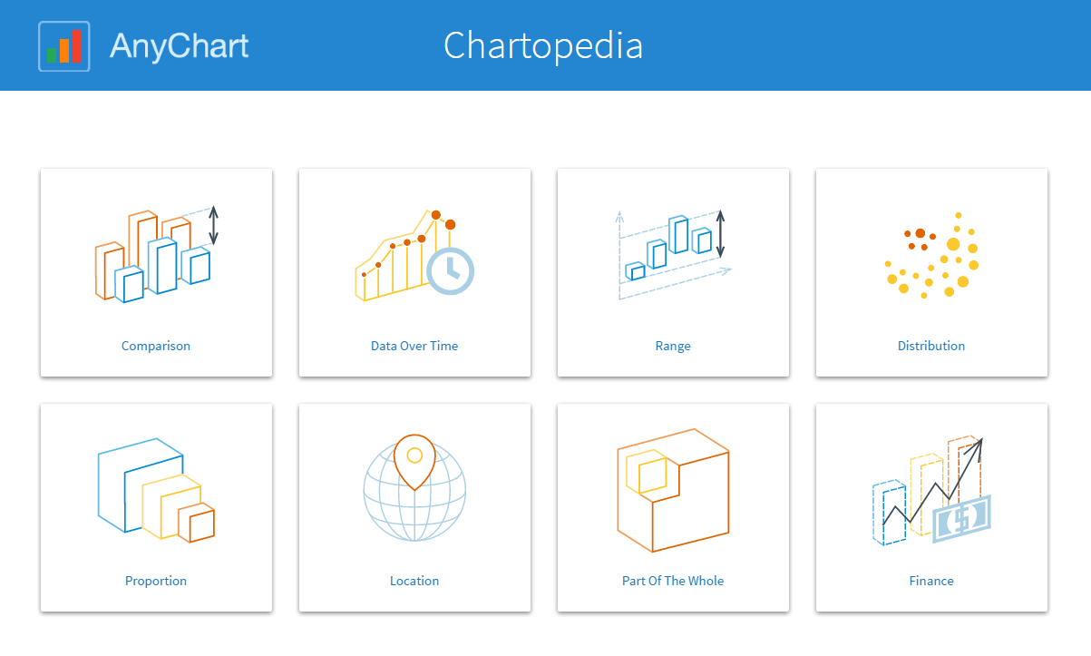
In addition to its valuable encyclopedic essence, Chartopedia is actually a great tool for selecting the right chart type for your specific data and the questions you have. You can easily filter all the available options by purpose of use to see which types of chart work best in your situation. Then it gets pretty easy to learn the details of each potentially applicable one for the final choice. All in all, Chartopedia divides the chart types by mission into the following 8 groups:
- comparison;
- data over time;
- range;
- distribution;
- proportion;
- location;
- part of the whole;
- finance.
So, we are inviting you to try Chartopedia now and start using it in your everyday data visualization life! And please let us know what you think. We are going to further improve Chartopedia on a permanent basis, so your feedback and suggestions are more than welcome at any time.
- Categories: AnyGantt, AnyMap, AnyStock, Business Intelligence, Financial Charts, Gantt Chart, HTML5, JavaScript, News, Stock Charts, Tips and Tricks, Uncategorized
- 1 Comment »