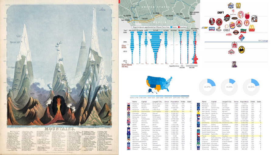
 Data Visualization Weekly presented by AnyChart is here! In this new issue, we are glad to show you an interactive dashboard as well as maps and charts in another collection of the best and most followed dataviz masterpieces that we shared on Facebook and Twitter over the course of the last week. These include:
- Interactive Dashboard of US States
- Is Donald Trump’s Wall Necessary?
- Finding the Cleanest Restaurants in NYC
- Early Maps and Infographics of the 1800s
DataViz of the Week: February 10, 2017 – February 17, 2017
Interactive Dashboard of US States
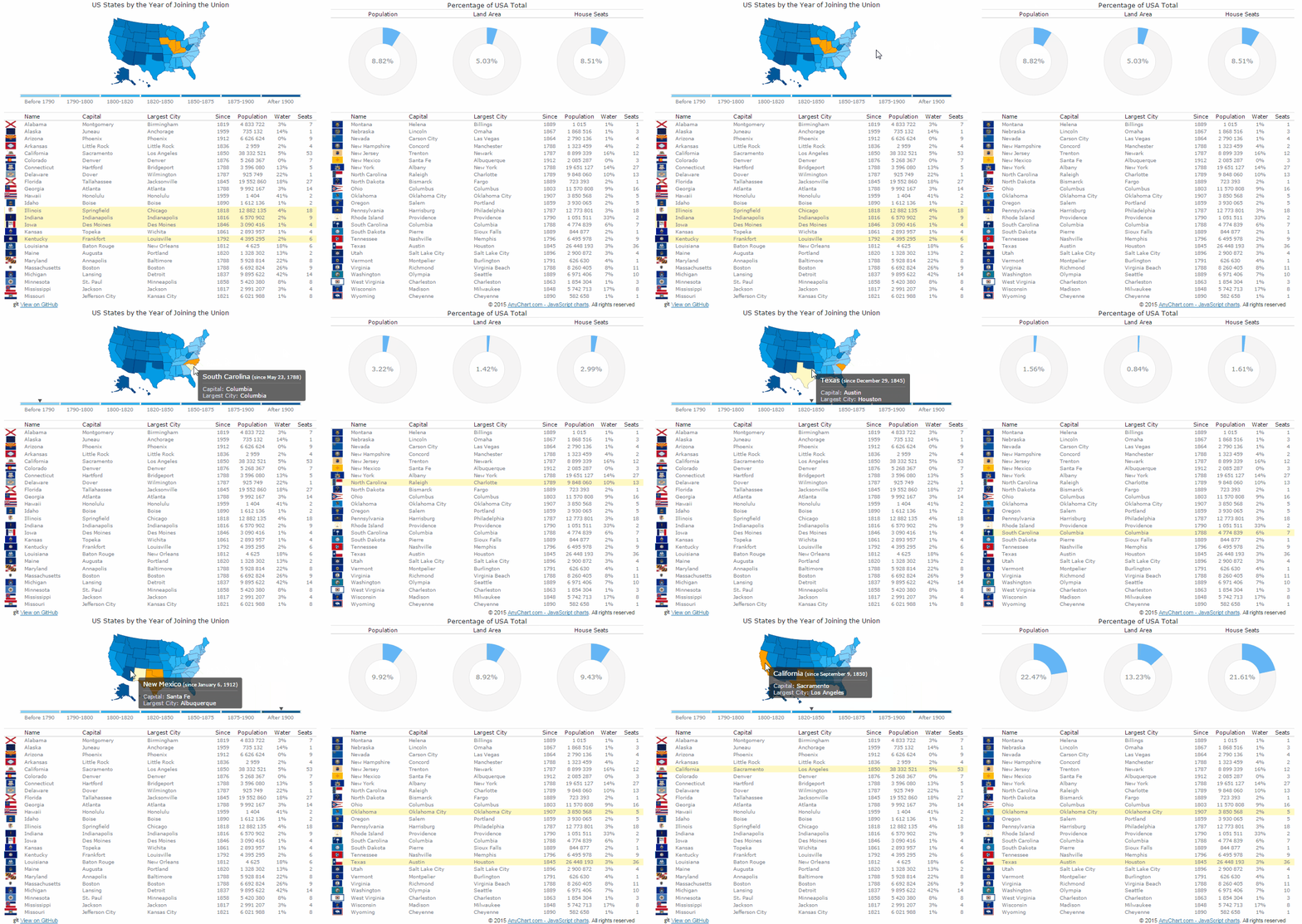
When Did Your State Join the Union is an interactive dashboard based visualization of data included in the List of states and territories of the United States article on Wikipedia. It displays basic information about the states of the Unites States of America at a glance. In particular, the dashboard is helpful to quickly learn in what year each state joined the union and their contribution to the whole US population, land area, and seats in the House of Representatives. It also shows state capitals, population, and some other relevant data.
When checking out this interactive dashboard, don’t forget to make good use of the multi-select feature to see totals for several states at once. And you are also welcome to take a look at more dashboard samples in our Solutions collection.
Is Donald Trump’s Wall Necessary?
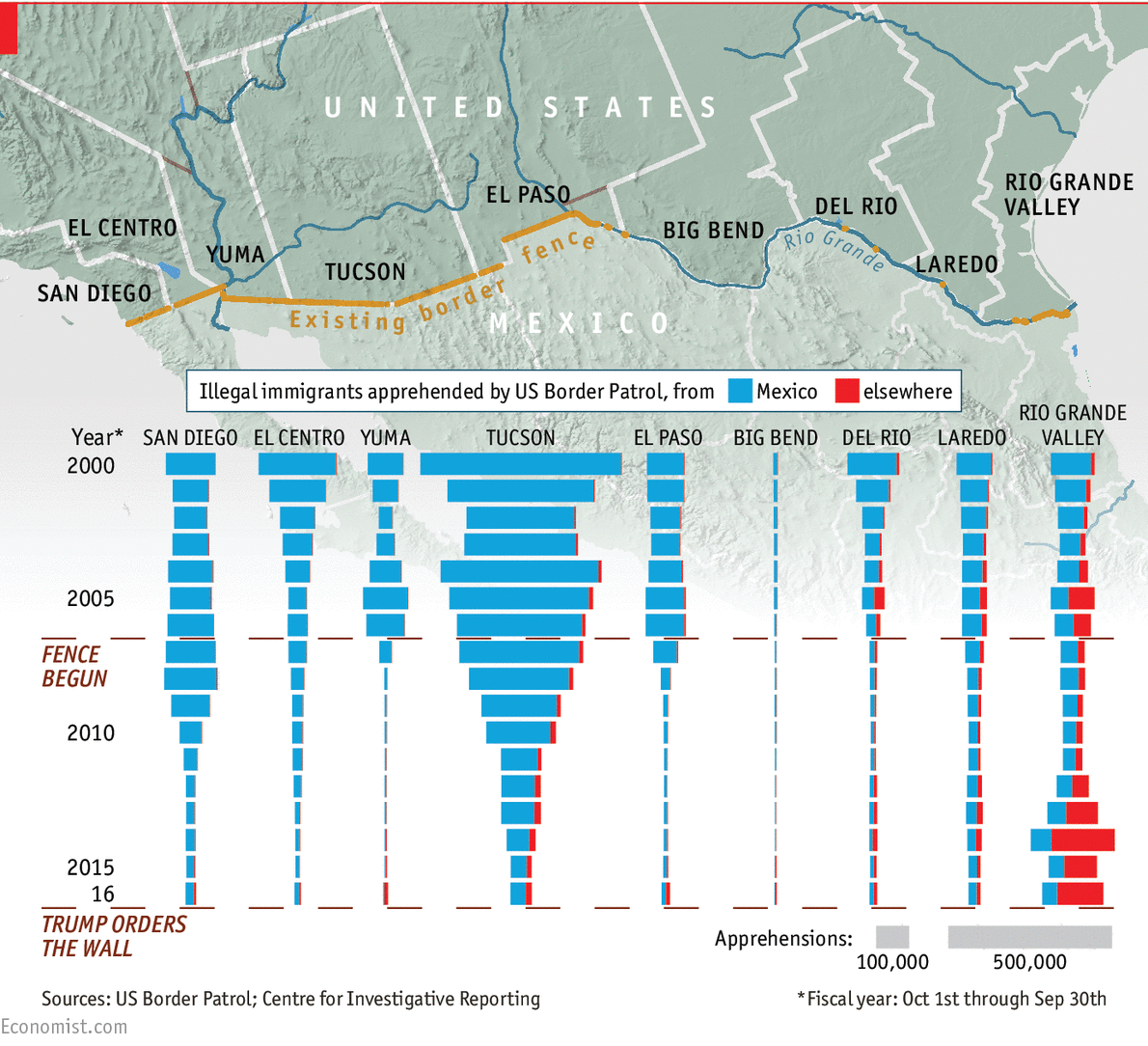
People in the United States continue arguing on whether building a wall along the US-Mexico border as promised by Donald Trump is really worth it. If you are ready to analyze data and decide whose side to take, take a look at this interesting chart published earlier this year by the Economist in the Daily Chart section. It is a visualization of data from the US Border Patrol and the Center for Investigative Reporting that displays the change in the number of people illegally crossing the boarder from Mexico.
Finding the Cleanest Restaurants in NYC
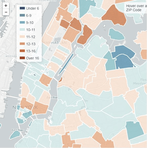
Mode Analytics took data of more than 400,000 inspection reviews and scores, published on NYC Open Data by the NYC Health Department, and visualized it in an interactive map. As a result, now it’s easy to see in what areas the cleanest restaurants in New York City are located.
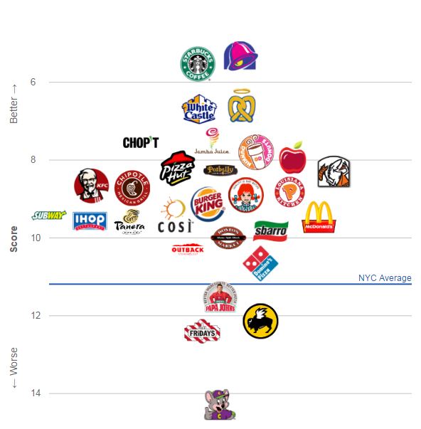
Head to this article on Mode Analytics Mode to see the map, read the explanations, and find even more of interesting data visualizations. To be precise, here you’ll also see more of interactive charts that visualize health inspection scores for national restaurant and fast food chains in NYC.
Early Maps and Infographics of the 1800s
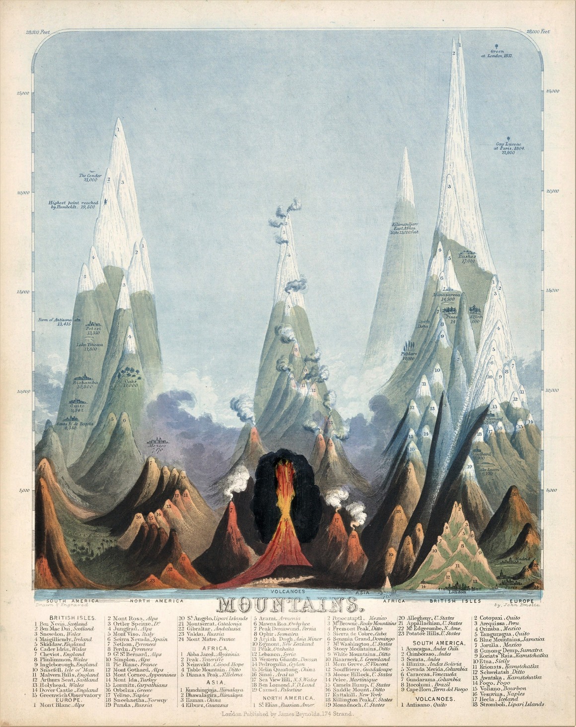
Atlas Obscura published a set of exciting educational infographics and maps that were created in the 1800s by topographical illustrator John Emslie and publisher James Reynolds. Check out these cool masterpieces and learn more about Moon’s surface, the tallest volcanoes, the longest rivers, the highest mountain peaks, and many other peculiar facts the way they were known and communicated two centuries ago.
We hope you like the new issue of our Data Visualization Weekly. Meanwhile, another week is about to start off just in a couple days, and it will definitely be also full of great interactive dashboards, infographics, maps, and charts. And we’ll be glad to share more of new wonderful dataviz next Friday. Stay tuned!
- Categories: Data Visualization Weekly, News
- No Comments »