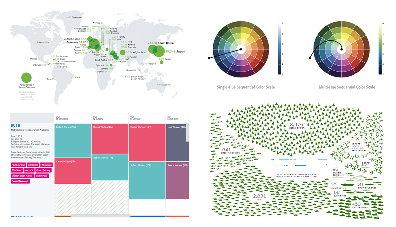
 In today’s Data Visualization Weekly issue, you’ll find another set of eye-catching dataviz examples shared and discussed on media within the last seven days. The current issue highlights several visualizations of America’s military expenditure, bus schedule as a chart for resource management, and explanation on how to use color in data visualization to the best effect.
DataViz of the Week: March 17, 2017 – March 24, 2017
U.S. Military Spending Visualized
The recent proposal of U.S. President Donald Trump to increase the defense budget by $54 billion inflamed big discussions on media. Whether this measure is necessary, rational and effective or not, the news actually provoked multiple interesting data journalism works here. We are almost sure that many of you guys have already seen some visualizations of the military expenditure and related data. Here’s a couple of highlights.
-
Visual Capitalist
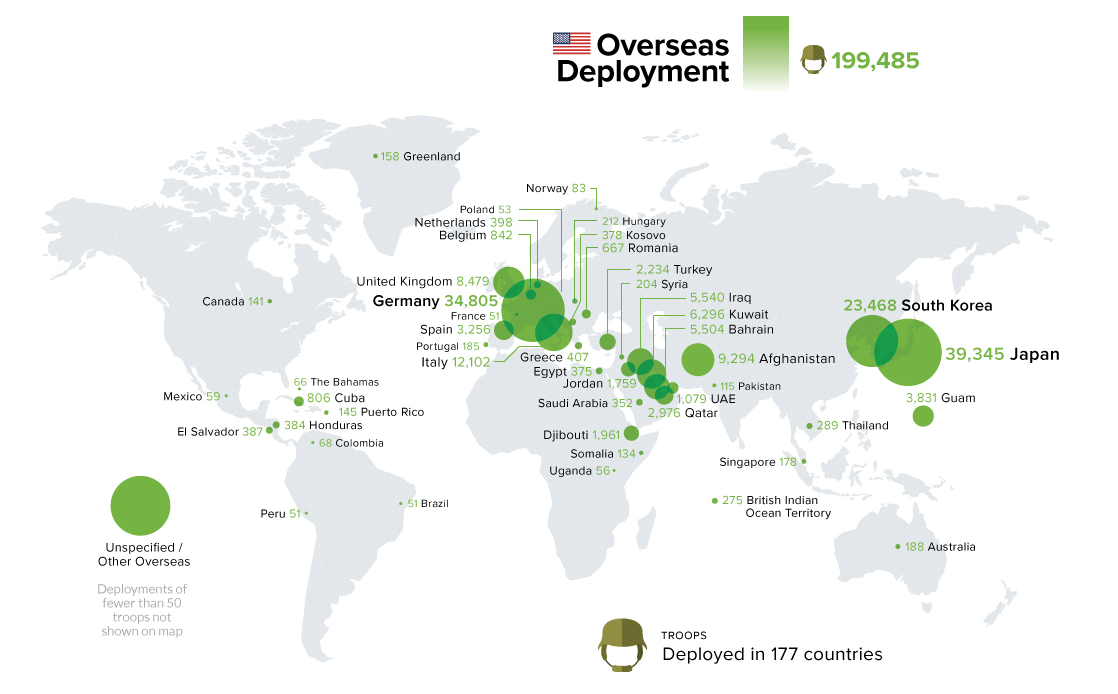
Visual Capitalist published an infographic with several peculiar charts. The first visualization is the treemap of the global military expenditure, where the current share of the United States is 35.8% (and the proposed increase alone equals to the entire defense budget of the United Kingdom). Next comes the breakdown of the U.S. defense personnel, both domestic and overseas. And then there is a bubble map that beautifully shows how 200,000 U.S. troops are distributed across 177 countries.
-
The New York Times
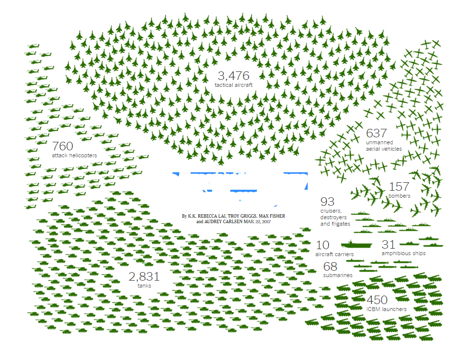
At the same time, The New Your Times tried to answer the question Is America’s Military Big Enough? with another set of data visualizations and infographics on the subject. Here you’ll find a lot of diverse charts, so I’d better not describe them all but invite you to go to this article right away.
Resource Management: Bus Schedule Chart
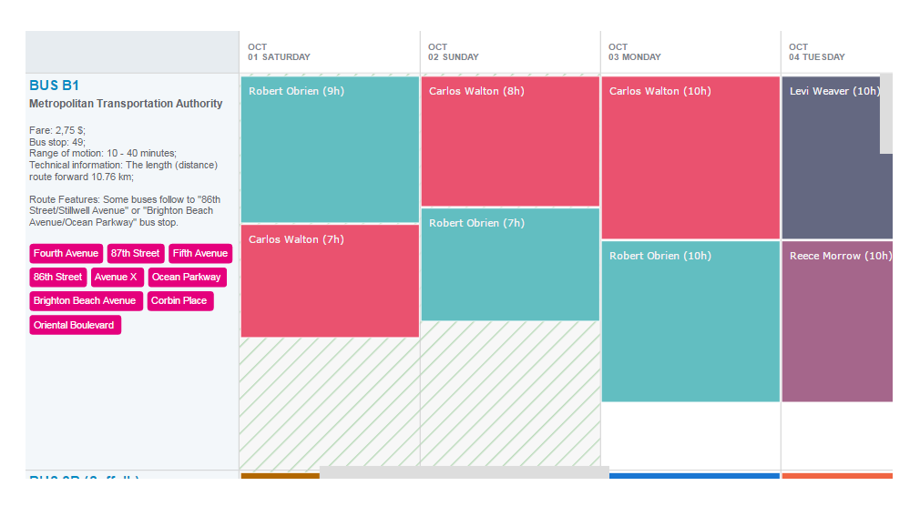
Charts for project and resource management are a great tool for organizing, scheduling and overseeing processes and activities to the best effect. The interactive Bus Schedule chart, created with the AnyGantt JS charting library, is a nice example of how Resource charts can be utilized in the real life. It visualizes sample data from the Metropolitan Transportation Authority and, in particular, displays bus drivers’ shifts (resources) on several routes during a week.
Power of Color Palette in Data Visualization

Alan Wilson from Adobe points out that the proper use of color in charts help them better deliver and clarify data. In his article The Power of The Palette: Why Color is Key in Data Visualization and How to Use It, he explains some effective approaches. In particular, the author writes about categorical color as well as sequential and diverging color scales. There is also a bonus at the end of the article where you can find a list of several convenient tools helpful in choosing the best colors.
That’s all we wanted to share with you this time within the framework of our Data Visualization Weekly. Have a wonderful weekend!
- Categories: Data Visualization Weekly
- No Comments »