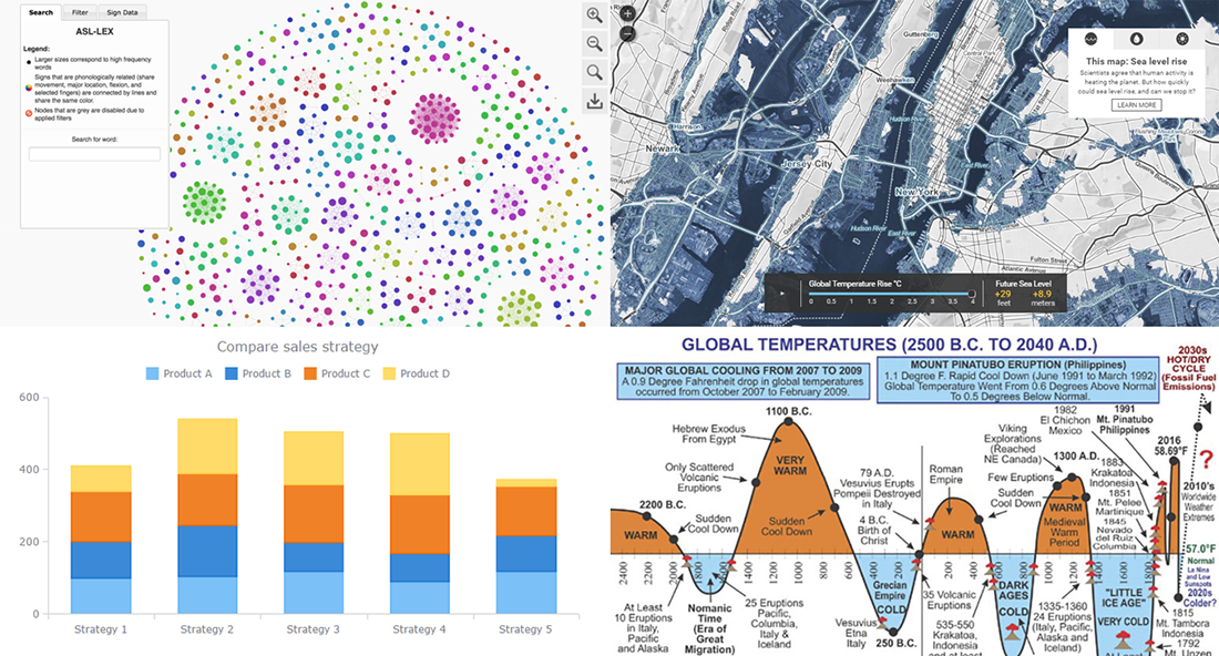
Today is the 13th Friday of the 2017 year, and another weekend is coming! In the meantime, we invite you to enjoy another portion of last week’s notable works in the data visualization field. The first highlight here is the article about stacked bar charts and how to use them, written by our Data Visualization Expert Vitaly Radionov specifically for Smashing Magazine. After briefing you on that, we’ll also take a look at this year’s winners of the Vizzies Challenge, a graph of global temperature change from 2500 BC to 2040 AD, and a (scary) map visualization of the sea level rise expected in the (near?) future.
DataViz Weekly: March 24, 2017 – March 31, 2017
Stacked Bar Charts: Useful Rather Than Useless
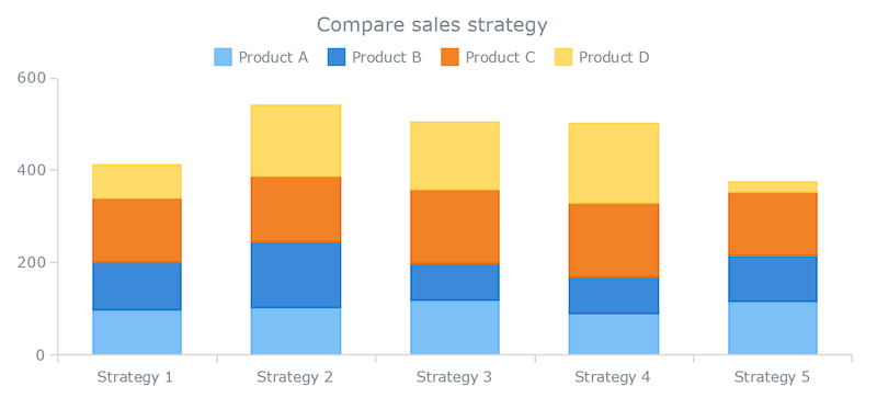
It’s awesome that there’s an abundance of chart types out there, enabling us to communicate data effectively. However, it’s also so easy to get lost in such a huge variety of visualization forms and accidentally make bad use of them. As a result of improper application taking place too frequently, pie charts have had maybe the most unfavorable reputation for a long time. Nowadays, stacked bar charts (and stacked column charts) are likely to become the next candidate for being called “the worst”.
Vitaly Radionov, Data Visualization Expert at AnyChart JS Charts and the author of Chartopedia, attempted to advocate stacked bar charts and help this chart type avoid being turned into the next black sheep along with Pie charts. In his article Understanding Bar Charts: The Worst Or The Best? published on Smashing Magazine last week, Vitaly made an overview of conventional and stacked bar charts, explained what purpose they truly serve, and provided nice examples for illustration.
Vizzies 2017: 10 Best Science Visualizations
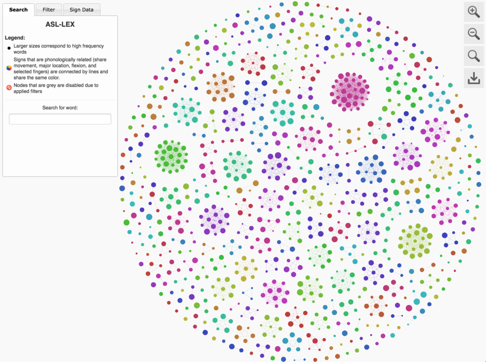
The National Science Foundation and the Popular Science magazine announced the winners of this year’s Vizzies Challenge. These are the best 10 graphical masterpieces of 2017 in the field of science: visualizations, videos and images.
Among this year’s winners are visualizations of the American Sign Language, human brain, hummingbird’s tongue, and more. Check out the full list and further details on Popular Science.
Global Temperatures: 2500 B.C. to 2040 A.D.
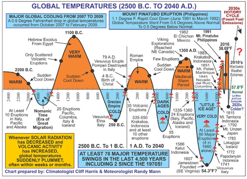
Climatologist Cliff Harris combined several resources to build this chart of global temperatures from 2500 B.C. to 2040 A.D. This visualization shows the fluctuations of the average global temperature as compared to 57 degrees Fahrenheit (approximately 13.9 degrees Celsius), the 20th century’s average. You can find the explanation he wrote together with Meteorologist Randy Mann in this article. In particular, they conclude that “the Earth’s coldest periods have usually followed excessive warmth“, but “in terms of upcoming cooling and warming periods, only time will tell“.
Sea Level Rise: Interactive Map of Flood Caused by Global Warming
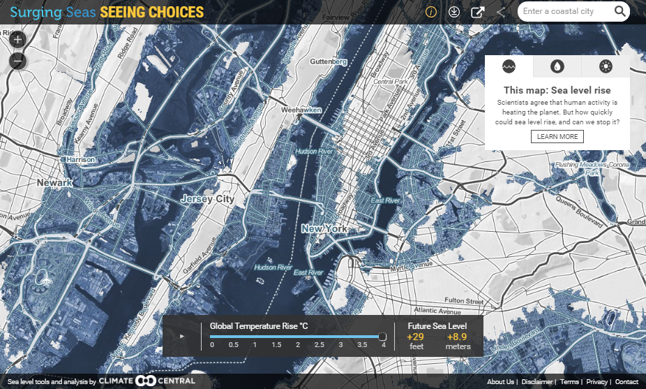
Global warming remains one of the most topical issues widely discussed in media, scientific community, and beyond. So, here’s another visualization within the framework of the climate change subject. This interactive map displays the influence of the global temperature’s rise on the water level in the seas. The Next Web says the visualization is scary, and we cannot help agreeing with this kind of diagnosis after all.
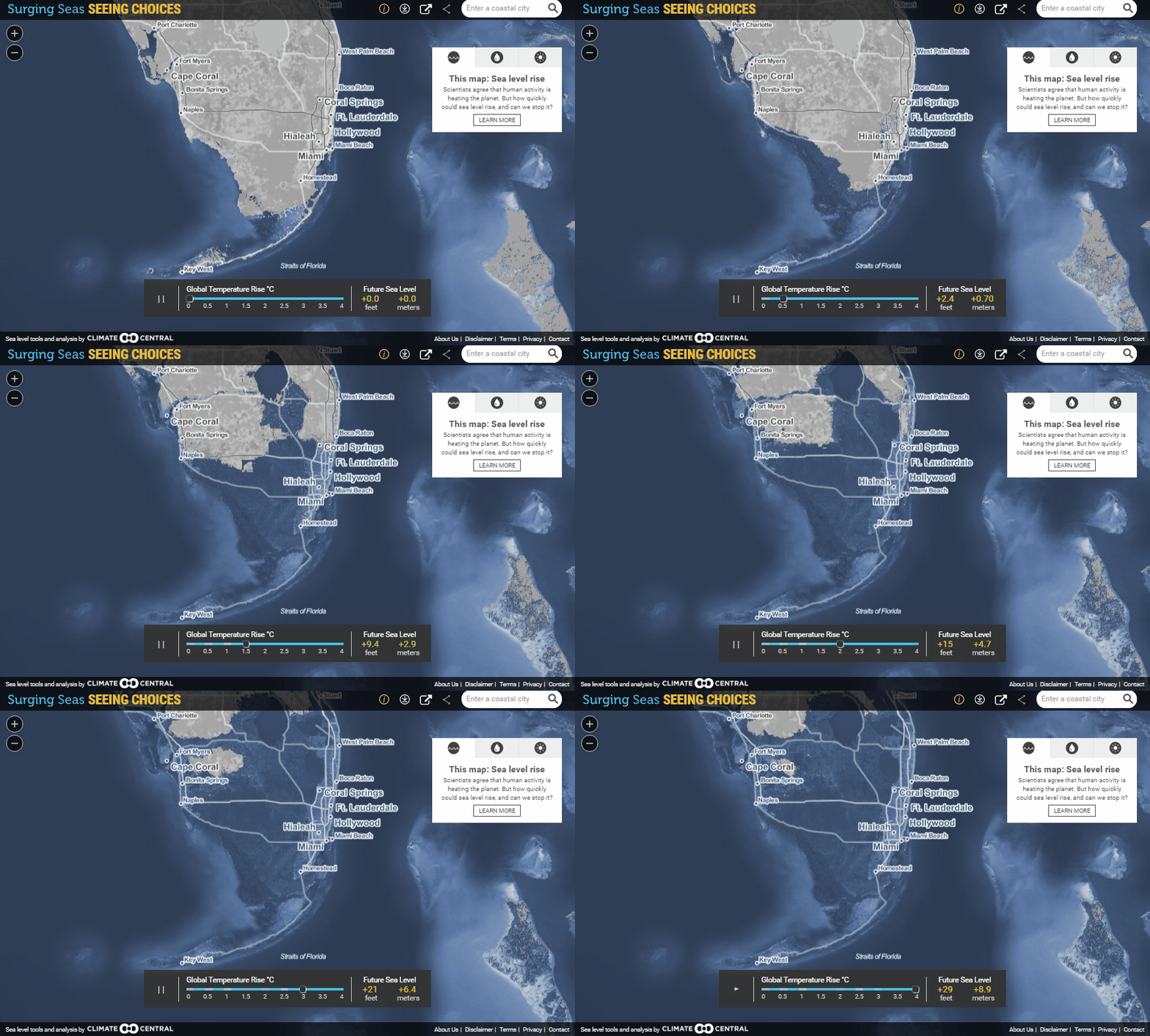
Still in doubt? Take a look what’s going to happen with South Florida if the global temperature goes up just a little bit, for example. And then go ahead to the interactive version of this map to see whether your area of living is safe enough from the sea level rise.
Thank you for reviewing the new issue of the Data Visualization Weekly series on our blog. As always, we all wish you a great weekend time!
- Categories: Charts and Art, Data Visualization Weekly
- No Comments »