 When it comes to creating data analytics and reporting solutions, choosing the right chart type for a certain data visualization task remains a common challenge. What do you pick for data comparison, studying distribution, observing data over time, or some other purpose? It can be very tricky! To help you overcome this challenge to the best effect, today we are launching a series of articles titled Choose Right Chart Type for Data Visualization. The series is designed to quickly explain what chart types you should pick for different purposes of data analysis. With that said, each article here will be devoted to a specific, yet still big question that you want your data to answer.
The current (first) guide of the series is all about chart types that work best for finding out the differences in data: Data Comparison. In fact, it is one of the most frequently established purposes of data analytics. And sometimes many people use wrong chart types to fulfil it correctly. Now, finally, let’s get to the very point and see what visualization forms work best for comparing data.
List of Chart Types for Comparing Data
To start off, here’s a list of basic chart types that are commonly helpful when your purpose is to compare some data:
- Bar and Column charts;
- Stacked and 100% Stacked charts;
- Radar charts.
Now, let’s see what they are all about and how each type should be used.
Choosing Charts for Data Comparison
Bar Chart, Column Chart
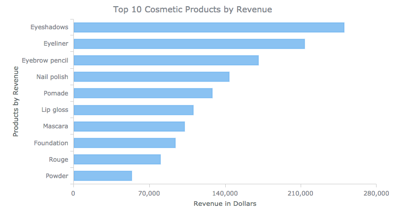
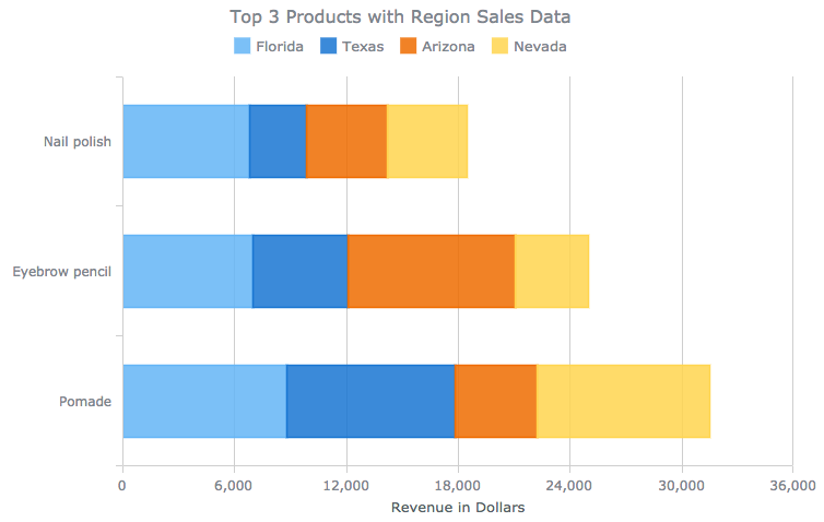
For data comparison across several categories based on their absolute or relative values, the easiest way is to depict them as horizontal or vertical bars in a Bar chart or a Column chart respectively. The general rule here is to pick the latter for smaller sets of data, usually up to 10 values. The Bar chart type can be used for bigger ones and when captions appear to be long.
For example: revenue per product.
Additional examples include: referral websites by attracted visitor traffic, etc. Take a look at more Bar chart samples in this gallery.
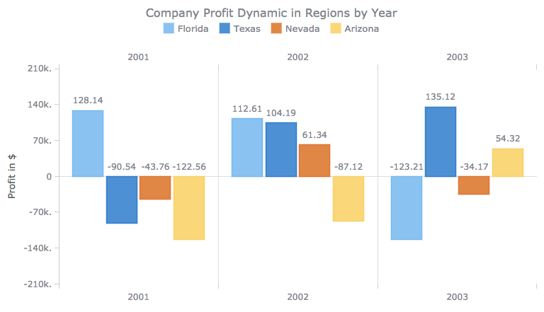
For comparing aggregated values regarding several periods of time among themselves and if you would like to focus on each data point, basic Column charts can also be a nice fit.
For example: revenue per month.
Take a look at more Column chart samples in this gallery.
To understand exactly which one you need for data comparison, the Bar or the Column chart type, follow this guide:
- When categories represent product names, brands, personal names, and so on, Bar charts usually work best. That is because horizontally oriented texts are much easier to read.
- When categories stand for periods of time such as years, months, quarters, and so on, pick Column charts. This way, the X-axis imitates a date/time scale that is intuitively easier to read from left to right.
Stacked Chart, 100% Stacked Chart
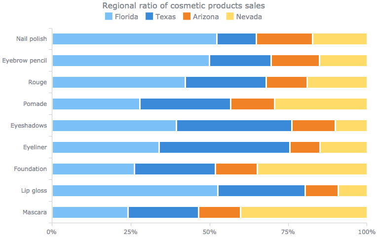
Stacked charts do the best job when you have several series and would like to not only compare individual values of data within series but also assess the behavior of categories in total or the breakdown of each category by series values.
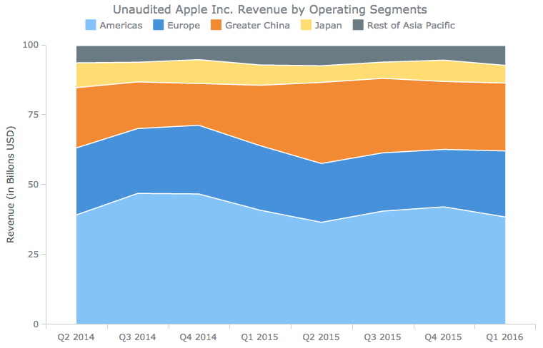
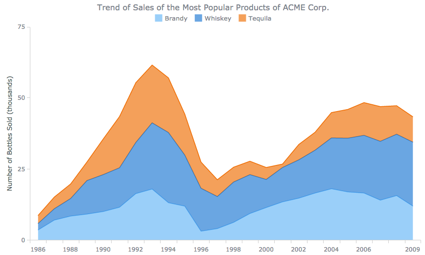
Anticipating the forthcoming explanation of Area-like charts (Area, Spline Area, and Step Area charts) and following the same principle of choosing between the Bar chart and the Column chart described here earlier, let’s see the examples of what you can get as a result.
- To understand the distribution of values in a category, use 100% Stacked charts. For example, a 100% Stacked Bar chart or a 100% Stacked Area chart.
- To examine the category behavior in total, pick the conventional Stacked chart type. For example, a Stacked Bar chart or a Stacked Area chart.
You can find more of Stacked and 100% Stacked chart samples in this gallery by exploring relevant sections (Bar Charts, 3D Bar Charts, Column Charts, 3D Column Charts, Combined Charts, etc.).
Radar Chart
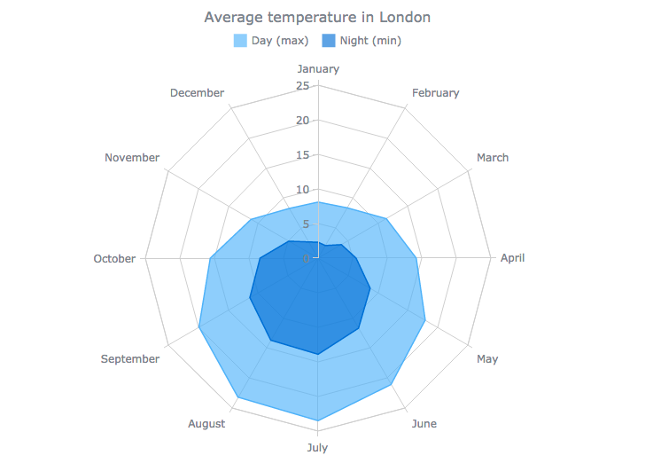
When analyzing cyclic data (seasons, months, etc.), you can use a Radar chart. In fact, it is ideal for comparing and identifying patterns and relationships in cyclic data. Also known as spider, spiderweb and star charts, these types of visualization plot the values along axes starting from the same point in the chart’s center and ending on the outer radius.
For example: average monthly temperature.
Additional examples include: average number of visitors per each day of the week, etc. Take a look at more of Radar chart samples in this gallery.
Conclusion
When comparing data is what you are looking for in a visualization, first consider choosing a Bar (Column) chart, a Stacked or 100% Stacked chart, or a Radar chart. These types of chart usually work best for data comparison. However, it should go without saying that your specific questions and your particular data have the last say of what chart type to pick in one situation or another.
For further information, please stay tuned to the Choose Right Chart Types for Data Visualization series on our blog. We’ll publish articles covering other purposes soon.
You are also welcome to visit Chartopedia, the definitive guide to chart types launched just recently. It will help you if you can’t wait or just need more (and comprehensive) details on visualization options for data comparison. To learn how to quickly create the chart you need, with the help of AnyChart JS (HTML5) Charts, please refer to our Documentation and API Reference.
- Categories: Choosing Chart Type, Tips and Tricks
- 4 Comments »
