 Welcome to the new Data Visualization Weekly collection of interesting chart visualizations of the latest 7 days! In this series, it’s always Friday. Not that we are now part of the T.G.I. Friday’s restaurant chain – not at all! But we usually publish DataViz Weekly posts on Friday, in the Friday mood. And our goal here is to let you heave a sigh of relief after another workweek and simply enjoy some cool chart visualization examples before going to a pub (or exactly from there!), home, or wherever else for a Friday night.
See below for four engaging data visualizations. In particular, there you’ll find the animated chart that became one of the most widely liked and shared tweets with third-party charts in our Twitter account‘s history. And it goes first.
DataViz Weekly: Chart Visualizations of the Week, April 14, 2017 – April 21, 2017
Animated Chart of World Population by Continent, 1950-2100
Cool #DataViz #Animation: The #World’s #Population from 1950 to 2100 by Region: https://t.co/SRsVpvYH8W by @simongerman600 via @visualcap pic.twitter.com/OMQBZZDFXh
— AnyChart (@AnyChart) April 20, 2017
Based on data from the UN Population Division, this column chart visualization shows what share of the world’s population lived, lives and is expected to live on what continent. The biggest trend seen here – Africa accommodated only 9% of all people on Earth in 1950, but its share in this regard will rise to as much as 39% by 2100. Well, the chart speaks for itself, so you are welcome to check it out and draw conclusions by yourselves.
This cool animation created by German geographer and demographer Simon Kuestenmacher has been very, very popular these days. We first found it on Visual Capitalist, shared in on Twitter, and the tweet has already gained a lot of impressions, engagements, etc.
Huge Flow Chart Visualization of Infrastructure Project Approval Process
This 8-foot tall non-interactive flow chart – click the fragment above to view its full version – may well make it into history. Maybe it will even get its own star on the Hollywood Walk of Fame as the data visualization that was most frequently shown on TV. Or maybe it will be included in the Guinness World Records in some category. But let’s get to the point. U.S. President Donald Trump used this huge chart to demonstrate how hard it is to get a permit to build a highway (and, basically, any infrastructure project) in the United States.
Here’s one of the videos of the presentation in case you missed it:
Thanks to CNBC, now we all can see what’s in it. “Sort of incredible,” Trump said. Indeed, it looks impressive, if not to say more.
American Airline Companies’ Mistakes with Overbooking, 2008-16 Average

The recent situation when United Airlines removed a passenger from a plane – let’s put it softly – against his will attracted attention to the problem of overbooking. (However, it became clear just a little bit later that that horrible violence was not caused by overbooking. The company is reported to have simply decided to accommodate several employees on that flight to transport them from Illinois to Kentucky.)
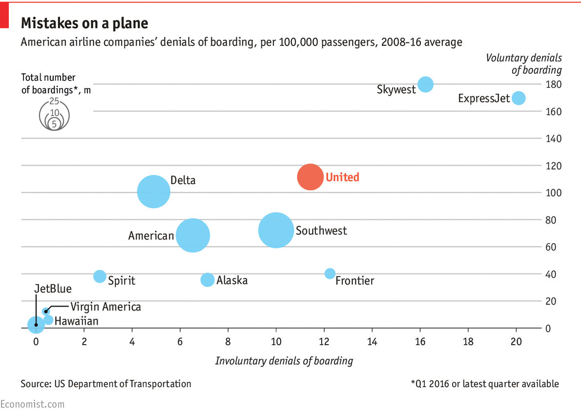
Well, anyway, overbooking indeed appeared to be a dangerous matter. Just look at this: More than 500,000 passengers in the U.S. were denied boarding while they had valid (!) tickets for a flight. Moreover, about 40,000 of those denials, which equals to 8.6%, were involuntary. And these are the figures from the year of 2016 only!
Whether you think it’s a problem or not, worth talking or not, there’s also a peculiar fact. Although the incident with United Airlines is likely to have no relation to overbooking, check out a funny coincident: United bumps more passengers than any other large American airline, according to federal data nicely visualized by The Economist in the chart embedded above.
Chart Visualizations of Big U.S. Cities with Cheapest Rent

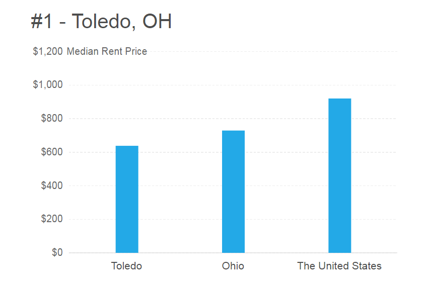
According to some data, young Americans are very mobile and move to another place to live in an average of four times. And, ideally, the destination should be both affordable and interesting (cultural, diverse, etc.). But where exactly to go? FindTheHome analyzed American cities with at least 250K citizens in population and picked the 18 most affordable ones on the basis of renting rates. Here’s the result of the research – an article that lists big U.S. cities in which you can actually afford to live. All listings are accompanied with nice column charts for better insights. Check it out!
So, that’s it for now, folks. Now you are absolutely free to enjoy your Friday! Stay tuned, and we’ll be happy to familiarize you with more of cool chart visualizations, maps, and/or other eye-catching dataviz pieces next time, in a week. In the meantime, may all of you have a great weekend!
- Categories: Data Visualization Weekly
- No Comments »
