 In the previous articles from the Choose Chart Type for Data Visualization series, we covered the ways to visually represent information for data comparison, composition and distribution analysis, and observing trends over time. The current post sheds light on a situation when you only have Single-Value Data that can serve as Indicators of the current performance. In this quite widespread case, plotting each value on a separate chart often makes sense. That is where Gauges and Bullet charts come into play.
List of Chart Types for Single-Value Data Visualization
Generally, there are two basic chart types that work best for visualizing single-value data as indicators. In fact, we’ve already mentioned them in the introduction. But here they are again, just in case:
- Linear and Circular Gauge charts;
- Bullet charts.
You are welcome to find out the details on them below: purpose of use, some worth noting peculiarities, and examples.
Choosing Charts to Display Indicators (Single-Value Data)
Linear and Circular Gauge
Generally, Linear Gauge and Circular Gauge charts are the most suitable chart types to choose for displaying single-value data and are widely used in dashboards. In particular, they are ideal for comparing an actual value vs. a KPI so users can rapidly assess the current figure – poor, average, good, etc. – without having to view precise numbers.
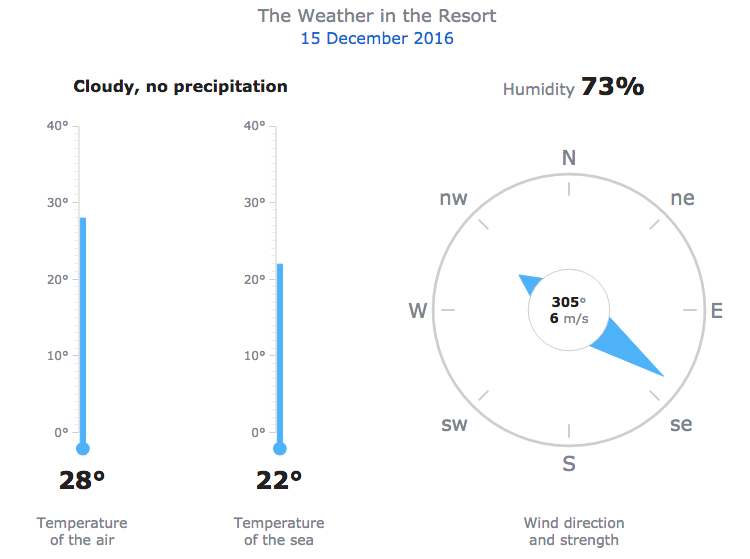
For example, it is very convenient to create a weather dashboard with one Circular and two Linear Gauge charts, each displaying only one value:
Additional examples include: server load vs. capability, hotel room capacity, tank volume, etc.
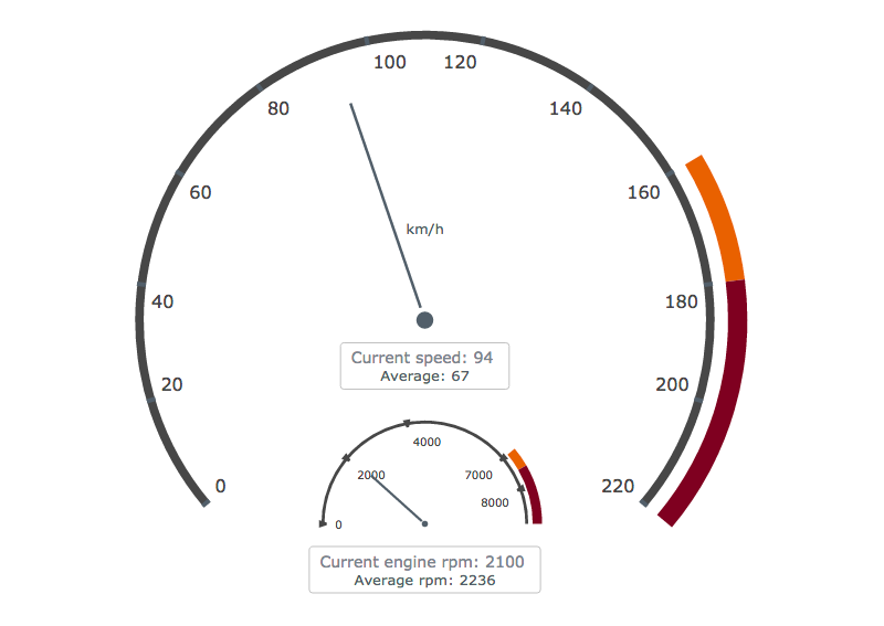
Most commonly, Gauges imitate real-world measurement instruments such as thermometers, compasses, speedometers, and so on:
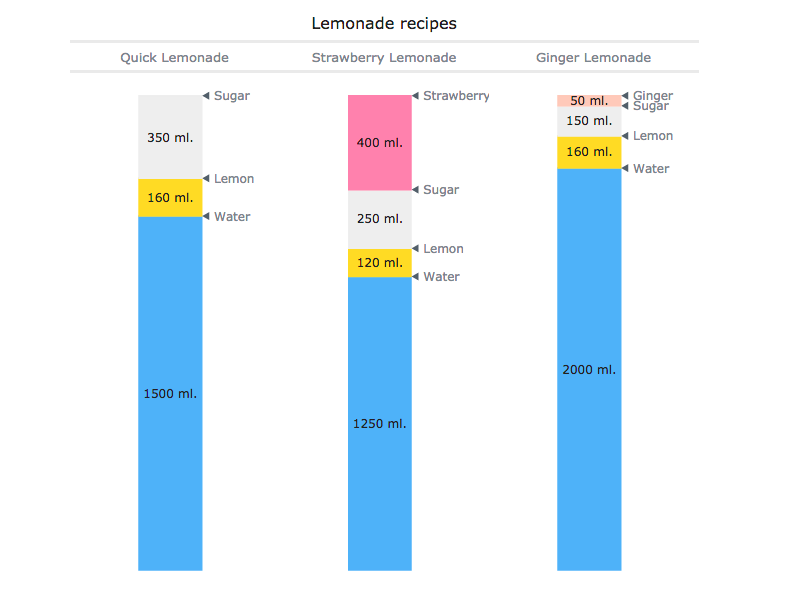
However, the Gauge chart type is also useful for imitating infographics:
You can find more Linear Gauge chart examples in this gallery and take a look at Circular (Angular) Gauge chart examples here.
Bullet Chart
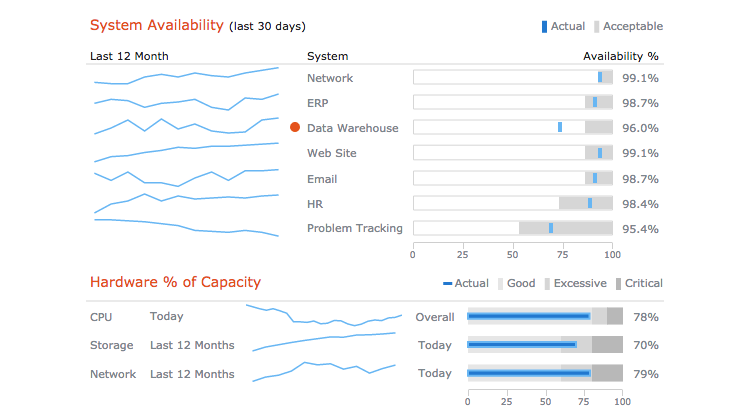
Bullet charts should be separately noted as a type of Linear Gauges that provides users with a rich display of information in a small space. Technically, the Bullet chart is a single-value chart, because it displays current performance against a target value.
This type of chart is great for comparing quantitative data against qualitative ranges such as profit or loss against good or bad. Much like Sparklines, Bullet charts can be beautifully used in dashboards.
For example: system availability and hardware capacity (part of a CIO dashboard).
Additional examples include: current vs. target sales by region, new customers per month, etc. Take a look at more Bullet chart examples in this gallery.
Conclusion
Single-value data can be nicely visualized as indicators with the help of a Circular (Angular) Gauge chart, a Linear Gauge chart, or a Bullet chart. These are quite common solutions, for example, when you look for comparing current performance to some KPI or qualitative range.
If that is not exactly what you need and would like to get as a result, check out the other articles in our Choose Right Chart Type for Data Visualization or (and) the free information resource of Chartopedia that we have recently launched. In any case, it is your data and conclusions you want to extract from them that have the final word on what chart type to pick in a situation.
For manuals on creating the charts you need in HTML5, with the help of JavaScript, please see the API Reference and Chart Docs.
- Categories: Choosing Chart Type, Tips and Tricks
- No Comments »
