 Geovisualization and map-based analysis of geo-data sets related to given territories or spatial environments can provide significant insight into trends and assist greatly in exploring and associating the impacts of variables. Nowadays, maps are used for data visualization very frequently, both as standalone geovisualizations and part of complex dashboards.
In this new article within the framework of our Choose Right Chart Type for Data Visualization series, we’ll write about map charts and explain how (when) to properly use each of corresponding types.
List of Chart Types for Visualizing Geo-Data on Maps
If you’re just wondering what types of charts (maps) exist out there for geovisualization / geo-data visualization, you’ll be happy enough to find the following list here:
- Choropleth maps;
- Dot (Point) maps;
- Bubble (Proportional Symbol) maps;
- Connector maps;
- Flow maps.
Now, for everyone who would like to learn more details on the difference between them and how to use these map chart types properly, we’re publishing the explanation below.
Choosing Charts for Geovisualization with Maps
Choropleth Map
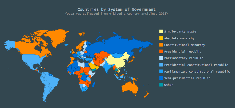
To compare different countries or regions and indicate geospatial differences of some variable including its contribution to the whole, i.e. how data varies across one or another territory, choose Choropleth maps. Areas in these maps are shaded or colored according to the inherent color-vs.-value progression, which makes it easy to notice the extent of geospatial variability, find leaders, and so on.
For example: countries by system of government.
Additional examples include: countries by product sales, website traffic source countries, population density by country, etc. Take a look at more Choropleth map chart samples in this gallery.
Dot Map (Point Map)
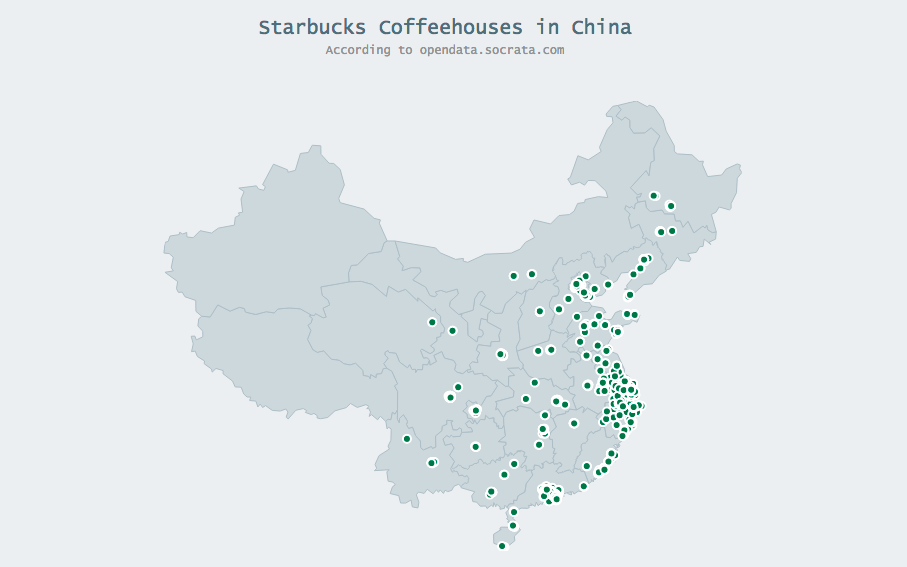
To understand distribution trends across countries or regions, you can choose to use the Dot (Point) map chart type and display locations by means of markers.
For example: location of points of sale.
Additional examples include: airplane crashes, office locator, etc. Take a look at more Dot map chart samples in this gallery.
Bubble Map (Proportional Symbol Map)
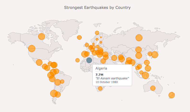
If you want to differentiate points proportionately with their values, Bubble (Proportion Symbol) maps take the lead as a variation of the Dot (Point) map chart type.
For example: earthquakes by magnitude.
Additional examples include: sales offices by revenue, etc. Take a look at more Bubble map chart samples in this gallery.
Connector Map
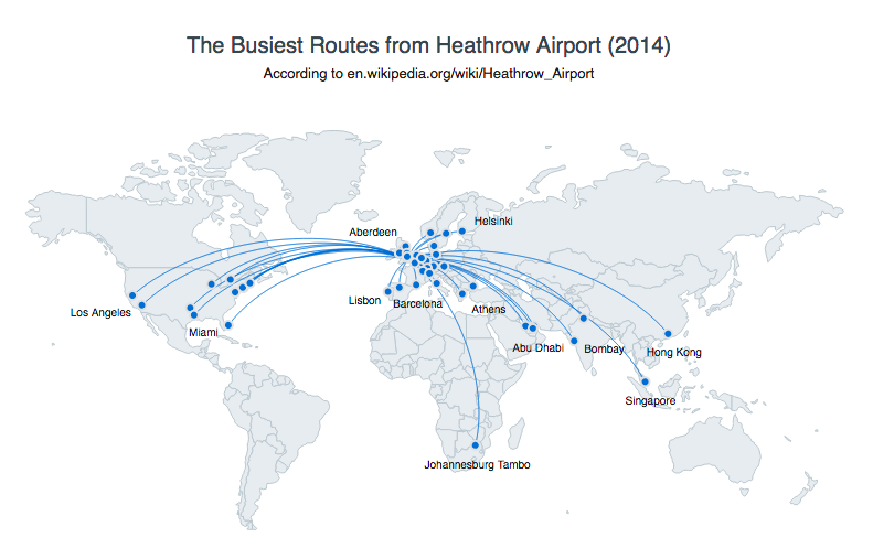
To understand geographical connections, like flight information or migration trends of any kind, you should use Connector maps. In this type of visualization, points – mainly in pairs – are connected with the help of lines that commonly do not specify a direction.
For example: air (or any other) routes.
Additional examples include: supply chain, network or branches and their connection with parent points, etc.
Flow Map
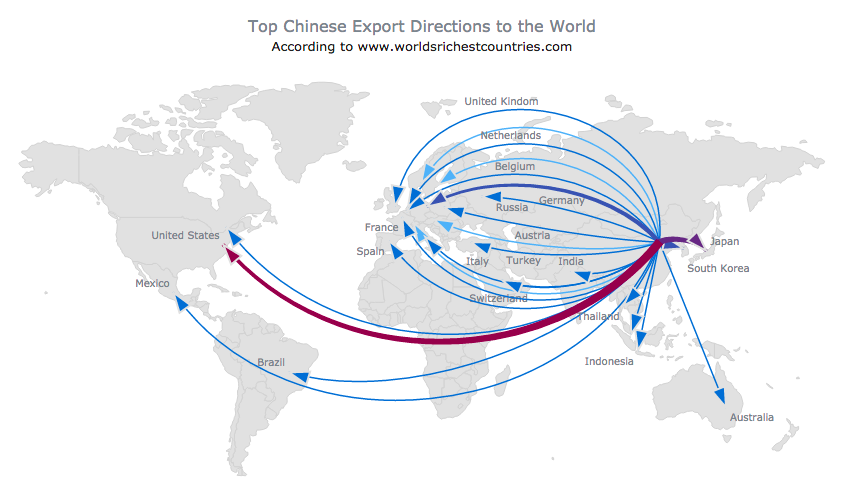
For displaying the movement of objects between locations and in any other situation when directions are important, Flow maps are a good choice. In visualizations using this map chart type, lines that connect points on a map feature arrows.
For example: exporting directions.
Additional examples include: military tactical maps, etc.
You can find more Connector map and Flow map chart samples in this gallery.
Conclusion
Whether you need a standalone interactive map or geovisualization for a complex business dashboard, these chart type options can get the job done. You can pick a Choropleth map, a Point (Dot) map, a Proportional Symbol (Bubble) map, a Connector map, or a Flow map for your data. What you specifically need to visualize (and for what exact purpose) should determine the final chart choice, however.
These map chart types are also explained in Chartopedia and grouped into the Location section. Moreover, there you can find examples, links to live, interactive samples, specific JS chart documentation articles, and other important information. Finally, for details on how to use our API to create such maps in HTML5, go to the extensive API Reference.
- Categories: Choosing Chart Type, Tips and Tricks
- No Comments »
