New DataViz About Dating, TV Shows, Populists, and School Safety — DataViz Weekly
November 30th, 2018 by AnyChart Team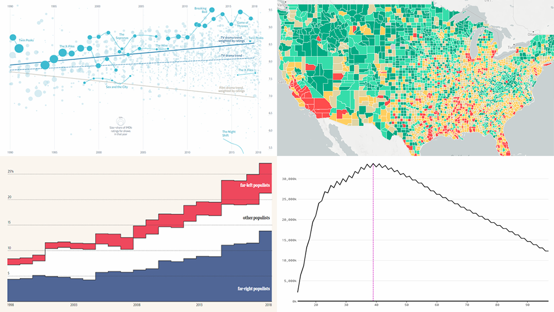 Data visualization is a wonderful way to represent data for intuitive, insightful exploration. The following new dataviz works we’ve found are actually good examples to prove this point.
Today on Data Visualization Weekly:
- dating pool by age;
- TV shows in IMDb user ratings;
- rise of populist parties in Europe;
- safety on the roads around American schools.
- Categories: Data Visualization Weekly
- No Comments »
Interesting Data Visualization Projects About Thanksgiving, Air, Greenery, and Rape Clearance — DataViz Weekly
November 23rd, 2018 by AnyChart Team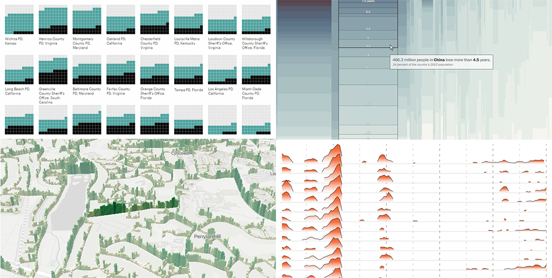 Happy Thanksgiving holiday! While the traditional Black Friday rush is getting into the full swing, we hope you can spare a minute to check out new interesting data visualization projects. Let’s see a list of what’s featured this time on DataViz Weekly and without more ado proceed to the charts:
- years lost due to air pollution;
- urban greenery in Cardiff and Newport;
- rape case clearance rates across the United States;
- Thanksgiving holiday trends.
- Categories: Data Visualization Weekly
- No Comments »
What Is Data Visualization? Definition, History, and Examples
November 20th, 2018 by Jay Stevenson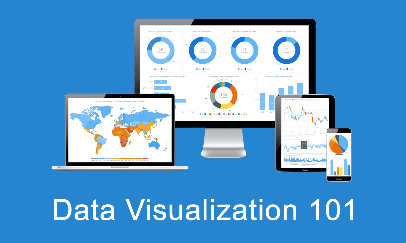 Data visualization is the practice of converting data from raw figures into a graphical representation such as graphs, maps, charts, and complex dashboards. Let’s see what makes it important (meaning), how it has developed (history), and exactly how it can work in real life (examples). Join us on Data Visualization 101, an introduction to dataviz and its power.
Data Analysis Through Visualization in New Examples: Citywide Migration, Cost of Living, #JobsNotMobs, Urban Evolution — DataViz Weekly
November 16th, 2018 by AnyChart Team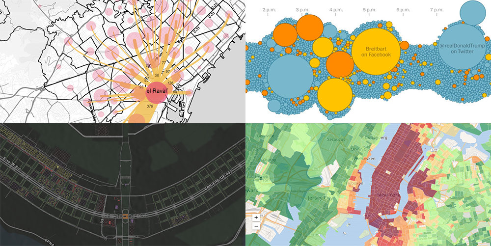 With visualization, data analysis can get easier, faster, and more insightful. In this DataViz Weekly article, we’ll share a few more interesting practical examples we’ve recently come across:
- internal migration paths in Barcelona;
- cost of living in the United States;
- #JobsNotMobs meme transition onto a slogan;
- urban evolution of Brasilia.
- Categories: Data Visualization Weekly
- No Comments »
2018 Midterm Election Results in Data Visualization — DataViz Weekly
November 9th, 2018 by AnyChart Team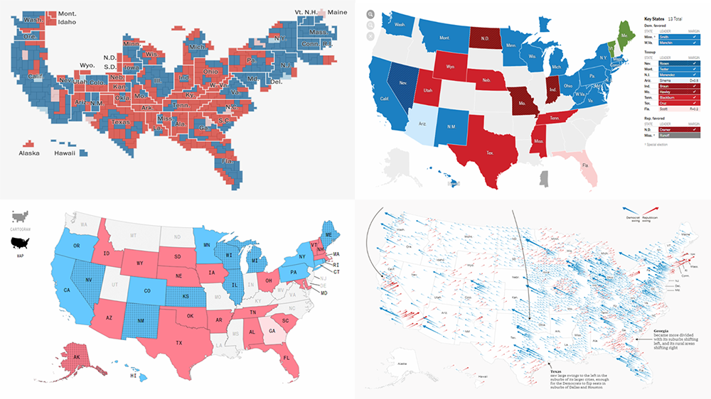 The 2018 midterm election in the United States of America has been among the hottest topics on the media agenda for quite a long time. Various publications were covering the course of the House, Senate, and governor campaigns, sharing forecasts from analysts, and so on. Now that voting is over, all eyes are on the outcome.
Today’s DataViz Weekly will show you how several prominent publications communicated the results of the midterms to their readers with the help of data visualization techniques: The New York Times, The Washington Post, Bloomberg, and The Guardian. So get ready for a lot of choropleth maps! But not only.
- Categories: Data Visualization Weekly
- 1 Comment »
Qlik Extension Gets Gantt Chart and Tag Cloud in Version 2.5.0
November 6th, 2018 by AnyChart Team Following the 8.4.0 release of the AnyChart JS Charts library, now we’ve also got an awesome major update for our data visualization extension for Qlik Sense. Its version 2.5.0 is already available, adding Gantt Chart and Tag Cloud to the list of supported chart types.
Meet AnyChart Qlik Extension 2.5.0!
- Categories: AnyChart Charting Component, Qlik
- No Comments »
New Visualizations of Data on Subreddits, Voters, Population, and Health — DataViz Weekly
November 2nd, 2018 by AnyChart Team Hey everyone! We’ve gone through a number of new visualizations this week and selected four interesting projects to feature on DataViz Weekly today:
- the most commented subreddits over years;
- voter turnout in the United States;
- population density as terrain;
- years lost to leading death causes across the United Kingdom.
- Categories: Data Visualization Weekly
- No Comments »