Best Data Visualizations of 2018 — DataViz Weekly
December 28th, 2018 by AnyChart Team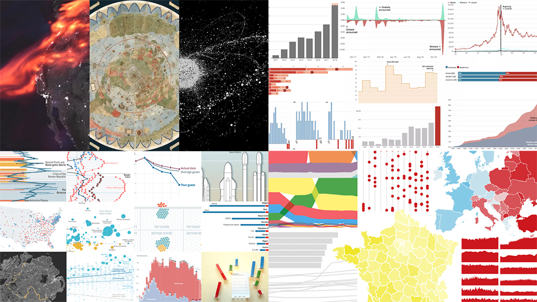 The last days of 2018 are a great time to look back at these 12 months. The year’s final issue of DataViz Weekly is here to familiarize you with four cool selections of the best data visualizations that show the picture of 2018, curated by four major media outlets: POLITICO, Recode, The Economist, and Fast Company. Take a quick look at the lists and check out the charts.
- Categories: Data Visualization Weekly
- 3 Comments »
JavaScript Data Visualization Libraries Updated with New Features — Meet AnyChart JS Charts 8.5.0
December 25th, 2018 by AnyChart Team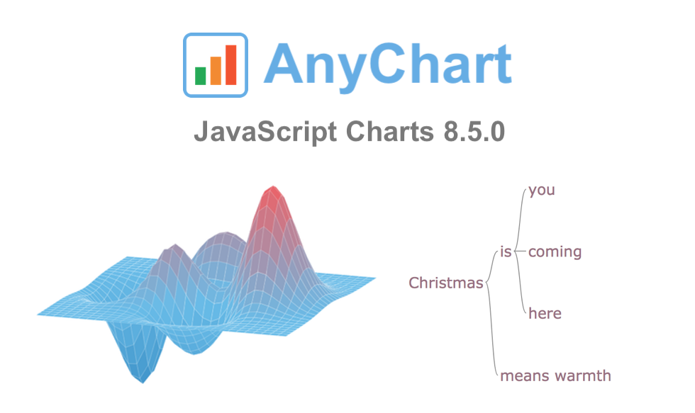 On this wonderful day, we are excited to announce a new major update for our JavaScript data visualization libraries: AnyChart 8.5.0 is released!
The new version brings a lot of advanced features and improvements that make our JS (HTML5) charting solutions even more powerful. 3D Surface Plot, Word Tree, and much more — spare a minute to look through the highlights of the 8.5.0 release of AnyChart, AnyStock, AnyGantt, and AnyMap.
- Categories: AnyChart Charting Component, AnyGantt, AnyMap, AnyStock, HTML5, JavaScript, News
- 1 Comment »
New Interesting Charts on China’s Rise, Top B-Schools, NFL, and Food Categorization — DataViz Weekly
December 21st, 2018 by AnyChart Team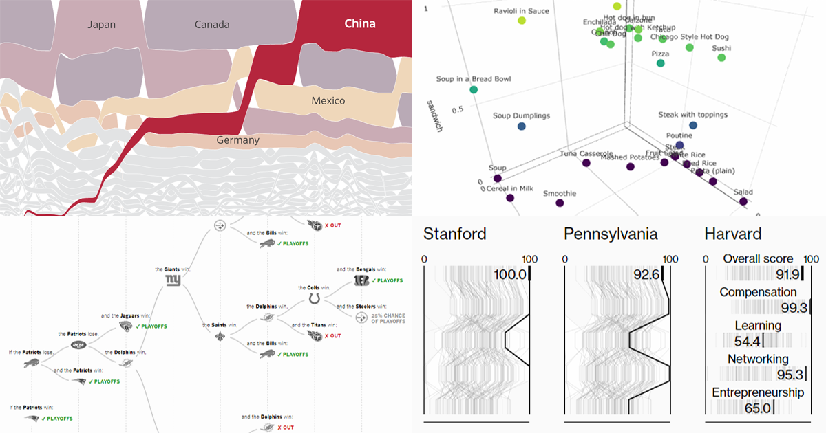 Get ready for another portion of new interesting charts from around the web! Here’s what topics are covered in the data visualization projects that have made it to DataViz Weekly this time:
- China as a trade Leviathan;
- top business schools in America and worldwide;
- NFL playoff paths for each team;
- food categorization as a sandwich, salad, or soup.
- Categories: Data Visualization Weekly
- No Comments »
Qlik Extension: Introducing Configuration File Settings for Charts
December 20th, 2018 by Irina Maximova Another brand new AnyChart Qlik plugin feature has arrived: Now it is possible to change the default settings in the configuration file of our Qlik extension for data visualization!
AnyChart Qlik plugin’s configuration file allows you to apply the default settings to all charts and dashboards created by the extension and customize them, which is impossible to achieve in the chart editor itself.
- Categories: Big Data, HTML5, News, Qlik, Tips and Tricks
- 2 Comments »
Visualizing Data About Occupations, Airfares, Patents, and Porn — DataViz Weekly
December 14th, 2018 by AnyChart Team DataViz Weekly is here to tell you about new web projects and articles that feature interesting data graphics. This time, we showcase charts and infographics visualizing data about occupations of single earners in couple households in America, companies winning patent wars, change in air ticket prices globally, and Pornhub trends in 2018.
- Categories: Data Visualization Weekly
- No Comments »
New Cool Data Visualizations on Emissions, Climate, Travel, and Music — DataViz Weekly
December 7th, 2018 by AnyChart Team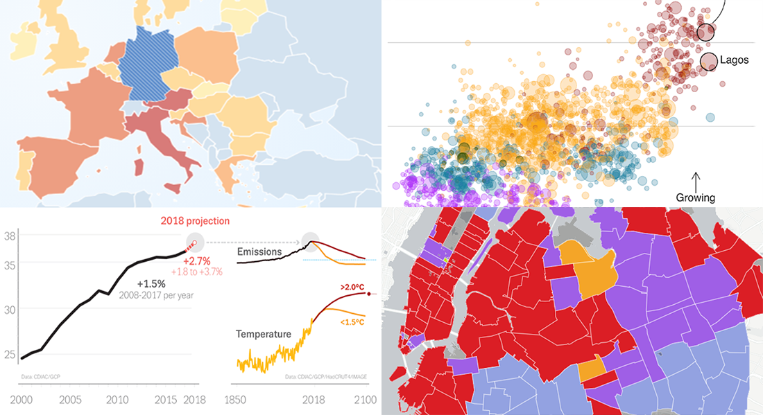 Take a look at new cool data visualizations recently published on the web. In today’s DataViz Weekly, we are glad to feature interesting information graphics from the Global Carbon Project, BBC News, Berliner Morgenpost, and Vivid Seats, dedicated to the following subjects:
- carbon dioxide emissions;
- current state of climate change;
- top 2018 summer travel destinations for Germans;
- top music genres and artists in NYC by neighborhood.
- Categories: Data Visualization Weekly
- No Comments »