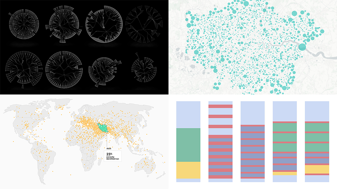
 Join us on a quick review of some of the most interesting projects with cool charts and maps made public just recently. These are good examples of visualizing organization structure, changes in time spending patterns, and more. Here’s a full list of the projects highlighted in today’s DataViz Weekly:
- Structure of British government departments — Peter Cook
- Identifying Iran on unlabeled maps — Morning Consult
- Time allocation before and with a baby — Caitlin Hudon
- Retreats from busy streets in big cities — Hans Hack
Data Visualization Weekly: January 10, 2019 — January 17, 2019
Organization Structure of UK Government Departments
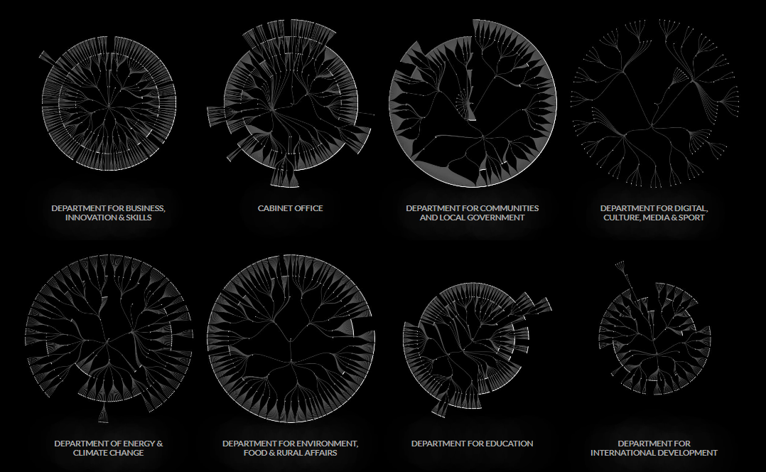
Peter Cook, a front-end developer and data visualization practitioner, created super wow interactive organization charts for 17 British government departments — Department for Business, Innovation & Skills; Cabinet Office; Department for Communities & Local Government; Department for Digital Culture, Media & Sport; Department of Energy and Climate Change; Department for Environment, Food & Rural Affairs; Department for Education; Department for International Development; Department for Transport; Department of Health; Department for Work and Pensions; Foreign and Commonwealth Office; Her Majesty’s Revenue and Customs; Her Majesty’s Treasury; Home Office; Ministry of Defence; and Ministry of Justice.
Also called organograms, such visualizations are helpful when analyzing the structure of organizations along with the relationships within them. In Peter Cook’s project, each org chart provides an overview of one department of the Government of the United Kingdom and can be clicked for an in-depth exploration.
Identifying Iran on Unlabeled Map
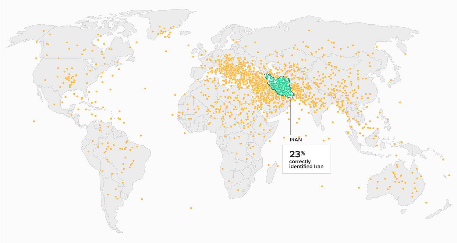
According to the results of a polling experiment conducted by Morning Consult and Politico, only 23% of registered U.S. voters could locate Iran on an unlabeled map of the world. On a smaller map (of the Middle East region), 28% succeeded to make a correct guess.
Wondering where the other respondents thought Iran was located? Find out on two new dot maps published last week on Morning Consult. Each orange point represents a guess of one respondent. Green dots mark a correct placement. In addition, there is a bar chart showing demographics of those who made no mistake in identifying Iran on an unlabeled map of the Middle East, including data about their age, gender, education, income, and political party preference.
Time Allocation Before and With Baby
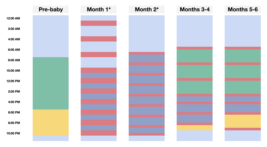
Caitlin Hudon, Lead Data Scientist at OnlineMedEd, a clinical learning platform for health professionals and medical students, used the stacked column chart technique to visualize the changes in how she had spent time before and with a baby. Activities taken into account were sleeping, working and commuting, nursing and pumping, taking care of baby, and free time.
Look at it as a nice simple illustration of how greatly life changes with a baby.
Retreats from Streets
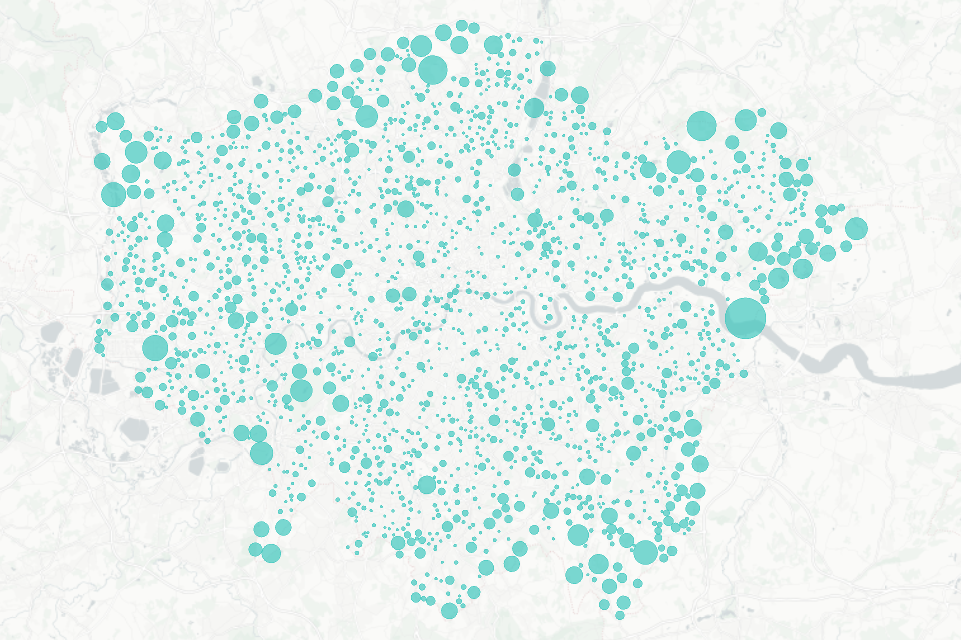
Data visualizer Hans Hack launched an interesting data visualization project called ‘Retreats from Streets.’ It features interactive bubble maps that reveal what places in Berlin, London and Brussels are furthest away from busy streets with traffic and pollution from cars. The project is based on OpenStreetMap data.
Find out where such retreats are located in those three big European cities. Click on a bubble to see the maximum distance away from a busy street for the corresponding block.
***
We hope you like these graphics visualizing organization structure, location guesses, time allocation, and retreats from streets in big cities. Stay tuned for more cool data visualization examples.
- Categories: Data Visualization Weekly
- No Comments »