Top Languages, Airbnb Litigations, Train Travels, and Gmail Filters — DataViz Weekly
February 28th, 2020 by AnyChart Team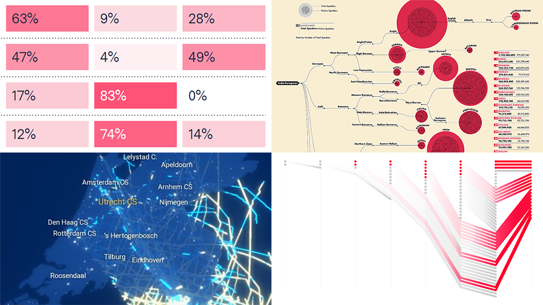 Another week has brought multiple new awesome charts and infographics into the focus of our attention. Join us on a quick review of the most interesting data visualization projects, within the framework of the regular DataViz Weekly feature on the AnyChart blog.
- Top 100 languages and their origins — WordTips
- Airbnb’s legal challenges — Bloomberg
- Dutch trains on an average working day — Jan Willem Tulp for NS
- Political email filtering in Gmail — The Markup
- Categories: Data Visualization Weekly
- No Comments »
Creating Heat Map Chart Using JavaScript
February 26th, 2020 by Anastasia Zoumpliou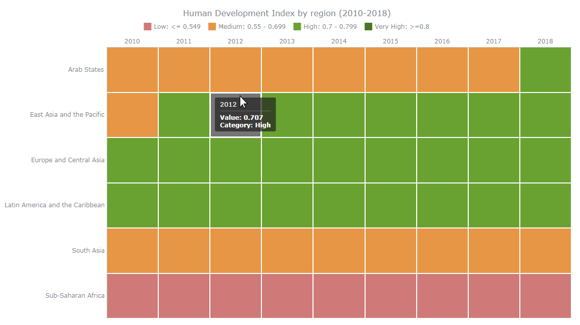 Want to learn how to quickly create an interactive heat map chart using JavaScript? This data visualization tutorial will guide you through the coding process step by step. Basic knowledge of HTML (HTML5) and some understanding of programming are more than enough to master this charting technique.
A heat map (or heatmap chart) is a two-dimensional, matrix-based data visualization in which colors represent values. It is often used to facilitate the analysis of complex data sets, revealing patterns in how variables change, correlate, and more.
Read this JS charting tutorial to the end and you will have no more problems with getting compelling heat maps up and running on your web sites and in your apps.
Read the JS charting tutorial »
- Categories: AnyChart Charting Component, Big Data, Business Intelligence, HTML5, JavaScript, JavaScript Chart Tutorials, Tips and Tricks
- 1 Comment »
Pesticide Sales, Workweek vs Happiness, Bloomberg’s Ads, and Epidemics Spread — DataViz Weekly
February 21st, 2020 by AnyChart Team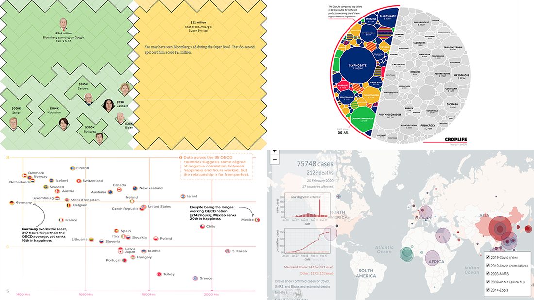 Hey chart lovers, check out a new portion of cool data visualizations! We have come across these fresh projects just about now and are glad to feature them in DataViz Weekly:
- Hours worked vs happiness — Visual Capitalist
- Mike Bloomberg’s advertising budget — The Washington Post
- Pesticide sales of global agrochemical giants — Unearthed
- Covid 2019 spread in comparison with other epidemics — London School of Hygiene & Tropical Medicine
- Categories: Data Visualization Weekly
- No Comments »
Magic Quadrant, State Taxes, Parks and Roads, and Train Disruptions — DataViz Weekly
February 14th, 2020 by AnyChart Team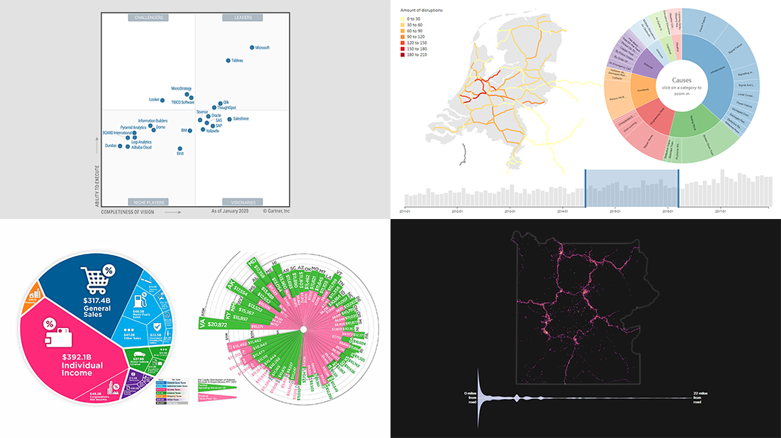 Can’t wait to meet new awesome data visualizations in DataViz Weekly? There you go! Today we are pleased to put a spotlight on the following graphics worth seeing:
- Magic Quadrant for Analytics and BI Platforms — Gartner
- State taxes in the United States of America — Howmuch.net
- Viewing locations at U.S. national parks — Nick Underwood, Clare Sullivan and Peter Newman, UW-Madison
- Disruptions in the Dutch railway system — Chris Mostert, TU Delft
- Categories: Business Intelligence, Data Visualization Weekly
- No Comments »
Iowa Caucus, Weather to Climate, Interest Rates, and Food’s Carbon Footprint — DataViz Weekly
February 7th, 2020 by AnyChart Team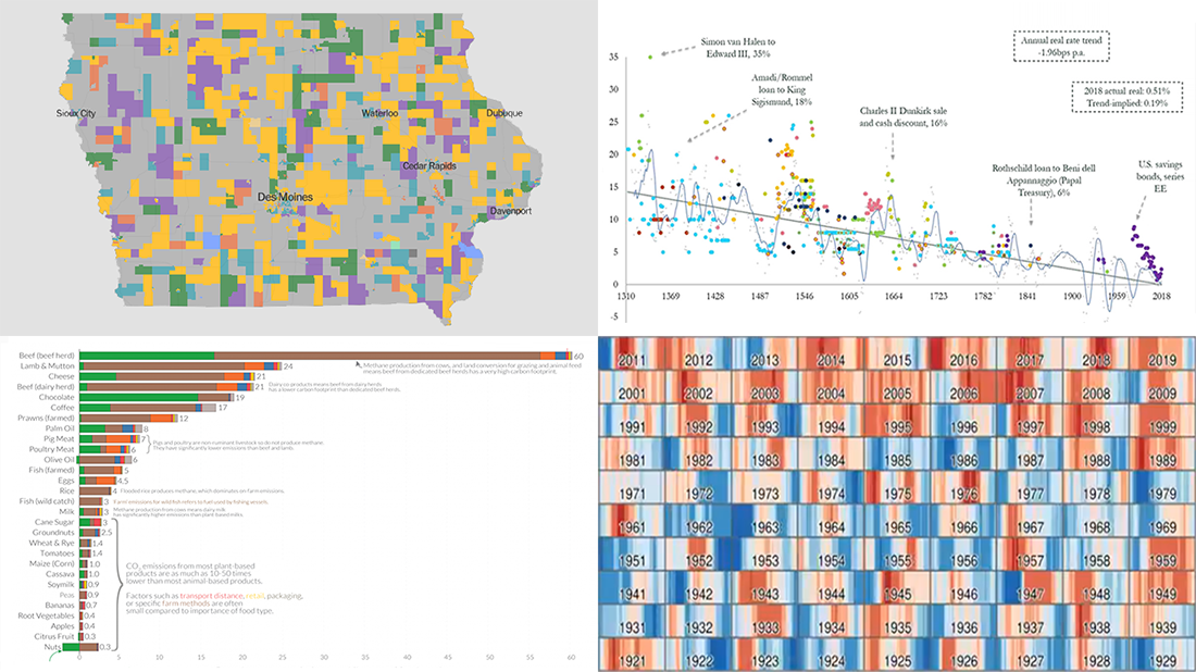 A new DataViz Weekly post is finally out! Here’re some of the most interesting charts and maps we’ve found just lately:
- 2020 Iowa caucus results for Democrats — The New York Times
- Transition from weather to climate — Neil Kaye, Met Office
- Global real interest rates since the early 14th century — Paul Schmelzing, Bank of England
- Greenhouse gas emissions across the supply chain of diverse food products — Our World in Data
- Categories: Data Visualization Weekly
- No Comments »