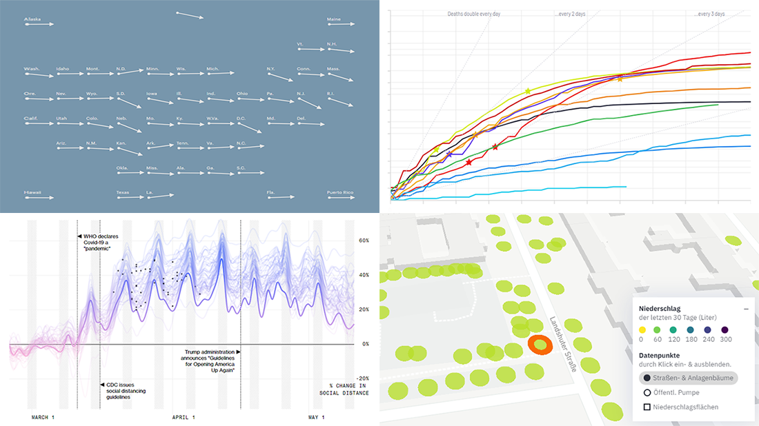
 In the new DataViz Weekly article, we highlight four fresh projects, visualizing COVID statistics and data about Berlin trees, for great use of charts. Here’s a quick list of what each is about:
- StopCorona, a COVID tracker charting data from over 20 sources — Diffco
- Social distancing in America and how it worked in each state — Bloomberg
- COVID-19 test trends in the United States, by state — ProPublica
- Berlin trees and how each is watered — CityLAB Berlin
Data Visualization Weekly: May 15, 2020 – May 22, 2020
StopCorona, COVID Tracker Visualizing COVID Statistics from 20+ Data Sources
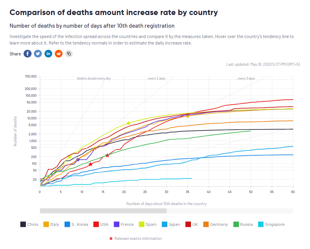
Diffco, a California-based app development company, launched StopCorona.info, a new live COVID-19 tracking project. Collecting and processing the latest pandemic statistics from more than twenty reliable sources, it is designed to enable convenient analysis of global and regional trends in a user-friendly interface with the help of robust data visualization.
We presented the StopCorona COVID tracker in our blog earlier this week. Its charts are powered by the AnyChart JS library. You can check out the interview with Vadim Peskov, CEO at Diffco, to learn more about the project and the team’s experience using AnyChart for visualizing COVID statistics for StopCorona.
Social Distancing in US
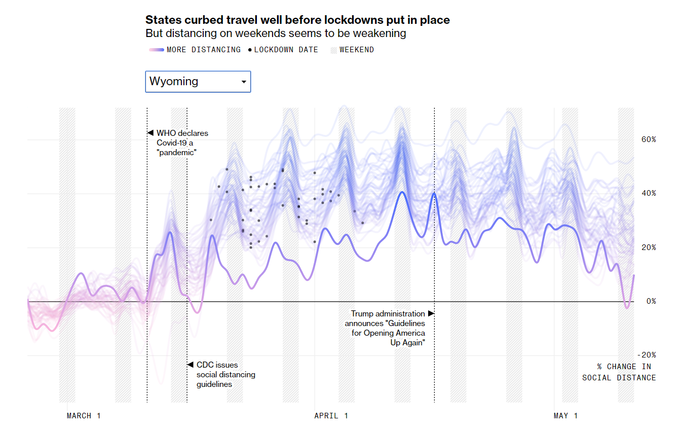
As the U.S. states have already begun to lift restrictions, many Americans’ commitment to social distancing is likely to be eroding. Bloomberg visualized data from Unacast, JHU, Ballotpedia and Surgo Foundation for a closer look.
The picture above, for example, shows an interactive chart that displays the change in average distance traveled from late February through mid-May in each state, with some key milestones including the state-specific lockdown date. While scrolling down this new story on Bloomberg, pay attention to a number of small line charts. Visualizing the percentage change in average distance traveled against daily cases per 100,000 people on a two-week lag, these nicely illustrate how social distancing worked in every state.
COVID-19 Test Trends by State
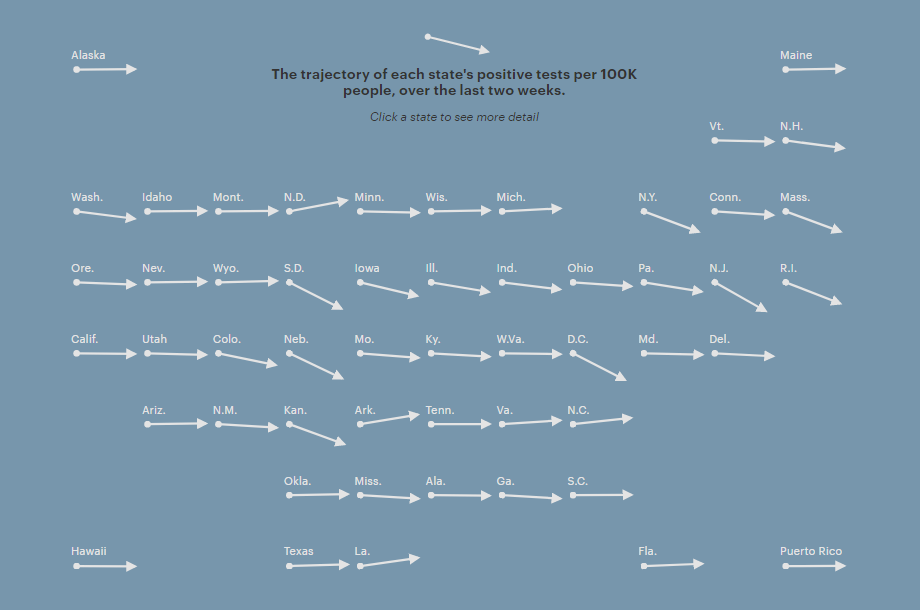
ProPublica published a simple, yet informative map visualizing the trajectory of each state’s positive tests per 100,000 people over the last two weeks. It greatly shows the big picture of where across the United States the number of COVID-19 cases is growing or going down as states reopen.
The map is interactive. To view several key figures describing the situation in a certain state, click it. The metrics shown about each state include the number of tests and positive tests per 100,000 people and percentage of tests that are positive, as well as ICU bed availability and hospital visits for flu-like illnesses. ProPublica says they plan to keep this resource up to date.
Berlin Trees
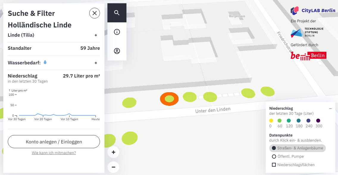
CityLAB, a project of the Berlin Technology Foundation, made an interactive visualization designed to help establish proper watering for Berlin trees. It shows the location of every tree in the city, as well as its type, age, and water requirements.
The map is part of the Giessdenkiez.de platform when everyone can also commit to watering a local tree and see what trees are already being taken care of by someone else. Check out this impressive project and participate if you live in Berlin, Germany.
***
Dealing with data visualization for websites or apps? Don’t miss out on our JavaScript charting library’s latest release bringing new awesome features and improvements to AnyChart JS Charts.
Stay tuned for great data visualization projects, in DataViz Weekly.
- Categories: Data Visualization Weekly
- No Comments »