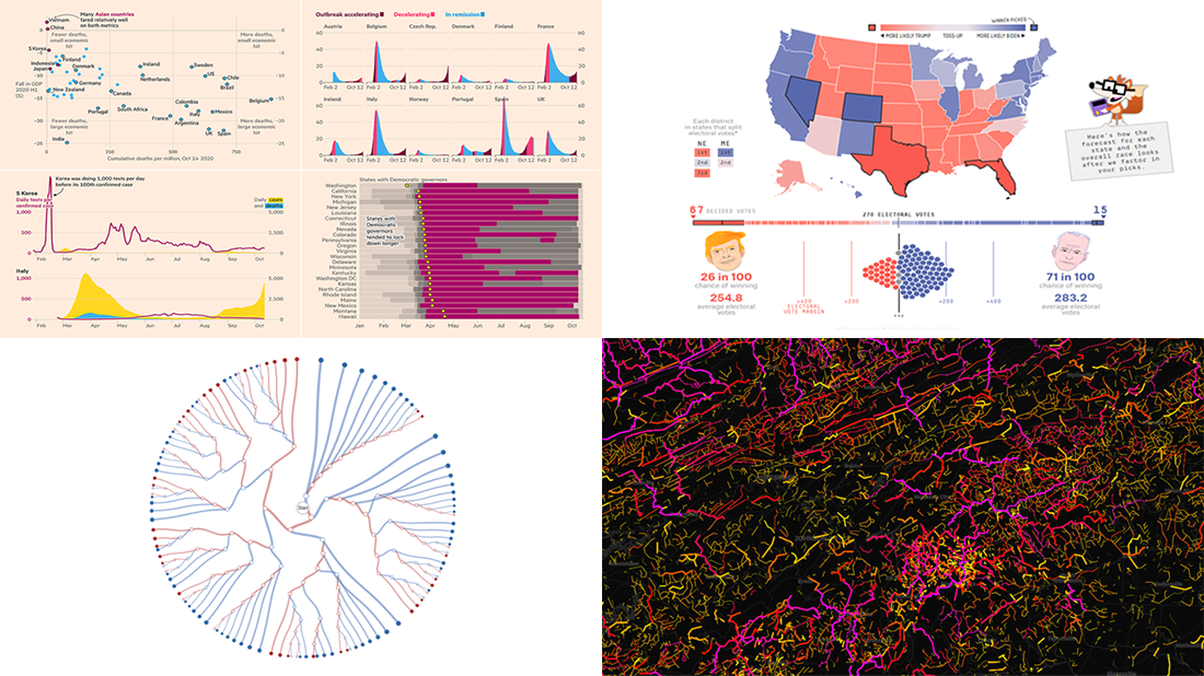
 Meet a set of new amazing visualizations we’ve spotted and admired lately. Below is a list of the projects featured today on DataViz Weekly. Keep reading to learn about each and then check them out right away.
- Global COVID-19 crisis in data — FT
- Twisty roads worldwide — Adam Franco
- Ways Biden or Trump could win — FiveThirtyEight
- Electoral College Decision Tree — Kerry Rodden
Data Visusalization Weekly: October 16, 2020 — October 23, 2020
Global COVID-19 Crisis in Data
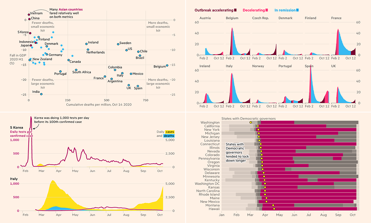
As the pandemic resurges, threatening to raise the global death toll even higher this fall than during the first wave, The Financial Times put together all the most important data about the crisis to tell us the story of the crisis. This impressive project features a lot of charts showing the scale, impact, and key trends.
The piece consists of several chapters arranged in chronological order, each telling a (small but important) part of the big story with the help of robust visualizations. Together, they are helpful in explaining how we have attempted to live through the coronavirus so far, why it has been so harmful and deadly, as well as what to expect.
It is very possible you have not met some of the data being analyzed here or at least have not thought about certain figures or trends that way. The article is free to access on FT.com.
Twistiest Roads Worldwide
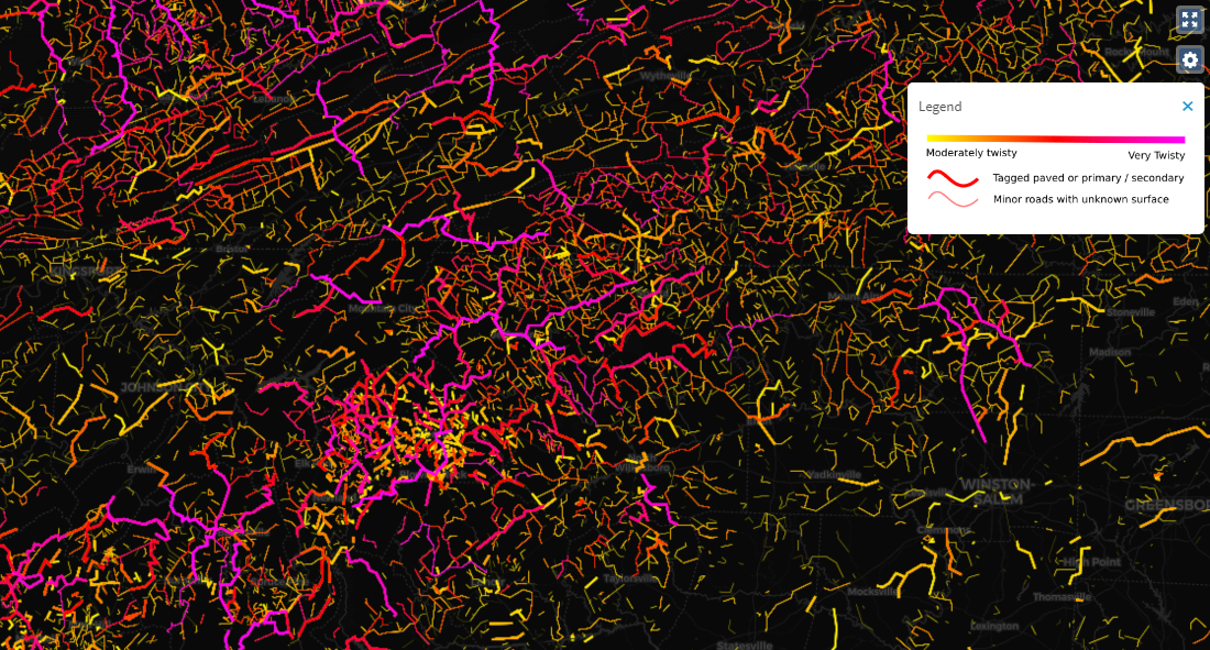
If you are a motorcyclist or motorist who prefers winding roads over straight and long highways, Curvature may well become one of your favorite data visualization tools. Created by Adam Franco, a web app developer currently working at Middlebury College, it can show you the twistiest roads around you based on length of curves.
The project has been live for a while, providing KML files to download and open in Google Earth. These days, it has got an in-browser map which greatly facilitates the user experience. Visualizing data about more than 10 million road segments analyzed by Adam’s own algorithm, this beautiful map displays moderately to very curvy ways and covers the entire world.
Check it out and easily plan a trip on twisty roads wherever you are.
Ways Biden or Trump Could Win
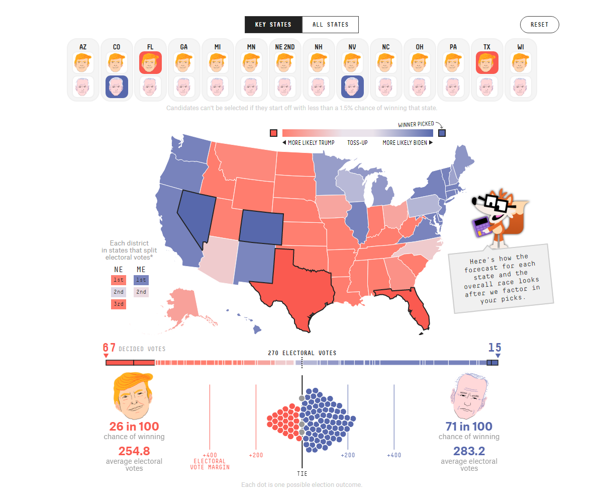
Less than two weeks until November 3, Election Day, it is hard to keep away from the election topic. Over 50 million Americans have already voted, by mail or in-person. Who do you think will win the U.S. presidency for the next four years? FiveThirtyEight made another cool tool to help you explore possible outcomes based on their own model.
There, you can choose who, Donald Trump or Joe Biden, you believe will win each state, and the system will factor in your selections to recalculate the two key candidates’ chances of getting the desired minimum of 270 electoral votes and winning the overall race under your scenario.
Play with the simulations to find out in what ways Biden or Trump could win. Look how FiveThirtyEight’s forecast changes as you modify your picks.
Electoral College Decision Tree
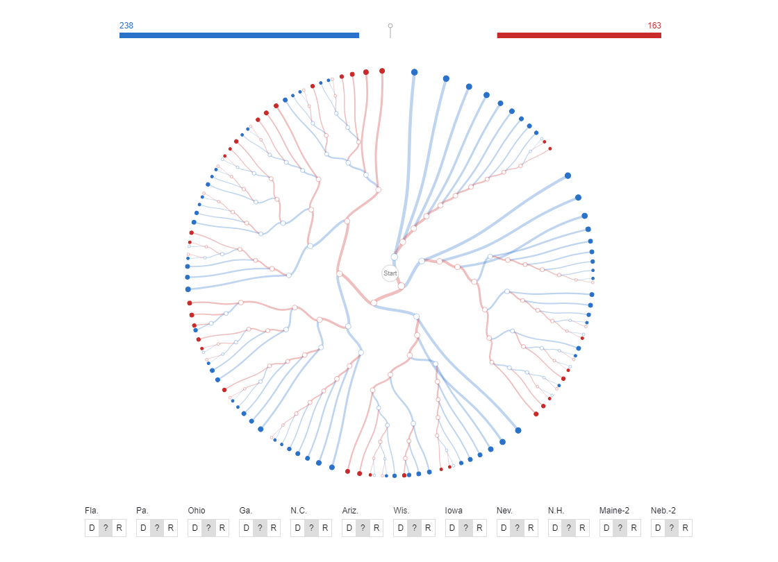
Another great tool to explore the U.S. presidential election scenarios has been made public just about now, Electoral College Decision Tree. Built by Kerry Rodden, a developer at Observable, it visualizes possible outcomes depending on who, Biden or Trump, wins the swing states.
You can hover over a path to investigate the corresponding scenario. Or pick the winner of individual swing states to filter the view.
A radial decision tree turns out to be a great tool for such explorations, indeed. Check out this amazing data visualization work by Kerry Rodden on Observable.
***
Thank you for staying tuned. The next dose of awesome visualization examples will be waiting for all data science and charting addicts next Friday on our blog. In the meantime, have a great weekend time, everyone!
- Categories: Data Visualization Weekly
- No Comments »