Analyzing Population Shifts, Box Office, Heat Exposure, Daily Routines — DataViz Weekly
November 26th, 2021 by AnyChart Team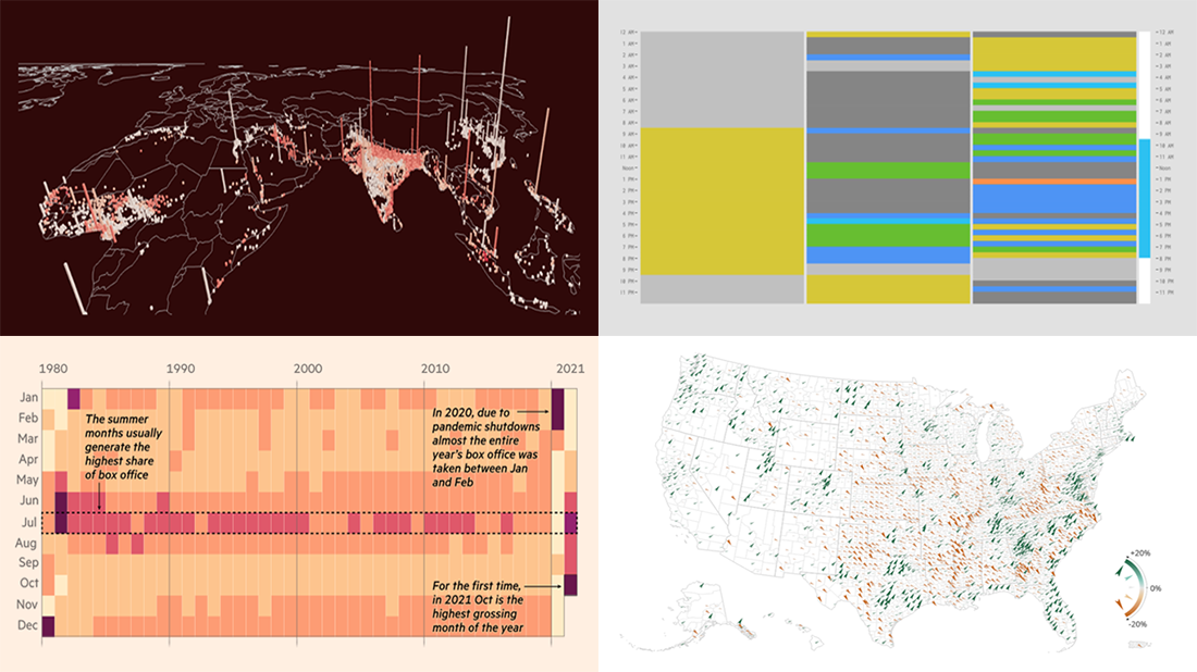 It is much easier to analyze large amounts of data when they are represented using the right visualization techniques. We are ready to show you another four vivid examples! Today on DataViz Weekly:
- Population and racial changes in the United States — Pitch Interactive & Census 2020 Data Co-op
- Box office for cinema-exclusive and simultaneous release movies — FT
- Global extreme urban heat exposure — AP News
- Most common daily time uses — Nathan Yau
- Categories: Data Visualization Weekly
- No Comments »
Roundup of Stunning New Data Visualizations — DataViz Weekly
November 19th, 2021 by AnyChart Team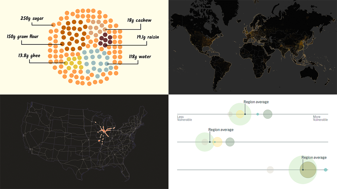 It’s Friday and time for a fresh dose of stunning data visualizations! In this DataViz Weekly roundup, we are going to show you four new projects worth checking out.
- Maternal health risks across the United States — Surgo Ventures
- Impact of human sewage on coastal ecosystems — UCSB & Columbia University
- Deepavali snacks and sweets — Kontinentalist
- U.S. highway signs indicating destination cities — Matt Dzugan on Observable
- Categories: Data Visualization Weekly
- 1 Comment »
Visualizing Data on Prices, Emissions, Workforce, Palm Oil — DataViz Weekly
November 12th, 2021 by AnyChart Team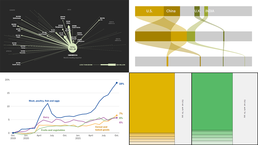 Hi everyone! DataViz Weekly is here to introduce you to some awesome new data visualizations that we have recently found out there and admired!
- Inflation in America — The Washington Post
- Carbon dioxide emissions by country — Reuters
- Shifts in how much U.S. men and women work — Nathan Yau
- Sustainable palm oil problem — Bloomberg Green
- Categories: Data Visualization Weekly
- No Comments »
How to Make JavaScript Polar Chart
November 11th, 2021 by Shachee Swadia Polar charts often look impressive, which makes some people think that creating them is a tricky process demanding plenty of skills and expertise. Well, I am going to debunk this myth right now! Let me show you how to easily visualize data in a beautiful interactive JavaScript Polar Chart.
Fundamentally, a polar chart is a variation of a circular graph drawn with polar coordinates. It can also work well to visualize some sorts of categorical data for comparisons, which is exactly the case I want to demonstrate now. In this tutorial, I will build a column polar chart, with the bars growing from the center of the diagram to represent values with their length.
Data Visualization Society (DVS) conducts an annual State of the Industry survey of data viz practitioners, and I thought it could be a great opportunity to play with some of its latest data. In particular, I wanted to look at the most popular technologies used for data visualization based on the responses. So here, I will produce a JS polar chart that plots the top 15 ones, making up a cool illustrative real-world example.
It will be fun — come along, everyone!
Read the JS charting tutorial »
- Categories: AnyChart Charting Component, HTML5, JavaScript, JavaScript Chart Tutorials, Tips and Tricks
- No Comments »
Amazing New Charts and Maps That Tell Stories — DataViz Weekly
November 5th, 2021 by AnyChart Team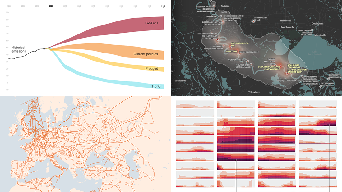 Ready for a new portion of amazing charts and maps for inspiration? We’ve got it for you right here! Join us today on DataViz Weekly as we look at four new visualizations that definitely deserve your attention.
- Greenhouse gas emission pathways and climate goals — The New York Times
- U.S. drought extent patterns by region since 2000 — Scientific American
- Cancer-causing industrial air pollution across the United States — ProPublica
- European natural gas pipeline infrastructure — The Financial Times
- Categories: Data Visualization Weekly
- No Comments »