Reviewing Four New Exciting Data Visualizations — DataViz Weekly
March 25th, 2022 by AnyChart Team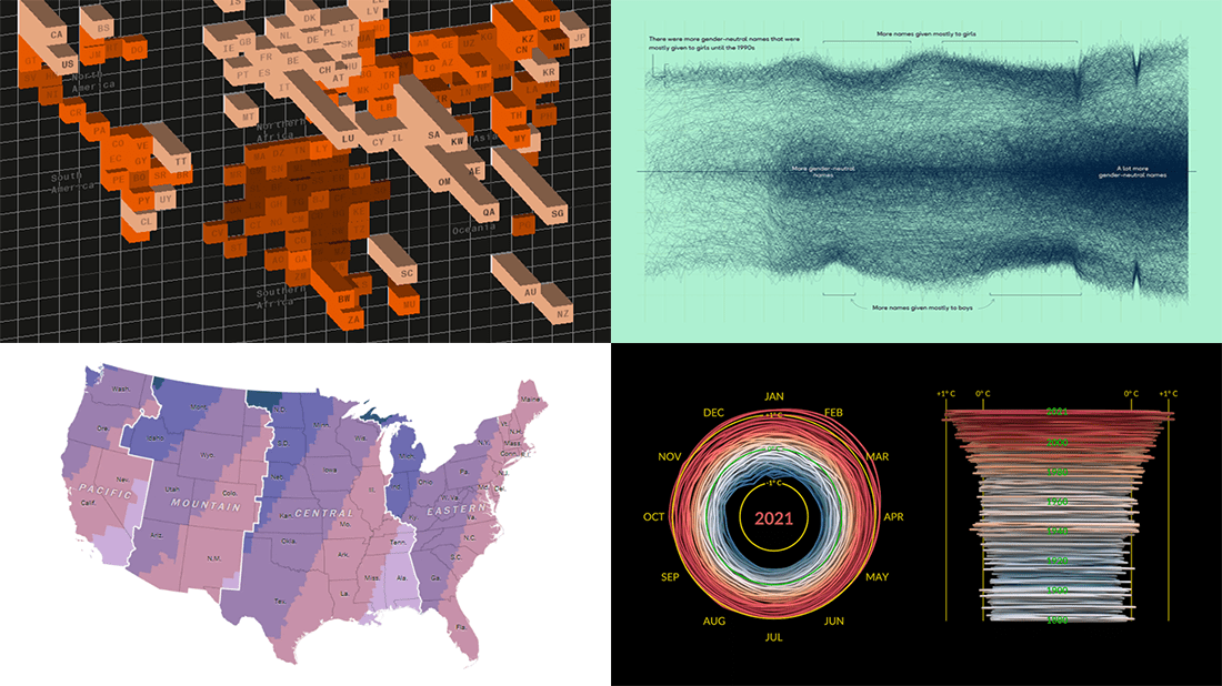 If you are reading this, you (almost certainly) love good data graphics. Well, we won’t leave you hanging! Check out a new DataViz Weekly review of exciting data visualizations recently built by honored professionals.
- Sunrise times with permanent daylight saving time in the U.S. — The Washington Post
- Inequality between rich and poor people’s carbon emissions — Bloomberg
- Gender-neutral baby names in America — Georgios Karamanis
- 3D climate spiral for 1880–2021 — NASA
- Categories: Data Visualization Weekly
- No Comments »
Creating Bullseye Chart with JS to Visualize the COVID-19 Vaccine Pipeline
March 25th, 2022 by Shachee Swadia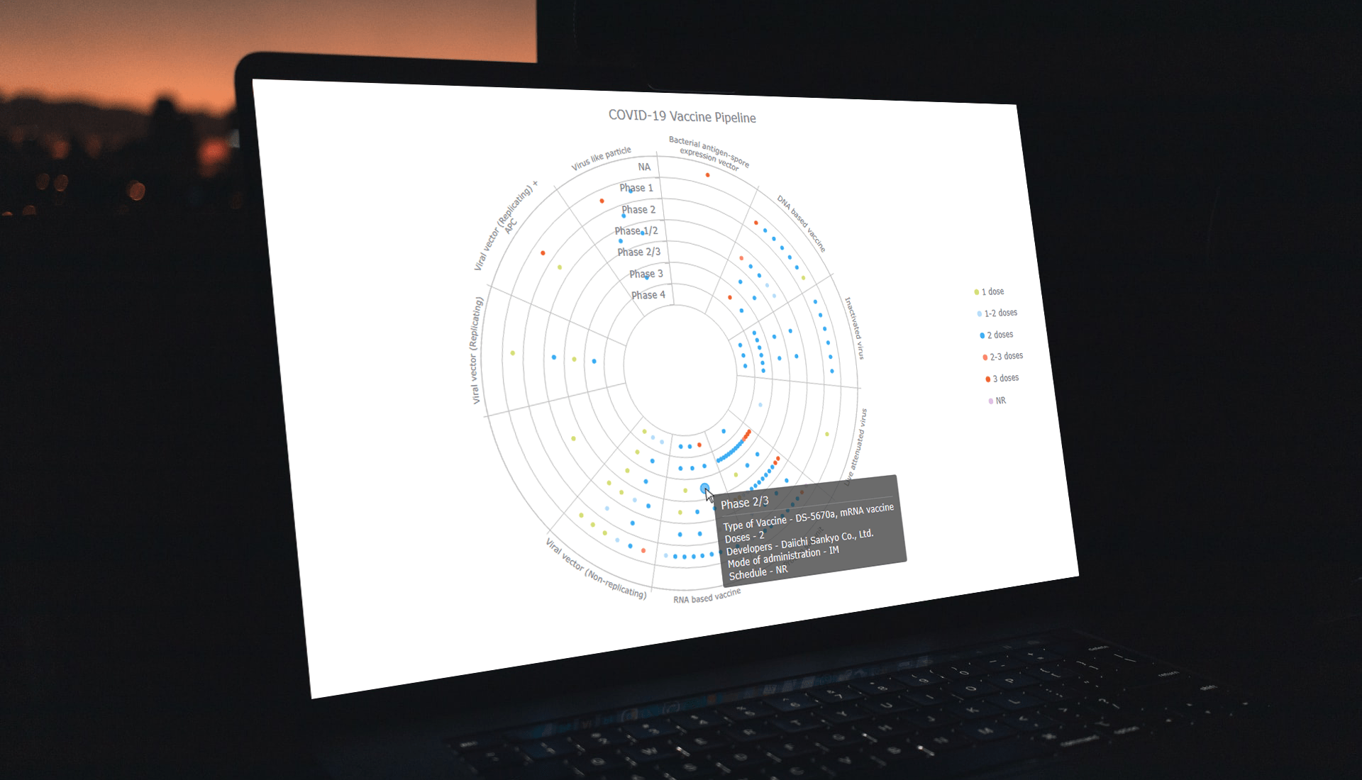 Visualizing data across a set of concentric rings, bullseye charts are widely used in drug pipeline and clinical trials data analysis. This tutorial will explain how to create this type of diagram with JavaScript. What’s more, you’ll see an excellent, typical example of an interactive bullseye chart in action!
I collated detailed information about all the COVID-19 vaccine candidates currently undergoing clinical studies from the WHO’s vaccine tracker. Now, join me as I plot it all in an interactive JS-based bullseye chart, by vaccine type and development phase!
Read the JS charting tutorial »
- Categories: AnyChart Charting Component, Big Data, Business Intelligence, HTML5, JavaScript, JavaScript Chart Tutorials, Tips and Tricks
- No Comments »
Visualizing Gender, Cycling, Polling & Climate Data — DataViz Weekly
March 18th, 2022 by AnyChart Team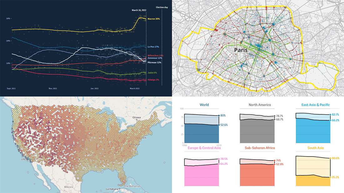 Friday is a lucky day for all fans of data visualization: DataViz Weekly is out! Join us as we look at some great examples of charts and maps published out there just recently.
- World Bank Gender Data Portal — The World Bank
- Cycling environment across France — FUB
- French presidential election polls — Reuters
- Ideal climate finder — Luke Champine
- Categories: Data Visualization Weekly
- No Comments »
How to Build Circle Packing Chart in JavaScript
March 15th, 2022 by Shachee Swadia A clear step-by-step guide for building an interactive JS Circle Packing Chart to visualize the top 100 most streamed songs on Spotify.
Want to learn to visualize hierarchical data in stunning circle packing charts that can be added to a web page or app in a hassle-free manner? Don’t feel overwhelmed and just follow my stepwise data visualization tutorial! Using a cool example of data on the top 100 most streamed songs on Spotify, I will show you how to easily create and customize a great-looking interactive circle packing chart with JavaScript.
Read the JS charting tutorial »
- Categories: AnyChart Charting Component, Big Data, HTML5, JavaScript, JavaScript Chart Tutorials, Tips and Tricks
- No Comments »
Impressive New Data Graphics on Abortions, Homes, Names, Land — DataViz Weekly
March 11th, 2022 by AnyChart Team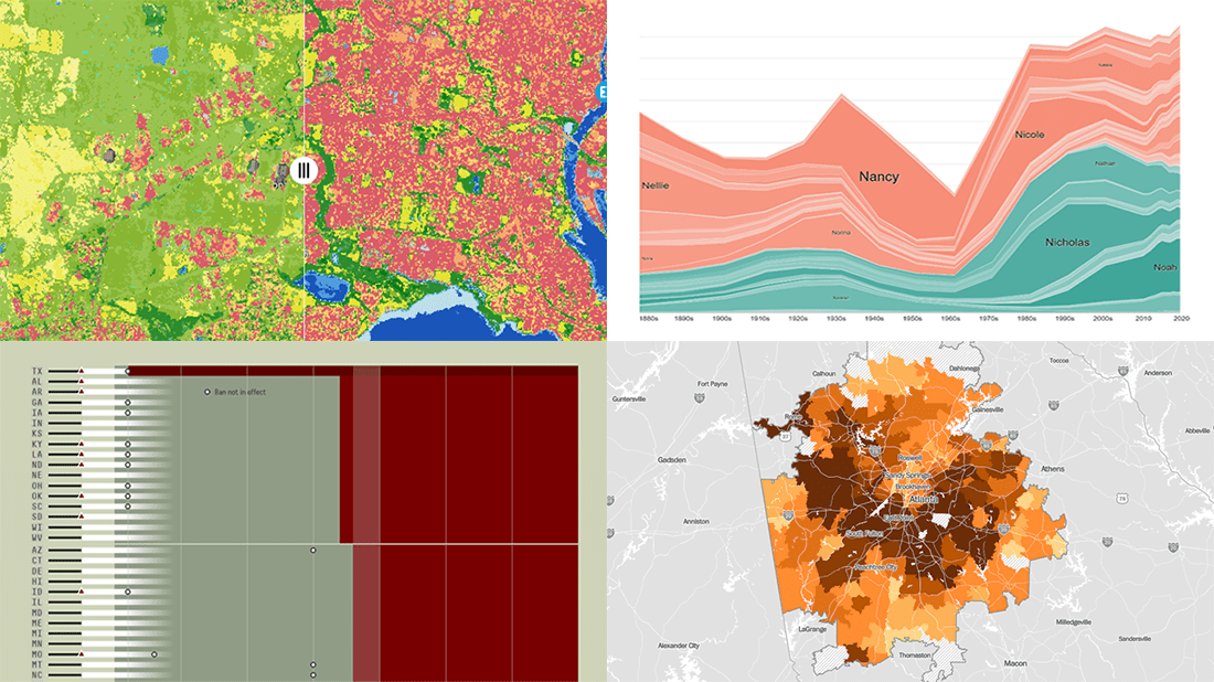 DataViz Weekly is here with another batch of impressive data graphics worth looking at and exploring! Today, we are eager to tell you about the following four new projects:
- Burden of abortion across the United States — FiveThirtyEight
- Real estate investor activity in the 40 major American cities in 2021 — The Washington Post
- Historical popularity of baby names in the U.S. since the 1880s — Namerology
- Australia land cover in detail — Geoscience Australia
- Categories: Data Visualization Weekly
- No Comments »
Most Interesting Visualizations to Check Out and Learn From — DataViz Weekly
March 4th, 2022 by AnyChart Team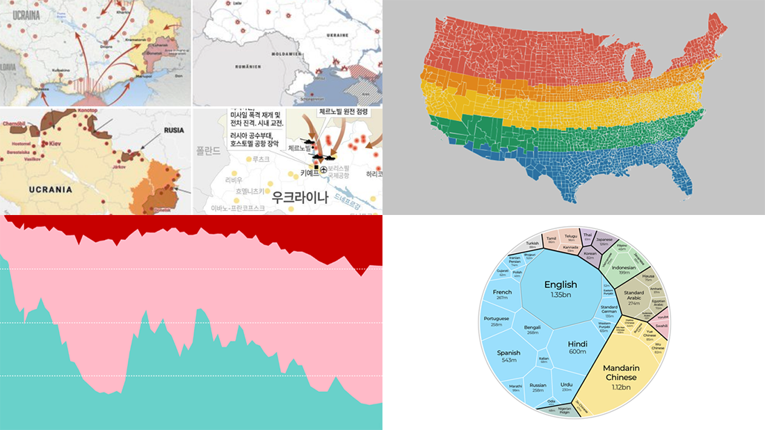 We are glad to continue our DataViz Weekly blog feature where we curate some of the most interesting and topical visualizations from around the internet. Check out a new selection:
- Russia–Ukraine conflict in maps — Lisa Charlotte Muth’s thread on Twitter
- The world’s most popular languages — Al Jazeera
- Dividing the U.S. by equal populations — Engaging Data
- Lifestyle changes during COVID-19 lockdowns — The Guardian
- Categories: Data Visualization Weekly
- No Comments »