Looking at Some Awesome New Graphs & Maps — DataViz Weekly
July 29th, 2022 by AnyChart Team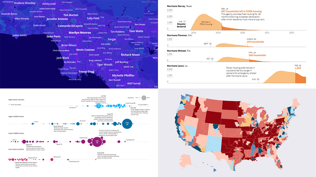 It’s time to check out some awesome new graphs and maps! In this DataViz Weekly roundup, we are glad to put a spotlight on the following great data visualization works:
- Birthplaces of notable people worldwide — Topi Tjukanov
- Global COVID-19 vaccine inequality — The Guardian
- New congressional district boundaries — CNN
- Post-disaster displacements in America — The New York Times
- Categories: Data Visualization Weekly
- No Comments »
Most Interesting Data Visualization Projects We’ve Seen Lately — DataViz Weekly
July 22nd, 2022 by AnyChart Team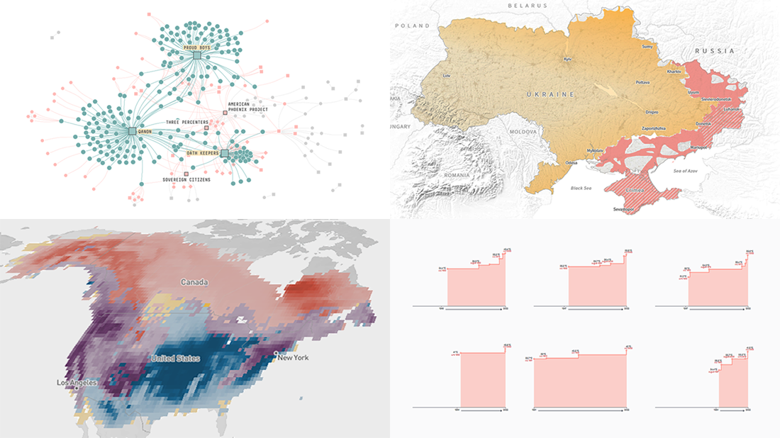 Welcome to DataViz Weekly! It’s where we let you know about the most interesting data visualization projects released out there just about now. Here’s what’s on DataViz Weekly today:
- Record high temperatures across France — Le Monde
- Five-month path to the military impasse in Ukraine — Reuters
- Ties among January 6 defendants and extremist organizations — FiveThirtyEight
- Bird species abundance — eBird
- Categories: Data Visualization Weekly
- No Comments »
Great New Data Visualizations Worth Your Attention — DataViz Weekly
July 15th, 2022 by AnyChart Team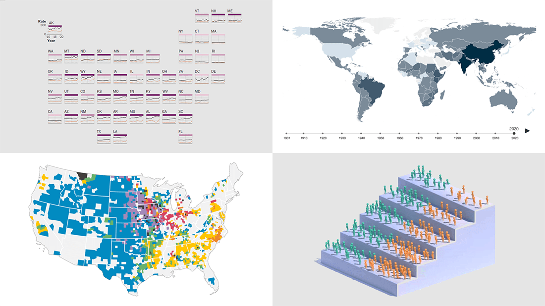 Eager to see some great data visualizations? Your wait is over! DataViz Weekly is back to the AnyChart blog to make sure you have not missed these four new works as they are definitely worth checking out!
- Gun deaths in America — The Washington Post
- Health effects of climate change worldwide — Wellcome
- Economic success of the U.S. immigrants’ children — The New York Times Opinion
- Livestock vs human populations in the United States — Data Stuff
- Categories: Data Visualization Weekly
- No Comments »
Creating Connector Map with JavaScript
July 15th, 2022 by Awan Shrestha Connector maps are designed to be ideal for visualizing routes and other links between locations in geospatial data analysis. In this tutorial, you’ll learn how to quickly create a compelling interactive one using JavaScript.
Step by step, we will be visualizing a route of the famous ancient Silk Road. We’ll start with the development of a basic JS connector map in four moves and then make a few tweaks to make it look awesome. Let’s start the voyage!
Read the JS charting tutorial »
- Categories: AnyChart Charting Component, AnyMap, HTML5, JavaScript, JavaScript Chart Tutorials, Tips and Tricks
- No Comments »
Top Recent Data Graphics from Around Internet — DataViz Weekly
July 8th, 2022 by AnyChart Team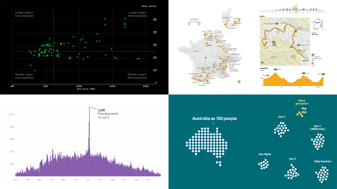 DataViz Weekly is here with an overview of the top data graphics recently published around the internet! Today we are pleased to tell you about the following visualizations:
- Electric car models in comparison — Bloomberg Green
- Australia as 100 people (according to the 2021 census) — ABC News
- Human-caused wildfires in the U.S. around Independence Day — CNN
- 2022 Tour de France route — Reuters
- Categories: Data Visualization Weekly
- No Comments »
Freshest Data Visualization Inspirations — DataViz Weekly
July 1st, 2022 by AnyChart Team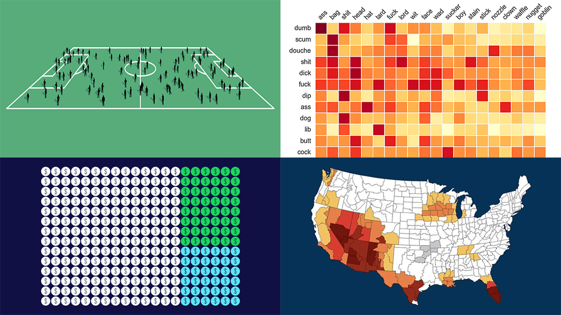 Need some inspiration for data visualization? Especially for you, on DataViz Weekly, we’ve selected four new online projects where charts and maps do a fascinating job to explain and let people explore a thing!
- Population of England and Wales, according to Census 2021 — ONS
- Daily estimates of climate change’s impact on temperatures across the U.S. — Climate Central
- Compound pejoratives on Reddit — Colin Morris
- Music streaming revenue distribution model — The Pudding
- Categories: Data Visualization Weekly
- No Comments »