Creating Interactive Flow Maps with JavaScript
March 22nd, 2023 by Awan Shrestha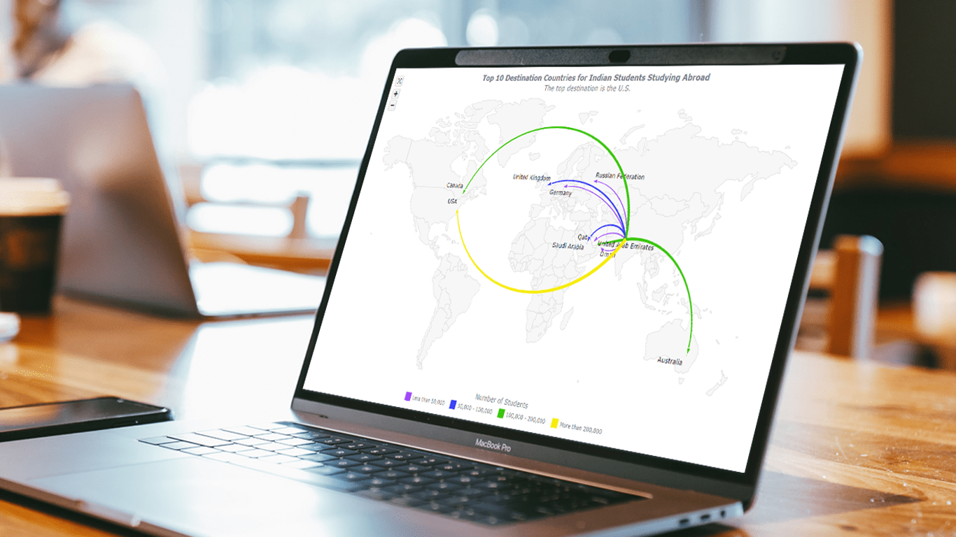 Flow maps are a powerful way to represent the movement of objects between different geographic locations, and with JavaScript, creating an interactive flow map is easier than you might think. Flow maps combine the functionality of a map and a flow diagram; this type of visualization shows the direction of movement of people, goods, money, or information, as well as the quantity of those.
In this step-by-step tutorial, we’ll guide you through the process of creating a JavaScript flow map. To make it more practical, we’ll use the example of visualizing the number of students from India studying abroad in different countries. By following the tutorial, you’ll learn how to create your own flow maps using JavaScript, regardless of the data you choose to use.
So, let’s get started! Follow along with us to learn how to develop your own JS Flow Map.
Read the JS charting tutorial »
- Categories: AnyChart Charting Component, AnyMap, HTML5, JavaScript, JavaScript Chart Tutorials, Tips and Tricks
- No Comments »
How to Create Box-and-Whisker Plot in JavaScript
March 16th, 2023 by Awan Shrestha Transform your data into insights with a stunning box-and-whisker plot! Learn what it is and how to create one with ease using JavaScript. In this tutorial, I’ll walk you through the steps to make a neat and visually appealing JS-based (HTML5) box chart with the yearly gross salaries of different IT professions in Europe. Unlock the power of data visualization and start quickly identifying trends and patterns today!
Read the JS charting tutorial »
- Categories: AnyChart Charting Component, Big Data, HTML5, JavaScript, JavaScript Chart Tutorials, Tips and Tricks
- No Comments »
Italian Gruppo Astrofili Galileo Galilei Uses AnyChart JS Charts for Astronomical Data Visualization
March 9th, 2023 by AnyChart Team We are glad to continue supporting non-profit initiatives all over the world by allowing them to use our JavaScript charting library free of charge. Recently, Giorgio Mazzacurati of Gruppo Astrofili Galileo Galilei, an Italian association of amateur astronomers, told us about how AnyChart helps with their visual data analysis. He also shared a few snapshots showing our interactive JS charts in action. Take a look! (Stack: Python/Flask/MySQL.)
- Categories: AnyChart Charting Component, AnyStock, Big Data, Dashboards, HTML5, JavaScript, Success Stories
- No Comments »
How to Build Venn Diagram Using JavaScript
March 2nd, 2023 by Shachee Swadia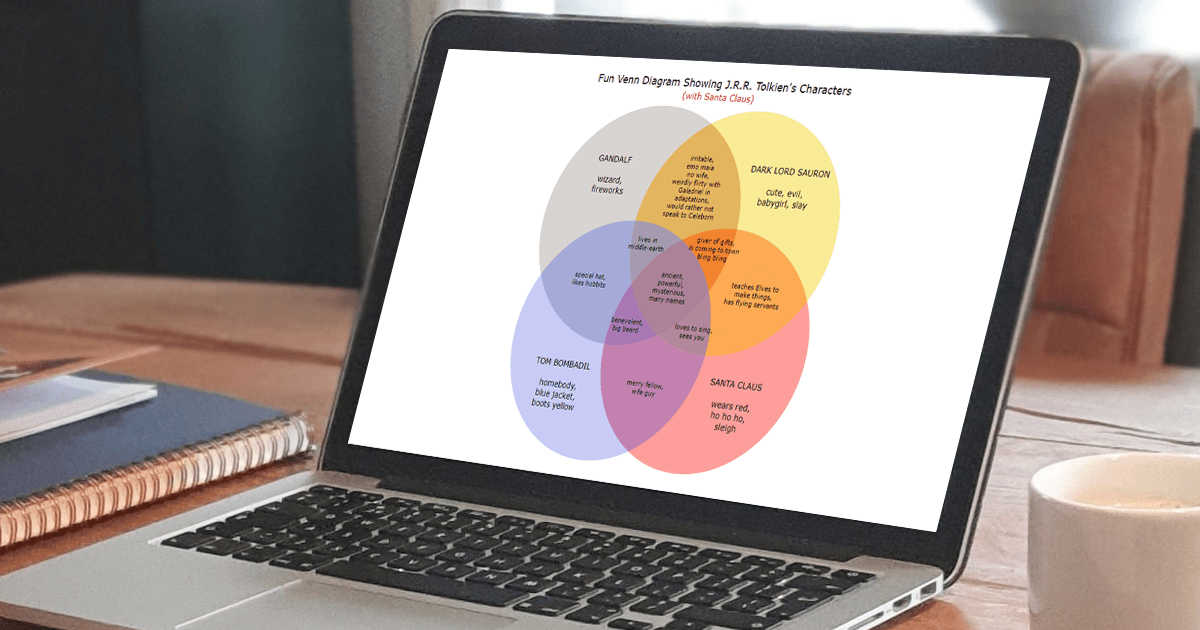 Humans are visual beings, and charts are widely used to boost the UX when it comes to showing a lot of information. Take Venn diagrams, for example, which are great at displaying commonalities and differences between several sets of items. And it’s possible to create a nice interactive one for a web page or app without much hassle.
Scrolling through Twitter before Christmas, I came across a cool Venn diagram comparing Santa Claus, Sauron, Gandolf, and Tom Bombadil. For fun, I reproduced it using JavaScript. That appeared to be easy enough to give me an idea of a tutorial on how to quickly build JS-based Venn diagrams, which I hoped could be helpful to both designers and developers.
So, here I am with the article! The original graphic by Tea with Tolkien that inspired me is used as an illustrative example — let’s build this Venn diagram in JavaScript step by step right now!
Read the JS charting tutorial »
- Categories: AnyChart Charting Component, Charts and Art, HTML5, JavaScript, JavaScript Chart Tutorials, Tips and Tricks
- No Comments »