Meet YODA — Your Own Documents Assistant in Qlik Sense
August 22nd, 2023 by AnyChart Team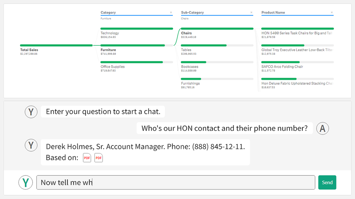 We’re thrilled to introduce YODA — Your Own Documents Assistant! It’s our brand new, AI-driven extension for Qlik Sense designed to augment your data journey when using Qlik. And we invite you to join its public debut at QlikWorld Tour 2023!
With YODA, you can seamlessly extract insights from various documents like contracts, corporate policies, and meeting notes directly within your Qlik reports, using natural language interactions.
Read more at qlik.anychart.com »
- Categories: Big Data, Business Intelligence, News, Qlik
- No Comments »
Creating Dynamic Linear Gauge for Real-Time Typing Speed Test Data Visualization: Using JavaScript
August 17th, 2023 by Nick Gogin From clocks to weight scales, speedometers to thermostats, and even the battery charge icon on your phone, Gauge Charts are widely used to represent a value on a scale or range, providing a clear visual indication of the represented measurement. Gauges can be circular or linear, and in this article, our focus will be on the latter style. I will guide you on how to create a cool linear gauge using JavaScript.
Specifically, we will explore the demonstration of linear gauges using an example of a real-time typing speed test. Throughout the article, we will delve into the structure of linear gauges, discuss styling options, explore how they can be connected to data, and show how you can easily build your Linear Gauges using JavaScript in just a matter of minutes. By the end of the tutorial, you’ll have an awesome example of a linear gauge used to dynamically illustrate typing speed test results or whichever data you want.
So, let’s dive in and elevate your web-based interactive data visualization game!
Read the JS charting tutorial »
- Categories: AnyChart Charting Component, Big Data, Charts and Art, HTML5, JavaScript, JavaScript Chart Tutorials, Tips and Tricks
- No Comments »
William Dibbern Uses AnyChart JS Charts to Visualize Wedding Guest Data
August 14th, 2023 by AnyChart Team The world’s leader in data visualization, AnyChart has a proven track record of empowering enterprises with robust charting solutions. However, the true essence of AnyChart lies in its versatility — it extends beyond corporate analytics, to making data meaningful in our everyday lives.
For example, meet William Dibbern, an Engineering Manager based in Chicago, who ingeniously applied our JavaScript charting library to his upcoming wedding plans, turning them into a heartfelt blend of technology and emotion.
Join us for an insightful interview with Will as we delve into his journey, exploring how he harnessed the power of AnyChart JS Charts to craft a delightful experience that celebrates love and data in a refreshingly personal way.
- Categories: AnyChart Charting Component, AnyMap, Charts and Art, HTML5, JavaScript, Success Stories, Third-Party Developers
- No Comments »
Join AnyChart at QlikWorld Tour 2023
August 10th, 2023 by AnyChart Team Get ready to dive into an exceptional data experience at QlikWorld Tour 2023! We at AnyChart are super stoked to be part of this epic roadshow as proud sponsors and warmly invite you to join us in one of the participating U.S. cities:
- Dallas (The Star in Frisco) — August 10
- San Francisco (Oracle Park) — August 24
- New York (Pier60 at Chelsea Pier) — September 18
- Atlanta (College Football Hall of Fame) — September 20
Spoiler alert: The star of the show will be our first-ever presentation of YODA — Your Own Documents Assistant, the newest, groundbreaking, AI-driven extension for Qlik Sense. Be among the first to witness its power!
Read more at qlik.anychart.com »
- Categories: AnyChart Charting Component, AnyGantt, Big Data, Business Intelligence, Dashboards, Gantt Chart, News, Qlik
- No Comments »
Building Bubble Chart with JavaScript
August 1st, 2023 by Awan Shrestha Do you want to turn that data chaos into a comprehensible data show? Look no further than data visualization! And let me tell you, one chart to rule them all is the bubble chart. It's like blowing bubbles at your data and watching them pop into understanding! And the best part? With JavaScript, you can easily create an interactive bubble chart, and I will show you how!
Bubble charts are versatile data visualizations that display data points in the form of bubbles, where the bubbles' size, color, and position represent different variables. In this tutorial, I'll walk you through building these graphics step by step, making the process a breeze. For illustration, we'll take data on the popularity of various YouTube videos and use JavaScript to create an interactive bubble chart showcasing the top 30 most-liked videos of all time, categorized by year of release, views, and likes.
By the end of this tutorial, you'll be able to create visually-stunning JS-based bubble charts without any hassle. So let's dive into the world of data bubbles and turn numbers into a visual feast for the eyes!
Read the JS charting tutorial »
- Categories: AnyChart Charting Component, Big Data, Business Intelligence, HTML5, JavaScript, JavaScript Chart Tutorials, Tips and Tricks
- No Comments »