Test Your Data Literacy & Luck — Win iPad at Qlik Connect!
May 30th, 2024 by AnyChart Team If you’re heading to the Qlik Connect show next week (June 3–5), don’t miss out on the chance to test your data smarts with our fun, interactive game, “Connections.” It’s not only a challenge of knowledge but also an opportunity to win an iPad!
Read more at qlik.anychart.com »
- Categories: AnyChart Charting Component, AnyGantt, Big Data, Business Intelligence, Dashboards, Gantt Chart, Qlik
- No Comments »
How to Build Network Graph with JavaScript
May 23rd, 2024 by Alex Carter | DZone Network graphs are a practical and effective tool in data visualization, particularly useful for illustrating the relationships and connections within complex systems. These charts are useful for understanding structures in various contexts, from social networks to corporate hierarchies. In this tutorial, we’ll delve into a quick path to creating a compelling, interactive network graph using JavaScript.
We’ll use the Volkswagen Group as our example, mapping out its subsidiaries and product lines to showcase how network graphs can make complex organizational structures understandable and accessible. By the end of this step-by-step guide, you’ll have a clear understanding of how to quickly construct and customize a JS-based network graph. Buckle up, as it’s time to hit the road!
Read the JS charting tutorial »
- Categories: AnyChart Charting Component, Big Data, HTML5, JavaScript, JavaScript Chart Tutorials, Tips and Tricks
- No Comments »
Stunning New Data Visualizations Not to Miss — DataViz Weekly
May 17th, 2024 by AnyChart Team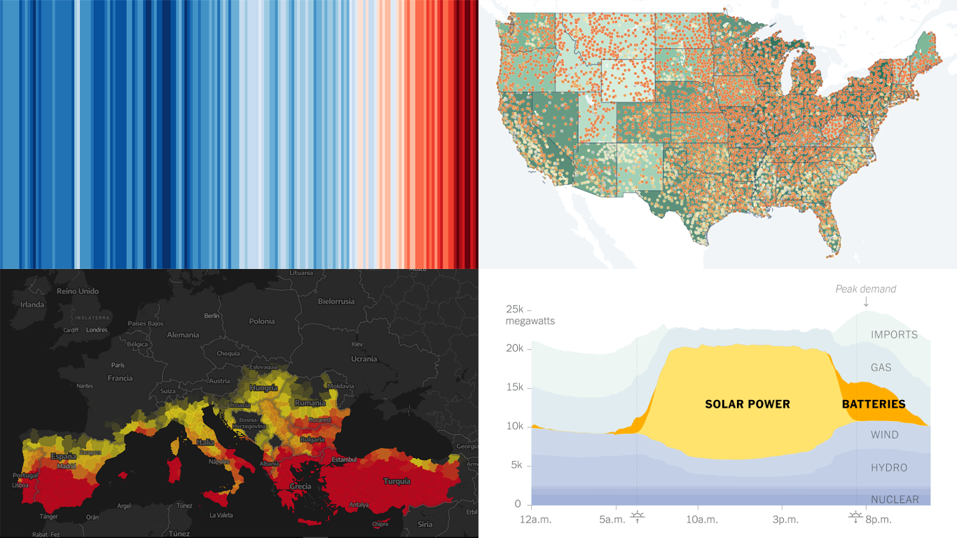 Data visualization is not just about making data look pretty; it’s about uncovering hidden patterns, revealing trends, and providing a clearer understanding of information. Through innovative visual techniques, we can explore data in ways that traditional methods can’t match. This week on DataViz Weekly, we bring you four compelling projects that showcase the transformative power of data visualization:
- Revealing the warming stripe for 2023 — Ed Hawkins
- Analyzing and predicting megafires in Europe — elDiario.es
- Understanding the growing role of giant batteries in electricity grids — NYT
- Analyzing segregation in U.S. schools — Stanford University
- Categories: Data Visualization Weekly
- No Comments »
Let’s Connect at Qlik Connect 2024: AnyChart Booth #807
May 13th, 2024 by AnyChart Team Qlik Connect 2024 is on the horizon, and we’re pleased to announce that AnyChart will be participating as an Emerald sponsor and exhibitor. Join us from June 3–5 at Rosen Shingle Creek in Orlando, Booth #807!
Read more at qlik.anychart.com »
- Categories: AnyChart Charting Component, Business Intelligence, Dashboards, Gantt Chart, News, Qlik
- No Comments »
New Insightful Data Visualizations in Focus — DataViz Weekly
May 10th, 2024 by AnyChart Team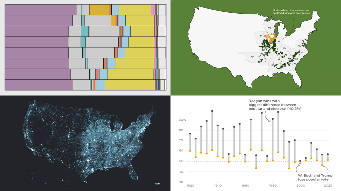 Data visualization serves as a powerful tool that enhances our understanding of complex data, transforming raw figures into insights. DataViz Weekly is here to share several great examples that demonstrate this capability in action. This week, we highlight four data visualization projects that have recently captured our attention:
- Exploring the U.S. bridges — Esri
- Analyzing time use by age — FlowingData
- Tracking historic cicada emergence 2024 — CNN
- Understanding election polls — Reuters
- Categories: Data Visualization Weekly
- No Comments »
Exploring Insights with Data Visualization — DataViz Weekly
May 3rd, 2024 by AnyChart Team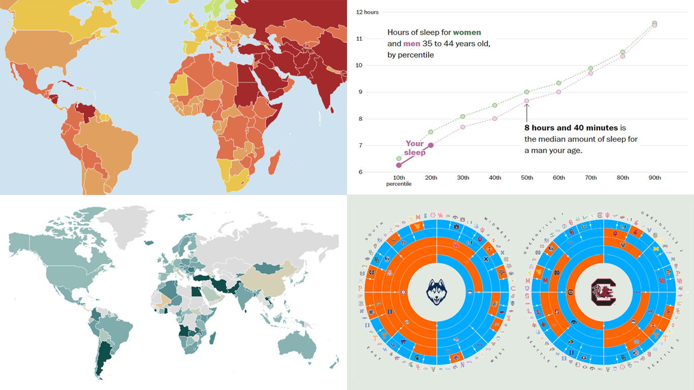 Welcome to the new DataViz Weekly, where we continue exploring the transformative power of data visualization. This edition presents a selection of new examples of how charts and maps can help us understand trends and patterns in various subjects — from sports and philanthropy to global challenges like press freedom and inflation, and everyday topics such as sleep. Here are the projects featured this time:
- March Madness philanthropy challenge — Bloomberg
- 2024 World Press Freedom Index — Reporters Without Borders
- Global Inflation Tracker — Council on Foreign Relations
- Sleep trends in America — The Washington Post
- Categories: Data Visualization Weekly
- No Comments »