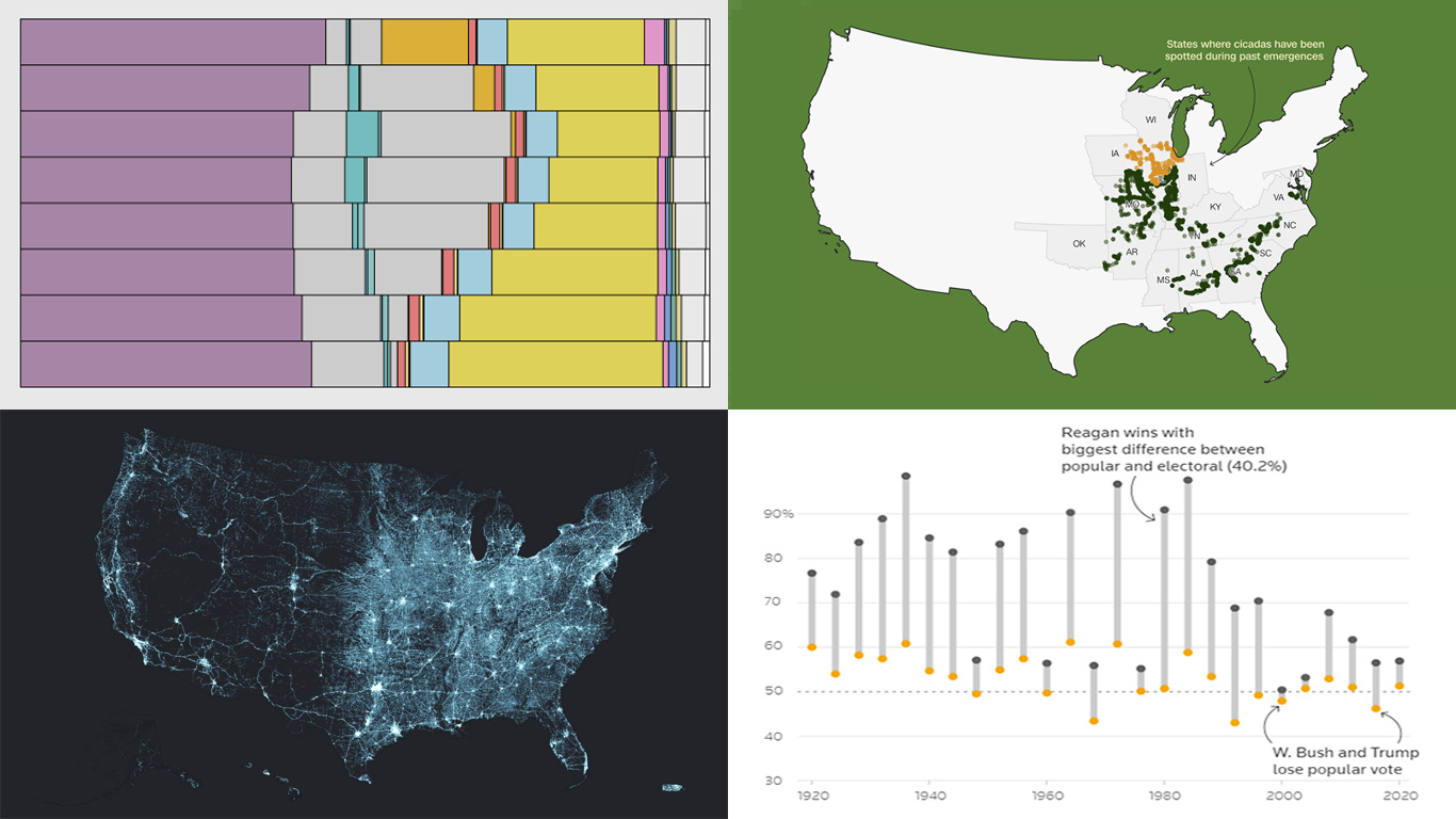
 Data visualization serves as a powerful tool that enhances our understanding of complex data, transforming raw figures into insights. DataViz Weekly is here to share several great examples that demonstrate this capability in action. This week, we highlight four data visualization projects that have recently captured our attention:
- Exploring the U.S. bridges — Esri
- Analyzing time use by age — FlowingData
- Tracking historic cicada emergence 2024 — CNN
- Understanding election polls — Reuters
Data Visualization Weekly: May 3, 2024 — May 10, 2024
Exploring U.S. Bridges
The U.S. is home to over 618,000 motor-vehicle-carrying bridges, with roughly 46,000, or one in thirteen, rated in poor condition. Developed by Cooper Thomas and Will Hackney, Esri StoryMaps’ “The Secret Life of Bridges” leverages the National Bridge Inventory and the Infrastructure Report Card to analyze these crucial structures.
This project traces the history of U.S. bridge construction and provides a current overview of bridge health nationwide, featuring several impressive visualizations. One of them is an animated map illustrating the growth of bridges since 1800, emphasizing their importance to national transport and the economy.
There is also an interactive map that represents bridge conditions by county, with color coding to indicate the proportion of bridges in poor condition, providing vital information on areas in need of investment. Clicking on a county reveals detailed statistics such as the total number of bridges, their average age, and the poor condition percentage.
Explore this data visualization project on Esri’s website.
Analyzing Time Use by Age
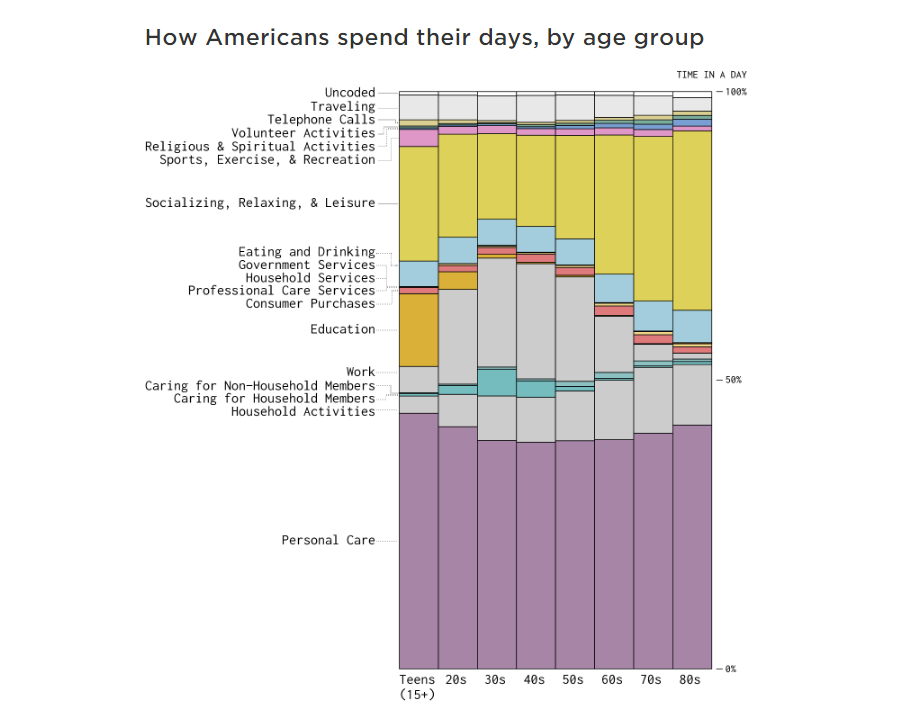
Every decade of life brings a shift in how we spend our time, from the formative years of education to the golden years of retirement. Nathan Yau’s new data visualization project, “Where the Time Goes with Age,” taps into the data from the American Time Use Surveys to display these changes vividly.
This project allows you to see the allocation of daily hours across different life stages, with detailed charts that depict time spent on education, work, and leisure. The data reveals how educational pursuits dominate in youth, work peaks in middle age, and leisure takes precedence in older age. You can delve into specific age groups to understand how typical daily activities evolve with age, providing a clear picture of life’s changing rhythms.
Delve into the visualizations on FlowingData.
Tracking Historic Cicada Emergence 2024
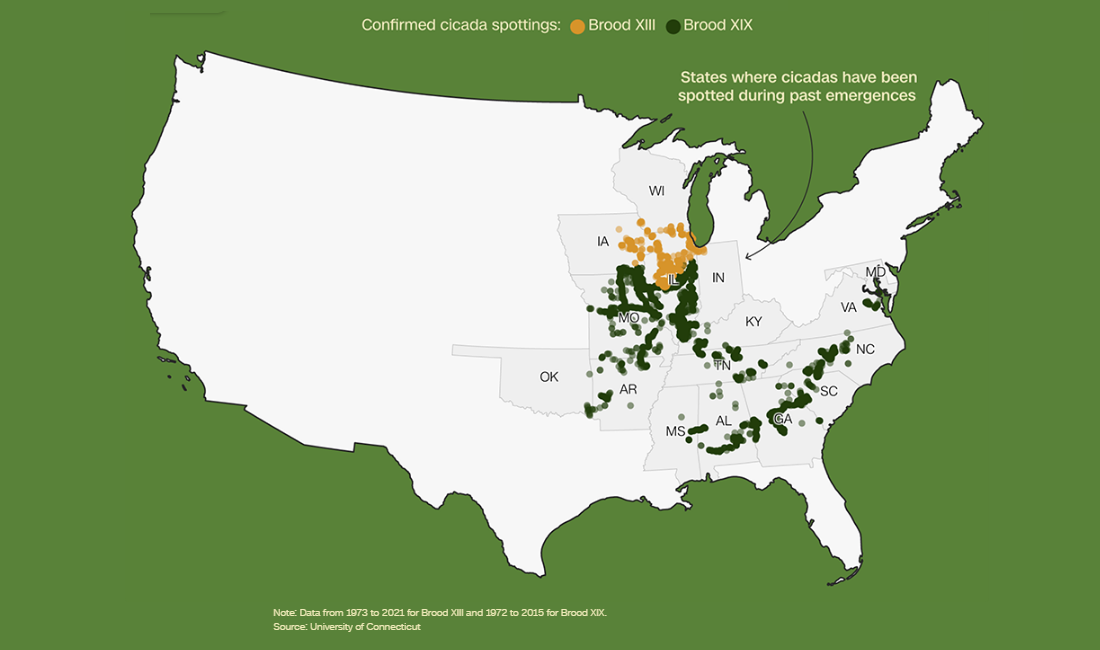
This year marks a rare natural phenomenon — the simultaneous emergence of two cicada broods in the U.S. Midwest and Southeast, an event not seen since 1803. CNN’s feature, “Cicada Emergence 2024,” utilizes historical data to shed more light on this occurrence, highlighting broods XIII and XIV.
This piece includes several visualizations. Maps reveal where you’ll find them in the U.S., showing confirmed cicada spottings for broods XIII and XIV and where they overlap. A timeline contextualizes the historical significance of their simultaneous appearance.
Check out the project on CNN, produced by Katie Hunt, Henrik Pettersson, Tiffany Baker, Marco Chacón, Annette Choi, Rachel Ramirez, and Lou Robinson.
Understanding Election Polls
In the lead-up to the 2024 U.S. presidential election, understanding the nuances of public opinion polls is crucial for grasping the political landscape. “Election Poll Analysis” by Reuters, utilizing data from Ipsos and insights from the American Presidency Project, explains what polls can and cannot tell us.
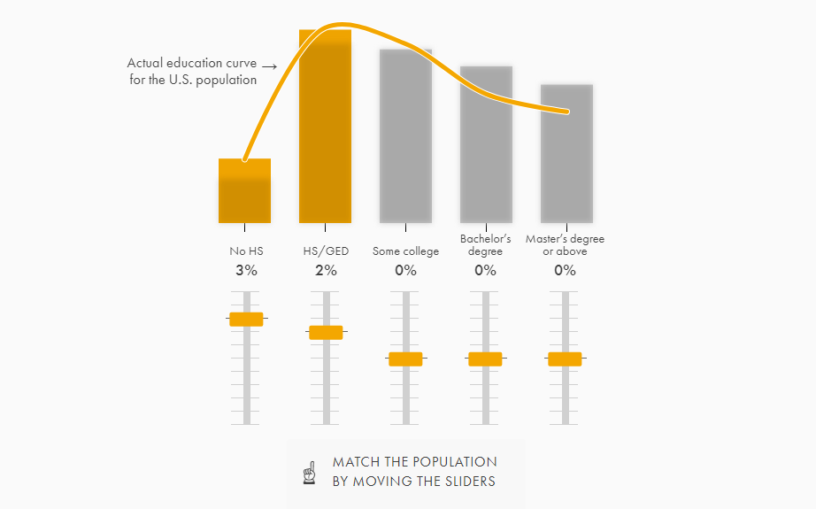
This visual story dives deep into how sample size and margin of error influence the clarity of polling results. It features two interactive tools that allow users to engage deeply with the mechanics of polling statistics.
Explore the story on Reuters, brought to you by Travis Hartman, Prasanta Kumar Dutta, and Jason Lange.
Wrapping Up
This week’s DataViz Weekly has brought to light four excellent data visualization projects that not only inform but also inspire. Each project demonstrates the profound impact that maps and charts have in making complex issues more comprehensible and engaging.
We hope these examples spark your curiosity and encourage you to explore the nuanced interplay between data and design. Join us next week for more insightful visualizations that bring data to life.
- Categories: Data Visualization Weekly
- No Comments »


