Exploring Trends and Patterns in Data Through Charting and Mapping — DataViz Weekly
June 28th, 2024 by AnyChart Team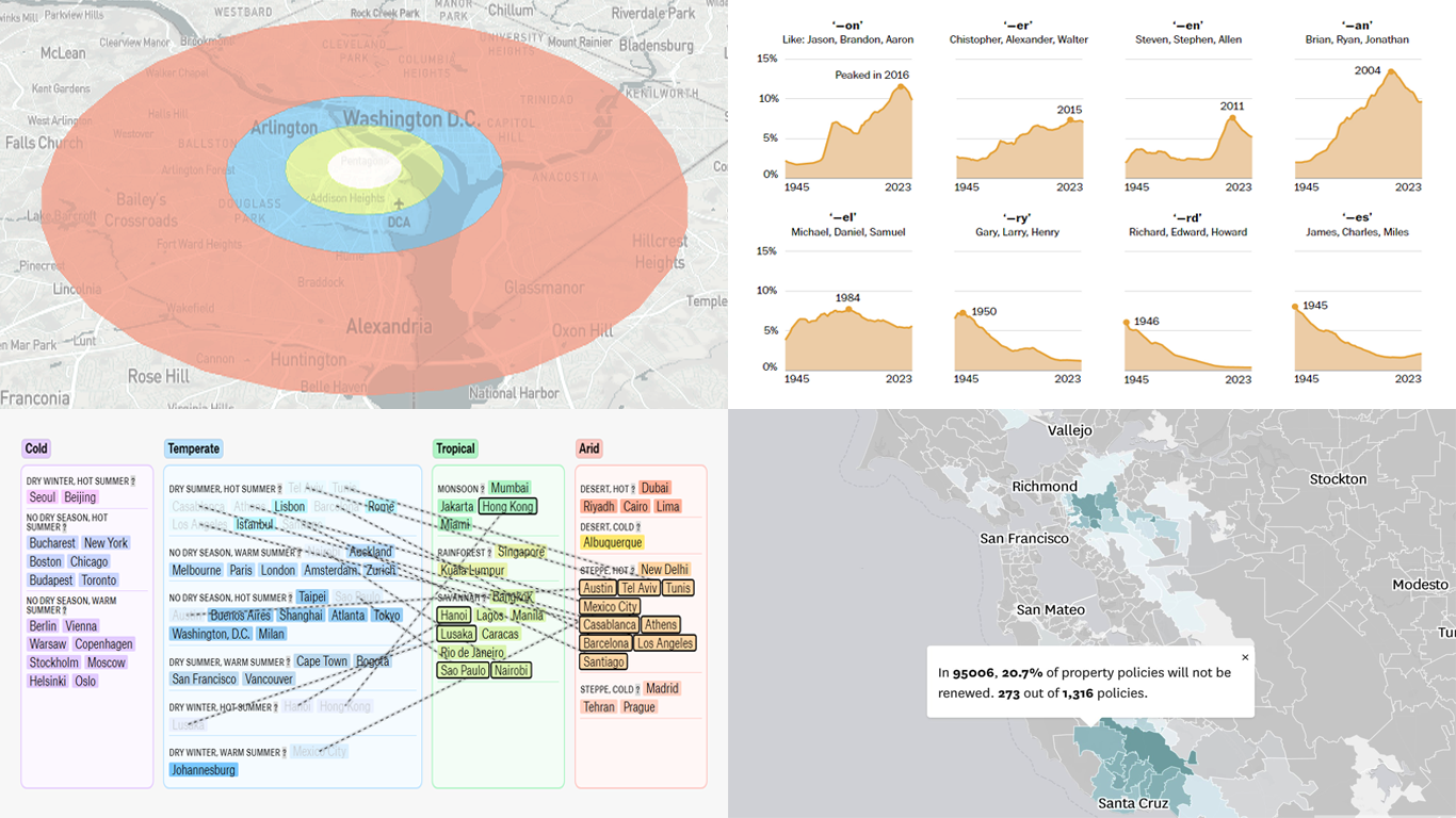 Visualizing data with charts or maps can make it easier to analyze and understand. In the DataViz Weekly feature, we spotlight new data graphics that have recently captured our attention for their clarity and insight. Check out our latest picks!
- Nuclear arsenal dynamics — SVT
- Future climate zone shifts — The Pudding
- Insurance policy changes in California — The San Francisco Chronicle
- Trends in American baby names — The Washington Post
- Categories: Data Visualization Weekly
- No Comments »
Pivot Table vs. Decomposition Tree: Advancing Data Insights
June 27th, 2024 by AnyChart Team In the evolving data landscape, the pivot table has long been a cornerstone of the data analyst’s toolkit. Traditionally used to summarize datasets in a condensed tabular form, pivot tables facilitate quick overviews and basic drill-down capabilities. However, as data sets grow larger and more complex, the static and manual nature of pivot tables can limit their effectiveness.
Enter the decomposition tree, an advanced data visualization technique that not only presents data but also uncovers deeper patterns and insights ad-hoc, all through its dynamic, interactive hierarchical structure. As a relatively new tool in the realm of data analysis and business intelligence, it is increasingly used as an effective alternative to a pivot table yet still often underrated, given its inherent potential.
This article explores several reasons why decomposition trees can be advantageous over traditional pivot tables, illustrated with real-world use cases.
Read more at qlik.anychart.com »
- Categories: Big Data, Business Intelligence, Dashboards, Qlik, Tips and Tricks
- No Comments »
Engaging Data Visualizations to Explore — DataViz Weekly
June 21st, 2024 by AnyChart Team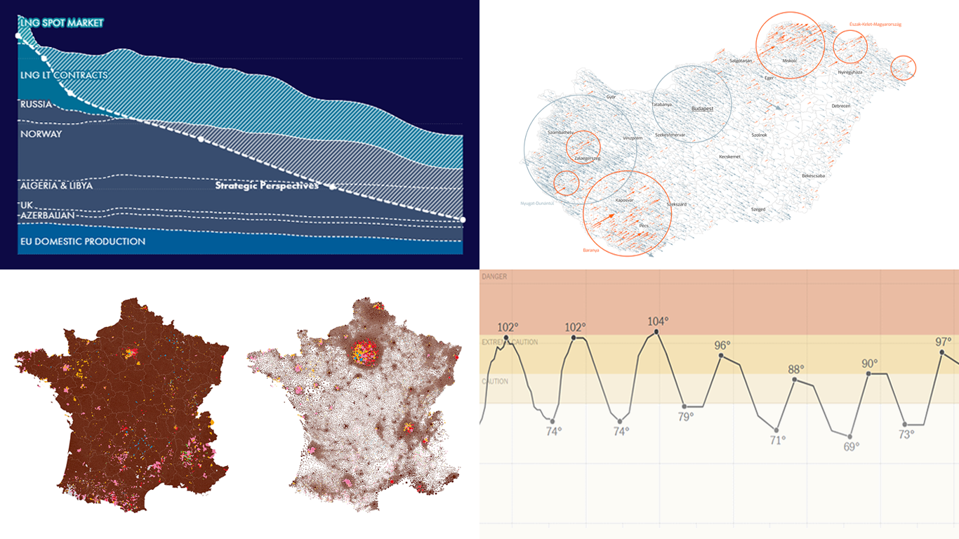 Welcome to another edition of DataViz Weekly, where we bring you some of the most interesting data visualizations we’ve recently come across. This week, we’re highlighting four fresh projects that effectively use data visualization to provide valuable insights:
- Tracking heat across the United States — The New York Times
- EU gas insights — Strategic Perspectives
- European Parliament election vote in France — Karim Douïeb (Jetpack.ai)
- European Parliament election vote in Hungary — Attila Bátorfy (atlo.team)
- Categories: Data Visualization Weekly
- No Comments »
Revealing Insights with Data Visualizations — DataViz Weekly
June 14th, 2024 by AnyChart Team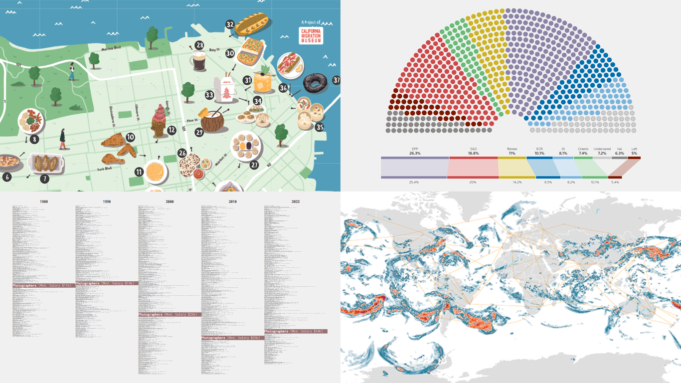 Data visualizations bridge the gap between raw numbers and clear, understandable insights. This week on DataViz Weekly, we showcase four remarkable new examples of how charts and maps illuminate diverse topics in a comprehensible and engaging manner:
- In-flight turbulence — South China Morning Post
- Shifts in occupation and income — FlowingData
- San Francisco’s culinary diversity — California Migration Museum
- EU election results — Reuters
- Categories: Data Visualization Weekly
- No Comments »