 Data visualizations bridge the gap between raw numbers and clear, understandable insights. This week on DataViz Weekly, we showcase four remarkable new examples of how charts and maps illuminate diverse topics in a comprehensible and engaging manner:
- In-flight turbulence — South China Morning Post
- Shifts in occupation and income — FlowingData
- San Francisco’s culinary diversity — California Migration Museum
- EU election results — Reuters
Data Visualization Weekly: June 7, 2024 — June 14, 2024
Understanding Turbulence
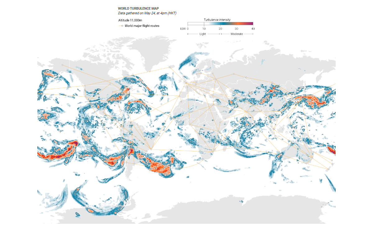
Regular fliers are familiar with in-flight turbulence, typically minor and passing quickly. However, turbulence can occasionally become severe, as seen with Singapore Airlines SQ321 over the Andaman Sea on May 21, 2024. This incident, which led to passengers and crew being thrown around the cabin, tragically resulted in a passenger’s fatal heart attack. The South China Morning Post explores turbulence in a recent feature.
The initial visual is what can be called a world map of turbulence. Using data from the Graphical Turbulence Guidance Product (GTG) forecasts by NOAA’s National Weather Service and the U.K. Meteorological Office, it displays turbulence hotspots around the globe in 2023, along with a layer of major flight routes.
The feature then delves into the ten most turbulent routes of 2023, based on an analysis of over 150,000 flights by Turbli, with turbulence intensity measured by the Eddy Dissipation Rate (EDR). Additionally, it explains the causes of turbulence, such as jet streams, high terrain, and thunderstorms, and offers practical advice on how travelers can enhance their safety during flights.
Discover the piece on SCMP, brought to you by Marcelo Duhalde, Andrew London, Joe Lo, and Catherine Ma.
Analyzing Shifts in Occupation and Income
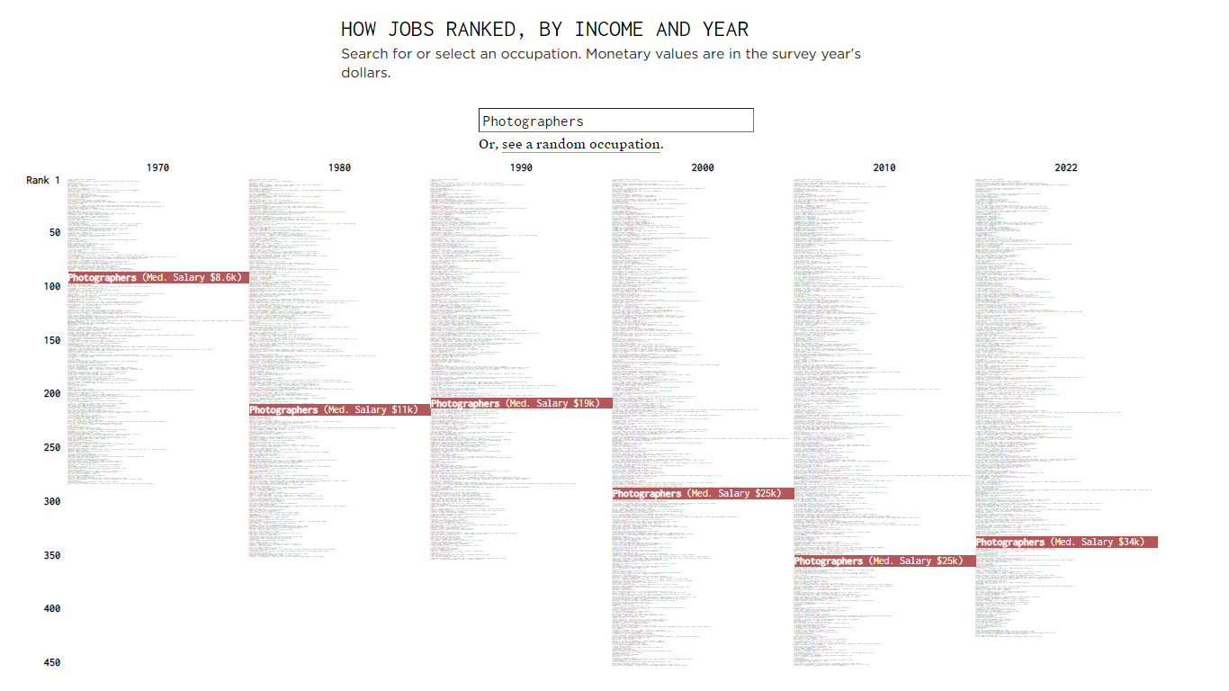
As technology reshapes industries, how have occupational incomes adjusted over the years? Nathan Yau’s visualization offers a comprehensive look at the changing landscape of job types and incomes since the 1970s, leveraging data from the Decennial Census and the American Community Survey.
His interactive bump chart lets you examine the economic trajectories of different occupations over the decades. At the high end of the scale, physicians and surgeons have maintained their strong income positions, whereas roles like counter attendants and cafeteria workers have consistently ranked low. The visualization also captures the shifts in income rankings for multiple occupations, such as photographers, potentially influenced by the accessibility of digital technology.
Significantly, the chart highlights the emergence of high-ranking tech occupations such as software developers and computer system managers in recent decades. Conversely, some traditional roles like statisticians have been reclassified, reflecting broader changes in the job market.
Explore the visualization on FlowingData.
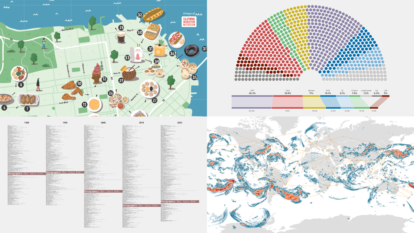
Exploring San Francisco’s Culinary Diversity
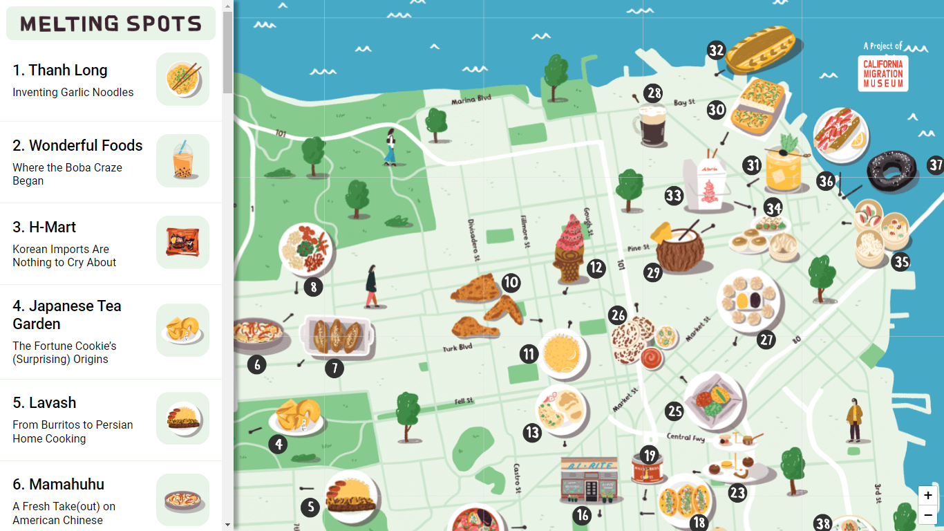
San Francisco’s vibrant food scene is a testament to its rich multicultural heritage. The California Migration Museum celebrates this diversity with an interactive project that showcases the city’s immigrant-inspired culinary delights.
The illustrated map features 38 stories highlighting the contributions of immigrant chefs, restaurants, and dishes that have shaped San Francisco’s food culture. For instance, the Mai Tai cocktail, created by Bay Area bartenders in the 1940s, is just one example of the many immigrant-inspired innovations. By selecting markers on the map or the sidebar, you can watch short videos detailing the history of each featured dish, chef, or restaurant.
Spanning from Gold Rush-era saloons to contemporary food pop-ups, the map traces the evolution of the city’s culinary landscape. It invites users to explore the stories behind iconic foods like Rice-A-Roni and Mission burritos, offering a unique auditory and visual experience.
Explore the interactive map of immigrant-origin food in San Francisco on the California Migration Museum’s website.
EU Election Results
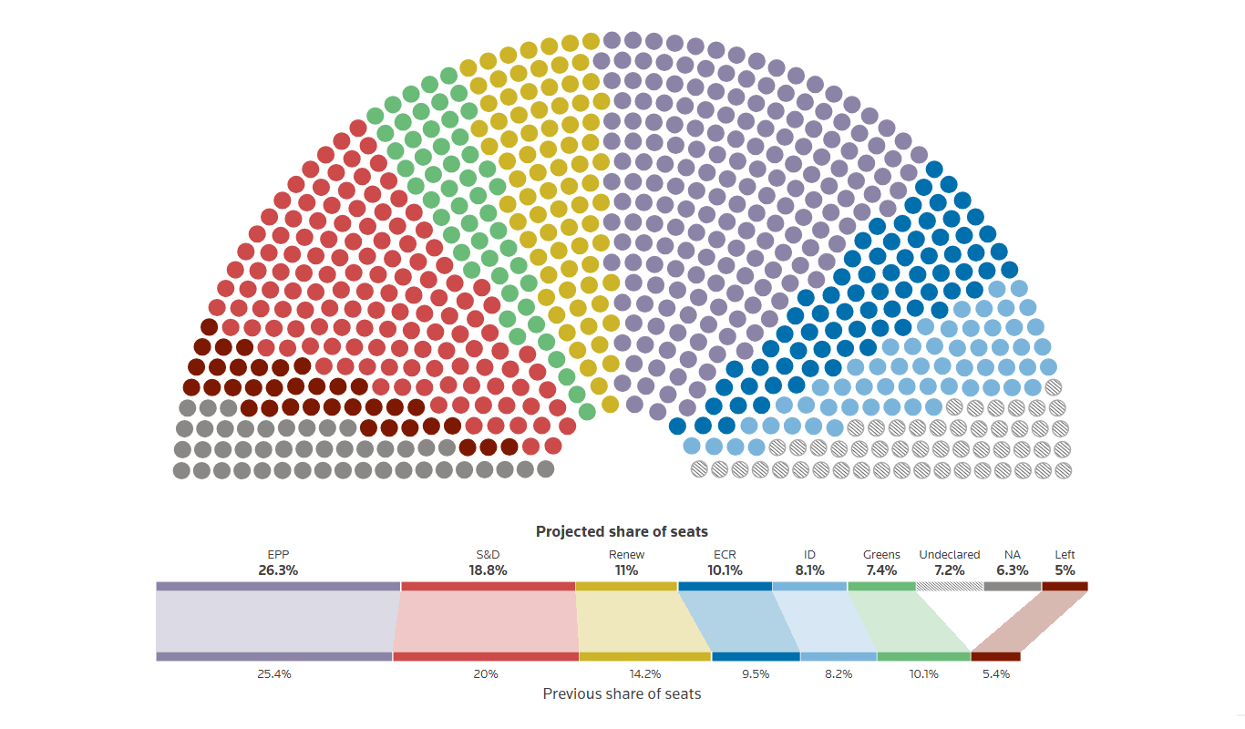
In the recent elections, voters across the 27 European Union countries selected 720 lawmakers to serve in the European Parliament for the next five years, revealing a shift to the right. Reuters presents the election results in detail using charts.
The European Parliament groups members by political affiliation, with the European People’s Party, Progressive Alliance of Socialists and Democrats, and Renew Europe forming the previous majority. The new results suggest some reconfigurations, clearly showing how a future EU parliament is projected to look in terms of the number of seats by parliament group. You can also see the results by country, switching between results by parliamentary group and by national party.
Check out the detailed EU election results on Reuters, in this feature by Philip Blenkinsop and Jon McClure.
Wrapping Up
We hope you found this week’s selection of data visualizations both informative and inspiring. Each featured project highlights the powerful role of data visualization in making complex information accessible and engaging.
Stay tuned for Data Visualization Weekly where we continue to explore the fascinating world of charting, mapping, and visual storytelling.
If you have any outstanding visualizations to share, we would love to see them and consider them for future features.
- Categories: Data Visualization Weekly
- No Comments »