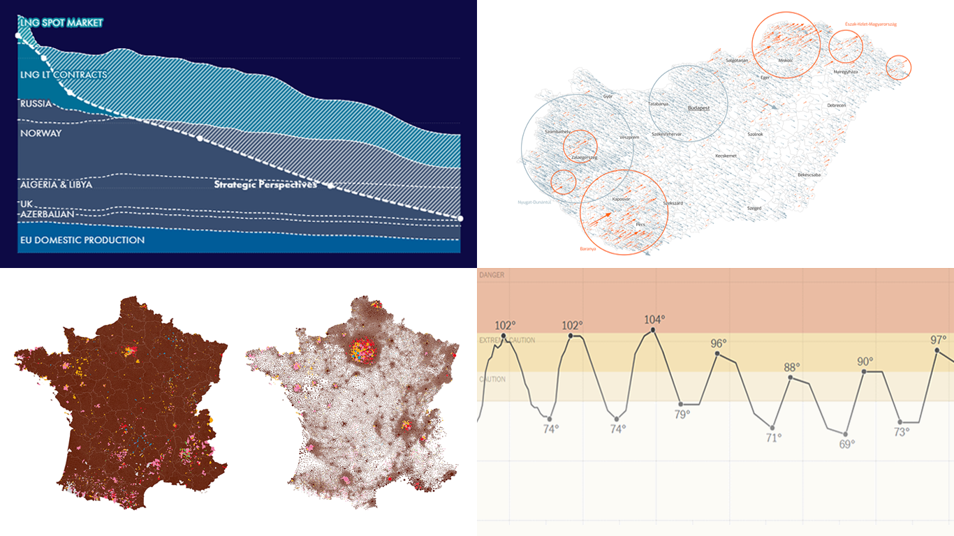
 Welcome to another edition of DataViz Weekly, where we bring you some of the most interesting data visualizations we’ve recently come across. This week, we’re highlighting four fresh projects that effectively use data visualization to provide valuable insights:
- Tracking heat across the United States — The New York Times
- EU gas insights — Strategic Perspectives
- European Parliament election vote in France — Karim Douïeb (Jetpack.ai)
- European Parliament election vote in Hungary — Attila Bátorfy (atlo.team)
Data Visualization Weekly: June 14, 2024 — June 21, 2024
Tracking Heat Across U.S.
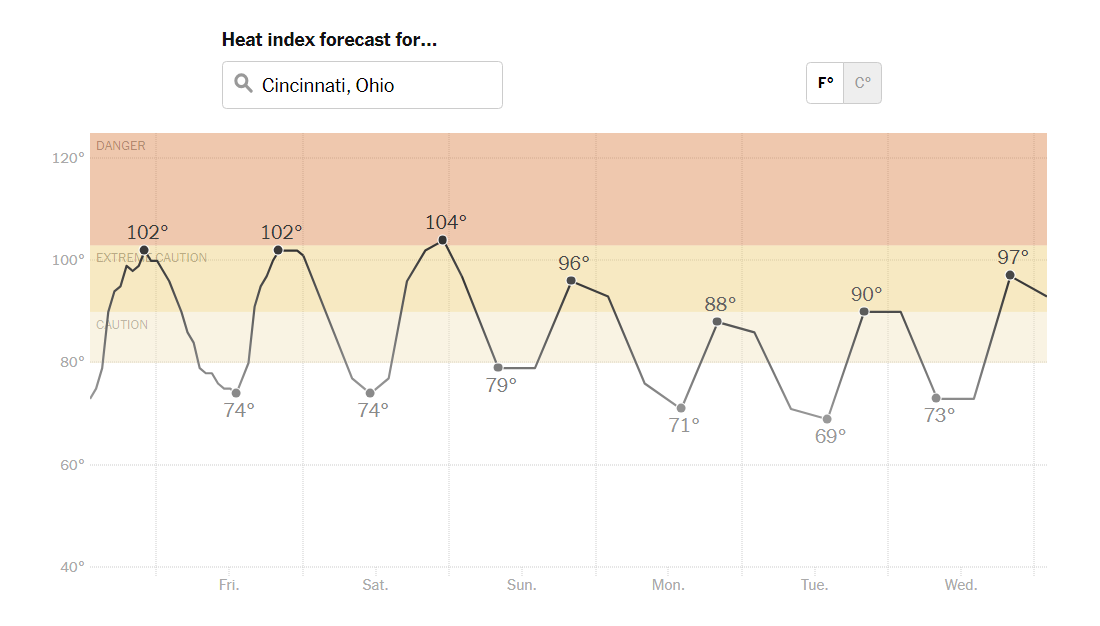
Approximately 16.6 million people, or 5 percent of the population of the contiguous U.S., are living in areas where dangerously high heat levels are expected. The New York Times has developed a heat tracker to pinpoint these areas and provide crucial information on how long the intense heat will persist.
Using data from the National Oceanic and Atmospheric Administration (NOAA), the tracker represents the projected heat index across the United States. This index reflects how hot it feels outside when both temperature and humidity are considered. Maps provide a bird’s-eye view, displaying the forecast for today and the next six days. A line chart offers a detailed outlook for specific locations and includes range axis markers based on NOAA’s definitions of heat index levels, making it easy to understand the severity of the heat.
Explore the U.S. heat tracker on The NYT — by Matthew Bloch, Lazaro Gamio, Zach Levitt, Eleanor Lutz, Bea Malsky, and John-Michael Murphy.
EU Gas Insights
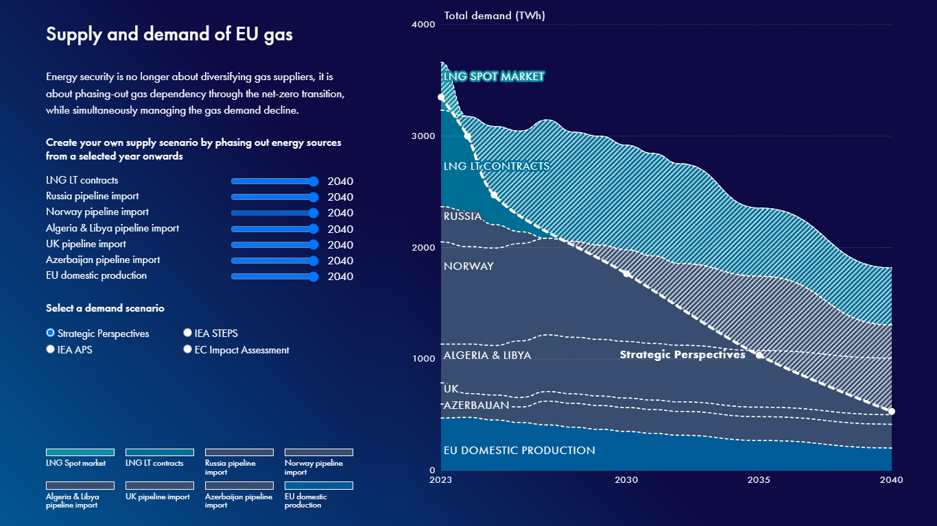
In 2023, the European Union (EU) imported 85% of its gas supply from outside the EU, highlighting its significant dependency on external sources. To aid in navigating Europe’s transition away from gas, Strategic Perspectives, a pan-European think tank dedicated to promoting effective climate action, launched EU Gas Insights.
EU Gas Insights offers a comprehensive view of how EU gas demand is expected to evolve under various scenarios. The tool features interactive visualizations that compare projected gas demand with the quantities the EU is contracted to import under existing supply agreements. By quantifying the oversupply, it provides a compelling rationale for a well-planned and managed gas phase-out across the EU.
Explore the project on the Strategic Perspectives website — designed and coded by Alice Thudt and Dominikus Baur.
European Parliament Election Vote in France
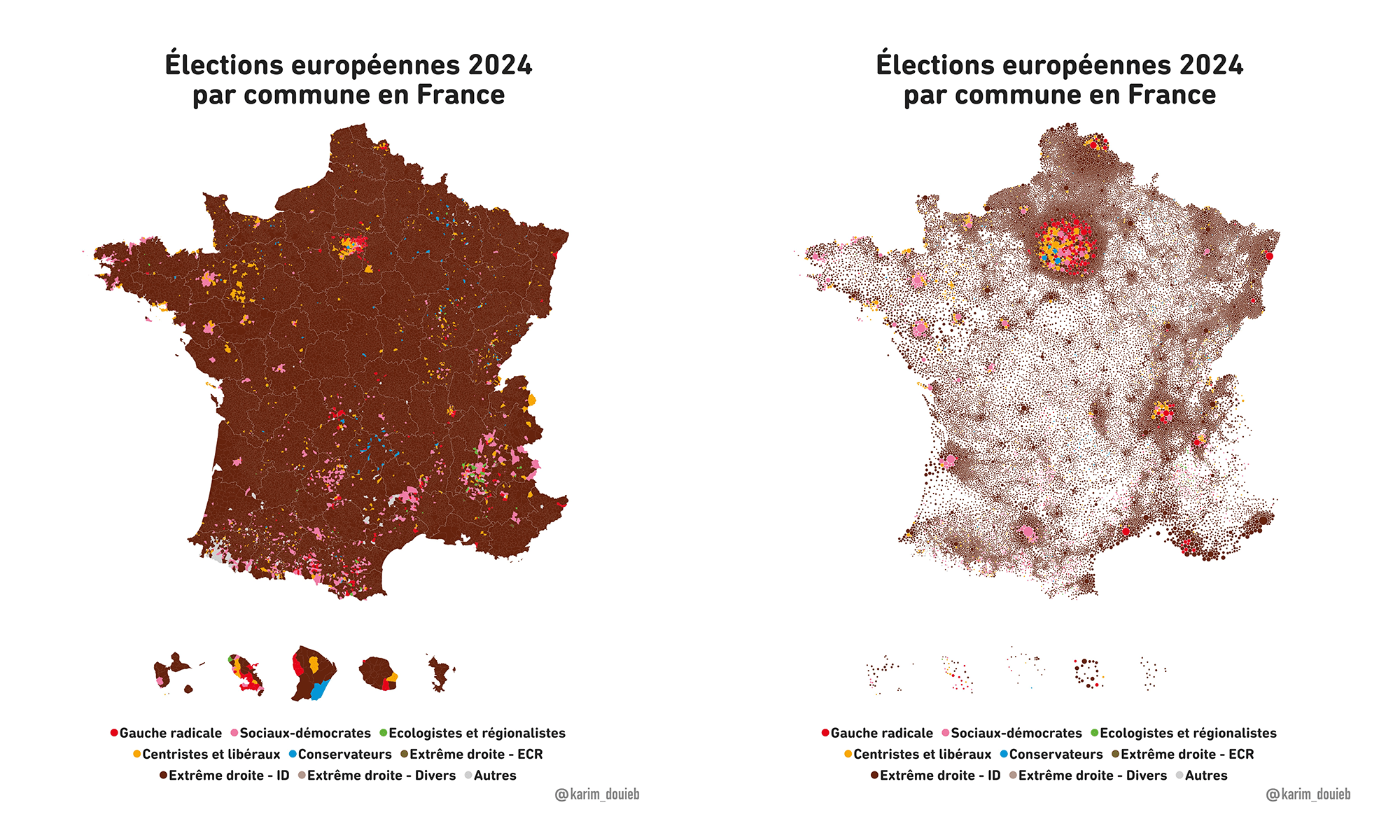
Choropleth maps are a traditional way to visualize election results, highlighting which territories were won by which parties. However, they often overlook a simple truth: people, not land, vote. For several years, Karim Douïeb of Jetpack.ai has been demonstrating a more accurate representation of voting patterns.
His approach employs colored bubbles, with their size proportional to the number of voters in each specific area, providing a more accurate representation of voter distribution. This technique becomes particularly impactful through an animation that transitions from a traditional choropleth map to that sort of a bubble-based geovisualization. Recently, for example, he applied this method to the European Parliament elections in France, transforming each municipality’s voting results into appropriately scaled and colored dots.
Check out the switching animation here and view the two maps side by side with the legend here.
European Parliament Election Vote in Hungary
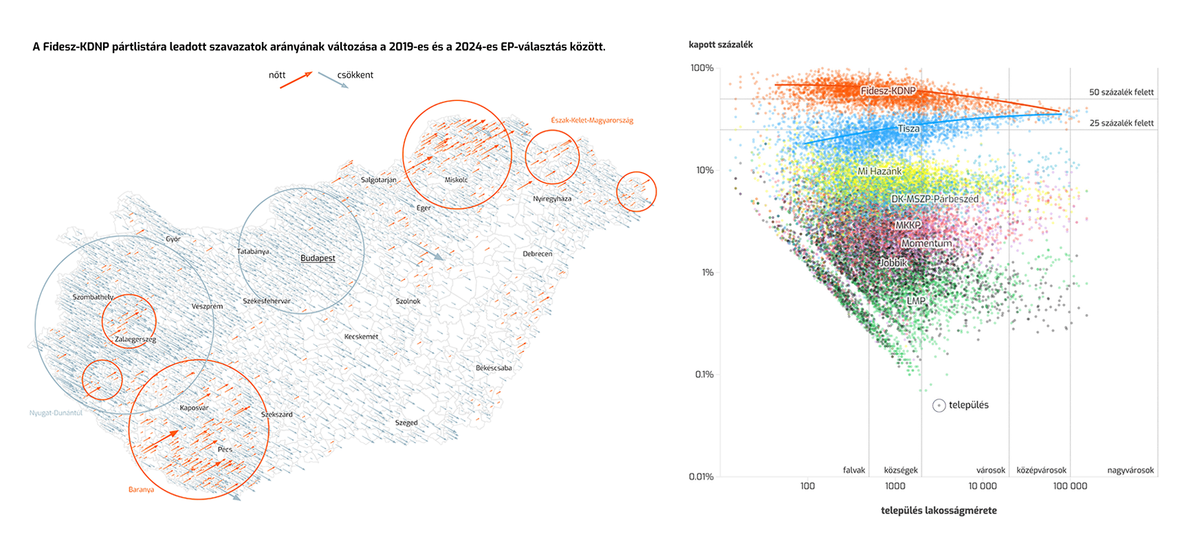
Continuing the discussion on the recent EU parliament elections, atlo.team’s project provides an insightful look into Hungary’s voting patterns.
In the latest elections, 83 percent of Hungarian voters supported parties promoting right-wing ideology, a significant increase from 62 percent in 2019. The project’s data visualizations powerfully communicate these results, offering a deep dive into the Hungarian EU parliament vote.
Rather than describing each of the many visualizations, it’s best to experience them directly right away. Take a look at the project by Attila Bátorfy on atlo.team‘s website.
Wrapping Up
These projects showcase the power of data visualization in making complex datasets more accessible and informative. Stay tuned for more examples in our next DataViz Weekly.
- Categories: Data Visualization Weekly
- No Comments »