 Visualizing data with charts or maps can make it easier to analyze and understand. In the DataViz Weekly feature, we spotlight new data graphics that have recently captured our attention for their clarity and insight. Check out our latest picks!
- Nuclear arsenal dynamics — SVT
- Future climate zone shifts — The Pudding
- Insurance policy changes in California — The San Francisco Chronicle
- Trends in American baby names — The Washington Post
Data Visualization Weekly: June 21, 2024 — June 28, 2024
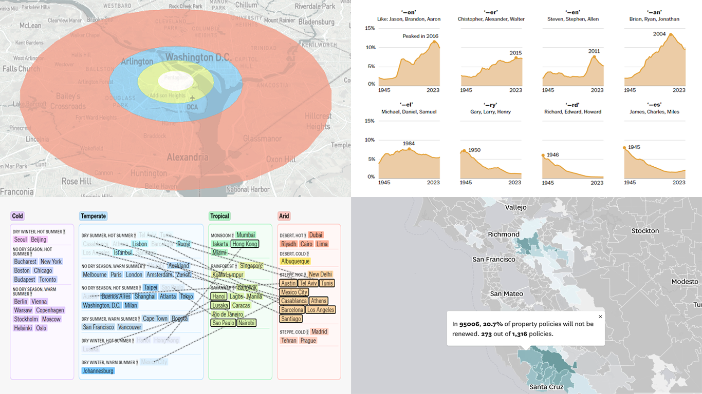
Nuclear Arsenal Dynamics
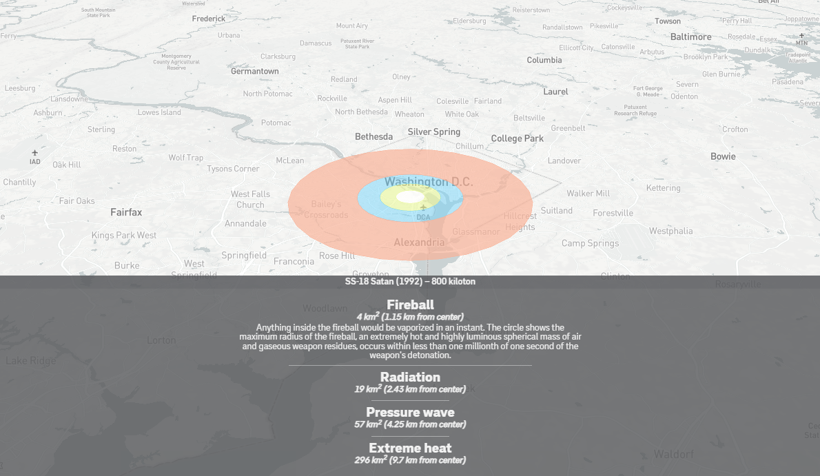
Following the Cold War, the global count of nuclear weapons was consistently decreasing. This trend, however, has now halted, with all nine nuclear-armed states not only modernizing their arsenals but, in some cases, expanding them.
SVT, Sweden’s national public television broadcaster, provides an in-depth analysis based on data from the Stockholm International Peace Research Institute (SIPRI) as published in the SIPRI Yearbook 2024. This data offers a snapshot of nuclear weapon counts and trends as of January 2024, breaking down the figures by country over the last two decades.
Additionally, the feature includes an interactive nuclear weapons simulator. This tool allows you to select from a variety of actual nuclear warheads and simulate the effects of their detonation on a chosen location — providing a stark visual of the potential impacts.
Explore the story on SVT, by Jonas Olsson, Martin Hedström, and the SVT Data Journalism Team.
Future Climate Zone Shifts
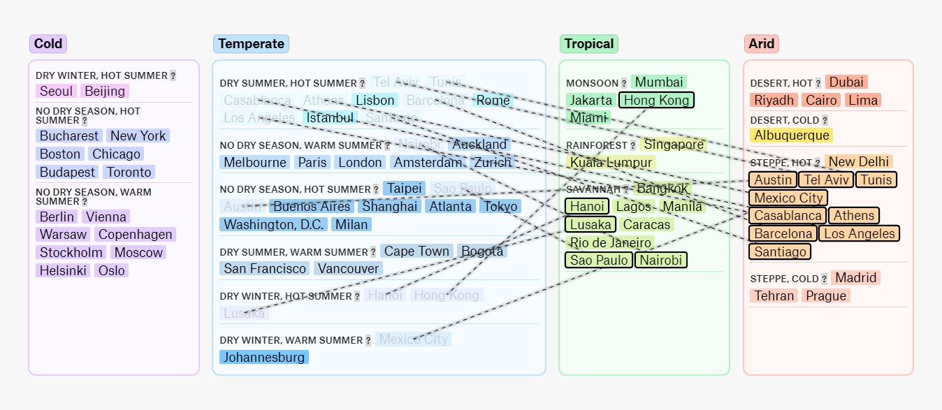
Within the next fifty years, Los Angeles is projected to exit its current temperate climate zone, transitioning to a climate similar to contemporary New Delhi. Its average temperatures are going to rise from 59.8°F to 65.2°F, resulting in hot, arid summers. Conversely, Moscow may become the only major city still categorized within the cold zone by 2070.
The Pudding has published a visual story by Derek Taylor, leveraging forecast data from a 2018 study led by Hylke Beck. This interactive visualization utilizes the Köppen climate classification to delineate current global climate zones and their predicted shifts due to global warming.
The visualization begins with an interactive global map of climate zones and breaks down further into subcategories for each zone. Users can navigate through a list of 70 global cities, observing how each city’s climate zone and average temperature are expected to change.
Check out this project on The Pudding.
Insurance Policy Changes in California
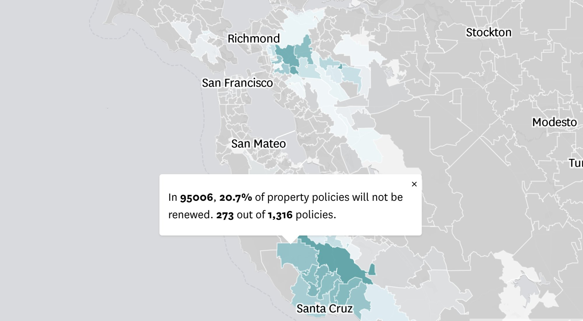
State Farm, the largest home insurer in California, has announced its decision to not renew approximately 30,000 policies due to elevated risks of wildfires and earthquakes. This move affects not only homeowners’ policies but also rental and other property insurances.
The San Francisco Chronicle has provided a detailed map that illustrates the share of non-renewed policies by ZIP code, utilizing recent filings with the California Department of Insurance. This visualization provides a clear view of the geographic distribution of impacted policies.
As shown, non-renewal rates vary significantly across ZIP codes. For instance, while less than 1% of policies are not to be renewed in some areas, the 90272 ZIP code near Santa Monica is drastically affected, with nearly 70% of the current policies set for non-renewal. This detailed mapping highlights the disparate impact across different regions.
See the article on The San Francisco Chronicle, by Megan Fan Munce, Harsha Devulapalli, Kate Galbraith, Yoohyun Jung, Jess Shaw, and Nami Sumida.
Trends in American Baby Names
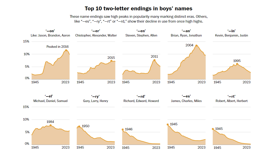
The way a name is spelled can reveal much about the era in which a person was born. For example, the name “Ashley” is predominantly associated with Millennials, while variations like “Ashly” are more common among Generation X, and “Ashleigh” is increasingly seen among Generation Z.
Daniel Wolfe, a graphics reporter for The Washington Post, collaborated with Laura Wattenberg, creator of Namerology.com, to analyze trends in American baby names from 1945 to 2023. Their focus was not on full names but rather on how the spellings have evolved over the decades.
The analysis is supported by multiple charts that allow you to zoom in on specific trends and patterns in American name endings. Interestingly, since the 1970s, the letter “n” has become the most common ending for male names in the U.S., with one in four men likely having a name ending in “n.”
Dive deeper into the analysis on The Washington Post.
Wrapping Up
Thank you for joining us to explore this week’s collection of standout data visualizations. Look forward to our next DataViz Weekly issue, where we will continue to bring you some of the most interesting new charts and maps from across the web.
- Categories: Data Visualization Weekly
- No Comments »