Stunning New Data Visualization Examples in Our Curated Collection — DataViz Weekly
July 26th, 2024 by AnyChart Team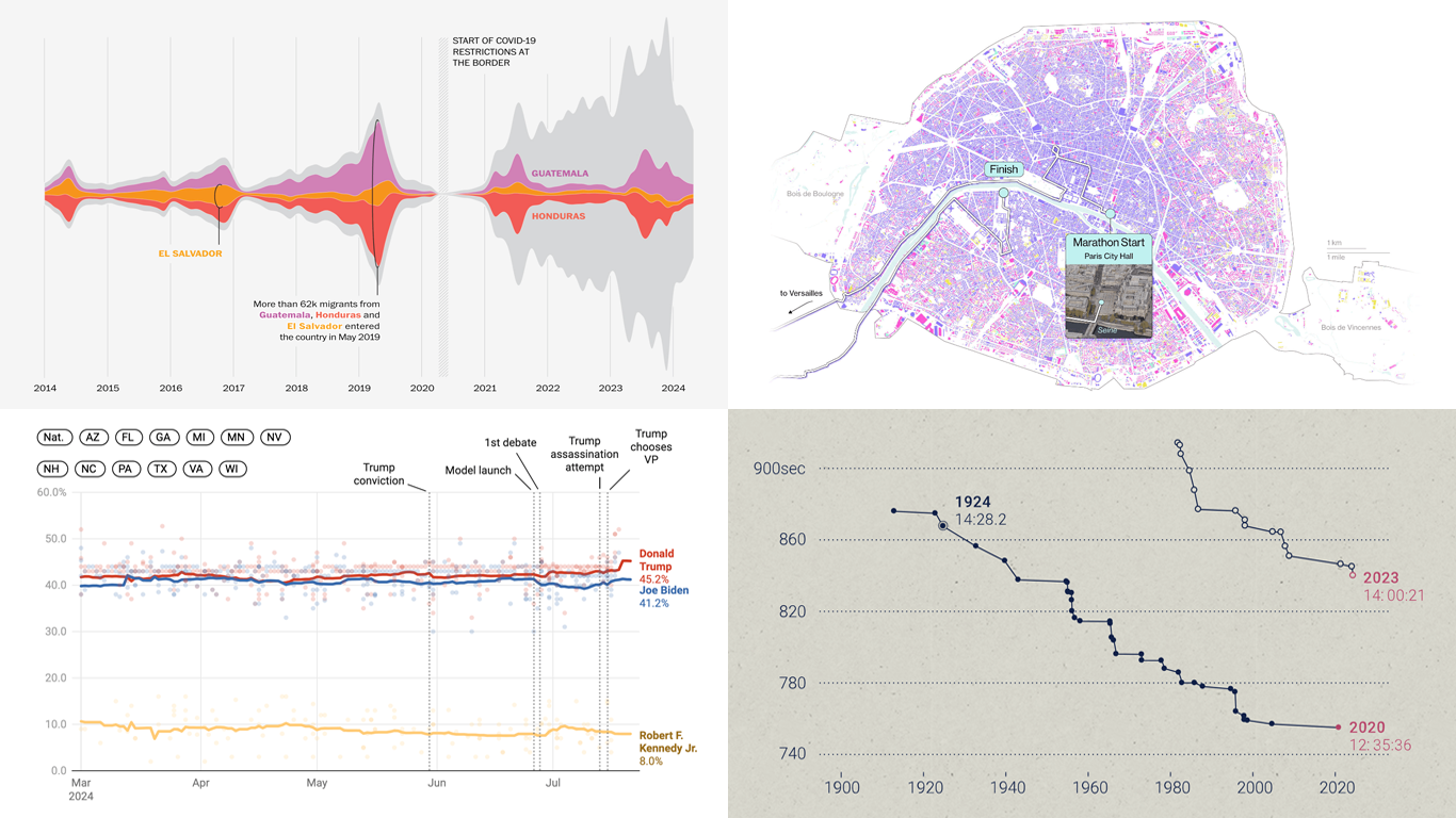 Welcome to DataViz Weekly, where we present a curated selection of stunning data visualization examples our there. Whether you’re a data professional or simply interested in visual data, these charts and maps can provide both inspiration and practical ideas. Here’s what we have for you to explore today:
- U.S. immigration patterns — WaPo
- 2024 U.S. presidential election forecast — Silver Bulletin
- Paris Olympics 100 years later — SCMP
- Extreme heat challenges at the 2024 Summer Olympics — Bloomberg Green
- Categories: Data Visualization Weekly
- No Comments »
New Data Visualization Projects Worth Checking Out — DataViz Weekly
July 19th, 2024 by AnyChart Team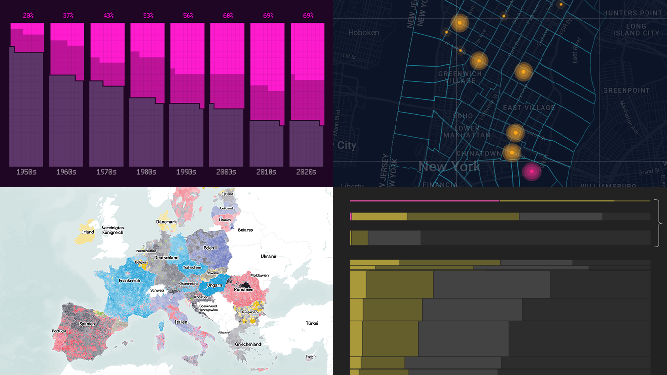 Data is easier to explore and analyze when visualized. If you’re looking for practical examples, you’ve arrived at the right place. DataViz Weekly is here to introduce you to some new data visualization projects we have found on the web.
- NYC congestion zone crash tracker — Transpo Maps
- 2024 European Parliament election map — ZEIT ONLINE
- Global hunger insights — Reuters
- Evolution of sci-fi films — The Pudding
- Categories: Data Visualization Weekly
- No Comments »
Visualizing Forecast Accuracy, College Admissions, Global Demographics, and Election Results — DataViz Weekly
July 12th, 2024 by AnyChart Team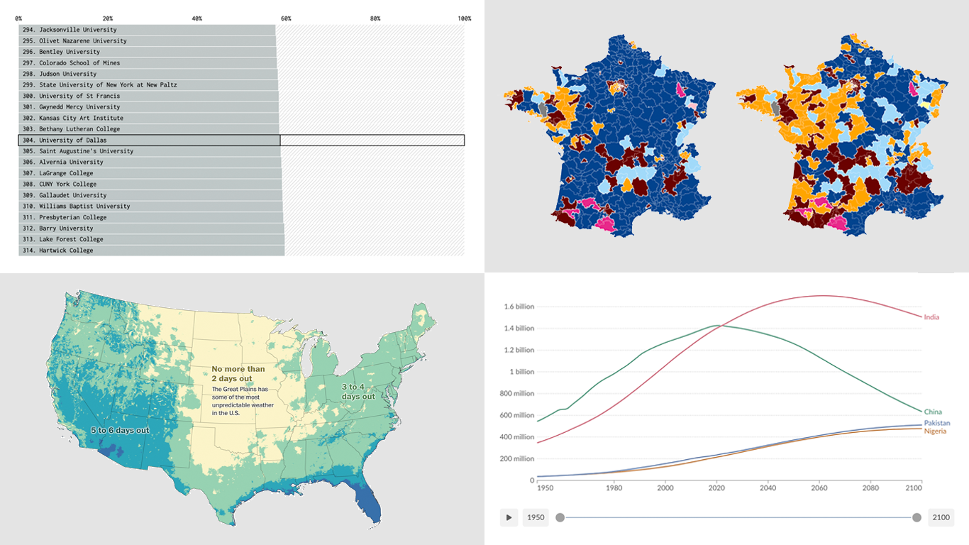 Ready for a fresh dose of impressive data visualizations crafted by seasoned professionals? Here’s what DataViz Weekly has in store for you this time:
- Weather forecast accuracy across the United States — The Washington Post
- U.S. college admission rates — FlowingData
- Global demographic shifts — Our World in Data
- France’s parliamentary election results — Various publications
- Categories: Data Visualization Weekly
- No Comments »
Celebrating Success at Qlik Connect: Recap from AnyChart
July 10th, 2024 by AnyChart Team Qlik Connect 2024 was nothing short of amazing, not just for its vibrant atmosphere but also for the palpable successes we experienced. Beyond the buzz, we showcased our latest advancements for Qlik Sense, gathered a wealth of insights, made meaningful contacts, and ran a hit interactive game that became the talk of the event. We even clinched a win in the social media contest — an unplanned but welcome accolade indeed! Join us for a recap of our time at Qlik Connect in Orlando.
Read more at qlik.anychart.com »
- Categories: Big Data, Business Intelligence, Dashboards, News, Qlik, Success Stories
- No Comments »
2024 UK Election Maps — DataViz Weekly
July 8th, 2024 by AnyChart Team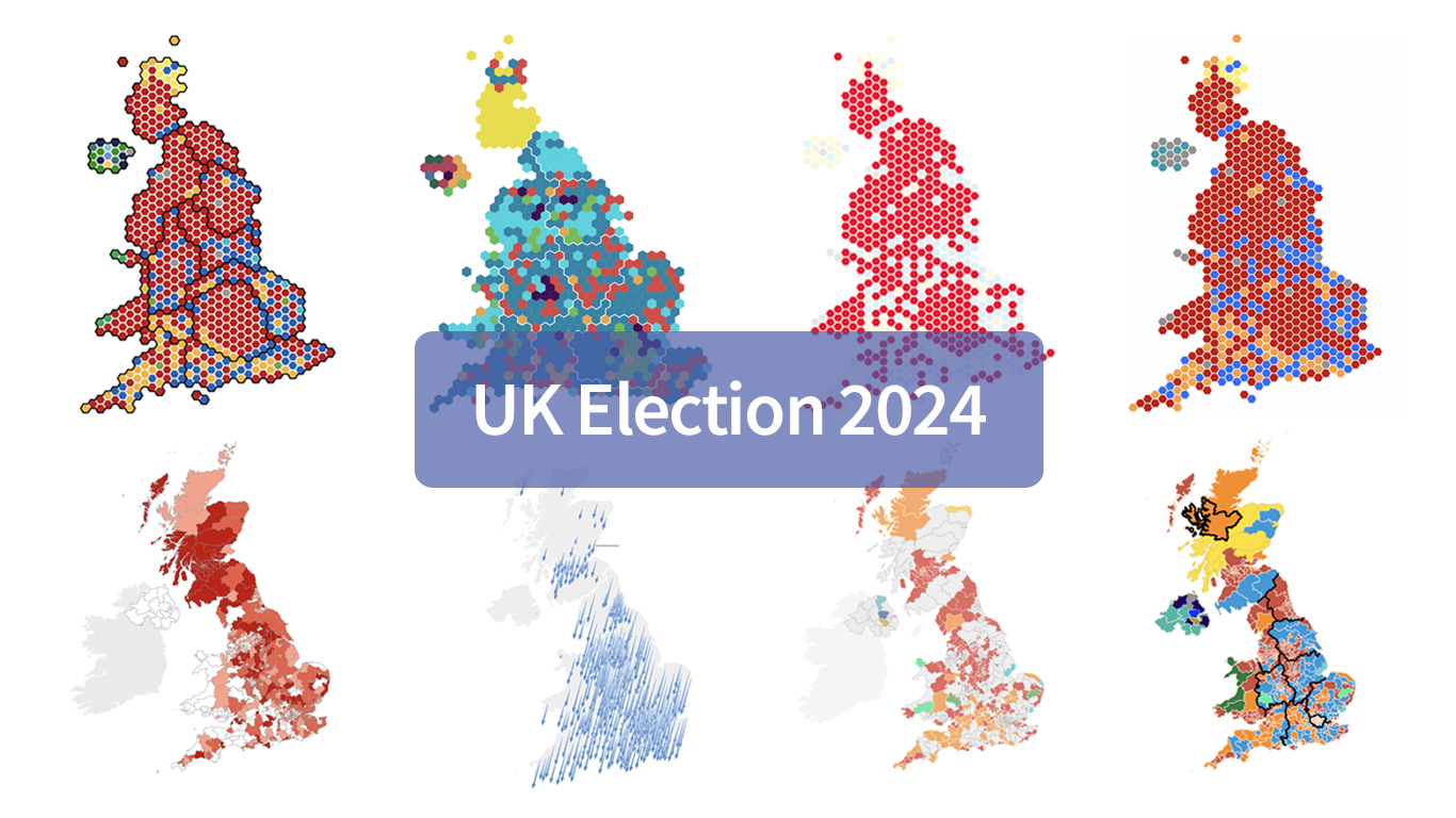 Last Thursday’s 2024 United Kingdom general election resulted in a historic shift within the nation’s political landscape, marking the Conservatives’ most severe defeat in nearly two centuries. As people look for clarity on these changes, election maps have come to the forefront as effective visual tools to make sense of voting outcomes and underlying patterns.
In this special edition of DataViz Weekly, we present a quick overview of UK election maps from prestigious sources including Sky News, The Independent, the BBC, The Financial Times, The Guardian, CNN, Open Innovations, and The New York Times, complete with links to them. Explore these data visualization projects to delve deeper into the dramatic shifts of the 2024 election, experience the power of effective electoral data mapping, and perhaps find inspiration for your own work.
💡 See also: 2024 U.S. Election Maps (November 2024).
- Categories: Data Visualization Weekly
- No Comments »