 Last Thursday’s 2024 United Kingdom general election resulted in a historic shift within the nation’s political landscape, marking the Conservatives’ most severe defeat in nearly two centuries. As people look for clarity on these changes, election maps have come to the forefront as effective visual tools to make sense of voting outcomes and underlying patterns.
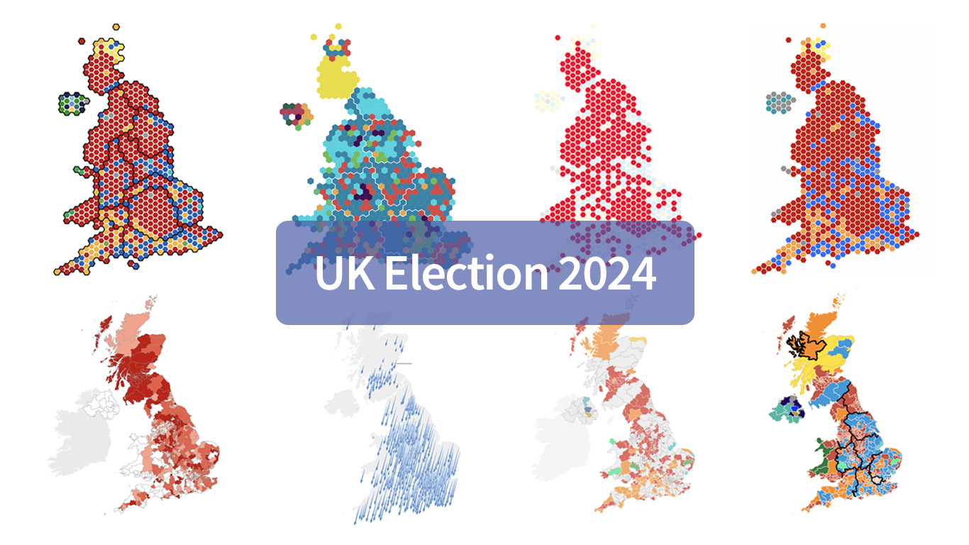
In this special edition of DataViz Weekly, we present a quick overview of UK election maps from prestigious sources including Sky News, The Independent, the BBC, The Financial Times, The Guardian, CNN, Open Innovations, and The New York Times, complete with links to them. Explore these data visualization projects to delve deeper into the dramatic shifts of the 2024 election, experience the power of effective electoral data mapping, and perhaps find inspiration for your own work.
💡 See also: 2024 U.S. Election Maps (November 2024).
8 UK Election Map Visualizations in DataViz Weekly Special Edition
1. Sky News
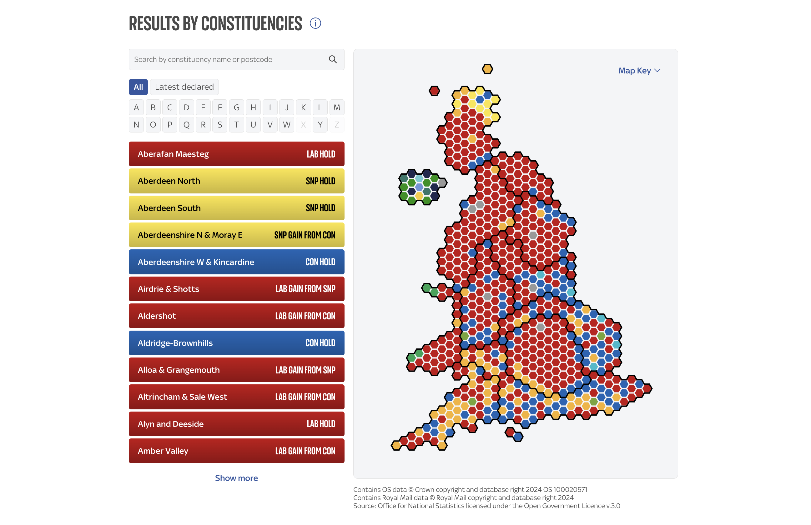
Sky News’s UK election map visualization features a cartogram that allows you to immediately grasp the essentials: which party won where. Each constituency, which is a geographical area represented by a member in Parliament, is depicted as a hexagon, providing a clear representation of the electoral landscape. You can input a postal code or constituency name to zoom into specific local results.
2. The Independent
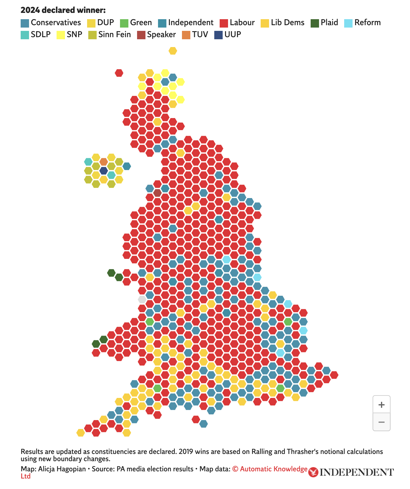
The Independent’s UK election map visualization also provides a cartogram-based view. It is enhanced by an interactive feature that allows you to highlight constituencies won by a specific party simply by hovering over that party in the map legend. This functionality provides a clear visual representation of the geographical areas where each party has prevailed.
3. BBC
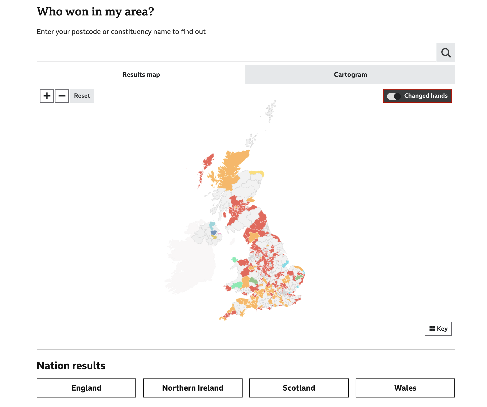
The BBC’s UK election map visualization offers a cartogram similar to those of Sky News and The Independent. Additionally, it features a geographic, choropleth map, which colors constituencies based on the winning party, providing a conventional geographical perspective. The BBC also includes a “Changed hands” toggle, allowing you to identify territories where party control has shifted since the 2019 general election.
4. The Financial Times
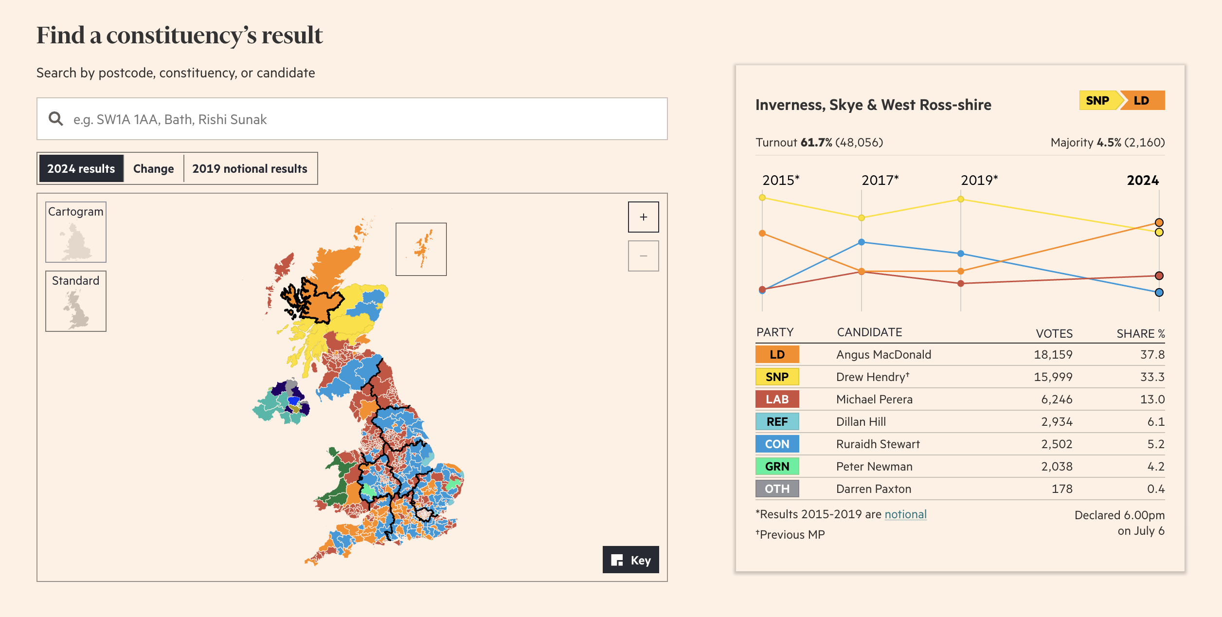
The Financial Times’s UK election map visualization includes all the major features offered by the BBC but expands upon them by introducing the option to display the notional results from 2019. Moreover, it allows you to search not only by ZIP code or constituency, as with Sky News, The Independent, and the BBC, but also by candidate name.
5. The Guardian
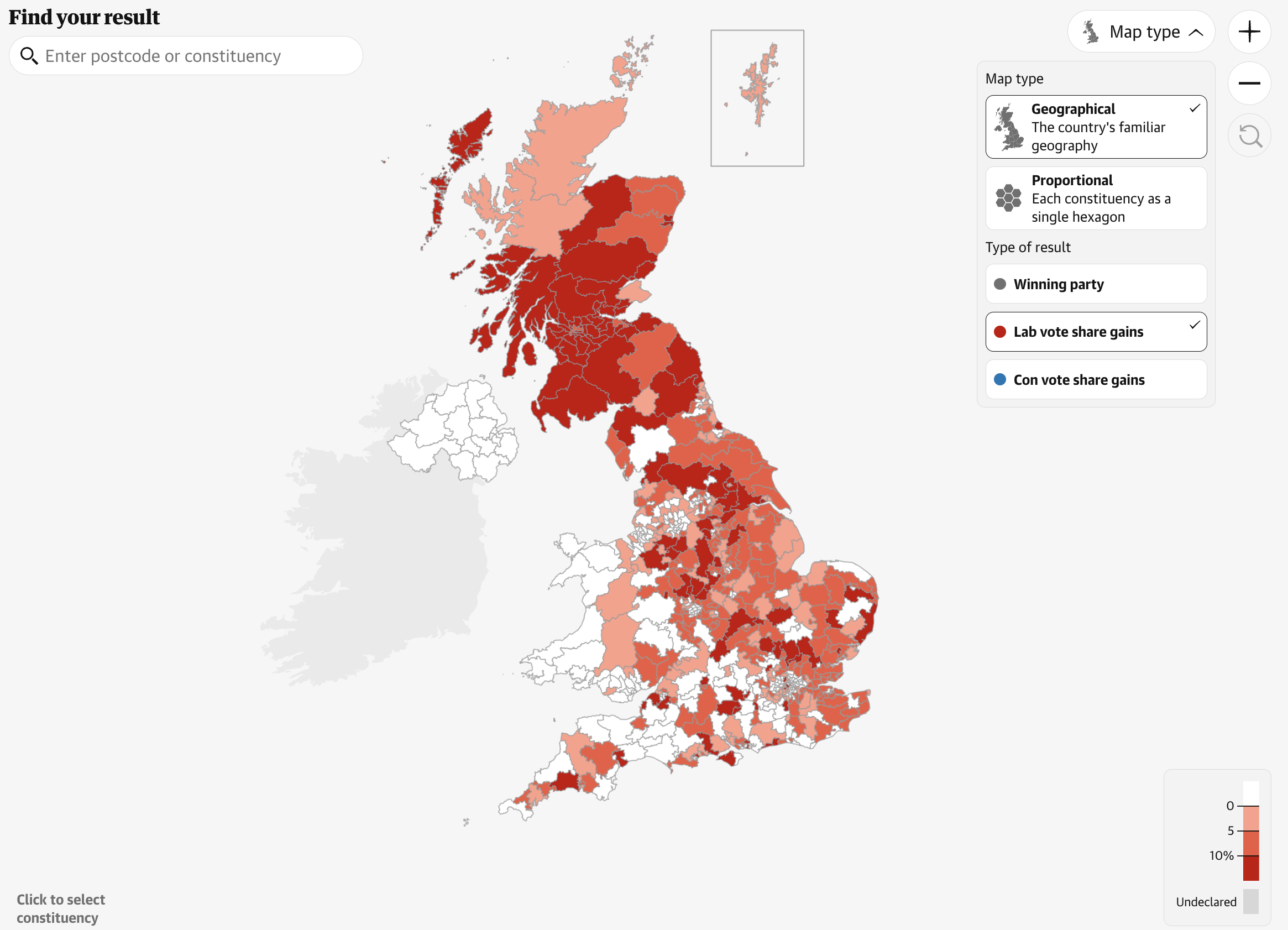
The Guardian’s UK election map visualization, like the BBC and The FT, offers the functionality to explore vote results either through a choropleth map (termed “Standard” here) or a cartogram. Although unlike those, it lacks a “changed hands” feature, it additionally provides a unique analysis of party share gains, with visualizations specifically for the Labour and Conservative parties. Labour party gains are indicated with shades of red, while Conservative gains were supposed to be highlighted with shades of blue but there are none at this time.
6. CNN
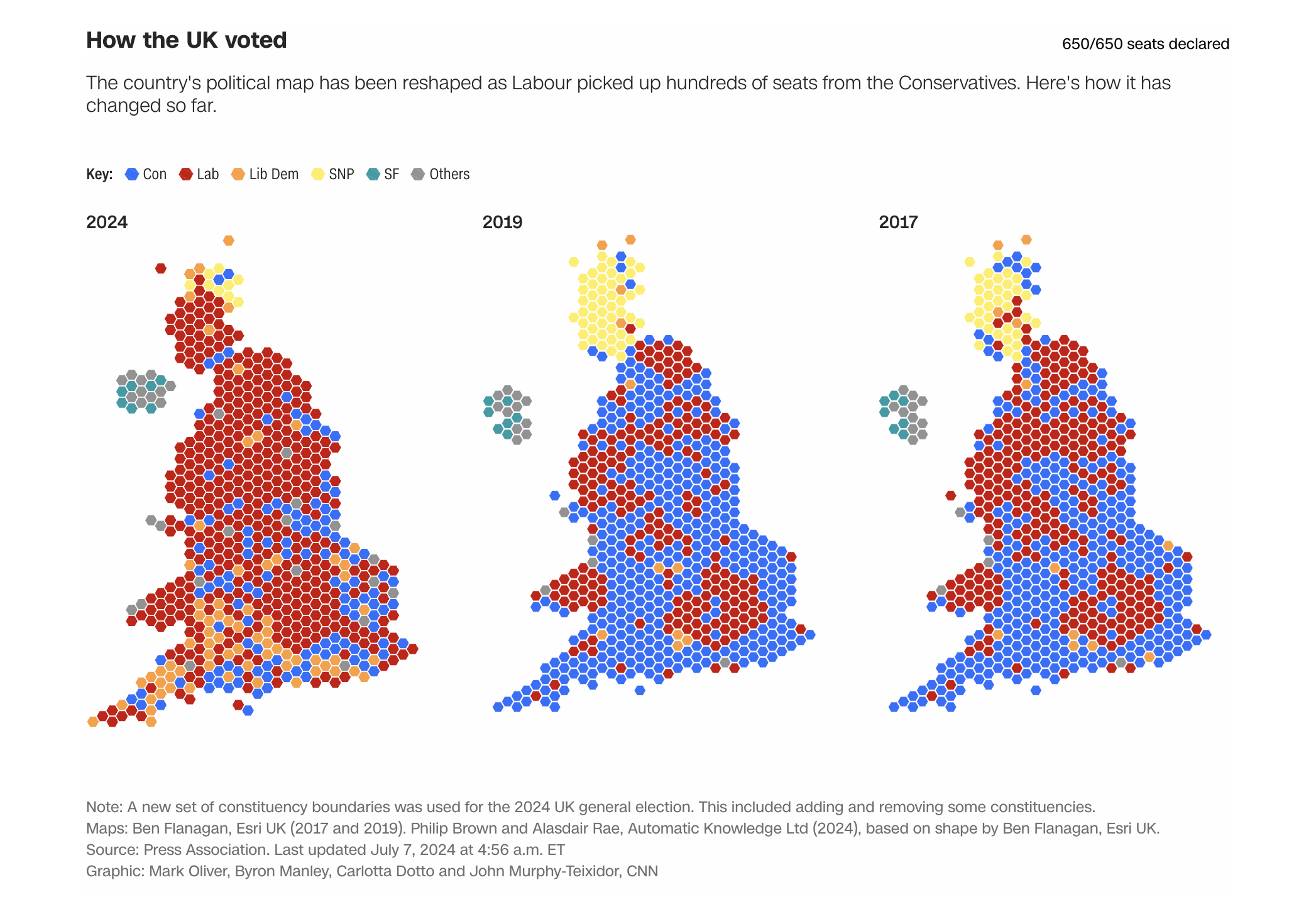
CNN’s UK election map visualization enables side-by-side comparisons of cartograms from the 2024, 2019, and 2017 general elections. This comparative approach illustrates the evolution of voting patterns over the last three general elections, revealing shifts in political allegiance in this way.
7. Open Innovations
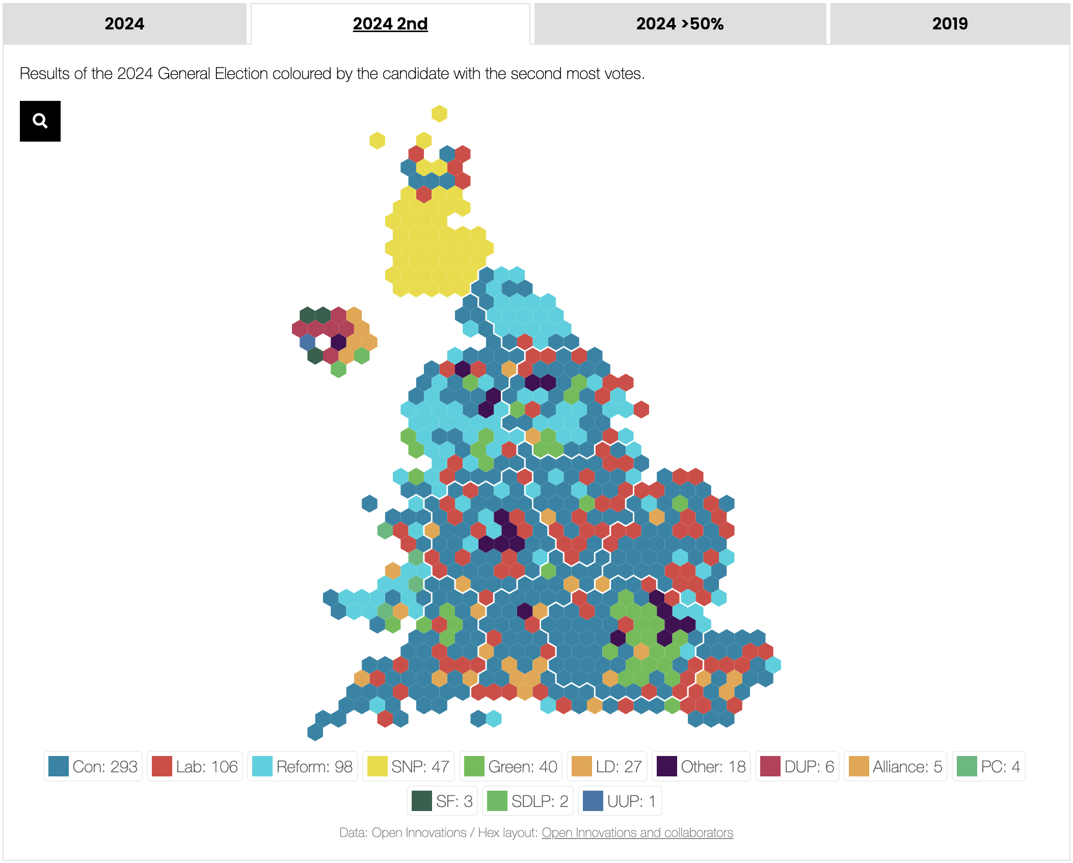
Open Innovations utilizes a cartogram-only view, referred to here as a “hex map.” This visualization project, however, not only shows the winning party (for the 2024 and 2019 general elections). It also offers additional layers of analysis by providing two specific hex maps. In one, constituencies are colored based on the party with the second most votes. The other reveals where the winner secured more than 50% of the vote. These details provide deeper insights into the electoral competition.
8. The New York Times
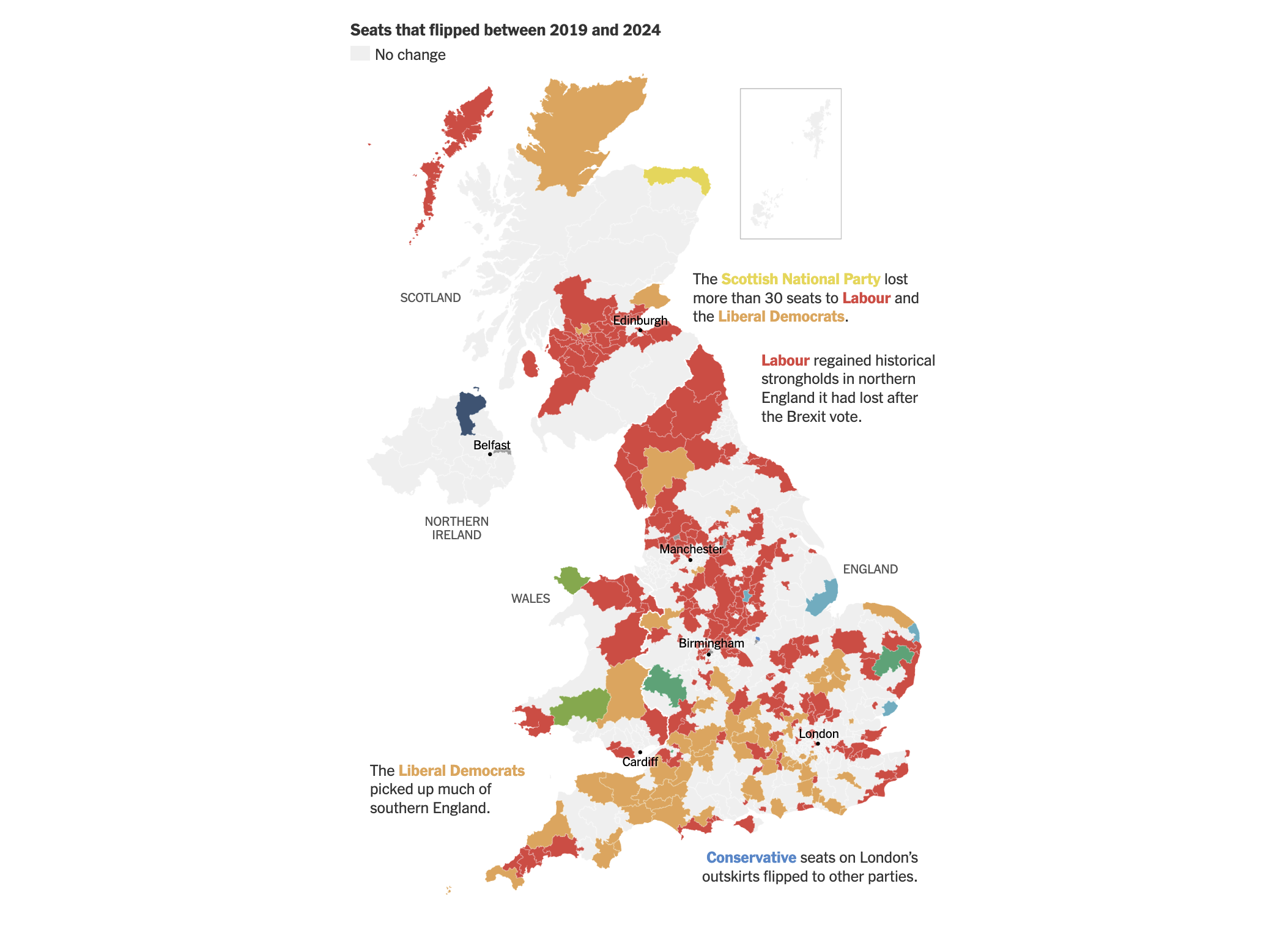
The New York Times has the article “Anatomy of a Landslide” by Josh Holder and Lauren Weatherby, which covers the UK election with visualizations. It starts with a UK map that uses arrows to illustrate the decrease in vote share for the Conservatives across the country. This is followed by a choropleth map highlighting constituencies that flipped between the 2019 and 2024 elections, with helpful annotations to underscore major geographical trends.
More UK Election Maps
Here’s where you can find more maps visualizing the 2024 UK general election results:
- Al Jazeera
- Bloomberg
- Daily Mail
- The Economist
- Election Maps UK
- The Hindu
- i newspaper
- MAPROOM
- Metro
- Mirror
- POLITICO
- The Spectator
- The Sun
- The Telegraph
- The Times
- Yahoo News
Wrapping Up
Here are some UK election maps we’ve found worth checking out. The most common types of such visualizations, choropleth and cartogram, are often used in conjunction to provide a comprehensive view of election results. If you are interested in developing election maps, we encourage you to examine each featured project closely. Notice the differences in color, tooltips, hover and click functionalities, data point grouping, and so on. Consider what and how these elements might be implemented in your own projects to convey voting trends and patterns in the most efficient and effective manner.
Moreover, each of these UK election map visualization projects includes data charts that provide insights into the current election results and the distribution of MP seats in Parliament. For those particularly interested in charts, the analysis featured in The NYT’s piece may be especially noteworthy.
Ready to build your own interactive choropleth maps with ease? Learn how to create a choropleth map using JavaScript with our detailed step-by-step tutorial and explore our choropleth map documentation to get started.
Looking to broaden your data visualization skills? Visit our encyclopedia of chart types, where you’ll find descriptions and examples of a wide range of charts (and maps) to help you choose the right visualization for your data. Additionally, our JavaScript charting tutorials provide guidance on creating various visual data graphics.
- Categories: Data Visualization Weekly
- No Comments »
