 Ready for a fresh dose of impressive data visualizations crafted by seasoned professionals? Here’s what DataViz Weekly has in store for you this time:
- Weather forecast accuracy across the United States — The Washington Post
- U.S. college admission rates — FlowingData
- Global demographic shifts — Our World in Data
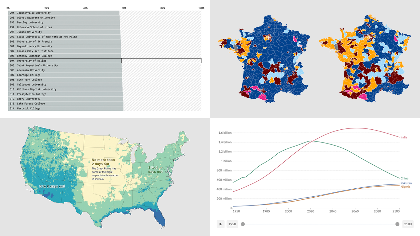
- France’s parliamentary election results — Various publications
Data Visualization Weekly: July 5, 2024 — July 12, 2024
Weather Forecast Accuracy Across U.S.
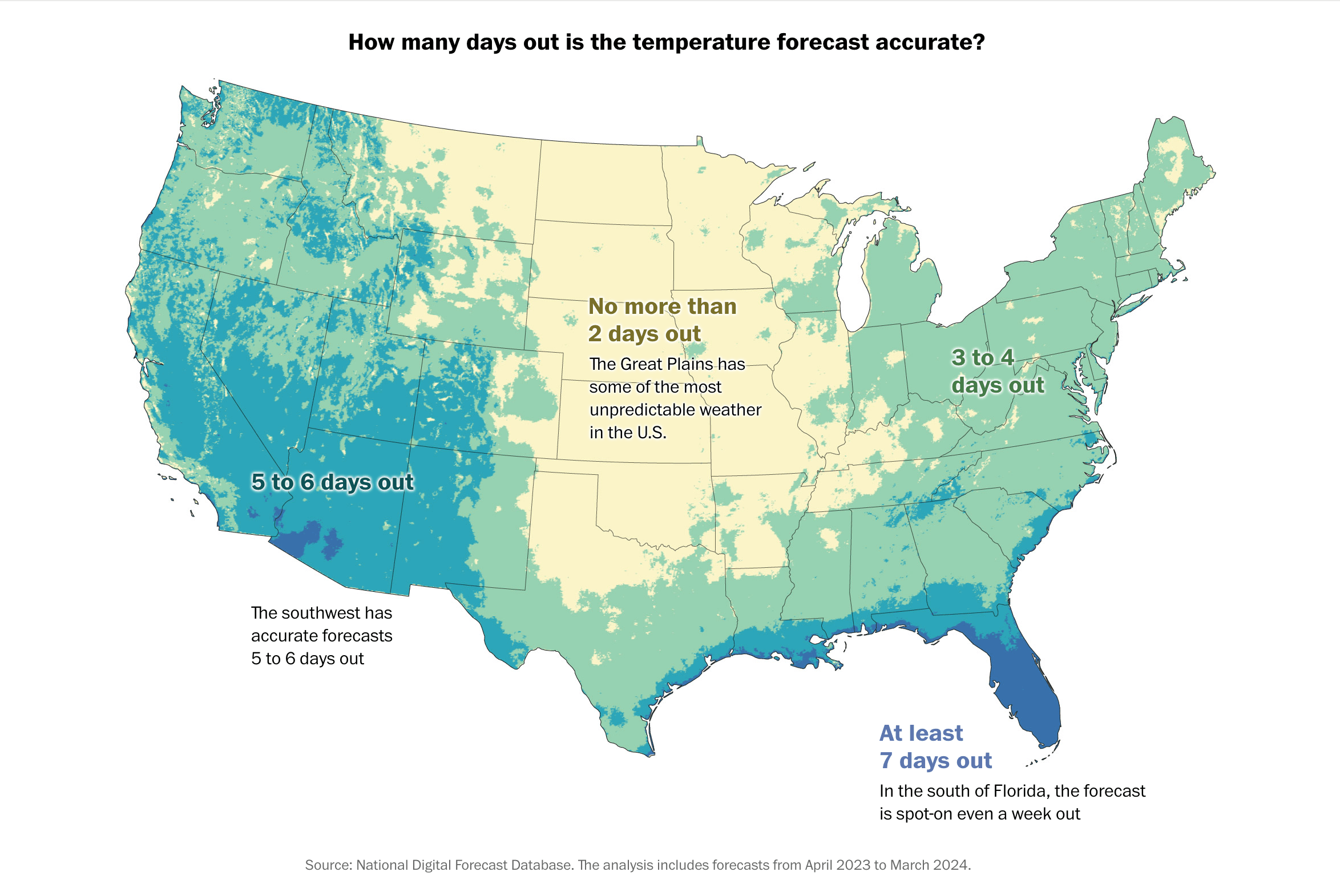
Many people critique the accuracy of weather forecasts, but certain areas have more substantial reasons for dissatisfaction. In some regions, forecasts predict temperatures accurately a week in advance, while in other areas, even next-day forecasts can be incorrect.
Harry Stevens and Niko Kommenda from The Washington Post conducted an analysis using newly released data from the National Digital Forecast Database. This data sheds light on both the broad patterns and specific details of the accuracy of the National Weather Service’s official forecasts, which play a critical role in activating the nation’s emergency alert systems and fuel numerous commercial weather applications.
To present these insights, they crafted an interactive map of the contiguous United States, illustrating the duration for which the Weather Service’s high temperature forecasts remain accurate within three degrees Fahrenheit. They also designed a chart that allows users to assess the temperature forecast accuracy for individual U.S. cities.
Check out the graphics on The Washington Post.
U.S. College Admission Rates
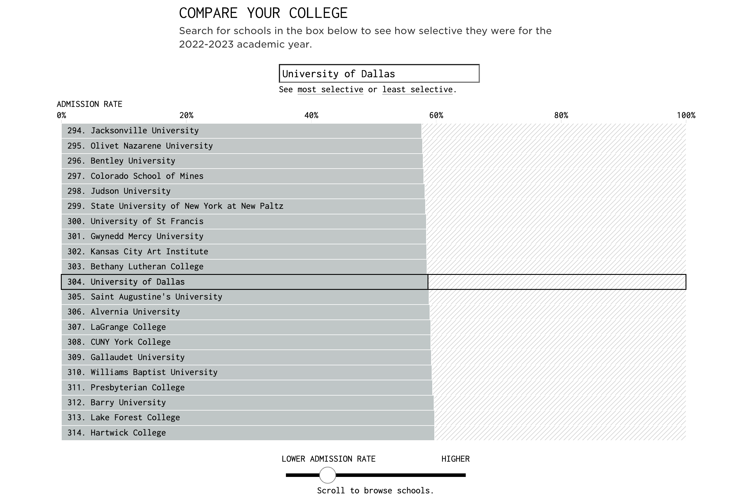
The variance in college admission rates across the U.S. is substantial. For the 2022-2023 academic year, the California Institute of Technology boasted the lowest acceptance rate, under 3%, making it the most exclusive institution. Close behind in selectivity are Harvard, Stanford, Columbia, and MIT, which complete the top five. However, being rejected by these elite schools doesn’t spell the end of college aspirations. In fact, most colleges (around 85%) accept more than half of their applicants, offering numerous opportunities for prospective students.
That’s according to the United States Department of Education’s College Scorecard data effectively visualized by Nathan Yau. He created an interactive bar chart that covers just under 1,400 institutions that grant at least a bachelor’s degree and have a minimum of 500 undergraduates. This tool allows you to explore and compare how selective various schools were in the 2022-2023 academic year. Then you can explore broader admission trends through a histogram.
Look at the visualizations and read more on FlowingData.
Global Demographic Shifts
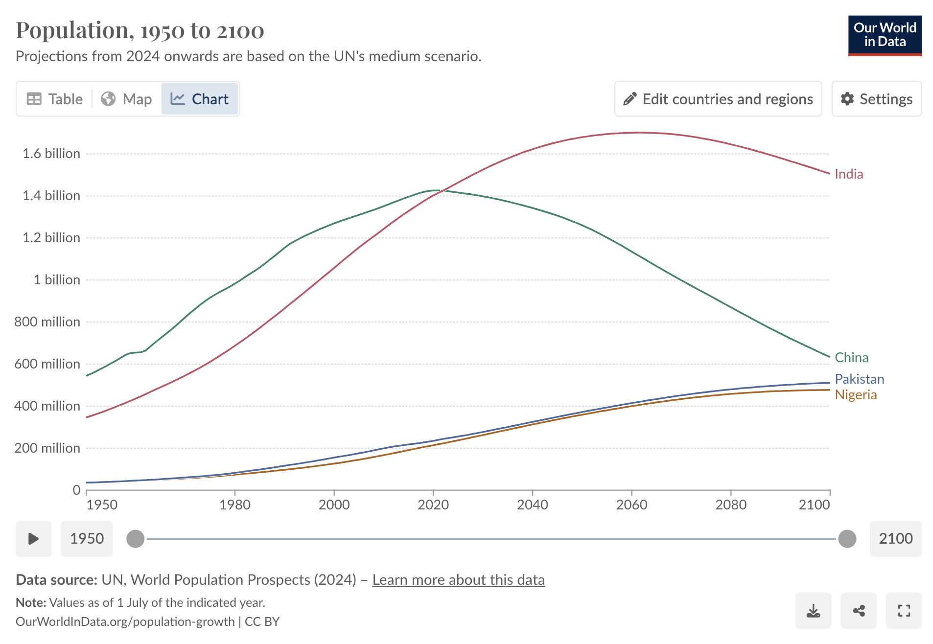
How many people currently inhabit our planet? What are the global birth and death statistics, and how might demographic trends evolve in the years to come? The Population Division of the Department of Economic and Social Affairs of the United Nations Secretariat provides answers to these pivotal questions through the biennial update of the World Population Prospects. The most recent update was issued this week.
Following this release, Our World in Data has updated its demographic datasets and visualizations to incorporate the latest figures and published an article summarizing the principal findings from this new iteration of the UN’s population data. The article features a range of visual tools that illustrate current population estimates and future projections, comparing these new findings with those from the earlier 2022 edition. Detailed analysis covers variables such as total population numbers, fertility trends, life expectancy, and migration patterns, with data available for individual countries.
Explore the article by Hannah Ritchie and Lucas Rodés-Guirao on Our World in Data’s website.
France’s Parliamentary Election Results
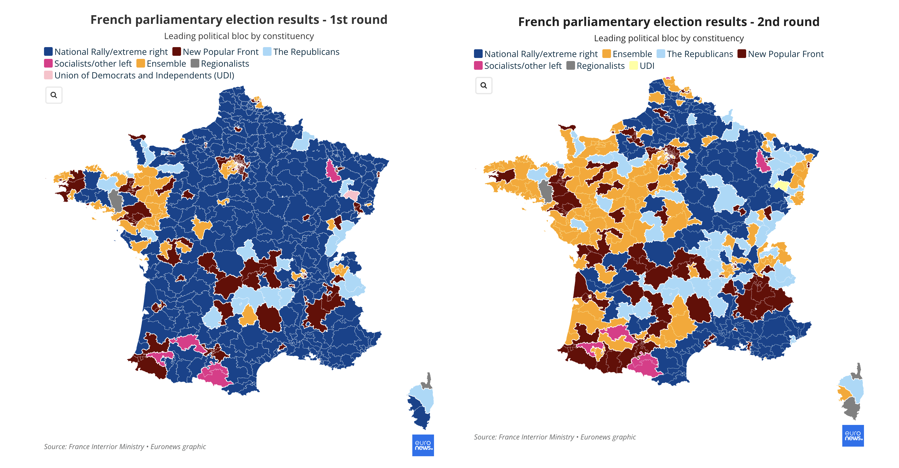
After the second round of voting in France’s national parliamentary election, the left secured 182 seats, surpassing President Emmanuel Macron’s coalition, which captured 168 seats. The far-right Rassemblement National and its allies amassed 143 seats, according to the final results.
With numerous elections happening around the world recently, election maps have become quite ubiquitous tools, as they effectively serve for making sense of voting outcomes. In our previous, special edition of DataViz Weekly, we explored UK election maps. Now, we’ve curated a selection of projects that analyze the results of this French second-round vote. These resources are assembled here below for you to explore, listed in no particular order. If there are additional notable projects we haven’t included, please feel free to suggest them in the comments or get in touch in your preferred way.
- Le Parisien
- Néocarto
- Agence France-Presse
- Le Monde
- Euronews
- Politico
- The New York Times
- The Financial Times
- Bloomberg
Wrapping Up
Thank you for joining us for this edition of Data Visualization Weekly. We hope you found these charts and maps as insightful and engaging as we did. Each project demonstrates the power of data visualization in making complex information more accessible and understandable. Stay tuned for our next edition, where we’ll continue to bring you the latest and most intriguing data stories from around the web.
- Categories: Data Visualization Weekly
- No Comments »