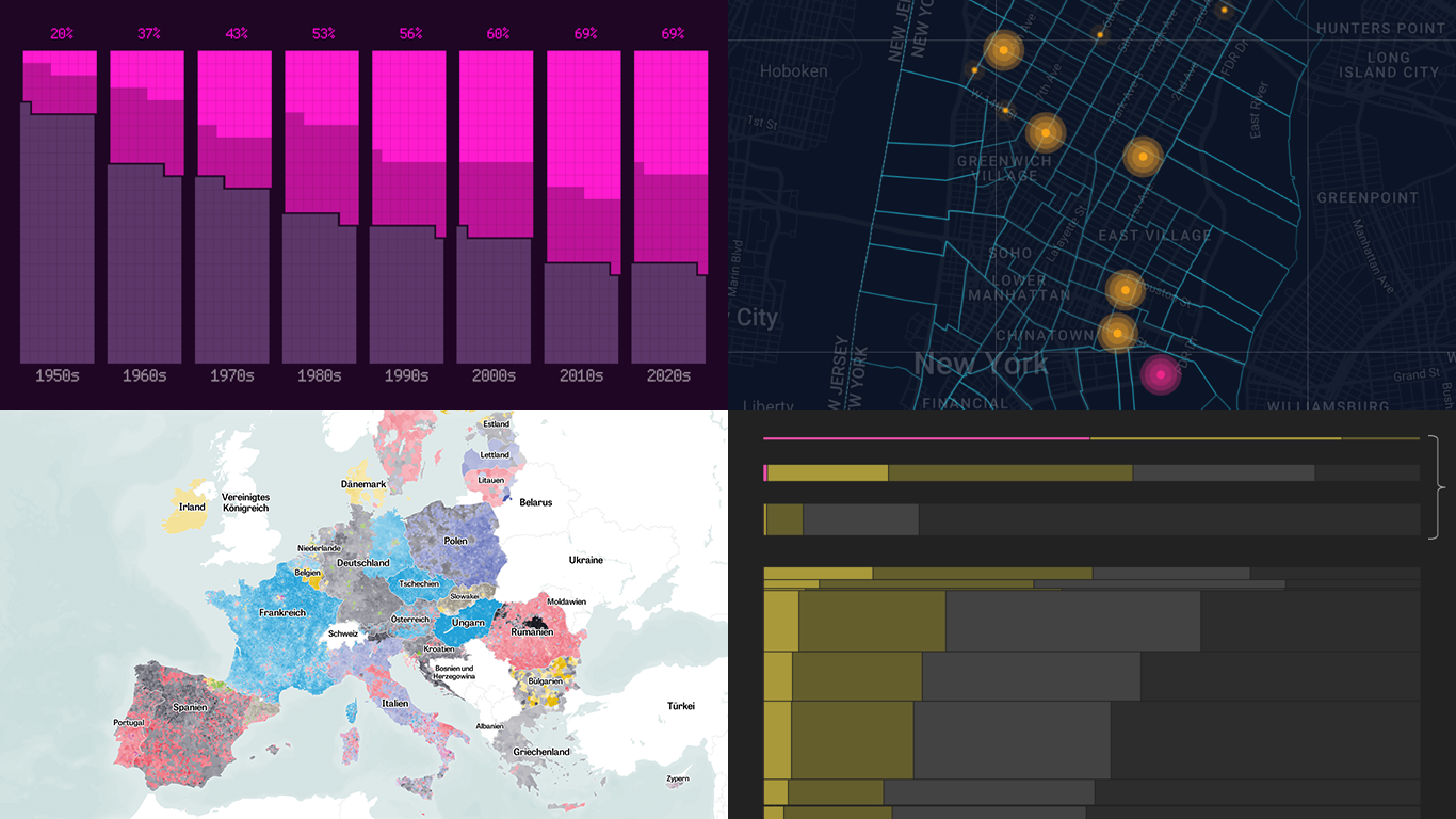
 Data is easier to explore and analyze when visualized. If you’re looking for practical examples, you’ve arrived at the right place. DataViz Weekly is here to introduce you to some new data visualization projects we have found on the web.
- NYC congestion zone crash tracker — Transpo Maps
- 2024 European Parliament election map — ZEIT ONLINE
- Global hunger insights — Reuters
- Evolution of sci-fi films — The Pudding
Data Visualization Weekly: July 12, 2024 — July 19, 2024
NYC Congestion Zone Crash Tracker
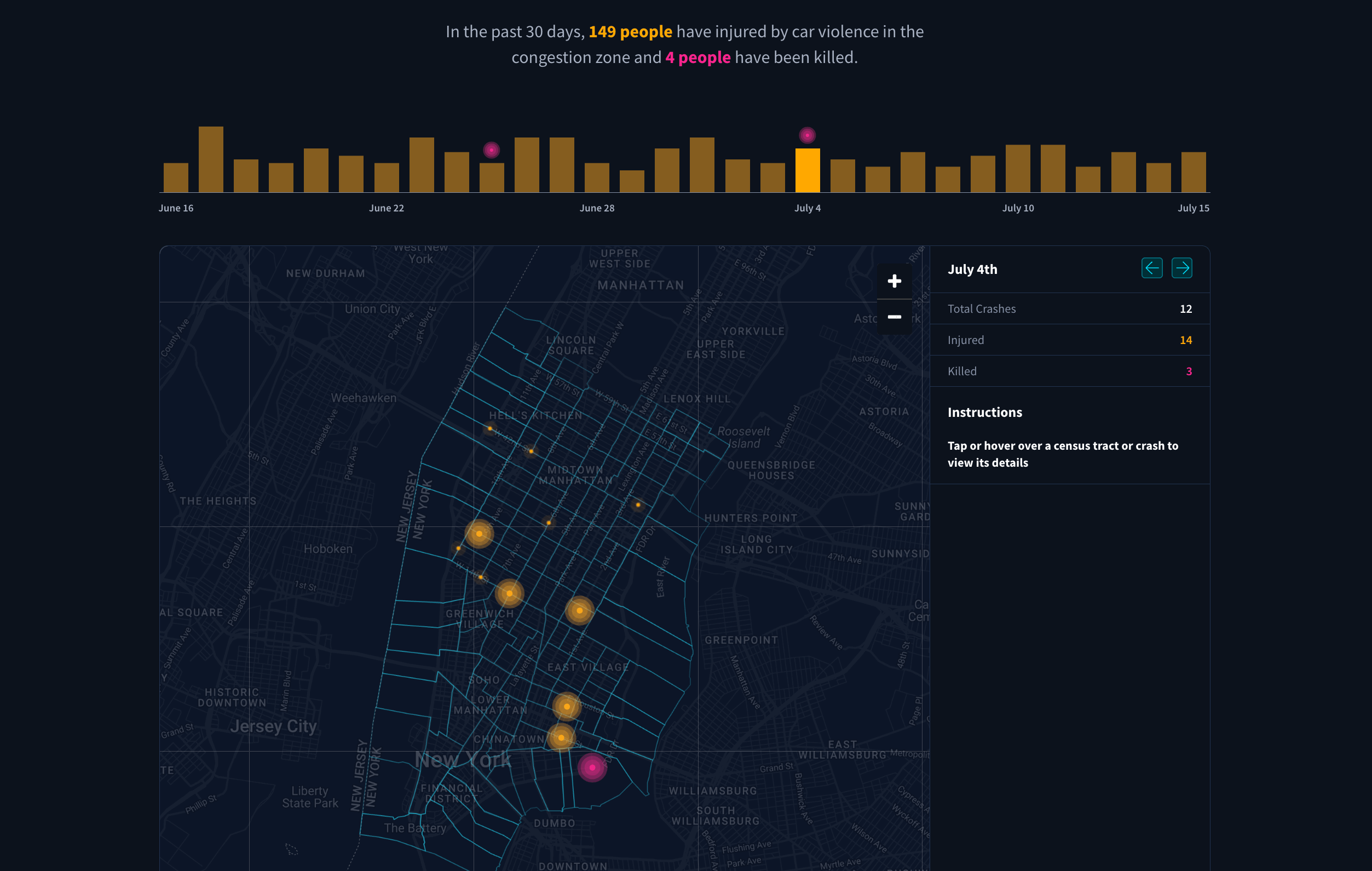
Data from New York City’s Open Data platform indicates there were nearly 10,000 vehicle collisions within New York City’s congestion pricing zone in 2023, averaging one crash every 54 minutes. Since January 1, 2024, over 1,400 people have been injured and 11 fatalities have occurred due to vehicle accidents. Experts had considered congestion pricing — a fee for vehicles entering or operating within Manhattan’s central business district — as a potential remedy. Nevertheless, Governor Kathy Hochul of New York called off the planned congestion pricing program last month.
The team at Transpo Maps, specifically Stephen Braitsch, Sam Vogt, and Beaudry Kock, have developed a crash tracker designed to monitor vehicle-related injuries in New York City’s congestion pricing zone. Using data from NYC’s Open Data portal, this tool maps the locations of vehicle crashes over the past 30 days as of the latest available data (at the time of writing — as of July 15), highlighting areas where people were injured or killed.
The tracker is updated as new data becomes available. “We hope this tool can help our friends in New York pressure Governor Hochul to reverse her disastrous decision and implement congestion pricing immediately,” commented Stephen Braitsch.
Explore the NYC Congestion Zone Live Crash Tracker on the website of Transpo Maps.
2024 European Parliament Election Map
The recent European Parliament elections, held across the European Union, reflect a vibrant yet increasingly polarized political landscape. As political fringes gain strength, the dynamics within the European Parliament are shifting noticeably.
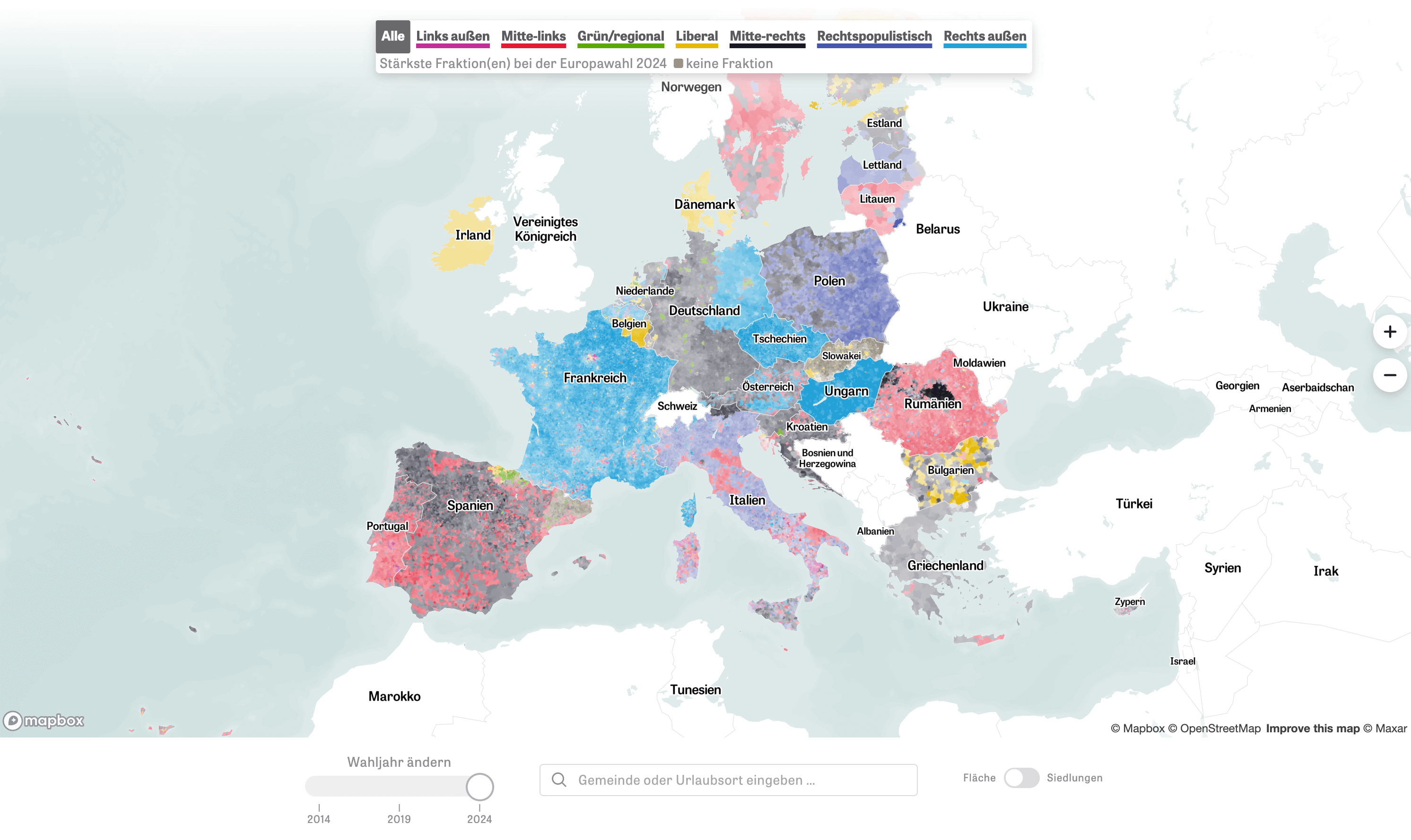
At the start of the new parliamentary term this week, ZEIT ONLINE has released an extensive analysis of the results from all 27 EU countries, covering about 83,000 municipalities. In particular, they created a comprehensive map, claimed to be the most detailed EU election map.
The map displays the political alignment of the predominant candidate in each area, allowing you to visually compare the 2024 results with those from the 2014 and 2019 elections. By toggling between these election years, you can trace the broader political shifts across Europe. It’s also possible to switch between area and settlement views.
Take a look at the article on ZEIT ONLINE, by Jakob Bauer, Paul Blickle, Tamara Flemisch, Arnold Platon, Michael Schlieben, and Julius Tröger.
Global Hunger Insights
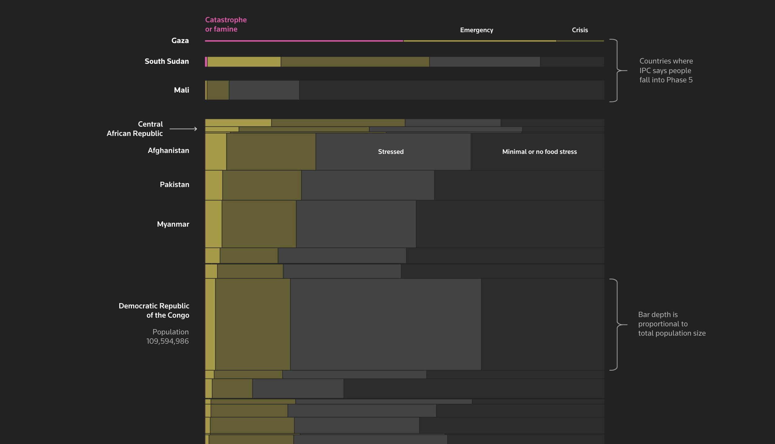
According to the Integrated Food Security Phase Classification (IPC), an estimated 166 million people globally require immediate action to combat hunger. This figure includes almost every resident in the Gaza Strip, where the Israeli military has launched operations following an attack by Hamas militants. In Gaza, over one million people are experiencing the most severe level of malnutrition, which the IPC categorizes as ‘Catastrophe or Famine.’
A recent Reuters article examines global famine, focusing particularly on the dire situation of starving children in Gaza. The piece is enhanced by graphic illustrations that engage readers, deepening the emotional impact of the stories told. It also features a Bar Mekko chart — a type of Mosaic Plot — that visually represents the extent of food insecurity and malnutrition across various countries, categorized into IPC’s phases 3, 4, and 5 on the five-category scale.
Check out the piece on Reuters, by Mahmoud Issa, Adolfo Arranz, Mariano Zafra, Jitesh Chowdhury, and Tom Perry.
Evolution of Sci-Fi Films
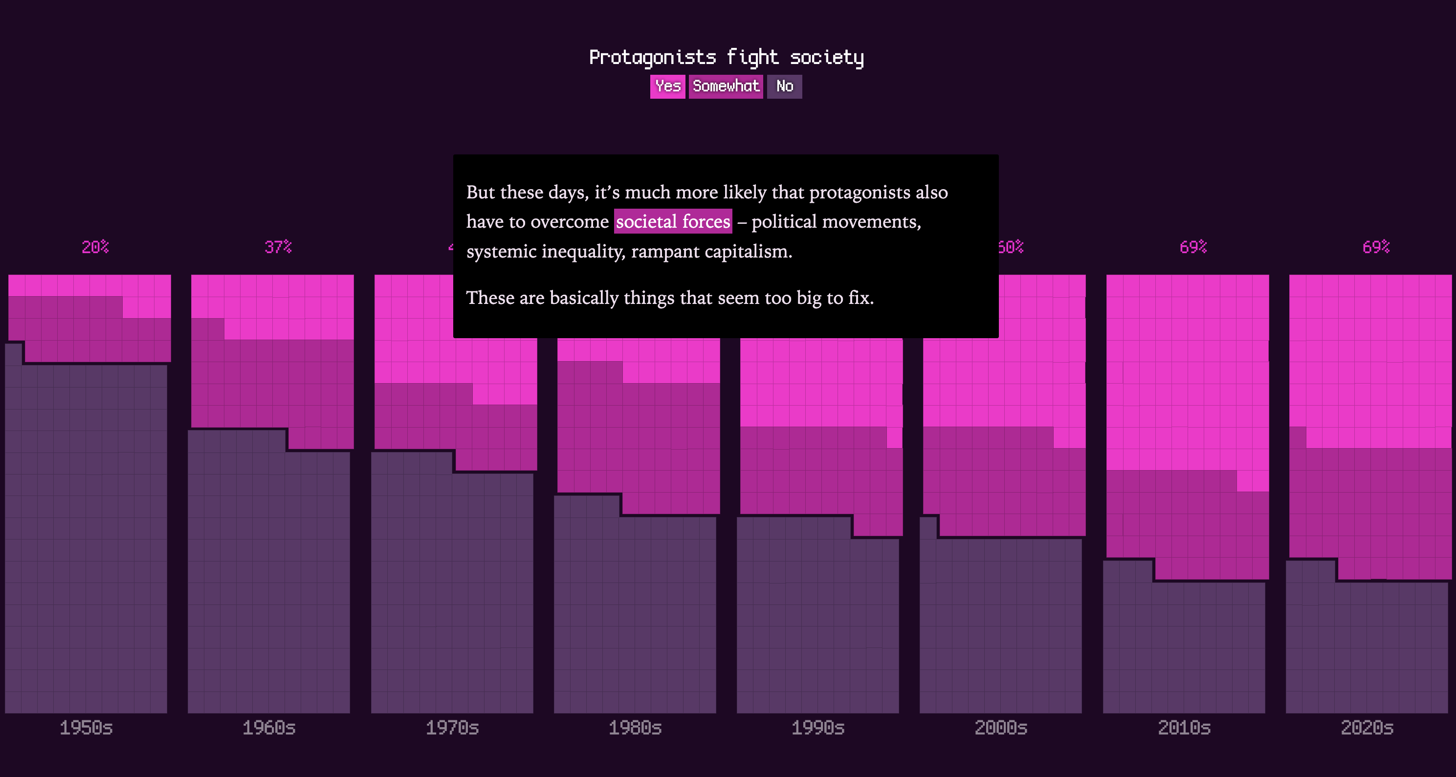
Science fiction films have undergone significant transformations over the past seven decades. Initially celebrated for their optimistic and inspiring narratives, the genre has gradually come to mirror our collective fears and anxieties.
In an engaging analysis for The Pudding, Alvin Chang delves into how the settings, protagonists’ goals, narrative themes, and conclusions of sci-fi films and TV shows have shifted since the 1950s. The story is worth scrolling rather than telling about. As you explore the piece, you encounter a series of mosaic-based columns, each representing a decade, with individual squares depicting films. This visual arrangement allows you to observe changing trends in the genre, with squares cleverly grouped to illustrate various percentages.
Scroll through the visual data story on The Pudding.
Wrapping Up
We will continue to provide updates on interesting data visualization projects and examples we discover on the web. Stay tuned to DataViz Weekly to explore more.
- Categories: Data Visualization Weekly
- No Comments »