JavaScript Gantt Chart with Custom Data Grid Header Font — JS Chart Tips
August 20th, 2024 by AnyChart Team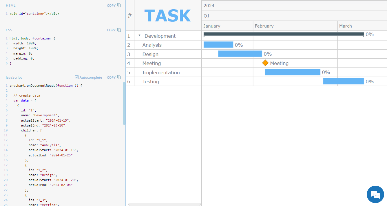 Hey everyone! We’re excited to launch a new regular feature on our blog called JS Chart Tips. In this series, we’ll share some recent cases handled by our Support Team for users of our JavaScript charting library, highlighting both frequent questions and those unique solutions that shouldn’t remain hidden.
Whether these scenarios directly resonate with a challenge you’re facing or simply spark an idea for your current or future data visualization development tasks, we hope you’ll find valuable insights. Each entry will include code snippets and JS chart examples to illustrate the solutions. If you get additional questions or need more details, simply comment below or contact our Support Team directly. We’re here to help enhance your JavaScript charting experience!
Without further ado, welcome to the first edition of JS Chart Tips! Today, you’ll learn how to customize the font of the data grid header in a JavaScript Gantt chart.
- Categories: AnyChart Charting Component, AnyGantt, Business Intelligence, Gantt Chart, HTML5, JavaScript, JS Chart Tips, Tips and Tricks
- No Comments »
Unlocking Visual Data Insights — DataViz Weekly
August 16th, 2024 by AnyChart Team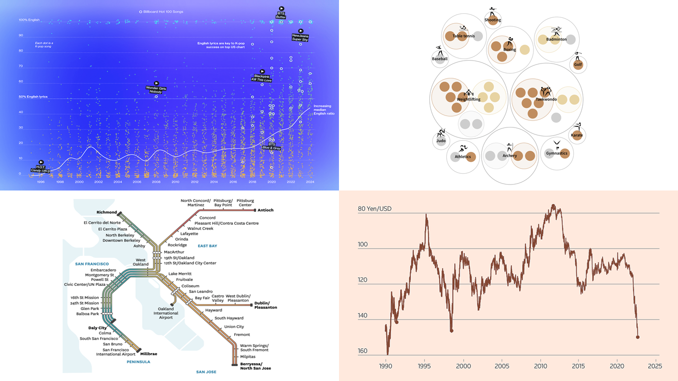 Data speaks louder when it’s represented graphically. Unlock the power of visual data insights in our new edition of DataViz Weekly, putting a spotlight on new charts and maps that make trends and patterns clear and engaging. Take a look at the projects that have stood out to us this week:
- K-pop’s global reach through internationalization — Bloomberg
- The Bay Area’s microclimates revealed through the BART network — The San Francisco Chronicle
- Taiwan’s Olympic medals — Taiwan Data Stories
- Yen fluctuations and the Bank of Japan’s influence — Reuters
- Categories: Data Visualization Weekly
- No Comments »
Paris 2024 Olympic Medal Count Trackers — DataViz Weekly
August 9th, 2024 by AnyChart Team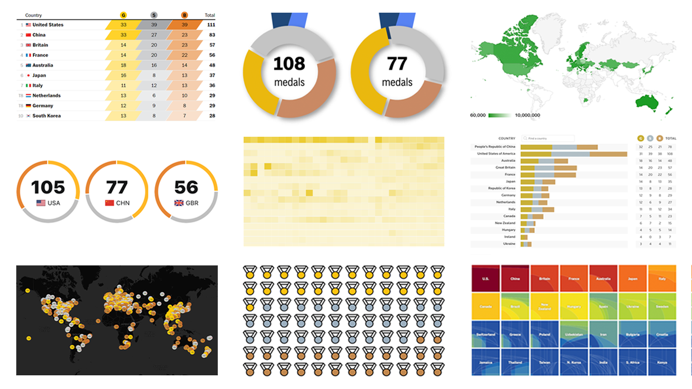 The Paris Summer Olympics are in full swing. If you’re interested in tracking the results and want to know which countries are excelling, numerous media outlets have prepared a variety of medal count trackers. In this special edition of DataViz Weekly, we showcase a selection of these projects, with a special focus on those that not only display numbers but also present them through compelling visualizations. Let’s dive in!
- Categories: Data Visualization Weekly
- No Comments »
Fresh Charts and Maps You Need to See — DataViz Weekly
August 2nd, 2024 by AnyChart Team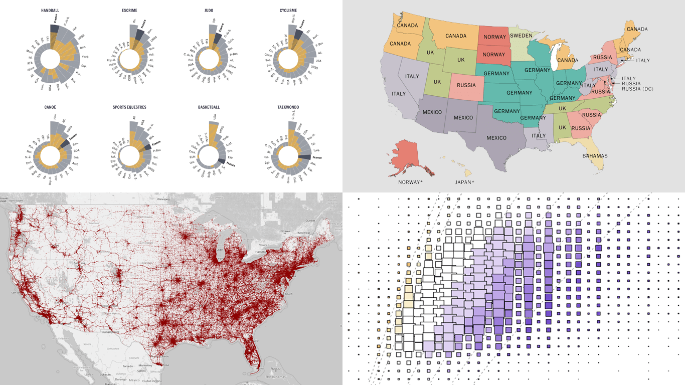 Greetings from DataViz Weekly, a feature on our blog dedicated to exploring the power of charts and maps in uncovering and communicating data. As visual creatures, humans understand and engage with information more effectively when it’s presented in graphical form. Our series focuses on highlighting outstanding and fresh data visualizations that have captured our attention. Today, we’ll showcase these great projects:
- Olympic performances since 1948 with focus on France — Le Monde
- U.S. immigrant origins and settlements in 1850–2022 — Pew Research Center
- Body mass index in the United States — FlowingData
- Traffic fatalities in the U.S. in 2001–2022 — Roadway Report
- Categories: Data Visualization Weekly
- No Comments »