 Greetings from DataViz Weekly, a feature on our blog dedicated to exploring the power of charts and maps in uncovering and communicating data. As visual creatures, humans understand and engage with information more effectively when it’s presented in graphical form. Our series focuses on highlighting outstanding and fresh data visualizations that have captured our attention. Today, we’ll showcase these great projects:
- Olympic performances since 1948 with focus on France — Le Monde
- U.S. immigrant origins and settlements in 1850–2022 — Pew Research Center
- Body mass index in the United States — FlowingData
- Traffic fatalities in the U.S. in 2001–2022 — Roadway Report
Data Visualization Weekly: July 26, 2024 — August 2, 2024
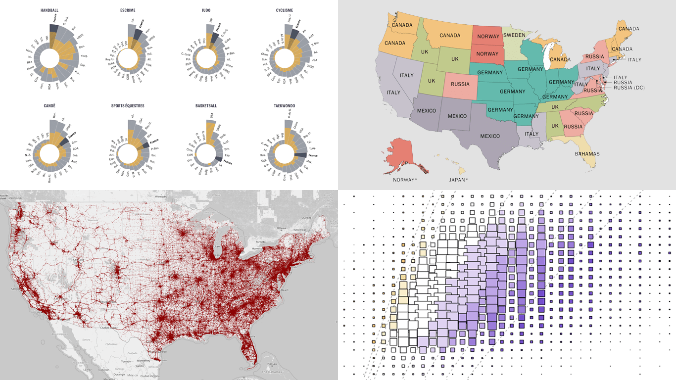
Olympic Performances Since 1948 with Focus on France
The Paris 2024 Olympic Games were officially inaugurated last Friday, with the opening ceremony igniting excitement across the nation. As the games progress until the closing ceremony on August 11, many are eager to see if French athletes can meet the Élysée’s challenge to rank in the top five of the medal standings — a significant improvement aimed after finishing tenth at the Tokyo 2020 Olympics, held in 2021.
Le Monde explores France’s prospects of achieving this ambitious goal through a detailed graphical analysis of Olympic performances since 1948. This analysis utilizes interactive polar charts with columns, also known as Nightingale rose charts. Each chart is dedicated to a single sport and displays medal counts for the top 25 countries, emphasizing France’s achievements and detailing both total and gold medals.
Check out the analysis on Le Monde, authored by Romain Imbach and Adel Miliani.
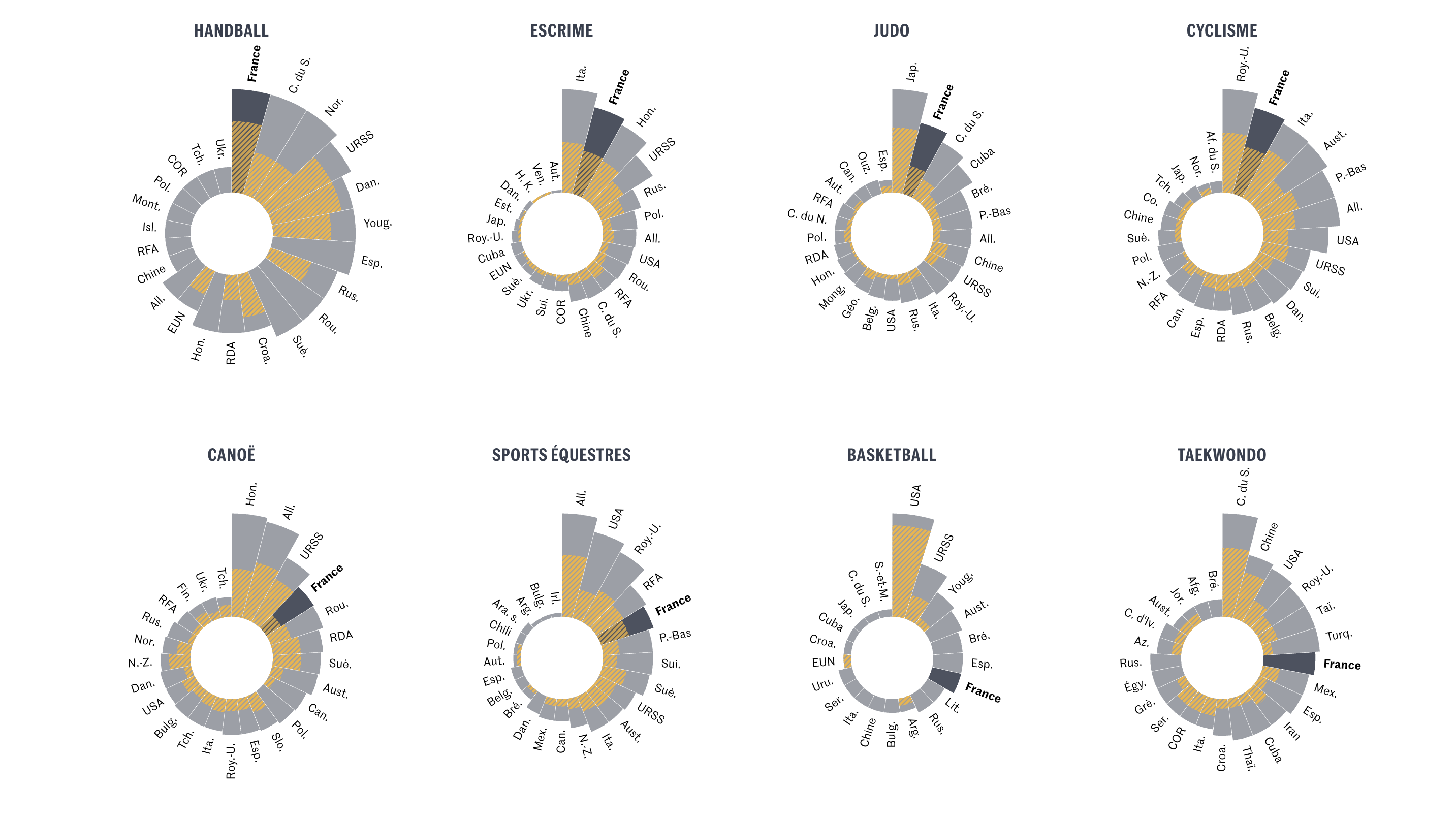
U.S. Immigrant Origins and Settlements in 1850–2022
The United States remains the prime destination globally for international migration. Since 1965, the U.S. has welcomed over 70 million immigrants. As of 2022, the immigrant population peaked at 46.1 million, making up 13.8% of the total U.S. population. These individuals originate from nearly every country, with the most significant numbers from Mexico and India. This demographic landscape marks a shift from 1920, for example, when the majority of immigrants in the U.S. were from Germany and Italy.
This information comes from a Pew Research Center analysis of data from the U.S. Census Bureau, spanning from 1850 to 2022. The study includes detailed choropleth maps that provide insights into where immigrants have settled across the U.S. and illustrates the leading country of birth for immigrants in each state for every census year since 1850 (excluding 1890 due to the loss of microdata in a 1921 fire). An interactive animation shows at a glance the shifting origins of America’s immigrants and reveals distinct immigration waves over the years.
Discover the maps on Pew Research’s website, in a project by Jeffrey S. Passel, Jens Manuel Krogstad, and Mohamad Moslimani.
Body Mass Index in U.S.
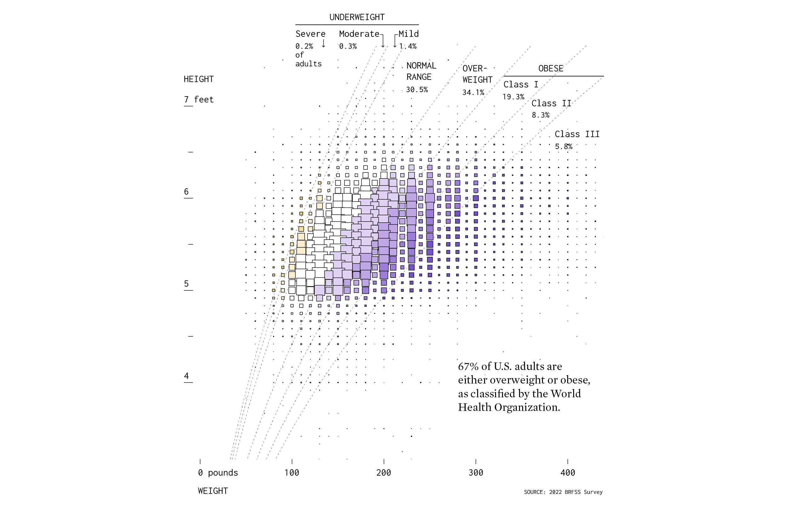
Body Mass Index (BMI) is a numerical calculation that evaluates whether a person’s body weight is appropriate for their height. It offers a simple method to gauge one’s body fat and identify potential health risks associated with both underweight and overweight conditions.
Nathan Yau showcases the distribution of height and weight across the U.S. population through a scatter chart published on his blog, FlowingData. This visualization is based on the 2022 Behavioral Risk Factor Surveillance System (BRFSS) survey conducted by the CDC. In the chart, larger squares indicate more common weight and height combinations among adults, while colors denote different BMI categories. The analysis reveals that most Americans fall into the overweight or obese categories, with slightly over 30% categorized as having a normal BMI.
Take a look at the chart on FlowingData.
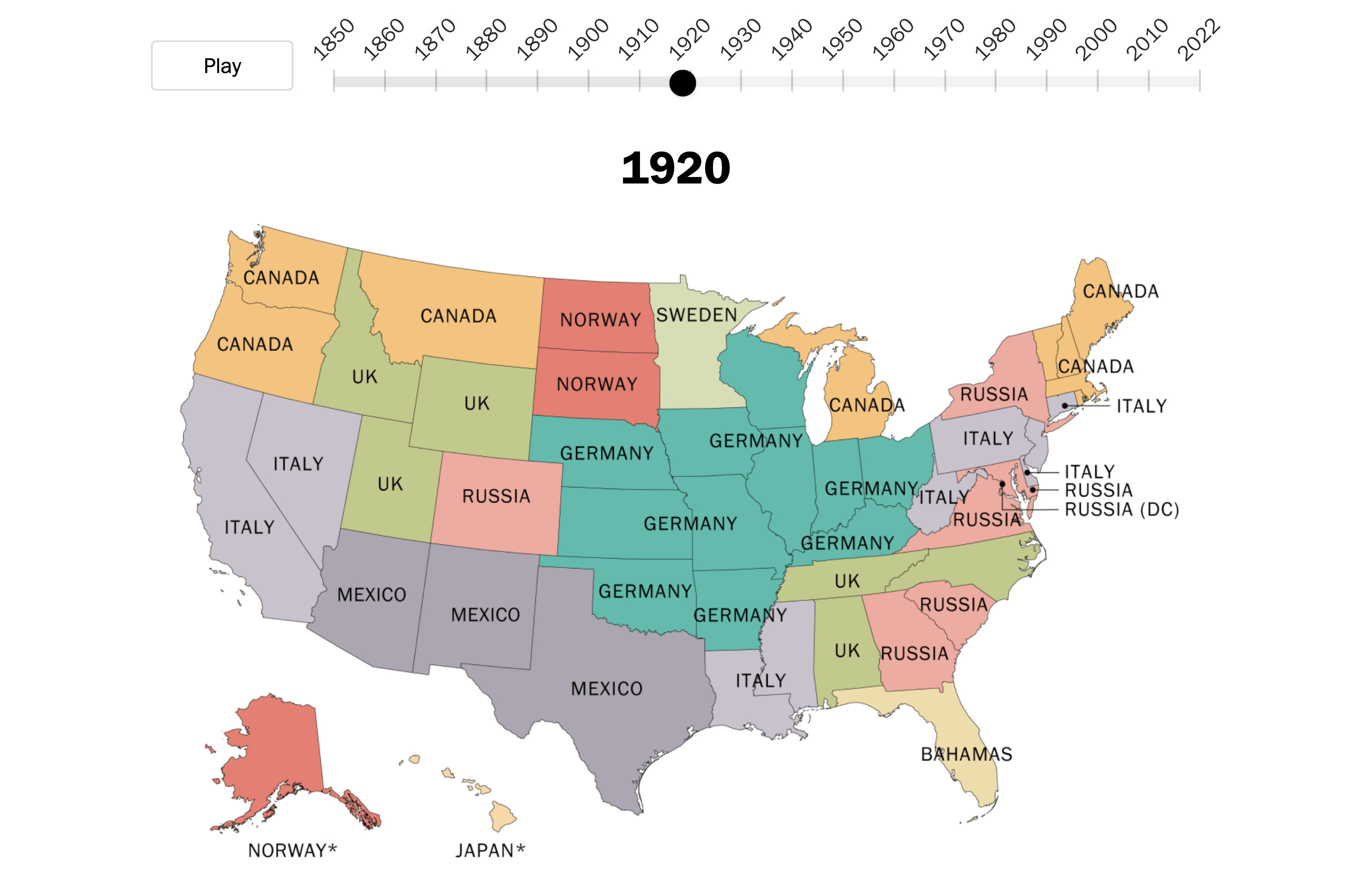
Traffic Fatalities in U.S. in 2001–2022
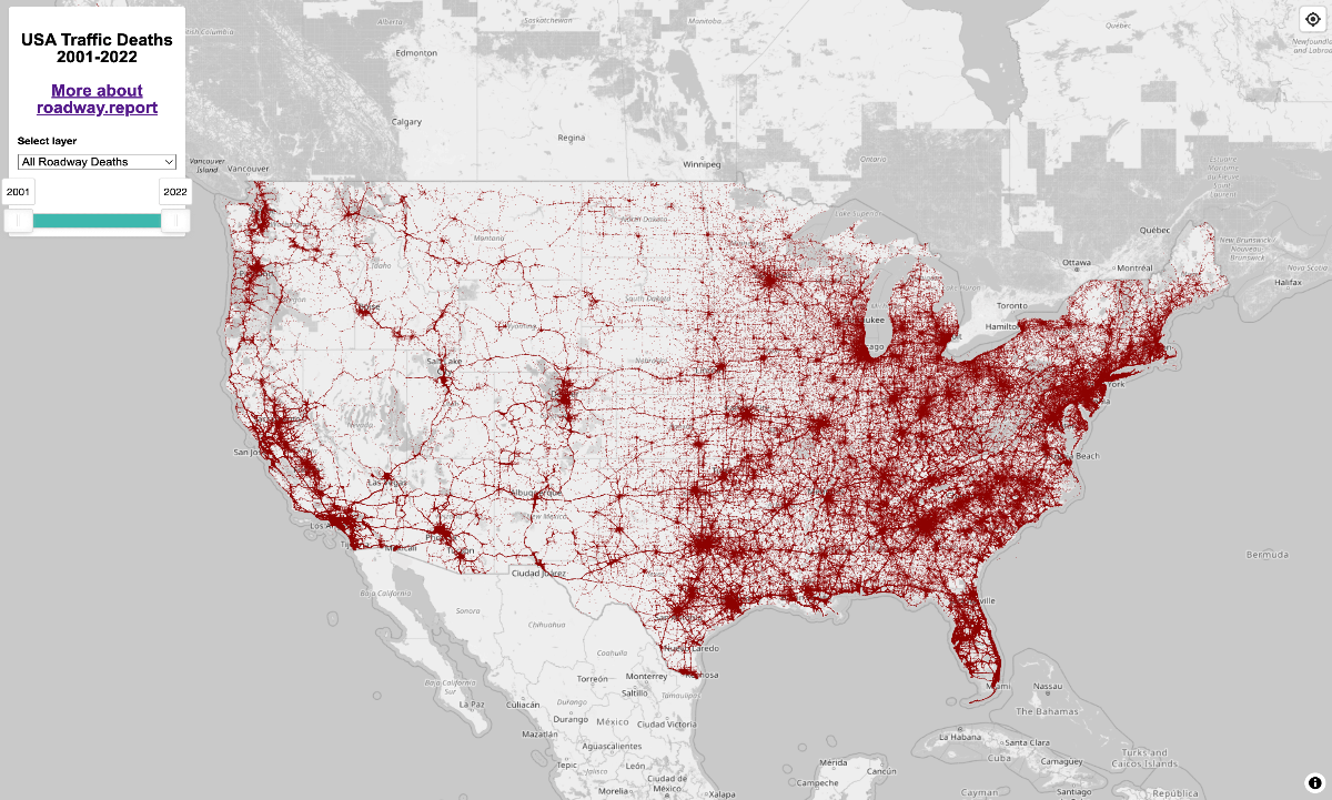
Traffic fatalities remain a significant concern in the United States. Over the last three years, from 2021 to 2023, more than 125,000 lives were lost in motor vehicle crashes, data from the National Highway Traffic Safety Administration (NHTSA) reveals.
Ben Carneiro has utilized data from NHTSA’s Fatality Analysis Reporting System (FARS) to create an interactive dot map that chronicles road fatalities from 2001 to 2022 across the nation. The map allows you to adjust the timeframe to a single year or several years and filter results by types of victims, such as drivers/passengers or pedestrians/cyclists/others. A cautionary note in the description of the project states, “There are four unmapped deaths for every death on the map,” highlighting potential data gaps. Click on individual dots to access detailed public record data for each specific accident.
See the map on the Roadway Report website.
Wrapping Up
We hope you found these data visualization projects both informative and inspiring. Whether they sparked new ideas or simply broadened your perspective on interesting topics, we’re glad to have shared them with you. Stay tuned for more captivating data viz in our next issue of Data Visualization Weekly.
- Categories: Data Visualization Weekly
- No Comments »