 The Paris Summer Olympics are in full swing. If you’re interested in tracking the results and want to know which countries are excelling, numerous media outlets have prepared a variety of medal count trackers. In this special edition of DataViz Weekly, we showcase a selection of these projects, with a special focus on those that not only display numbers but also present them through compelling visualizations. Let’s dive in!
Data Visualization Weekly: August 2–9, 2024 | Paris 2024 Special Edition
1. Olympic Medal Count Trackers with Data Visualizations
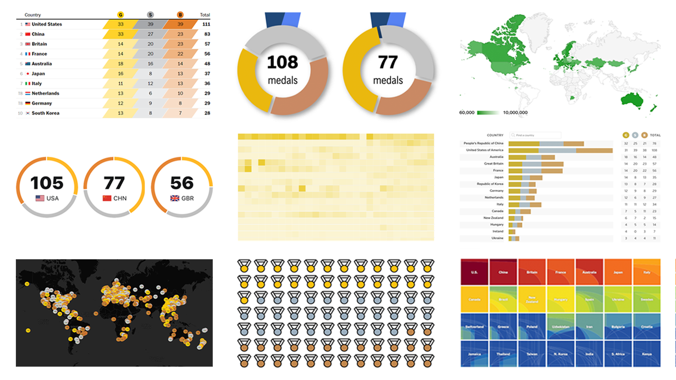
ESPN
![]()
ESPN provides a traditional table of medal counts where you can sort by gold, silver, bronze, and total medals. Additionally, for the top three ranking leaders, cute donut charts display the composition of medals by type. This tracker allows switching between country-based and individual athlete views, as well as delve into more details including the result of the medal winners such as time, points, etc.
Associated Press (AP)
![]()
AP’s Olympic medal tracker similarly features a table accompanied by donut charts that visualize the medal composition for the current leaders. If you sort the table by gold medals, the center content of the charts will change from the total number of medals to the gold medal counts. For a geographic perspective, a bubble map shows Olympic medal distribution by country, with options to view only gold, only silver, or only bronze medals, and a button to zoom into the European continent.
Reuters
![]()
Reuters combines a traditional sortable medal table with dynamic stacked bar charts for each listed country. These charts visually break down the total medal count by type within each bar, offering a clear visual distinction of each country’s medal achievements. The Reuters tracker also includes a venue map in the form of a dot map under the Schedule tab. In addition, you can check out an interactive guide to Olympic sports under the Sports tab, providing a compelling visual explainer for each sport competed at the Paris Olympics.
Bloomberg
![]()
Bloomberg’s approach to tracking Paris medal counts starts with a cartogram reflecting the distribution of medals by country. Their table not only allows sorting by medal type but also integrates historical Olympic results, offering a comprehensive view from 1896. Unique metrics consider GDP and population, providing insights into countries performing below or above their “weight” based on economic size and population.
The Washington Post
![]()
The Washington Post’s medal tracking project starts with a visual breakdown of the current top three leaders in total medals using colored proportional rhombuses to distinguish counts for each type of medal. In the overall medal table, numbers are highlighted with parallelograms filled with colors that vary based on the value, with darker shades indicating higher numbers and lighter shades for lower ones. Additional tables categorize countries as “overperforming” or “underperforming” compared to their results in the Tokyo Olympics. You can also search all 2024 medal winners by country or event and explore nations achieving their first-ever Olympic medals. Finally, you can see which countries have never won a Summer Olympics medal, at all or just not gold, illustrated through a choropleth map.
Axios
![]()
Axios presents an elegant Olympic medal count tracker as an infographic, depicting each medal won with a simple colored icon for each country. This visual format provides a quick overview of the total medals accrued by each nation, with hover-over details for additional information about the athlete and event.
EDJNet
![]()
The European Data Journalism Network (EDJNet), thanks to Giorgio Comai’s efforts, offers a unique take by mapping Olympic medal winners based on their NUTS (Nomenclature of Territorial Units for Statistics) region of birth. This interactive marker map layers data from Wikipedia and Wikidata, supplemented by geo-matching to attribute medals to specific regions. Click on a point for details, including a link to the Wikipedia page for the respective athlete.
MedalsPerCapita
![]()
Curious about which countries lead in Olympic medals per capita? Craig Nevill-Manning’s project MedalsPerCapita.com offers up-to-date insights. As of the time of writing, Grenada, Dominica, and Saint Lucia are at the forefront for the highest medals per capita in the Paris 2024 Olympics. The site features not only total but also gold medals per capita, as well as weighted medals per capita and GDP (where bronze = 1, silver = 2, and gold = 4). It also includes general rankings for total and gold medal counts. Interactive choropleth maps provide a geographical view of each of these rankings. Plus, you can view data from all past Summer and Winter Olympics.
The Upshot
![]()
Do you prefer to assess Olympic success by analyzing total medals, or just gold medals, or using some more sophisticated formula? The New York Times’s The Upshot lets you decide the relative worth of different medals and see which country leads based on your preferred measure. Their interactive charts visually represent each country’s potential standings under different valuation scenarios for gold, silver, and bronze. For example, if you value gold medals most, look at the top right corner of the chart. If you think all medals should count equally, the bottom left corner is for you.
2. Olympic Medal Count Trackers without Data Visualizations
There are numerous Paris Olympic medal trackers that focus solely on presenting medal counts through basic tables. While other articles from these sources might feature data visualizations, our attention here is strictly on the medal count trackers themselves. Below, you’ll find a selection of these simpler trackers, which could still serve as valuable references for those interested in examples of table-based data representation.
Medal Tables with Details
These tables provide more than just medal counts, offering additional insights and detailed breakdowns that enhance the understanding of each medal counted, including the sports, athletes, and more:
Basic Medal Tables
For a direct and uncomplicated approach to medal counts, these sources provide basic tables that list the medals without additional context or breakdown:
- USA Today
- The Independent
- BBC
- FOX Sports
- NBC New York
- CNN
- Le Monde
- The Times of India
- France 24
- CBS Sports
Wrapping Up
We hope this overview of Paris Olympic medal count trackers enriches your experience of the 2024 Games, illustrates the powerful role of data visualization in sports analytics, and inspires ideas for your own projects.
Want to see more projects like these? Check out Olympic medal trackers for Beijing 2022 and Tokyo 2020.
Keep following Data Visualization Weekly for more exceptional examples of charts and maps, showcasing real-world best practices. Visit our Chartopedia to learn about different types of data visualizations. Explore our JavaScript chart tutorials for step-by-step instructions on how to create them with ease.
Enjoy visualizing, whether it’s the Olympics or any other data-rich domain!
- Categories: Data Visualization Weekly
- No Comments »