 Data speaks louder when it’s represented graphically. Unlock the power of visual data insights in our new edition of DataViz Weekly, putting a spotlight on new charts and maps that make trends and patterns clear and engaging. Take a look at the projects that have stood out to us this week:
- K-pop’s global reach through internationalization — Bloomberg
- The Bay Area’s microclimates revealed through the BART network — The San Francisco Chronicle
- Taiwan’s Olympic medals — Taiwan Data Stories
- Yen fluctuations and the Bank of Japan’s influence — Reuters
Data Visualization Weekly: August 9, 2024 — August 16, 2024
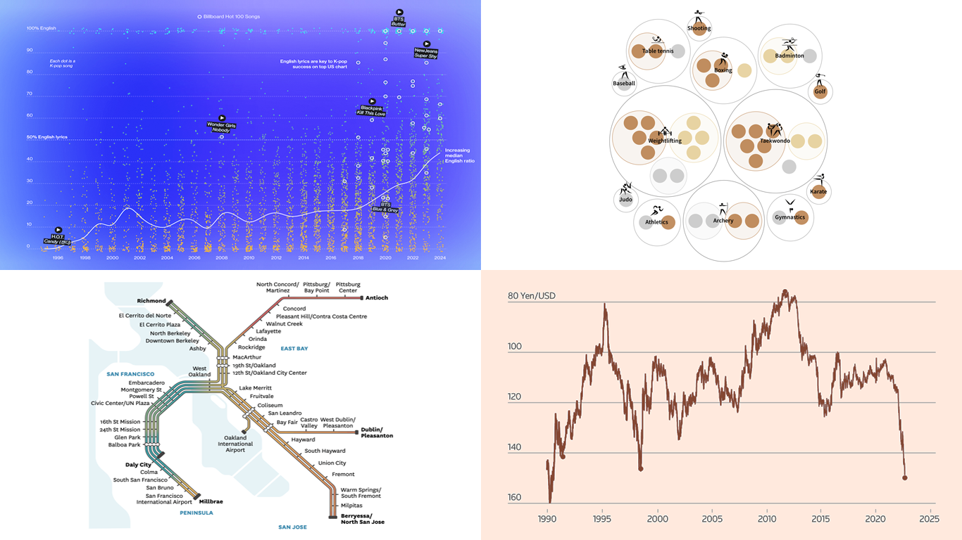
K-Pop Global Reach Through Internationalization
The K-pop industry is undergoing a critical transformation to expand its global reach, moving beyond its traditional Korean roots. This shift includes producing more English-language content and forming bands with international members to appeal to a broader audience.
Bloomberg’s Sohee Kim, Jin Wu, and Jeremy C.F. Lin explored how this strategy could redefine the genre’s future. Their recent piece includes several interesting data visualizations. For example, the one pictured above illustrates the growing trend of English usage in lyrics of K-pop songs over time and its influence on song success in the United States. You can even play some songs directly from there. Another visualization, a Marimekko chart, shows K-pop concert ticket sales broken down by country, revealing the rising global expansion.
Check out the feature on Bloomberg.
Bay Area Microclimates Revealed Through BART Network

The Bay Area is far from uniform when it comes to weather. It has diverse microclimates, and a trip across the 130+ miles of the Bay Area Rapid Transit (BART) system can offer a unique glimpse into these variations, particularly during periods of intense summer heat.
The San Francisco Chronicle’s Jack Lee and Sriharsha Devulapalli mapped how temperatures varied across the BART network on July 6, right on the BART scheme, based on modeled temperature data from the National Centers for Environmental Prediction, spotlighting the stark contrasts. On that day, there was a heatwave in the Bay Area, and temperatures ranged from 108°F in Walnut Creek to just 63°F in Daly City. The hottest areas are shown in red, while the coolest ones are in teal.
Explore the map on The Chronicle.
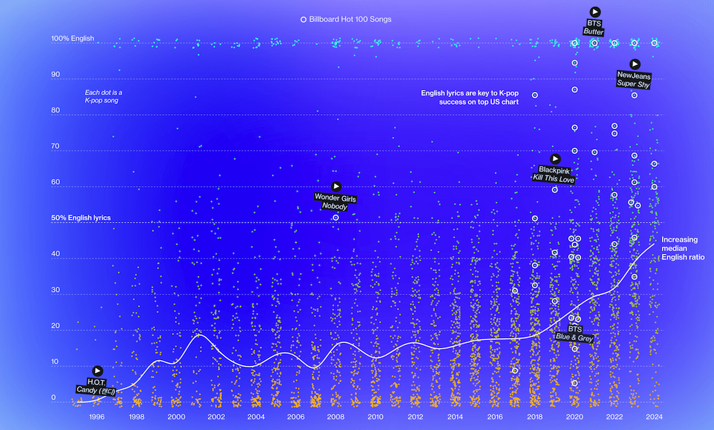
Taiwan Olympic Medals
Taiwan won its first Olympic medal in 1960 with a silver in men’s decathlon. Since then, Taiwan has accumulated 43 Olympic medals: 23 bronze, 11 silver, and 9 gold. The 2020 Tokyo Olympics marked Taiwan’s best performance yet, bringing home 12 medals.
Julia Janicki and Daisy Chung, Taiwanese data visualization professionals, used circle packing charts to visualize all medal successes of Taiwan (“Chinese Taipei”) in all Olympic Games. You can explore Taiwanese medals by sport, year, and gender — great examples of the circle packing technique in action.
See the charts on the authors’ collaborative blog Taiwan Data Stories. Also, don’t miss out on our last week’s review of Paris 2024 Olympic Medal Trackers.
Yen Fluctuations and Bank of Japan Influence
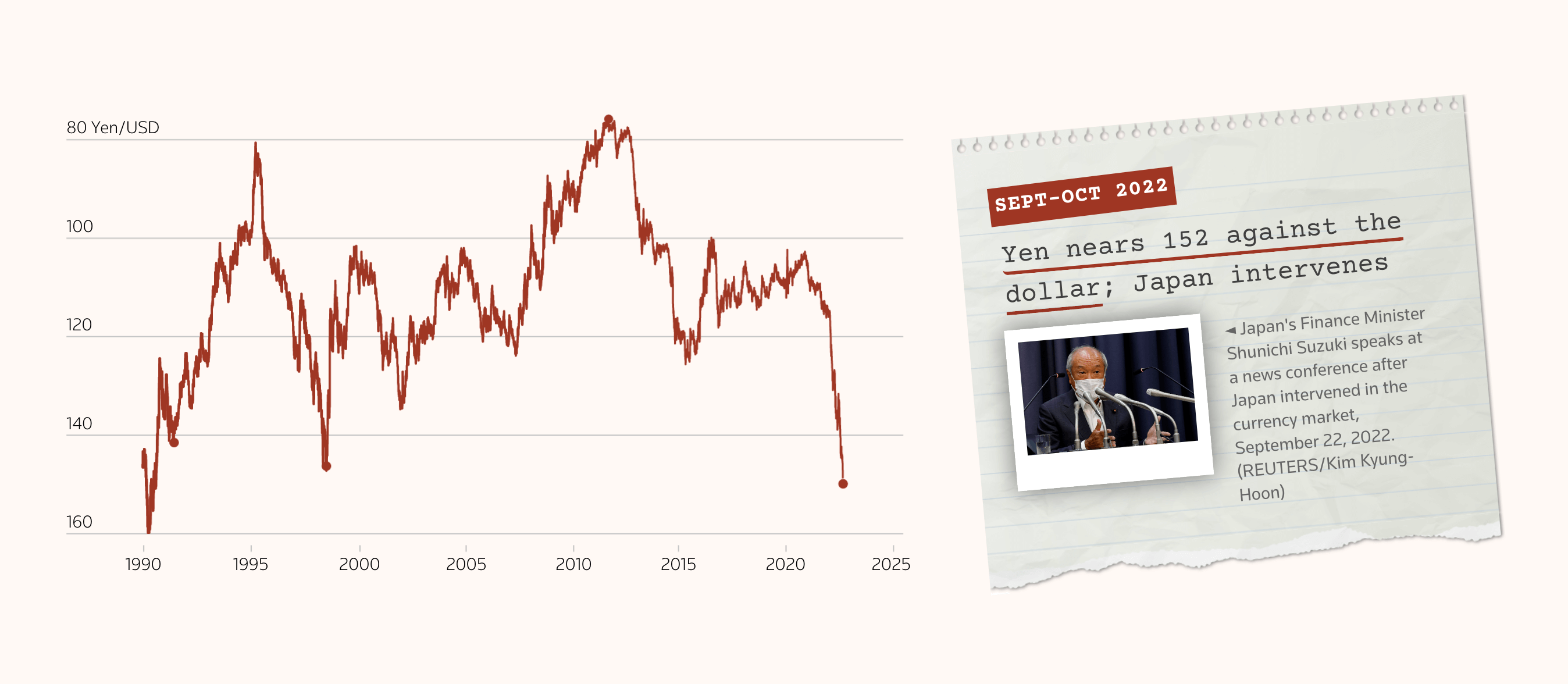
The Japanese yen has struggled in recent years due to the widening U.S.–Japan interest rate gap, losing over 20% against the dollar since 2022 and prompting several interventions by Tokyo. Despite these efforts, the yen hit a 38-year low in July 2024, but recently rebounded following a Bank of Japan (BoJ) rate hike that shook markets.
Reuters journalists Leika Kihara, Pasit Kongkunakornkul, Vineet Sachdev, and Kripa Jayaram analyzed the BoJ’s role in shaping the yen’s value and the broader effects on Japan’s economy. The centerpiece of their article is a scrollytelling feature: a line chart displaying the JPY/USD exchange ratio since 1990, which gradually draws as you scroll, highlighting key BoJ interventions with detailed explanations on the right.
Dive into the story on Reuters.
Wrapping Up
This week’s Data Visualization Weekly has taken us on a visual journey across different parts of the world, exploring the globalization of K-pop, the unique microclimates of the Bay Area, Taiwan’s Olympic triumphs, and the Japanese yen’s rollercoaster ride. Each visualization project presents data in an engaging and accessible way, deepening our understanding of the stories behind the numbers.
Stay tuned for more in next week’s edition, where we’ll continue to uncover the most fascinating data visualizations from around the web.
- Categories: Data Visualization Weekly
- No Comments »