 When properly visualized, data comes to life and reveals the stories hidden within the numbers. In this edition of DataViz Weekly, we showcase a selection of new projects that present data in compelling and insightful ways. Let’s dive into the visual data stories that caught our attention this week.
- Neglected tropical diseases — Nexo
- Migrants in U.S. swing states — Bloomberg
- Decisive votes in U.S. presidential elections — The Guardian
- What Americans are searching to kill — The Washington Post
Data Visualization Weekly: September 13, 2024 — September 20, 2024
Neglected Tropical Diseases
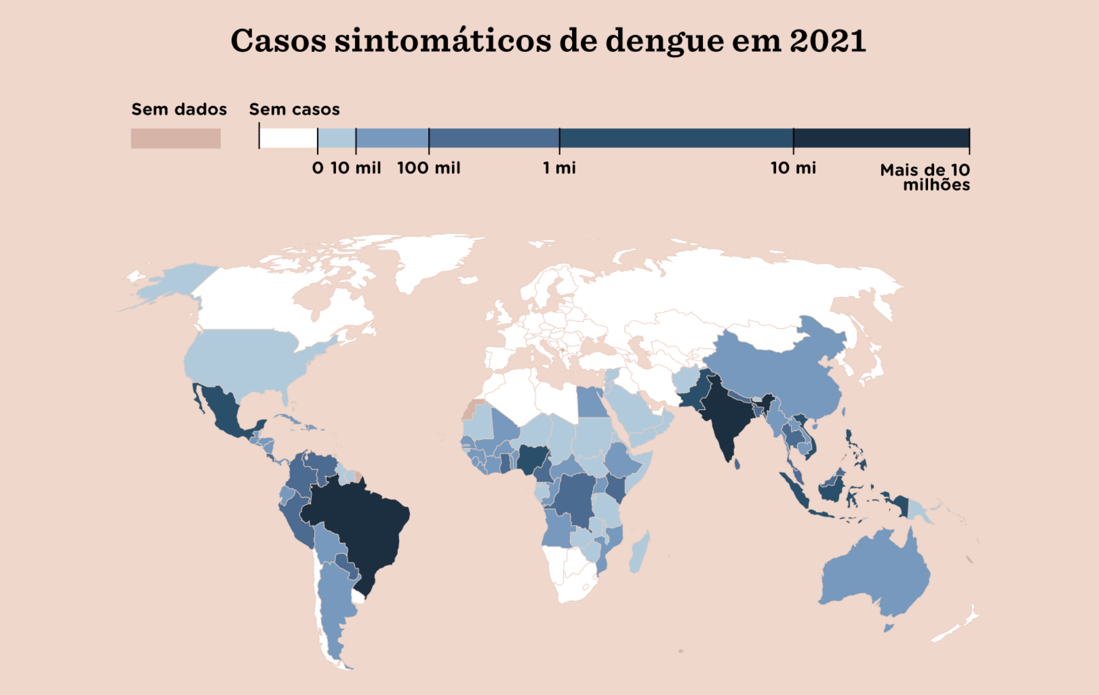
Despite the availability of vaccines and treatments, millions of people worldwide continue to suffer from preventable or curable diseases. These conditions, known as neglected tropical diseases, are a major focus of the World Health Organization (WHO), which tracks and categorizes them as requiring global action.
Brazilian newspaper Nexo published a special report that explains what neglected tropical diseases are, why tackling them is crucial in reducing poverty and inequality, and provides detailed insights into each condition. The report includes multiple visualizations based on data from WHO, the Global Burden of Disease, Our World in Data, and other sources. Maps illustrating the global distribution of each disease on the WHO’s list are among the highlights.
Explore the report on Nexo, authored by Gabriel Zanlorenssi with Giovanna Hemerly.
Migrants in U.S. Swing States
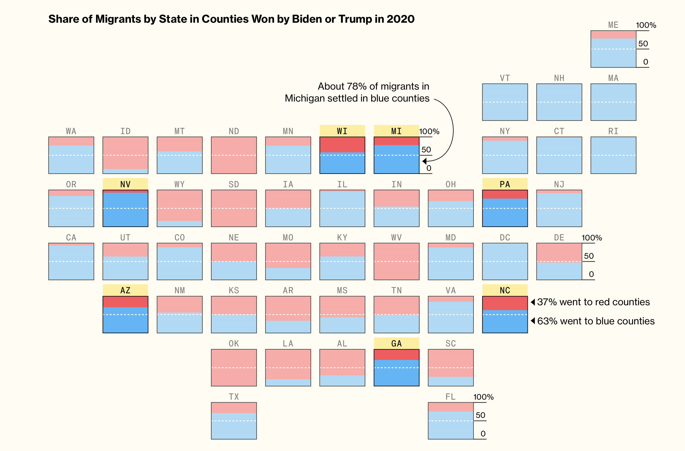
Migrants who arrived in the U.S. in 2023 have largely settled in counties that voted for President Joe Biden in 2020. In battleground (or swing) states that could decide the next election, about 72% of migrants have moved to Biden counties, while less than a third have settled in Trump counties.
This insight comes from a Bloomberg analysis based on immigration court data obtained by researchers at Syracuse University. The article presenting this analysis begins with a scrollytelling section, starting with a cartogram where each square represents a state, divided into red and blue to show the share of migrants in counties won by Trump or Biden in 2020. As you scroll, these squares transition into a geographic map, with each square now representing a county, colored by the 2020 vote and sized by the number of 2023 migrant court cases. The focus then shifts to swing states, followed by a graph that arranges counties by GDP decline or growth, split between Biden and Trump counties. The article concludes with a chart showing the share of the 2022 foreign-born population in swing-state counties by the 2020 presidential vote.
Check out the story on Bloomberg, created by Elena Mejía and Shawn Donnan.
Decisive Votes in U.S. Presidential Elections
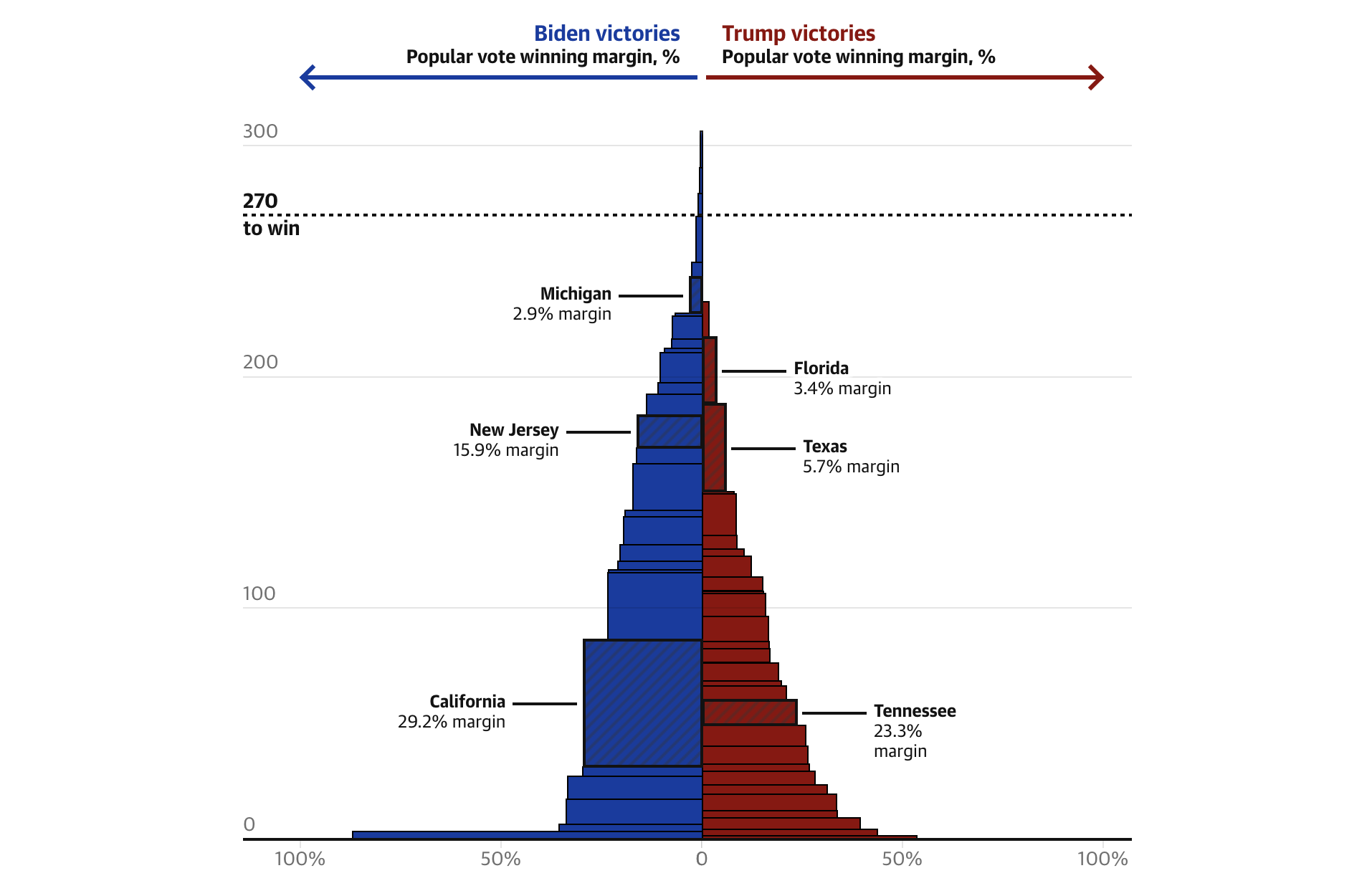
Even though millions of Americans vote in every election, only a small number of ballots can decide the outcome. In 2020, just 43,000 votes across Wisconsin, Georgia, and Arizona — representing only 0.03% of the total — secured Joe Biden’s victory. Similarly, in 2016, about 80,000 votes in key swing states gave Donald Trump his winning margin.
The Guardian published a visual explainer to illustrate how the Electoral College system works, using the 2020 U.S. presidential election as an example. The explainer begins with stacked columns for Biden and Trump, where each block represents a state, and the height of the block corresponds to the number of electoral votes the state provided. The chart then transitions to show the margin of victory in each state, with the width of each block reflecting the margin by which Biden or Trump won. As you scroll, the charts zoom in to highlight notable trends and patterns, helping to explain how the election result was shaped within the U.S. electoral system.
Discover the explainer on The Guardian, produced by Ana Lucía González Paz, Garry Blight, and Sam Levine.
What Americans Are Searching to Kill
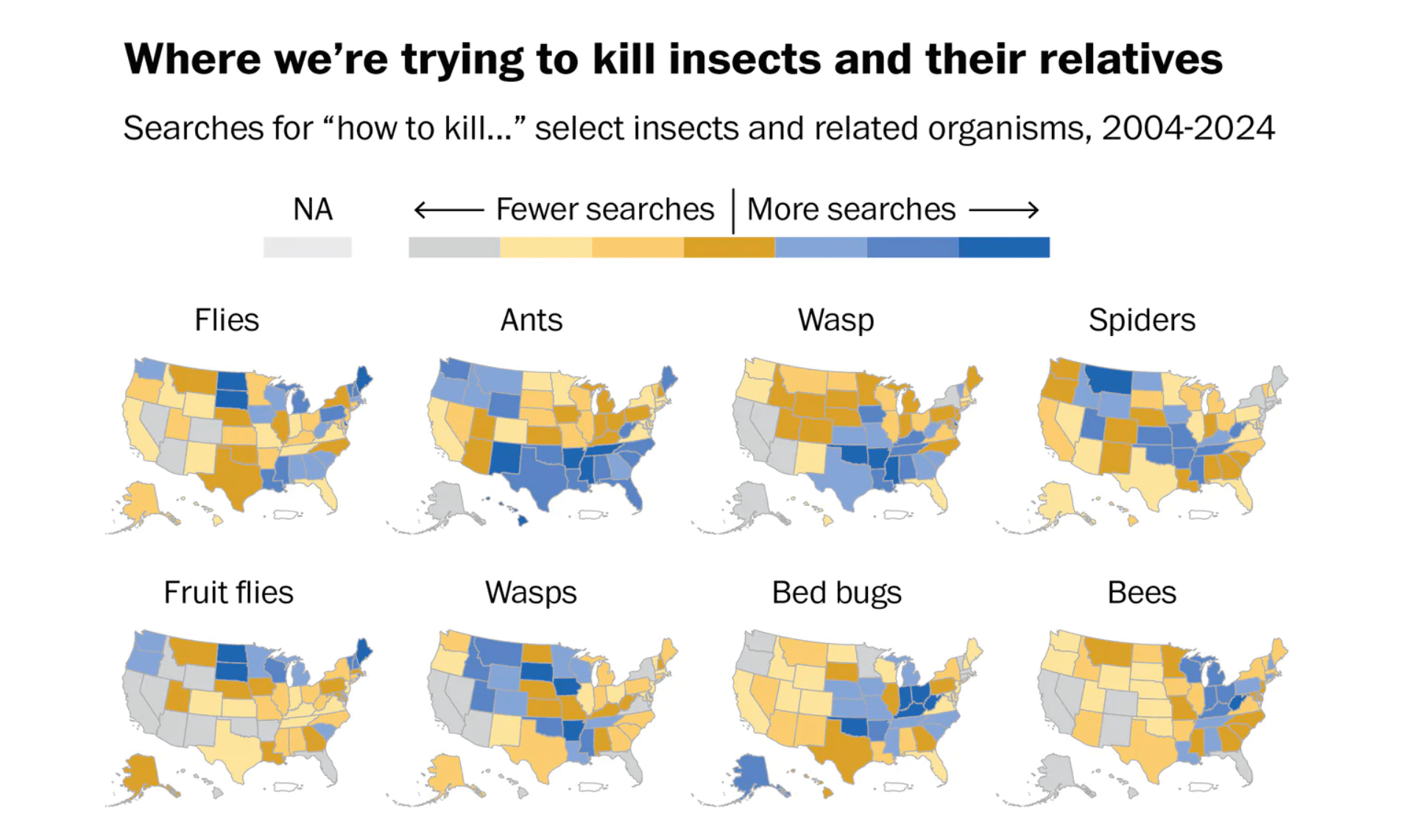
Analyzing Google search data can often yield surprising insights into the thoughts and concerns of a population. For example, did you ever wonder what Americans are searching for when it comes to “killing”?
Andrew Van Dam, who writes the Department of Data column for The Washington Post, analyzed two decades of U.S. search habits using Google Trends, revealing what Americans most frequently “try” to kill. The findings are presented in a series of graphs and maps, showing the popularity of these searches by month and state respectively. The data is categorized into themes, such as insects, plants, and animals. Additionally, searches related to “how to kill yourself/myself” are included and become a major focus in the final part of the article.
See the article on The Washington Post.
Wrapping Up
That concludes this week’s Data Visualization Weekly. We hope these compelling data stories have provided inspiration and insight into the power of data viz. Join us again next week for more highlights from the world of charts and maps.
- Categories: Data Visualization Weekly
- No Comments »