 Each week, DataViz Weekly brings you a curated selection of charts and maps based on real-life data. Welcome to our new roundup, continuing to demonstrate how effective data graphics can truly help make sense of complex topics. Take a look at the new data visualization examples we’ve lately found worth highlighting:
- The United Kingdom’s coal-free power era — Ember
- Grocery store ownership in the United States — The Washington Post
- Market reactions to the Federal Reserve’s rate cuts — Reuters
- Marriage patterns by occupation in Australia — ABC News
Data Visualization Weekly: September 20, 2024 — September 27, 2024
UK’s Coal-Free Power Era
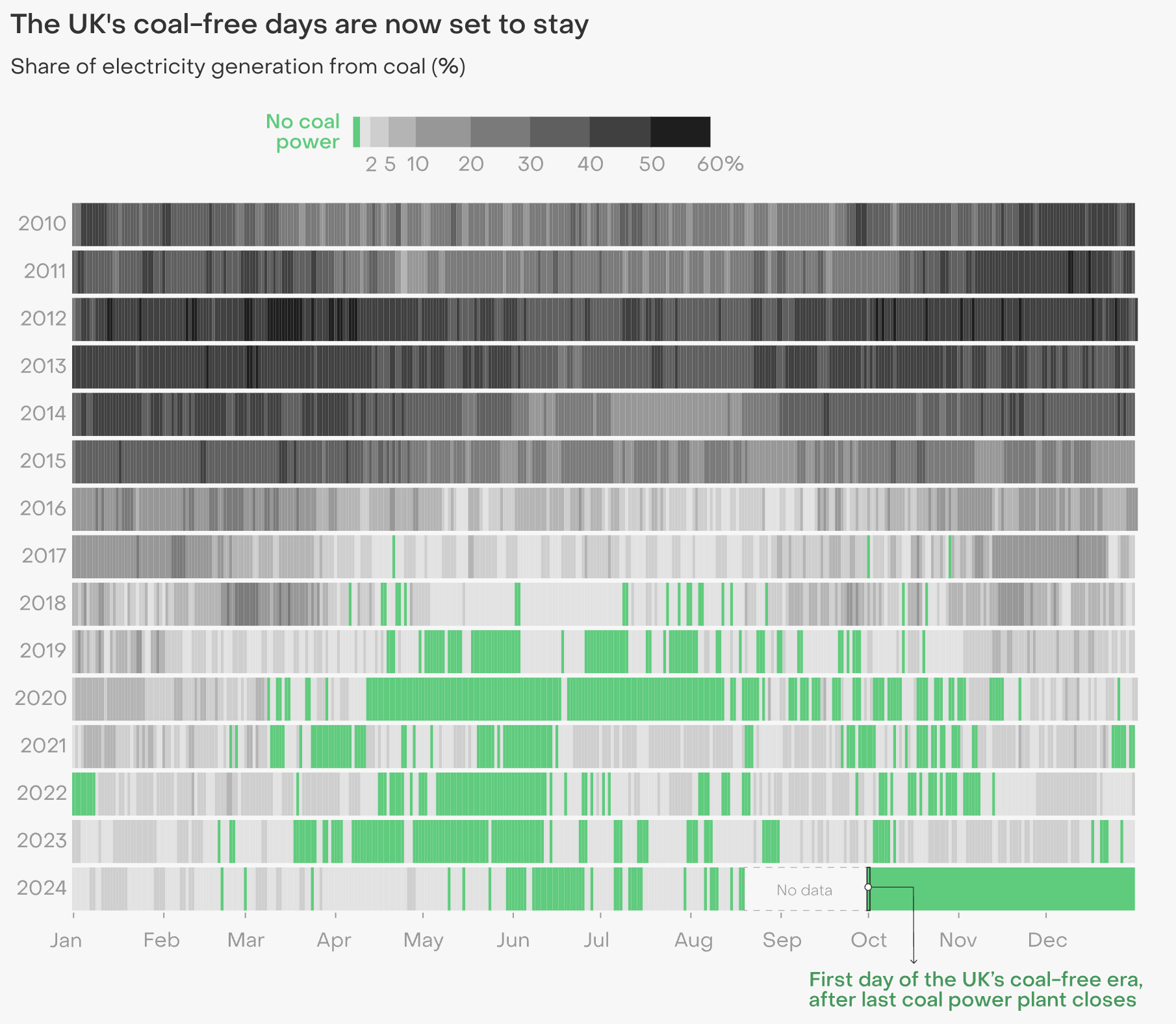
Since 2012, the United Kingdom has seen a rapid decline in coal’s share of electricity generation. The last coal-fired power plant in the UK, Ratcliffe-on-Soar, is set to close at midnight on September 30, 2024. This closure marks a significant milestone: the UK will officially begin a coal-free power era starting October 1st.
Ember, an independent energy think tank, has published a report that takes an in-depth look at the UK’s coal power phase-out, showcasing changes in electricity generation and offering context for how this transition was achieved. It features three interesting visualizations. The first, pictured above, tracks the daily share of coal-generated electricity starting from January 1, 2010, based on data from the Energy Informatics Group at the University of Birmingham. The other two visualizations place historical coal production since 2000 in context with other energy sources, using Ember’s own yearly electricity dataset.
Explore the report on Ember’s website, with lead author Frankie Mayo and data visualizations by Chelsea Bruce-Lockhart.
Grocery Store Ownership in U.S.
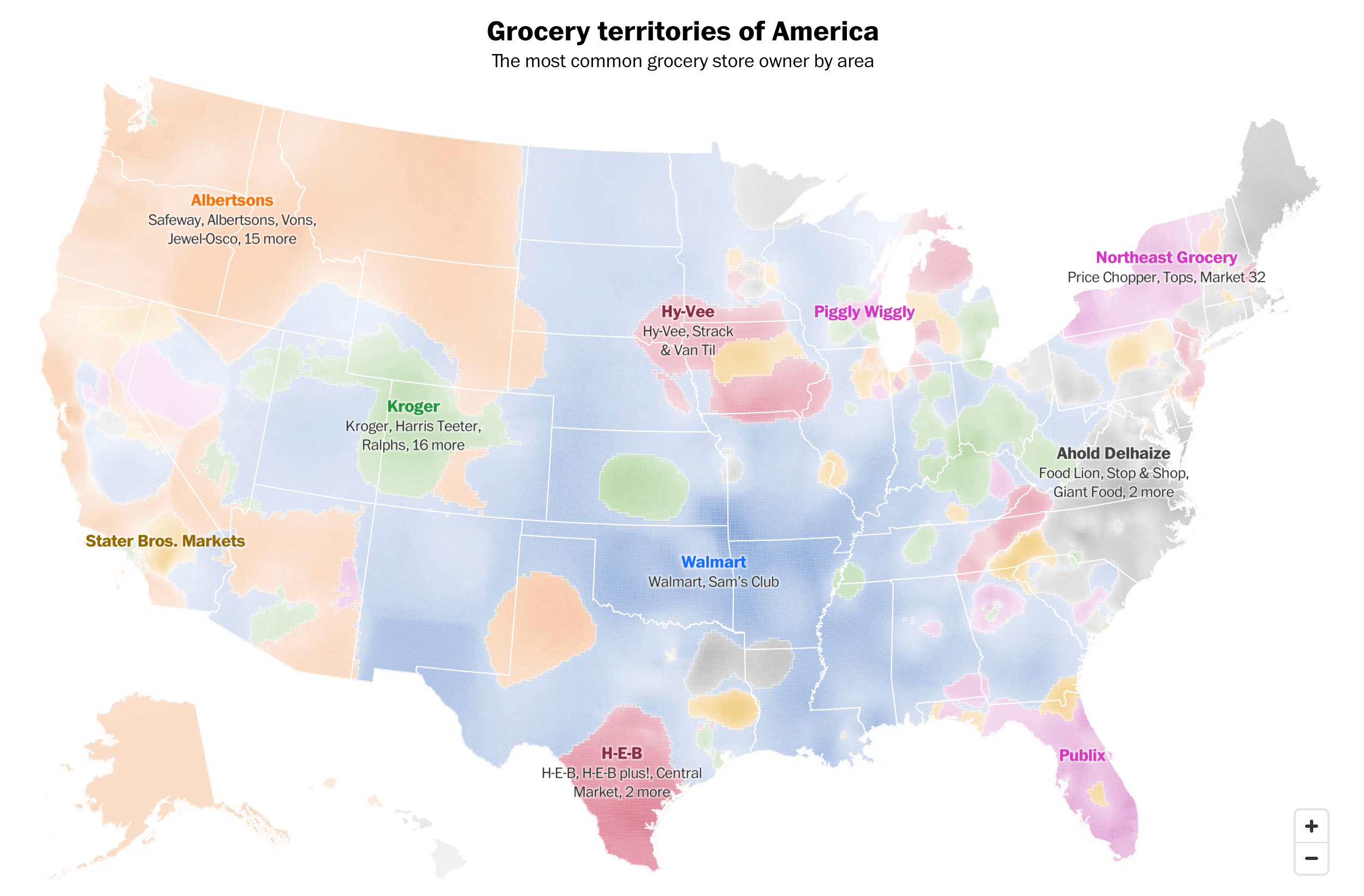
Over the past few decades, the U.S. grocery industry has undergone massive consolidation. A handful of big names, including Walmart, Kroger, Aldi (Süd), and Albertsons, now control one-third of all grocery store locations across the country.
A Washington Post analysis of OpenStreetMap location data offers a deep dive into this trend. The article features a compelling interactive map that visualizes the most common grocery store owner by area throughout the entire United States. Walmart — which has more locations than any other grocer — dominates the middle of the country, with about 90 percent of Americans living within 10 miles of a store. Albertsons sweeps the Northwest, and Kroger dots the mountain states and the Ohio Valley region. In addition to the map, there’s a search tool that allows you to plug in your county to find out which companies own the most common stores in your area, along with the store brands and their share.
Check out the analysis on The Washington Post, authored by Kevin Schaul and Jaclyn Peiser.
Market Reactions to Federal Reserve Rate Cuts
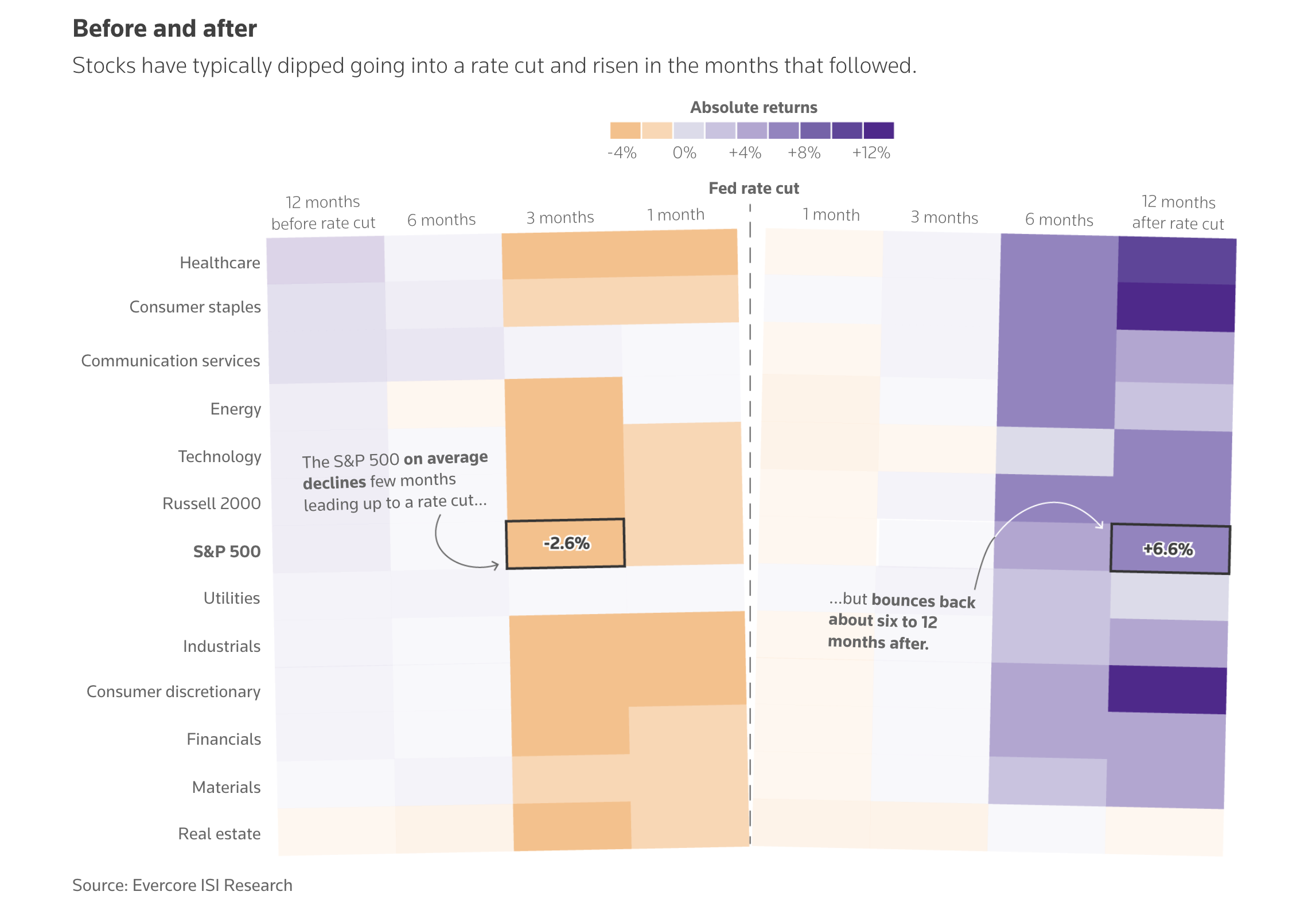
The Federal Reserve recently cut U.S. interest rates for the first time since the pandemic, marking the beginning of a potential easing cycle aimed at stimulating the economy. Investors are now closely watching how markets will react.
Ahead of the cut, Reuters published an article exploring the historical performance of markets following previous rate cuts. The article includes several charts that illustrate trends from past rate-cut cycles, showing how stocks, Treasuries, and the dollar have historically responded to Federal Reserve actions. The data is sourced from Evercore ISI Research, Goldman Sachs Investment Research, Carson Investment Research, LSEG Datastream, and CreditSights.
See the story on Reuters, by Lewis Krauskopf, Prinz Magtulis, Pasit Kongkunakornkul, and Vineet Sachdev.
Marriage Patterns by Occupation in Australia
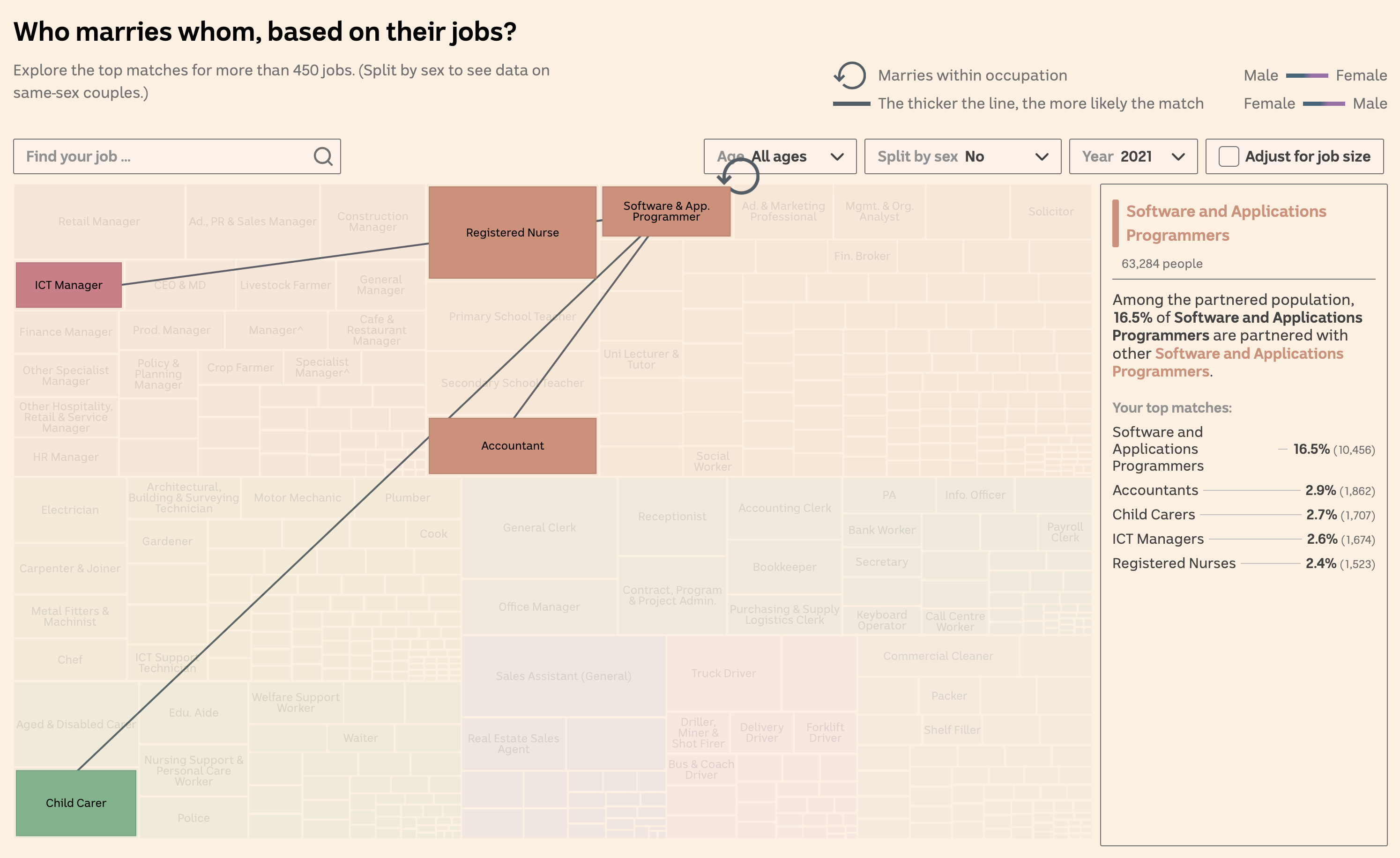
If you’re a software or app programmer, your most likely marriage match is another software or app programmer. At least if you live in Australia.
This finding comes from an ABC News analysis of 2021 Australian Census data. It reveals the most and least likely job-based marriage matches, covering over 43,000 job combinations and more than 2.8 million couples, also including data from the 2001 census for comparison. The article presents a range of striking interactive visualizations that allow you to explore the data from different angles. One example, shown above, is an interactive chart where you can search for an occupation and see the most common marriage matches in terms of jobs in 2021 and 2001. Connectors, which appear once you hover over a data point, illustrate the relationships between occupations, and details like percentage chances are displayed on the right.
Delve into the analysis on ABC News, brought to you by Inga Ting, Katia Shatoba, Brody Smith, and Thomas Brettell.
Wrapping Up
That’s all for this week’s Data Visualization Weekly. These projects showcase the power of data visualization in uncovering trends, patterns, and insights across a diverse range of topics. We hope these charts and maps will inspire you and provide new perspectives on the world around us.
Stay tuned for next week’s edition, where we’ll continue to bring you the most interesting and insightful data visualization examples from around the web.
- Categories: Data Visualization Weekly
- No Comments »