 AnyChart 8.13.0 is now available, bringing a set of new features and improvements designed to further elevate your data visualization experience. In this release, we’ve focused on enhancing the Timeline, Waterfall, and Circle Packing charts in our JavaScript charting library, making them even more flexible and user-friendly. Read on to explore what’s new!
What’s New in Version 8.13.0
1. Timeline Chart Update
Timeline charts efficiently represent sequences of events over time, grouping them into periods as needed. While these charts are widely used by our corporate clients for purposes such as project planning, product lifecycle tracking, and milestone reporting, AnyChart also caters to sectors like academic research. Scholars and historians, in particular, rely on precise chronological visualizations for their work.
To better accommodate such use cases — and especially inspired by a recent project by researchers at the Austrian Academy of Sciences (ÖAW) — we’ve improved our timeline charting solution to support historical data visualization even better.
Labels Improvement
Our key enhancement for timeline charts in this release is a refinement to the label configuration mechanism, which now ensures accurate display for years between 0 AD and 100 AD. This is crucial for users working with ancient historical data, where even minor inaccuracies in labeling can affect the overall narrative.
To showcase this improvement, we’ve provided our timeline chart gallery with a new example: Roman History Timeline. This interactive chart offers a detailed overview of major events and periods in the history of Rome, from the Roman Kingdom through the Byzantine Empire, demonstrating how the updated labeling mechanism works in practice:
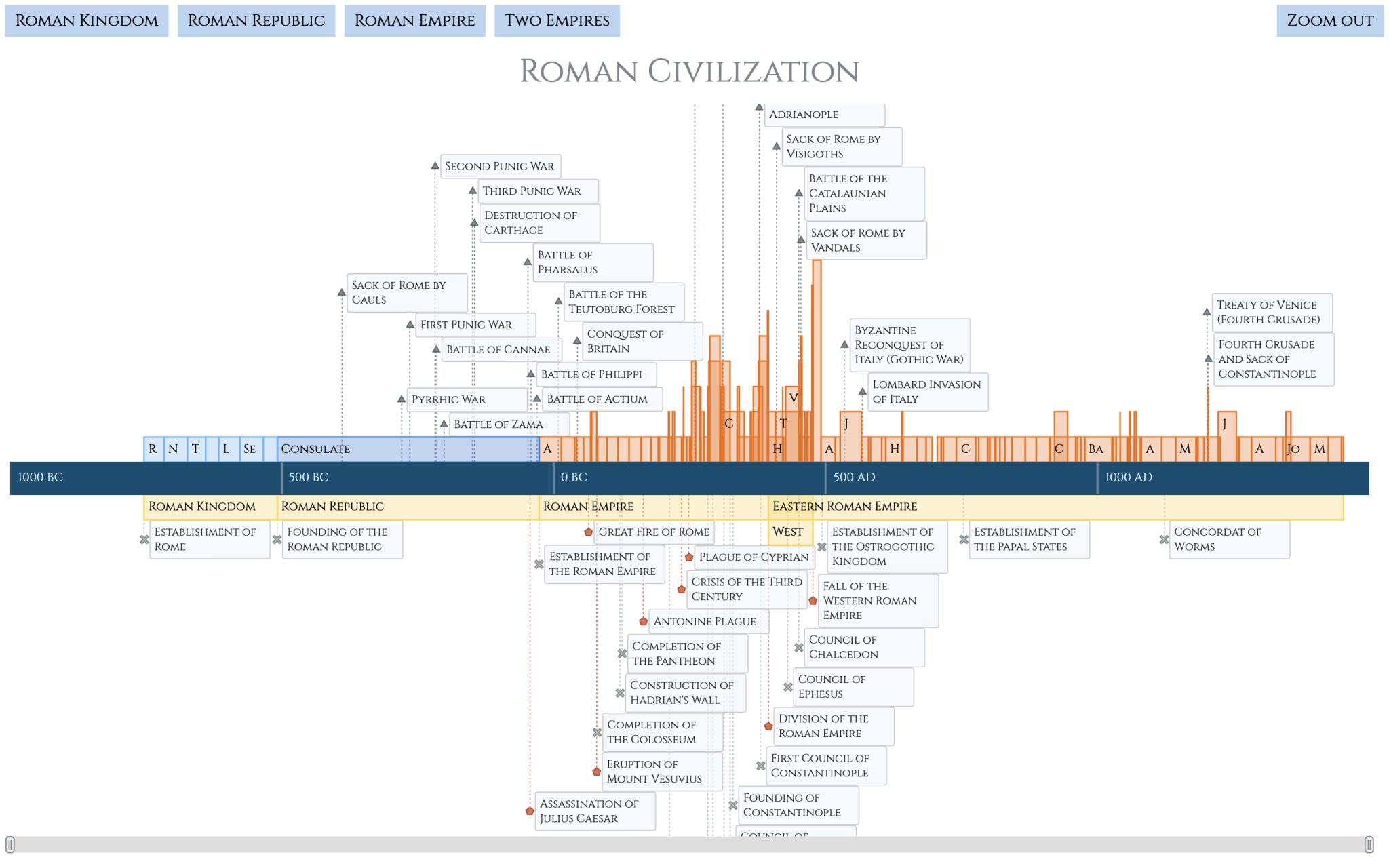
For those interested in building similar data visualizations, we’ve prepared a comprehensive tutorial that walks you through the entire process of creating the Roman History Timeline chart from scratch. This step-by-step guide covers everything from setting up a basic HTML page to customizing the chart with advanced navigation, locale adjustments, as well as personalized tooltips, labels, colors, and more, ensuring a visually engaging and informative experience when delving into historical timelines.
Check out the tutorial on our blog:
2. Waterfall Chart Updates
Waterfall charts are powerful tools for revealing the cumulative effects of sequential positive and negative values. In this release, we’ve added new features and improvements to help you better tailor your waterfalls to specific purposes.
Totals as Absolute Values
By default, waterfall charts calculate totals automatically based on the data mode you choose, displaying the resulting value in the label of the corresponding column. However, sometimes you might need to show a different total value.
We’ve introduced the drawTotalsAsAbsolute() method that allows you to display total and subtotal values exactly as they appear in the data, overriding the automatically calculated ones. Passing true to it will force the total column labels to put the provided absolute values on view, ensuring your complete control over the representation of your totals.
For example, let’s say your data directly specifies a total value of 100, but the calculated total is 150. Call drawTotalsAsAbsolute(true) to make the total appear as 100, keeping your visualization completely aligned with your data input:
// sample data
chart = anychart.waterfall([
 {x: "Net Sales", value: 100},
 {x: "Cost of Sales", value: -50},
 {x: "Extraordinary Gain", value: 100},
 {x: "Planned Total", value: 100, isTotal: true}
]);

// enable drawing totals as absolute values
chart.drawTotalsAsAbsolute(true);
Here’s how a waterfall chart will look in this case, with totals as absolute values:
Learn more in the documentation:
Dropped Connectors
Waterfall charts display connectors between neighboring columns by default to highlight progression between sequential values. In some data visualization scenarios, you might want to omit them for clarity or stylistic reasons.
You now have the flexibility to remove connectors between specific points in your waterfall charts using the new drawConnector field in your data. Setting drawConnector: false in a data point prevents the connector from being drawn from that column to the next, ensuring a cleaner visual when certain points do not need to appear linked.
For example, no connector line will be added between the last two columns if you write it in the penultimate data point:
// sample data with a dropped connector
var data = [
  {x: "2022", value: 23},
  {x: "Q1", value: -12},
  {x: "Q2", value: 16},
  {x: "Q3", value: 9},
  {x: "Q4", value: 7},
  {x: "2023", isTotal: true, drawConnector: false},
  {x: "Total", isTotal: true}
];
Here’s how a waterfall chart without that connector will look:
Learn more in the documentation:
Improved Arrows Placement
Arrows are often used in waterfall charts to highlight specific value transitions between two columns. The text labels attached to the arrowed lines automatically display the numerical difference, allowing for easier assessment of changes at a glance.
We’ve reworked the arrow placement algorithm to ensure even more accurate positioning, enhancing the legibility of your waterfall charts.
Check out how smoothly the Arrows feature works now when you use the addArrow() method:
chart.addArrow({from: "Net Sales", to: "Net Income"});Here’s how a waterfall chart with the updated arrows will look:
Learn more in the API reference:
3. Circle Packing Chart Update
Circle packing charts are excellent for visualizing hierarchical data through nested circles. In version 8.13.0, we’ve introduced a new feature to give you more control over label display.
Labels Mode
By default, circle packing charts display root node labels. Now, you can easily implement a different labeling strategy depending on your data visualization needs.
The new labelsMode() method allows you to display labels on the leaf node level instead with one quick line of code. Simply set the mode to leaves:
chart.labelsMode("leaves");To force the display of root labels, which is the default behavior, use labelsMode() with the roots parameter:
chart.labelsMode("roots");Explore how switching between these label modes can significantly alter the information conveyed by your circle packing chart, allowing you to focus on different levels of your data hierarchy:
Learn more in the documentation:
Wrapping Up
AnyChart 8.13.0 introduces powerful new features and improvements that make creating effective, visually engaging charts even easier. Whether you are exploring history with timeline charts, enhancing financial reports with waterfall charts, or visualizing hierarchies with circle packing charts, this update offers valuable enhancements for everyone. Plus, we’ve included various minor improvements and bug fixes across all other data visualization types in our JavaScript charting library.
Download the latest version and enjoy the updates. As always, we greatly value your feedback — feel free to share your thoughts and suggestions as we continue working to improve AnyChart.
Stay updated with the latest news and tutorials by following our blog and social media channels — LinkedIn, Medium, X (Twitter), Facebook. For technical assistance and questions, feel free to reach out to our Support Team anytime.
- Categories: AnyChart Charting Component, AnyGantt, AnyMap, AnyStock, Big Data, Business Intelligence, Dashboards, Financial Charts, Gantt Chart, HTML5, JavaScript, News, Stock Charts
- No Comments »