 Charts and maps have a unique power to let data talk, transforming raw numbers into meaningful insights that anyone can grasp. In this edition of DataViz Weekly, we’re featuring some of the most stunning new examples of how data visualization brings information to life.
- Hazard-prone locations in the United States attracting migration — NYT
- Shifts in college admissions after the affirmative action ruling — Bloomberg
- Google search trends around U.S. elections — Google Trends and Truth & Beauty
- Interactive timeline of Roman history — AnyChart
Data Visualization Weekly: September 27, 2024 — October 4, 2024
Hazard-Prone Locations in U.S. Attracting Migration
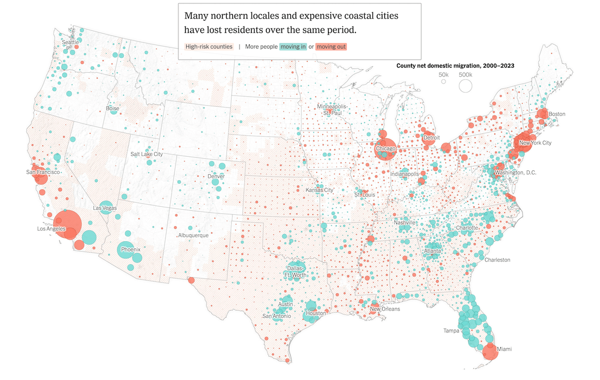
Certain regions in the United States frequently experience natural disasters like hurricanes, wildfires, floods, and extreme heat. However, over the past two decades, many of these areas have remained popular destinations for Americans relocating.
The New York Times presents an in-depth analysis using data from multiple sources to explore this trend. The article features maps showing high-risk territories for weather extremes, based on data from property analytics firm CoreLogic, alongside migration patterns. Green markers indicate areas where more people moved in than out, while orange markers show where more people left. On the national map, these markers are bubbles, with their size reflecting net domestic migration for each county using data from the U.S. Census Bureau. Regional maps provide more localized detail, showing ZIP code-level migration trends with uniformly sized dots, based on data from address analytics firm Melissa.
See the article on The New York Times, by Mira Rojanasakul and Nadja Popovich.
Shifts in College Admissions After Affirmative Action Ruling
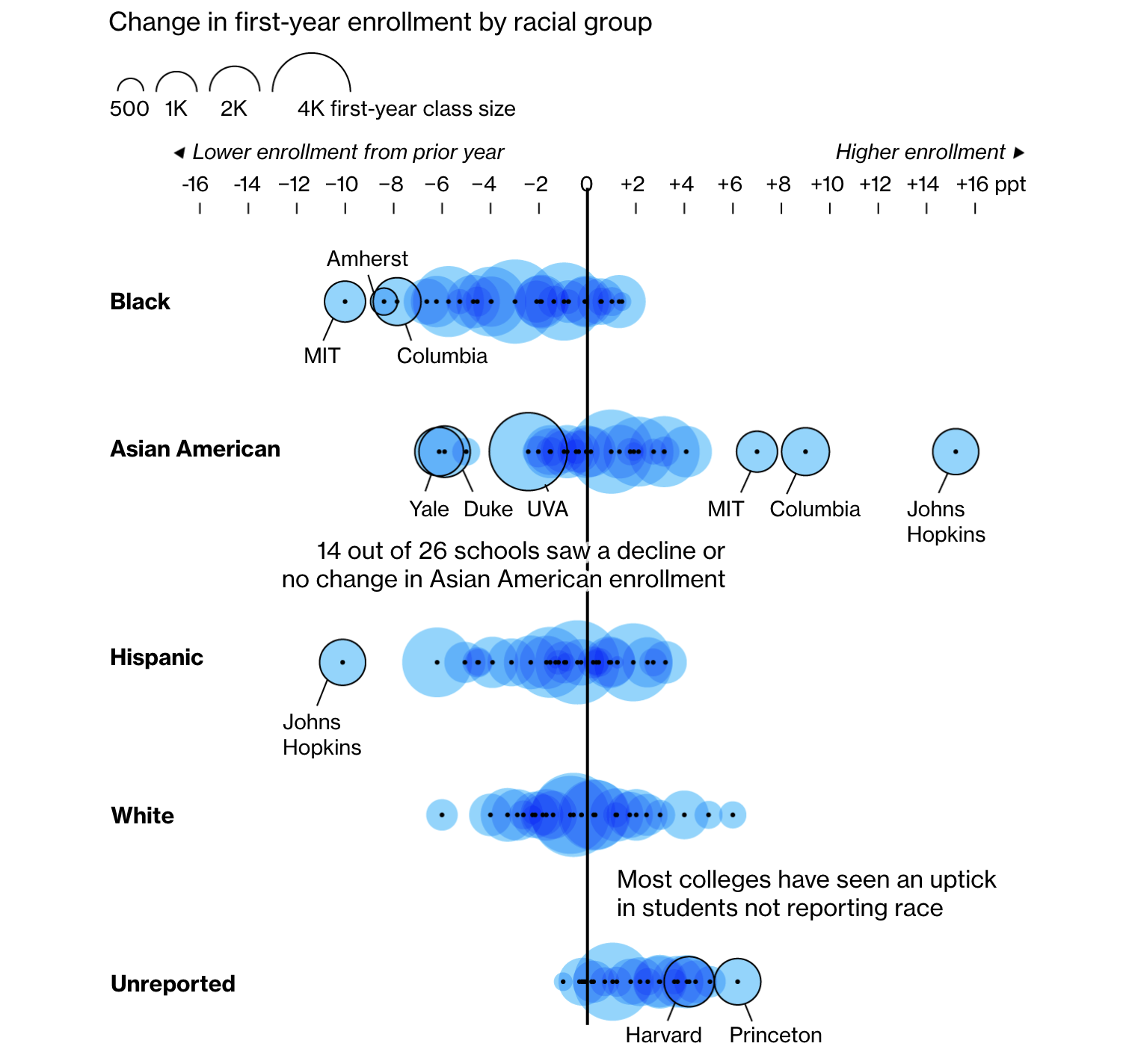
Following the U.S. Supreme Court’s decision to end affirmative action in college admissions, many experts predicted two key outcomes: a drop in Black student enrollment at selective universities and a corresponding rise in Asian American enrollment. According to early data, these predictions are only partially accurate.
A Bloomberg analysis, drawing from demographic data now being released for the first cohort of students admitted after the ruling, reveals that while Black student enrollment has indeed declined at many elite schools, including Harvard University, Amherst College, and the University of Virginia, the anticipated surge in Asian American enrollment has been inconsistent. One of the key visuals in the report, which you can see above, shows changes in first-year enrollment by racial group, based on Bloomberg’s survey. The piece also features two additional charts — one tracking universities where Asian American enrollment remained flat or dropped (notably at Duke, Yale, and Bowdoin), and another highlighting schools where Black enrollment decreased as Asian American enrollment rose, with Massachusetts Institute of Technology leading the shift.
Check out the piece on Bloomberg, by Francesca Maglione, Paulina Cachero, Ann Choi, and Raeedah Wahid.
Google Search Trends Around U.S. Elections
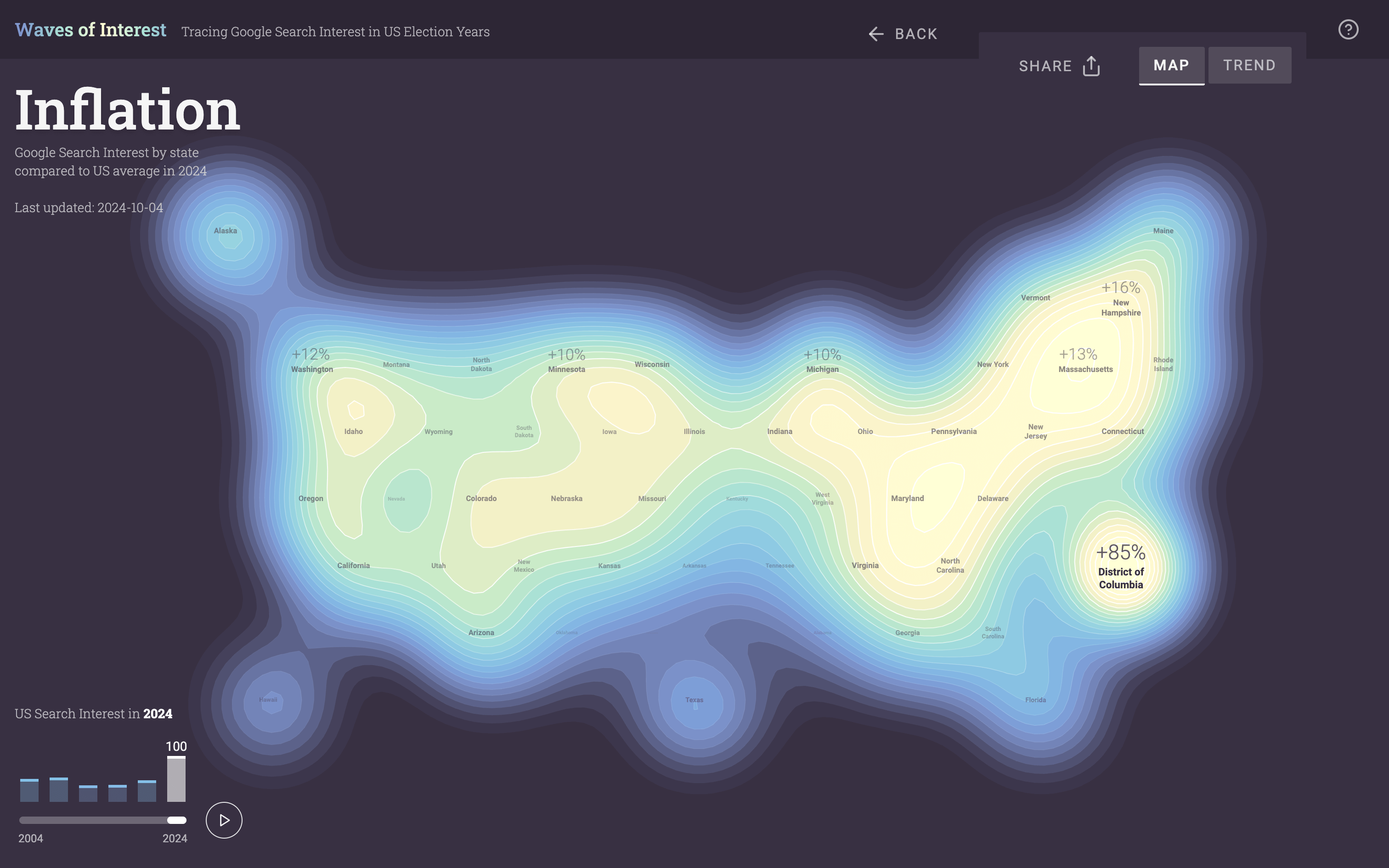
Four years ago, in the Pre-Election Data in Charts and Analysis edition, we featured the project “Waves of Interest.” It visualized Google search data to reveal the issues that captured Americans’ attention during election years from 2004 to 2020, highlighting shifts in public interest between election cycles. Now, as the 2024 U.S. presidential election approaches, the project has been revived.
The new Waves of Interest includes the latest Google Trends data for the current election year, maintaining the two core visual elements of its previous edition: blobby maps and animated multi-line charts. These data graphics showcase geographic and temporal patterns in searches for a curated set of fifty political topics. For instance, you can observe how interest in inflation has evolved since 2004 by playing the map animation pictured above, showing a significant rise in search interest nationwide.
Explore the new Waves of Interest project, by Google Trends and Moritz Stefaner, with direction from Alberto Cairo and Simon Rogers.
Interactive Timeline of Roman History
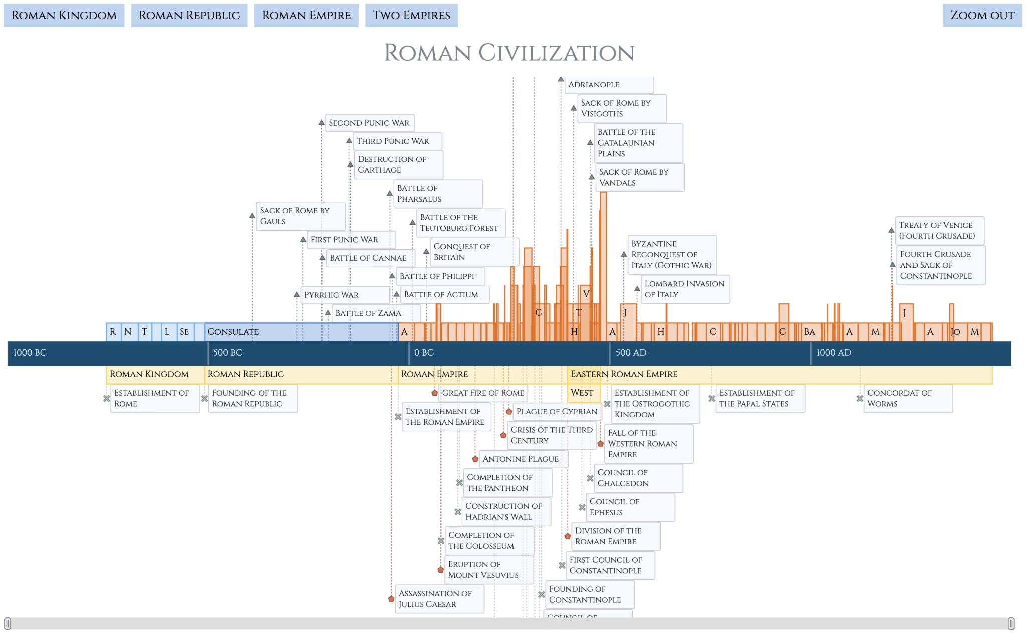
At AnyChart, we primarily focus on providing tools to empower others in visualizing data. But occasionally, we also create something ourselves, such as to showcase the latest capabilities of our JavaScript charting library. The recent release of AnyChart 8.13.0 included improvements to our timeline chart, and we decided to demonstrate them through a new visualization. We believe the result deserves a highlight on DataViz Weekly as an example you might find interesting to check out.
So, how often do you think about the Roman Empire?
Our interactive Roman History Timeline provides a detailed exploration of key moments in Roman history, from the Roman Kingdom through the Byzantine Empire. It covers major events such as wars, battles, establishments, and disasters, along with the reigns of significant rulers. The timeline features enhanced navigation, including custom zoom levels and click-to-zoom functionality, allowing you to explore centuries of history in depth. Rich tooltips with images and descriptions, as well as personalized labels, colors, and locale settings, provide an engaging and informative experience.
Whether you’re looking for inspiration for your own interactive historical timeline projects or simply interested in Roman history, explore the Roman History Timeline (see it here with the full source code in our online code editor) and follow our detailed tutorial to learn how to build one yourself.
Wrapping Up
Take a look at these visualizations, and stay tuned for more stunning data graphics in future issues of Data Visualization Weekly! If you’ve created or come across a remarkable chart, map, or full-scale data visualization project, don’t hesitate to share it with us — it could make it into the next edition!
- Categories: Data Visualization Weekly
- No Comments »