 Ready for another dose of impressive data visuals? DataViz Weekly is back with a fresh selection of projects that use powerful graphics to help unravel various trends and patterns. Here are our top picks from what we’ve most recently come across out there:
- End of the UK’s coal power era and lessons for the world — The Washington Post
- Hurricane Milton’s impact and power outages — Bloomberg
- Waffle House Index for Florida under and after Milton — Riley Walz
- Opioid overdose deaths across the United States — NYT Opinion
Data Visualization Weekly: October 4, 2024 — October 11, 2024
End of UK’s Coal Power Era and Lessons for World
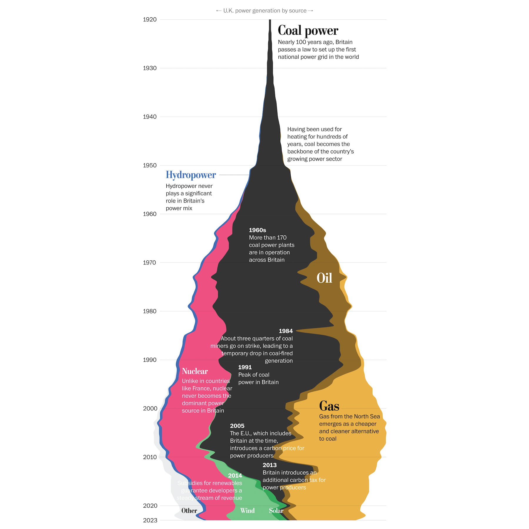
The previous week marked the end of an era in the United Kingdom, as the nation shut down its last operating coal power plant. This closure symbolizes a major shift, especially for a country that pioneered coal-fueled electricity during the Industrial Revolution. The UK’s transition away from coal power stands as a testament that large economies can successfully move beyond what’s considered the dirtiest fossil fuel.
An article by The Washington Post explores the UK’s journey from coal-based electricity to a cleaner energy mix, offering insights for other countries looking to follow suit. The story begins with a visually captivating “lava lamp” plot, showcasing the history of the UK’s power generation sources since 1920, based on data from Our World in Data. This is followed by a series of stacked area charts comparing power generation trends between 1990 and 2023 across several countries, including China, Germany, India, Indonesia, Japan, Portugal, South Korea, and the United States.
Check out the article on The Post, authored by Niko Kommenda and Harry Stevens.
Hurricane Milton’s Impact and Power Outages
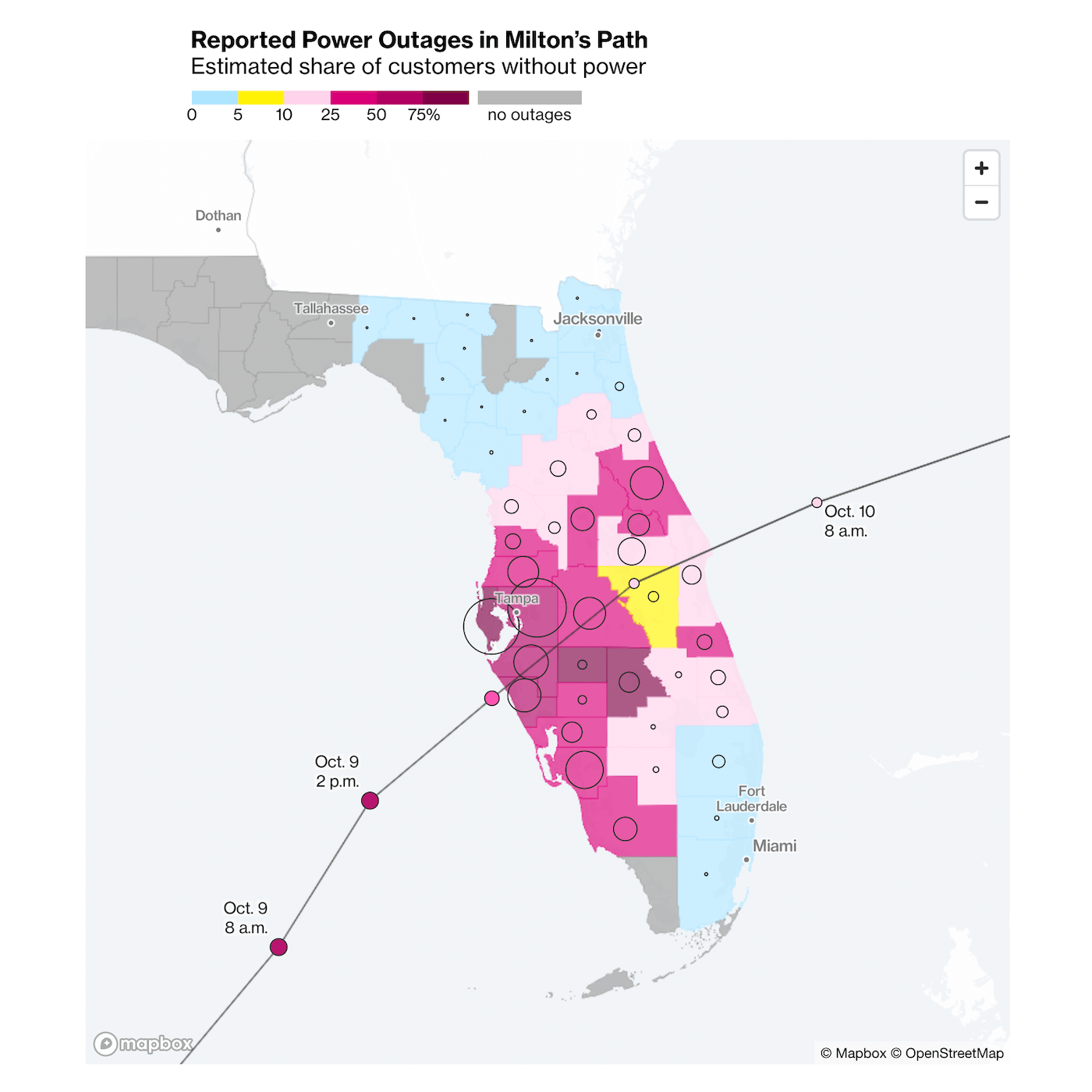
Millions of Floridians faced power outages as Hurricane Milton swept across the state, leaving behind severe flooding before moving into the Atlantic. Despite the widespread impact, officials have remained cautiously optimistic that the damage will not match the devastation of Hurricane Ian in 2022.
Bloomberg presents Milton’s path through a series of detailed maps. One map, shown above, visualizes reported power outages along the hurricane’s trajectory, with shaded areas indicating the estimated percentage of customers without electricity. Data is sourced from FindEnergy, updating almost in real-time, every 15 minutes. There are more maps in the article you may like to explore.
While awaiting Milton’s landfall, the same article had another series of maps showing projections for storm surges, high winds, flooding, and tornadoes. As you panned one map, the others adjusted in sync, offering a comprehensive view of the evolving threat. (Unfortunately, while we’d like to share a link to an archived version from earlier, the Internet Archive is currently down due to a “catastrophic security breach.”)
Find the piece on Bloomberg, by Cedric Sam and Armand Emamdjomeh.
Waffle House Index for Florida Under and After Milton
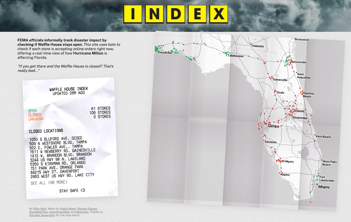
The Federal Emergency Management Agency (FEMA) is unofficially looking at the Waffle House Index as a gauge for disaster severity — based on how many Waffle House stores remain open during a crisis. Known for their resilience, these restaurants offer a quirky but effective metric for assessing storm impact and recovery.
To provide real-time insight into the effects of Hurricane Milton, Riley Walz developed a web project that uses bots to monitor the online ordering status of every Waffle House location. The site features an interactive map, using colored dots to indicate whether each location is open or closed. As of now, the tool shows that 106 Waffle Houses are closed in Florida, while 81 remain open, offering a unique snapshot of the current situation.
Explore the live updates on Walz’s website.
Opioid Overdose Deaths Across U.S.
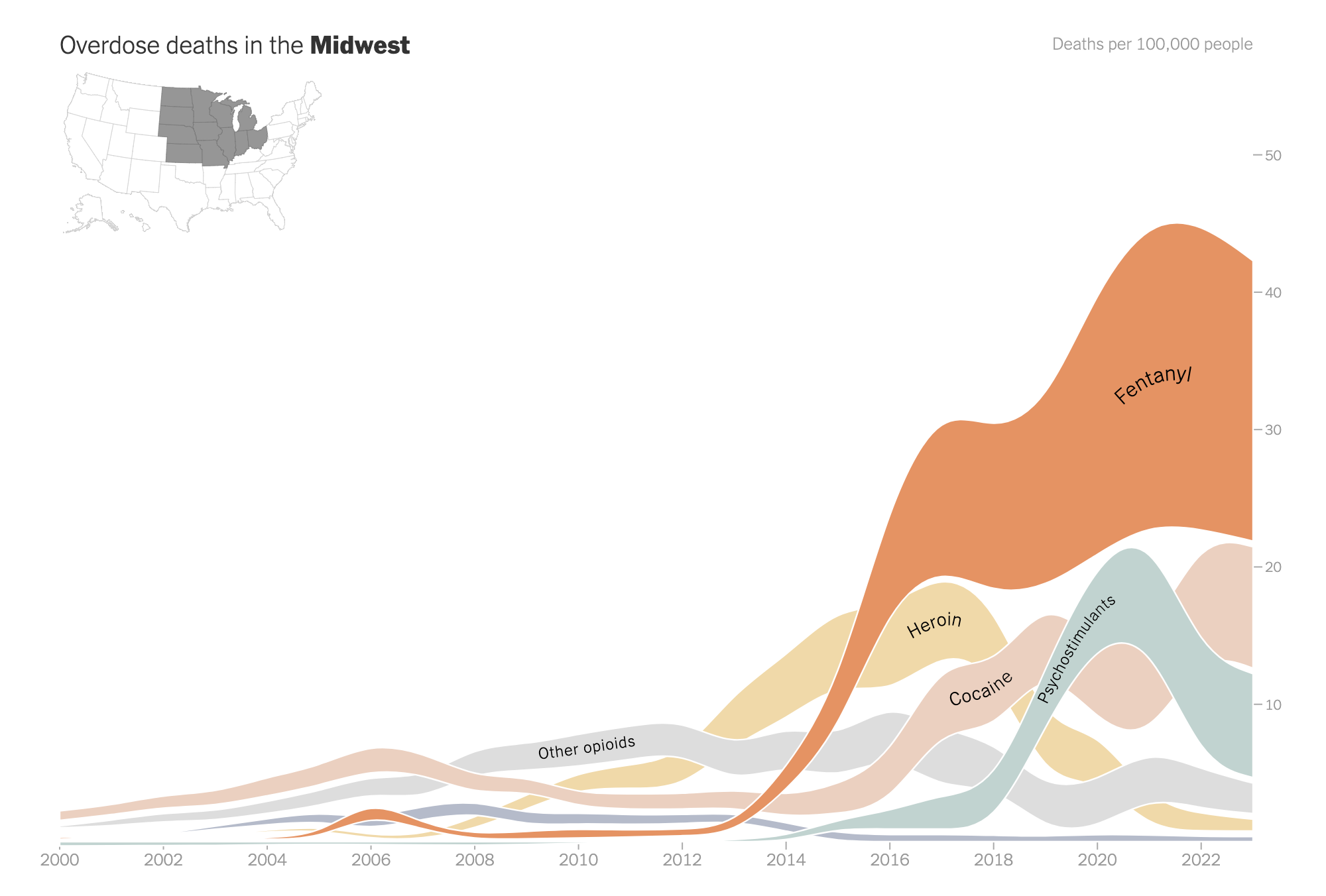
Over 70,000 Americans lost their lives last year due to drug mixtures containing fentanyl or other synthetic opioids. However, recent data suggests a positive shift — a decline in overdose deaths over the past two years, marking the first significant decrease in decades. Yet, this trend varies across different parts of the country.
An article in The New York Times Opinion section explores these shifts over the last 20 years, highlighting regional disparities. It features choropleth maps that reveal variations in overdose death rates by state. Additionally, the article includes alluvial diagrams that illustrate changes in overdose death rates across the West, South, Midwest, and Northeast, focusing on various substances like fentanyl, cocaine, psychostimulants, heroin, methadone, and other opioids from 2000 to 2023.
See the story in The NYT Opinion section, authored by Maia Szalavitz with graphics by Sara Chodosh and Aileen Clarke.
Wrapping Up
That wraps up this week’s Data Visualization Weekly. We hope these projects sparked new ideas and provided valuable perspectives on the use of data graphics to explore important topics. Stay tuned for more standout examples of data visualization in the next editions!
- Categories: Data Visualization Weekly
- No Comments »