 It’s Friday, which means it’s the perfect moment to look back at the data visualizations that have sparked our curiosity over the past few days. So, without further ado, welcome to DataViz Weekly!
- Electric vehicle adoption across the United States — FlowingData
- Europe’s military reductions and defense challenges — Bloomberg
- Climate—Conflict—Vulnerability Index for global risk assessment — UniBw München, PIK, AA, Truth & Beauty
- Campaign emails with donation incentives in the 2024 U.S. presidential race — The New York Times
Data Visualization Weekly: October 11, 2024 — October 18, 2024
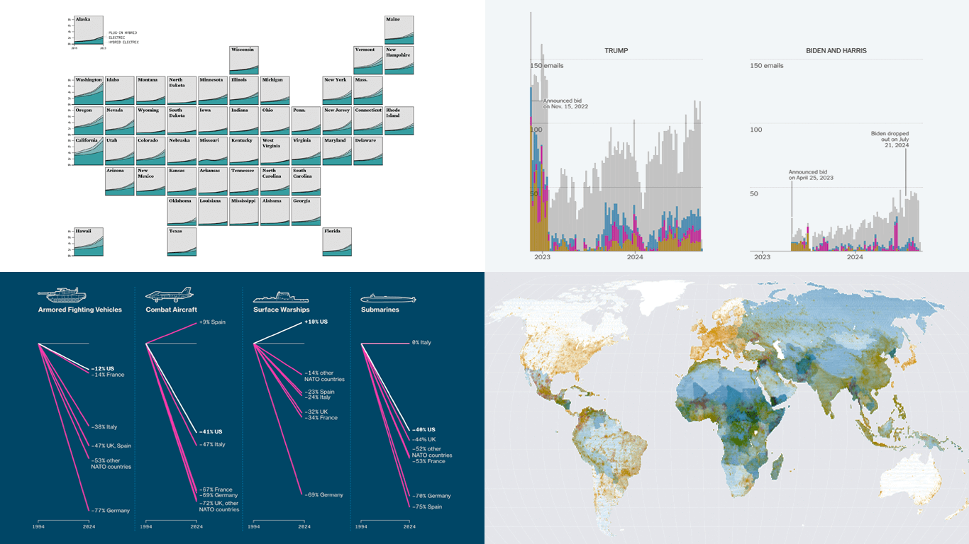
Electric Vehicle Adoption Across U.S.
In 2023, electric vehicles (EVs) accounted for approximately 4% of all registered light-duty vehicles in the United States, marking more than a twofold increase since 2016. However, this shift towards greener cars is far from uniform across the nation.
Nathan Yau created a grid map, representing states as squares. Each square contains a stacked area chart depicting the proportion of all-electric (battery-electric or BEVs), plug-in hybrid (PHEVs), and hybrid electric (HEVs) vehicles per 100,000 registered vehicles over time from 2016 to 2023. The data is sourced from the U.S. Department of Energy, and the visualization provides a clear view of how electric vehicle adoption has varied at the state level.
Take a closer look at the visualization and learn more on Nathan Yau’s blog FlowingData.
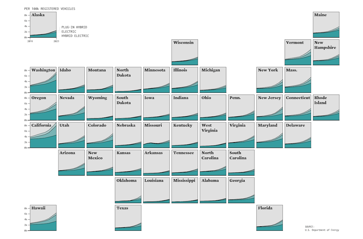
Europe’s Military Reductions and Defense Challenges
Since the end of the Cold War, NATO nations have significantly reduced their military forces, with European countries cutting back far more drastically than the United States. Some U.S. military experts even argue that without American support, European allies may struggle to defend themselves against a major threat.
Bloomberg offers a data-driven dive into why Europe is seen as unprepared for self-defense. The article features a series of visualizations and infographics, starting with line charts comparing the reduction of military vehicles — armored fighting vehicles, combat aircraft, surface warships, and submarines — across the U.S. and key European NATO countries, including France, Germany, Italy, the UK, and Spain. Following this are graphical presentations of the current inventory of these vehicles and vessels, troop numbers, and more, based on data from the International Institute for Strategic Studies, Royal United Services Institute, and others.
See the article on Bloomberg, by Tom Pfeiffer and Christopher Cannon.
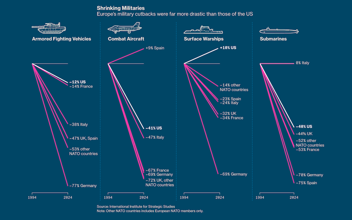
Climate—Conflict—Vulnerability Index for Global Risk Assessment
The sixth edition of the Berlin Climate and Security Conference (BCSC) took place last week at the German Federal Foreign Office, bringing together experts from around the world to examine the nexus between climate, peace, and security. A highlight of the event was the keynote by German Foreign Minister Annalena Baerbock, where she unveiled a project offering a fresh, comprehensive perspective of global risks.
The Climate—Conflict—Vulnerability Index (CCVI) integrates data on climate hazards, conflicts, and local vulnerabilities into a harmonized set of data layers, combined with a transparent scoring system that allows for comparing regions worldwide. A standout feature is an interactive map that represents climate risks (e.g., droughts, floods), conflict indicators (e.g., armed violence), and vulnerabilities (e.g., food insecurity, migration), which can be explored together or separately. The CCVI is fully accessible, with all data and methods shared under open-source licenses.
Explore the index at climate-conflict.org — developed collaboratively by the Center for Crisis Early Warning at the University of the Bundeswehr Munich (UniBw München), the FutureLab — Security, Ethnic Conflicts and Migration at the Potsdam Institute for Climate Impact Research (PIK), and the German Federal Foreign Office (AA), with support from Moritz Stefaner’s design agency Truth & Beauty.
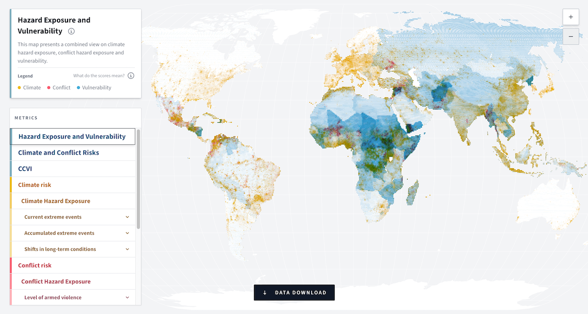
Campaign Emails with Donation Incentives in 2024 U.S. Presidential Race
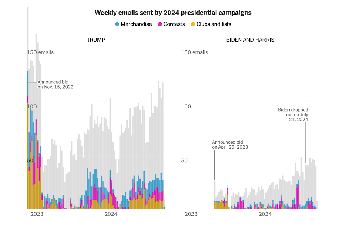
As the 2024 U.S. presidential race progresses, campaigns have heavily relied on email outreach. A significant portion of these messages includes incentives for donation.
The New York Times analyzed approximately 7,400 emails sent by Donald Trump’s campaign from his candidacy announcement on November 15, 2022, through September 16, 2024. Roughly one-third of these emails included offers such as merchandise, contest entries, or exclusive club memberships to entice contributions. Campaign emails from Vice President Kamala Harris and President Joe Biden totaled over 1,600 emails between April 25, 2023 (Biden’s announcement), and September 7, 2024. The stacked column charts shown above illustrate the weekly frequency of emails sent by each campaign, breaking down the types of donation incentives used. Additional details on these offers, along with links to the emails themselves, collected by the Archive of Political Emails, can be found at the end of the article.
Check out the piece on The NYT, by Karen Yourish and Lazaro Gamio.
Wrapping Up
That’s all for today’s roundup of data visualizations that we’ve found most compelling of all we’ve seen over the past week. Stay connected with Data Visualization Weekly for more charts and maps brilliance, and we’ll be back with more exciting projects soon!
- Categories: Data Visualization Weekly
- No Comments »