 The 2024 U.S. presidential election has concluded, and media outlets worldwide are offering a plethora of data graphics to convey the election results. In this special edition of DataViz Weekly, we’ve curated a collection of over twenty election maps, showcasing diverse ways to represent voting data — cartograms, choropleth maps, bubble maps, and more. Whether you’re a data enthusiast, professional, or simply intrigued by the 2024 election outcomes, explore the latest U.S. election maps from top media!
? Also see our previous special editions with election maps: 2020 U.S. election maps and 2024 UK election maps.
Cartograms of U.S. Election Results
Cartograms like grid maps — also known as tile maps, tile grid maps, and equal-area unit maps — are often used in visualizing U.S. election results. They typically represent each state or electoral vote as a uniform shape (like a square or hexagon), neutralizing the distortion caused by geographic area differences. The tiles are usually filled with the color of the winning candidate’s party: blue for Democrats (Kamala Harris in 2024) and red for Republicans (Donald Trump in 2024).
Here are some examples — from French Le Monde, American CBS News, British The Independent, and Australian ABC News.
Basic Cartograms
#1. Le Monde: Basic Cartogram
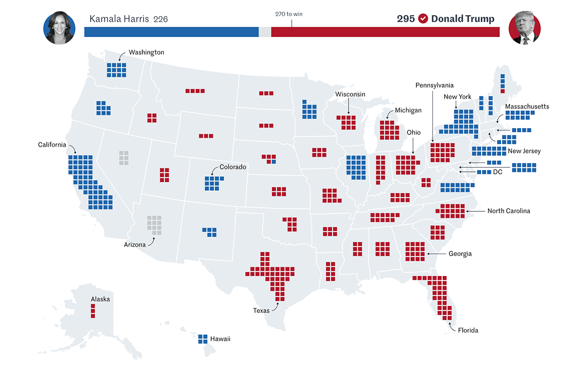
Le Monde presents one of the most straightforward and efficient election maps, focusing on the essential results. The map is a geographic visualization of the United States divided into states, each containing a grid of square tiles. Each tile of the cartogram represents one Electoral College vote, colored according to the candidate who secured that vote. Hovering over a state’s grid reveals the total electoral votes in the appearing tooltip along with a comparison with the 2020 election results.
Data source: AP.
#2. CBS News: Basic Grid Map
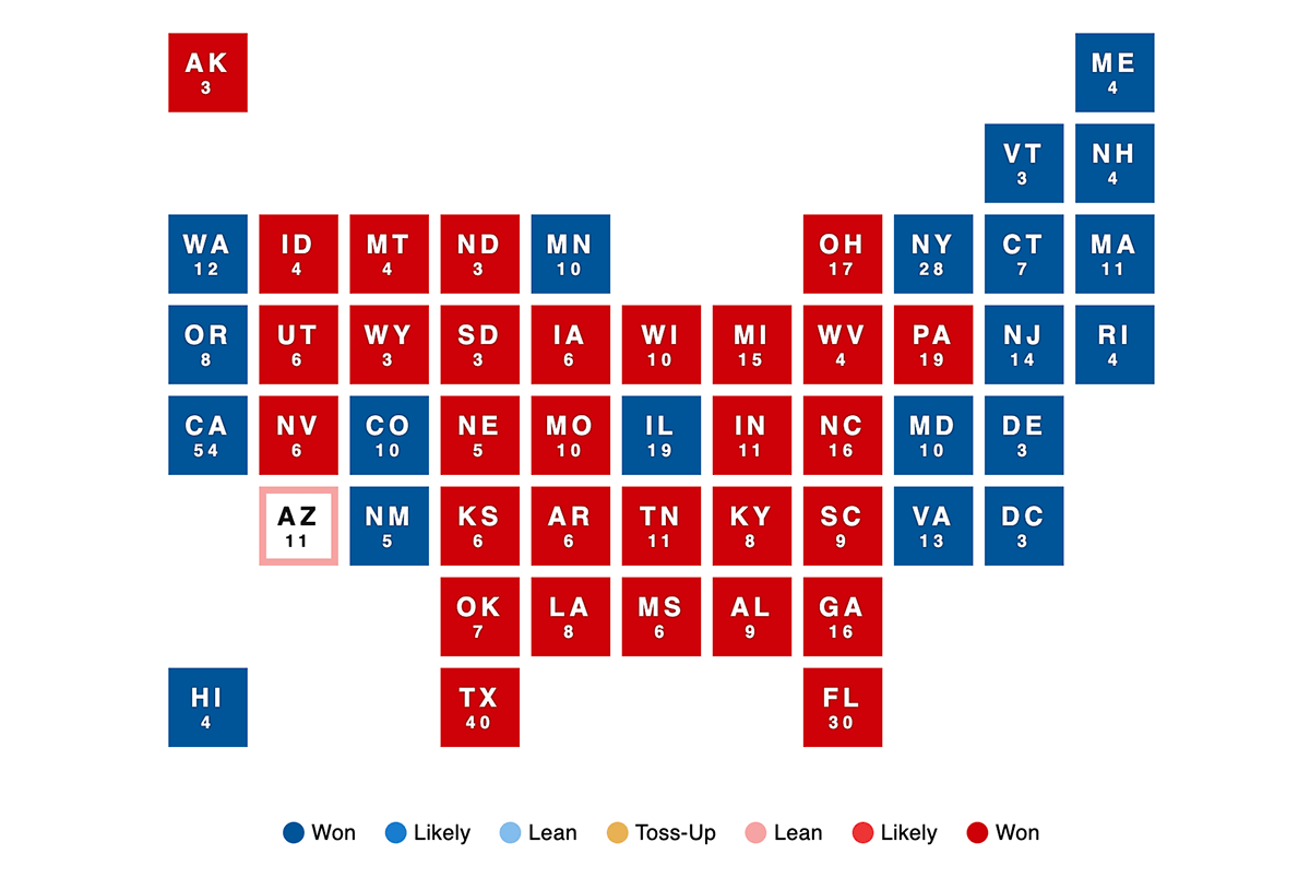
CBS News offers a classic grid map cartogram with one square per state, colored based on the winning candidate. The legend explains colors not only for the winners (red and blue) but also intermediary statuses (Likely, Lean, and Toss-Up), indicating real-time updates likely took place on Election Day (which seems to be the case for all the maps in this election map collection). Each state is labeled with its abbreviation and electoral vote count. The tooltip displayed on hover shows votes and percentages for the top two candidates, highlighting the winner.
Data source: Edison Research and The National Election Pool (NEP).
Hexagon Maps
#3. The Independent: Hexagon Map with Hover Interactivity
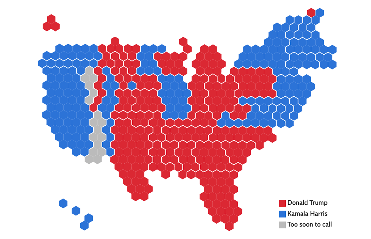
The Independent’s election map is a hexagon cartogram where each electoral vote is represented as a hexagon, grouped by state. State colors are typical — red or blue (or gray for states still counting at the time of writing). No supplementary labels are shown initially. Hovering over a state brings up a tooltip with more details like the state’s name and percentages for the top two candidates.
Data source: AP.
#4. ABC News (Australia): Hexagon Map with Click Interactivity
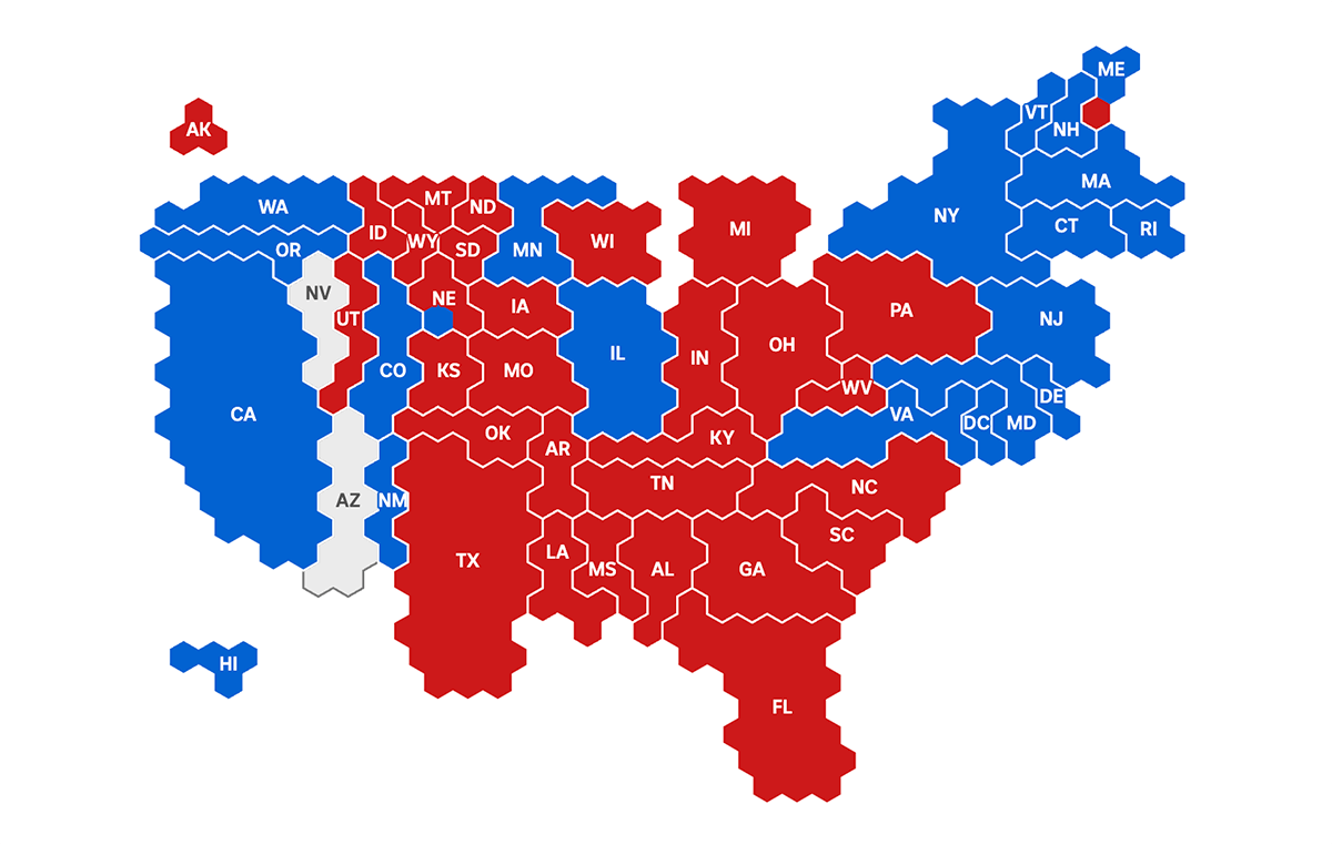
Australian ABC News provides a hexagon cartogram similar to The Independent’s. The differences lie in the details. ABC News’s map displays state abbreviations as labels and shows nothing when hovering. However, clicking on a state reveals more about its results, including votes and percentages for the two leaders.
Data source: AP.
Choropleth Maps of U.S. Election Results
Choropleth maps are also commonly used for visualizing U.S. election outcomes. Similarly to cartograms, they are typically colored based on the leading or winning candidate’s party affiliation (red for Republicans as Donald Trump in the 2024 election, and blue for Democrats as Kamala Harris in 2024). In addition, choropleths often include drill-down capabilities to see county-level details.
Here are some examples from the latest presidential election — from 270toWin, The Hill, CNN, ABC News, BBC, and Fox News.
Choropleth Maps with Drill Down
#5. 270toWin: Choropleth Map
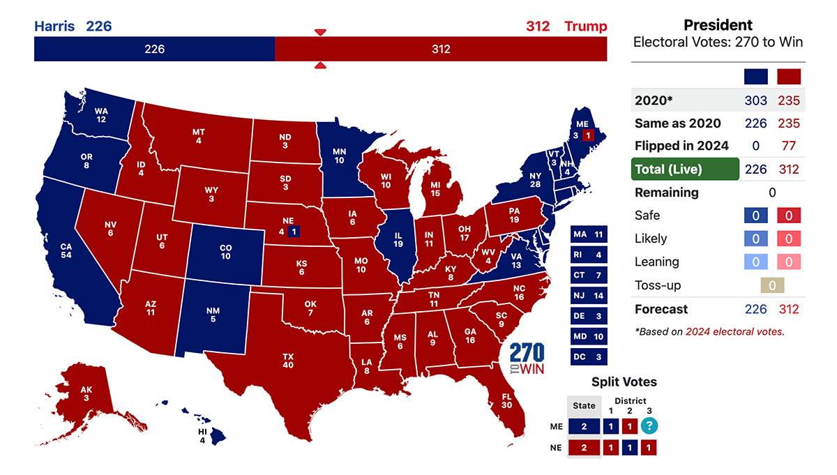
270toWin offers a traditional choropleth map representing each state’s results. States are labeled with abbreviations and electoral vote counts, including splits in Nebraska and Maine. Clicking on a state drills down to county-level results on a separate page, also using the choropleth mapping technique. While the national map doesn’t show tooltips on hover, hovering over counties on state pages displays votes and percentages for up to five top candidates.
Data source: Decision Desk HQ.
#6. The Hill: Choropleth Map
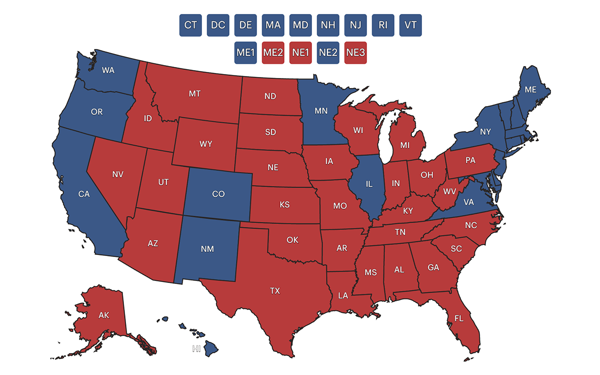
The Hill’s election map is another choropleth map with the drill-down capability. State labels include only abbreviations. Hovering over a state shows results in absolute votes and percentages for up to five leaders. Clicking on a state opens its county-level choropleth map, similar to 270toWin’s representation.
Data source: Decision Desk HQ.
#7. CNN: Choropleth Map with Lead Size
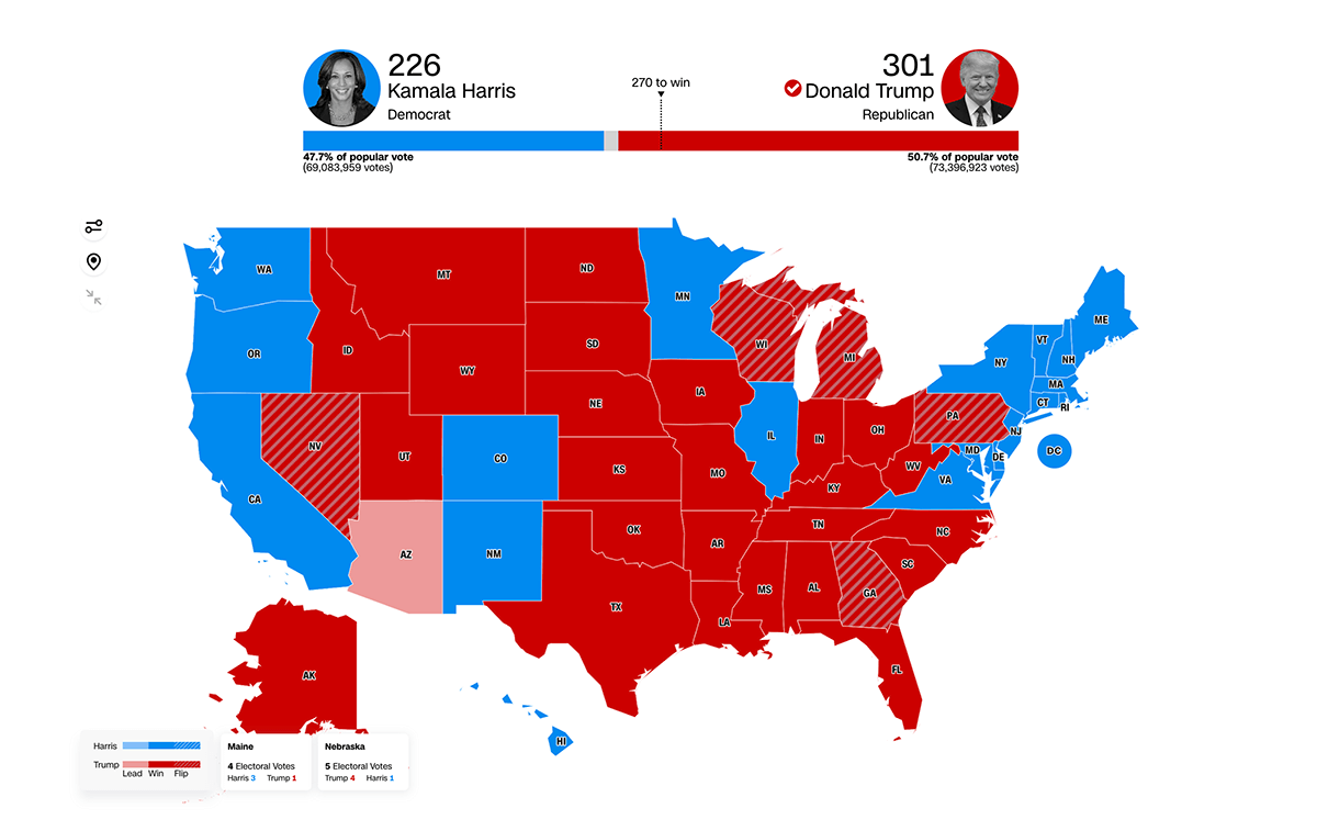
CNN provides two choropleth map views for an expanded geographic look at the 2024 U.S. presidential election results. The first shows states with their abbreviations. A key difference from previous choropleth maps is that here states where a flip occurred, compared to the 2020 winner’s party, are hatch-filled with diagonal lines. Hovering reveals votes and percentages for up to six candidates in the tooltip. The second choropleth map visualizes lead sizes using gradient color scales.
In both map views, clicking on a state zooms into the state’s division into counties and their voting results on the same map. You can easily zoom out when needed. There’s also a toggle to view the key races only.
Data source: Edison Research and The National Election Pool (NEP).
#8. ABC News: Accessible Choropleth Map
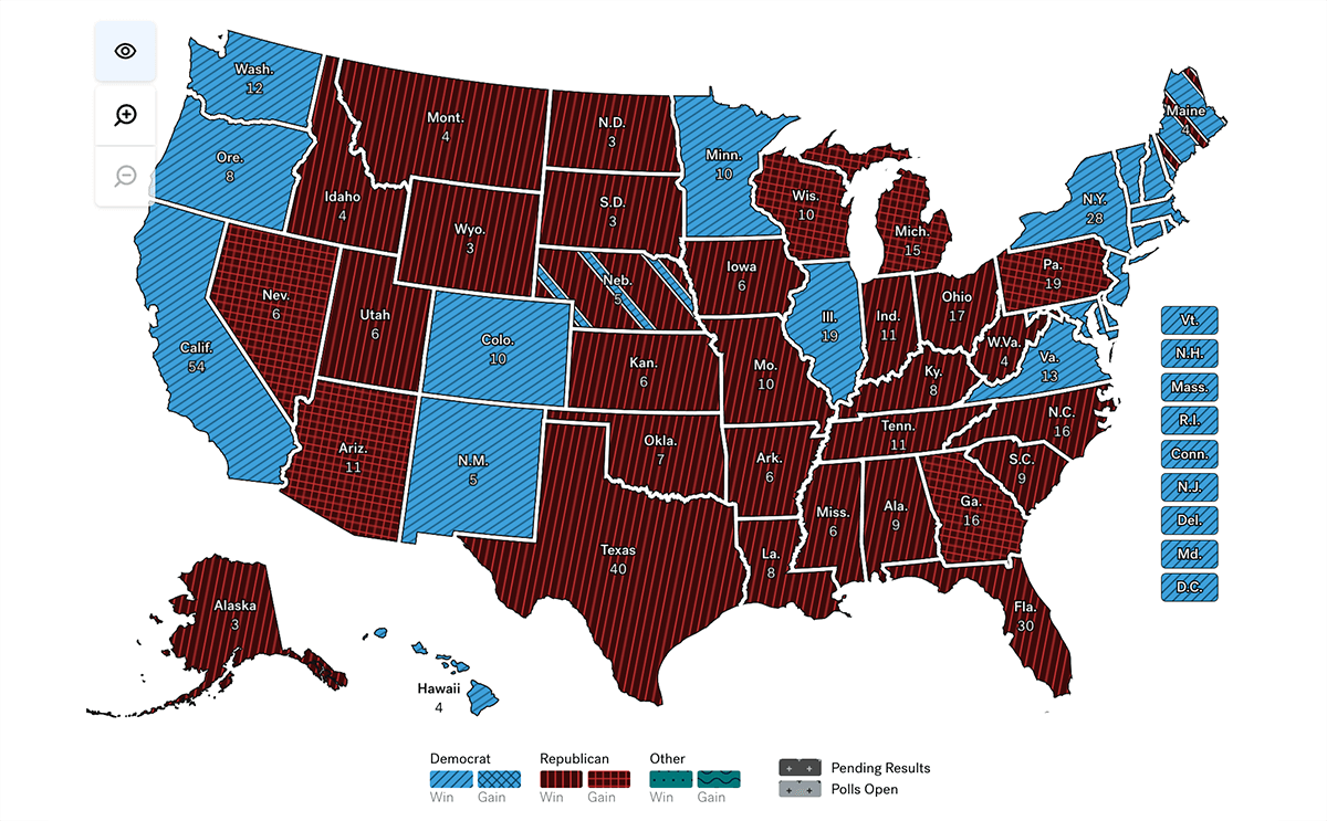
ABC News’s choropleth map looks similar to 270toWin’s but includes flip state indicators like CNN’s. It represents Maine and Nebraska’s split votes using differently colored stripes. While hovering doesn’t provide substantial additional information, clicking on a state zooms into county details like with CNN’s map, showing results for up to four candidates on the right.
A standout feature of ABC News’s map is its accessibility mode for color-blind users. It can be activated by clicking the eye icon above the zoom controls, which updates the contrasting settings and adds hatch fills to the color scheme.
Data source: Edison Research and The National Election Pool (NEP).
Choropleth Maps with Historical Context
#9. BBC: Choropleth Maps with Results from Previous Elections
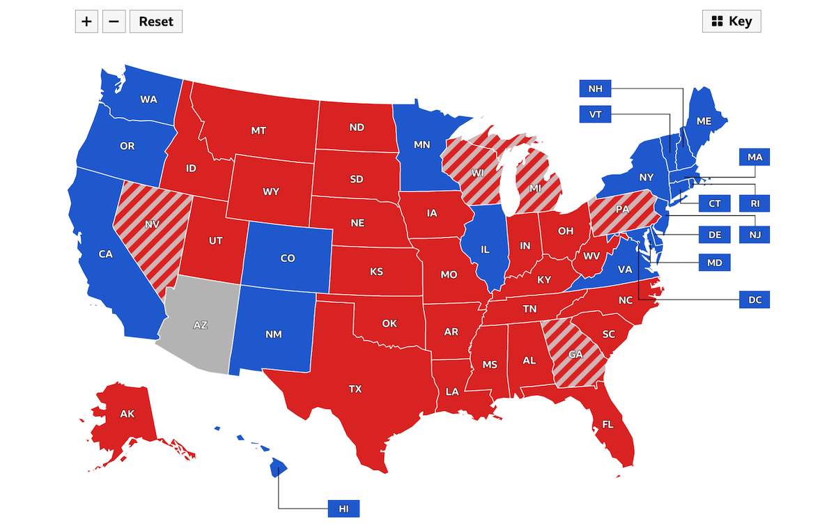
The BBC‘s U.S. presidential election map labels states with abbreviations and highlights flipped ones, similar to CNN‘s approach. Hovering displays votes and percentages for the top three candidates and the 2020 winner. Clicking on a state zooms into county-level results.
The key differentiator of the BBC’s map is the availability of previous results from 2020, 2016, 2012, and 2008, which can be visualized on the same choropleth map with one click. You can switch to a previous election and see the winner in the tooltip; for example, in the 2008 view, you’ll see the 2004 winner.
Data source: Edison Research and The National Election Pool (NEP).
#10. Fox News: Granular Choropleth Map with Previous Results
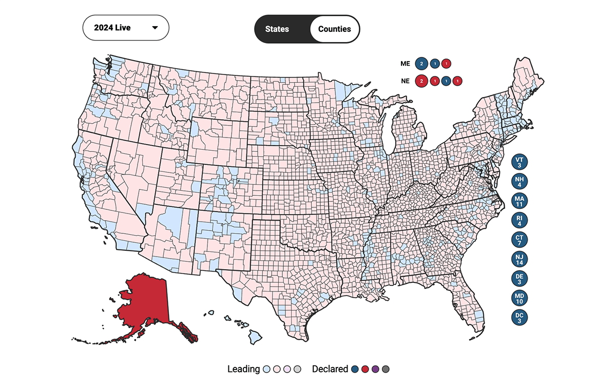
Fox News offers a choropleth map similar to the BBC’s in terms of allowing viewers to see previous election results, though in this case, only for 2020 and 2016. Visually, it’s closer to 270toWin’s map, as it labels states not only with abbreviations but also with the total number of electoral votes. Additionally, it stripes the Maine and Nebraska states similar to ABC News’s map. Hovering brings up tooltips with vote numbers and shares for the top two leaders. Clicking lets you see the results by county.
What distinguishes Fox News’s map the most is the availability of a granular county view on the national map, available by clicking “Counties” next to the “States” tab. This detailed county view is available for the 2020 and 2016 U.S. presidential election results as well.
Data source: AP.
Cartograms & Choropleth Maps of U.S. Election Results in Single Dashboards
Since cartograms and choropleth maps are the two most widely used forms of data visualization in U.S. election maps, they often go hand in hand, allowing you to choose the view you prefer and easily switch between them — toggling between a purely geographic perspective and a focus on electoral votes.
Here are some examples of such election dashboards — from The Washington Post, Politico, Axios, Al Jazeera, The Telegraph, The Times, and The Wall Street Journal.
Basic Cartograms and Choropleth Maps
#11. The Washington Post: Basic Cartogram and Choropleth Map
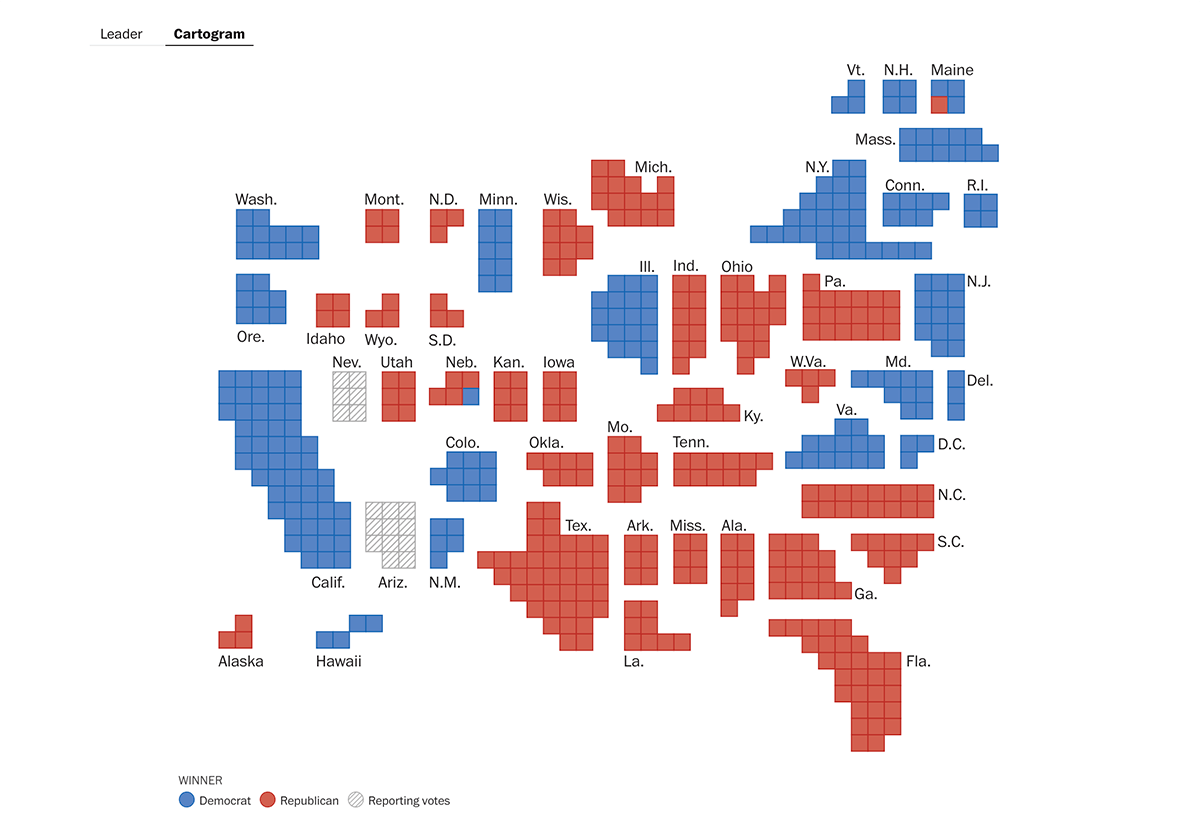
The Washington Post’s election graphics hub features two basic visualizations splitting the geographic and electoral-vote insights nationwide on a state level. The choropleth map colors states by the leading candidate’s party color, displays state names, and marks flipped states with arrow symbols. The cartogram uses equal-sized squares for each electoral vote, grouped by state and colored by the leading candidate’s color. In both views, hovering over a state reveals votes and percentages for Trump and Harris in the tooltip.
Data source: AP.
#12. Politico: Basic Cartogram and Choropleth Map
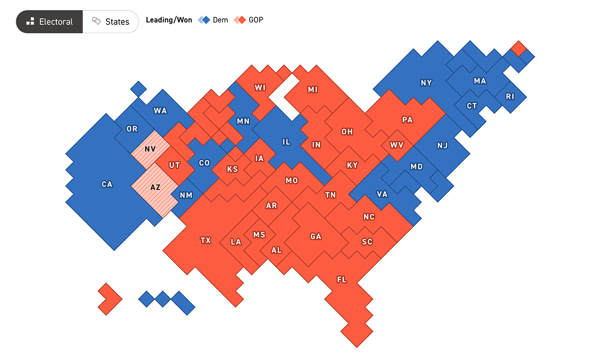
Politico presents the voting results in the same two basic visuals like The Washington Post: a cartogram and a choropleth map. The electoral cartogram resembles a real map but with geographic area relationships distorted based on electoral votes. The choropleth map is similar to The Hill’s, with state abbreviations shown and flipped states not highlighted. On hover, both visualizations display vote numbers and percentages for the top two candidates, plus the third-place result or combined results for other candidates where applicable.
Data source: AP.
#13. Axios: Basic Cartogram and Choropleth Map with Advanced Tooltips
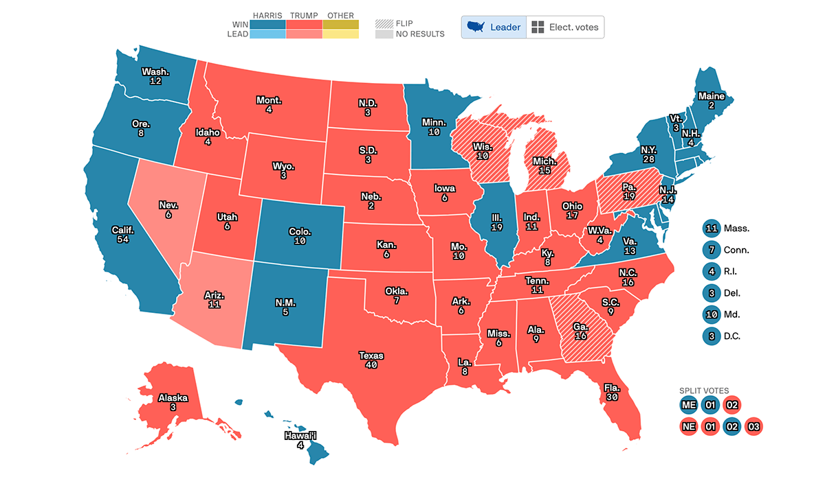
Axios also provides these two traditional geovisualizations. Axios‘s cartogram resembles Le Monde’s, showing squares for each electoral vote layered within the respective state’s boundaries. Like the choropleth map, it also displays states with names, electoral vote counts, and prominently colored flipped states.
The tooltip is what makes Axios stand out, as it is also interactive. It allows you to see vote numbers and percentages for the top candidates and press the “Show All” button to expand and view all candidates’ results directly within the same tooltip.
Data source: AP.
#14. Al Jazeera: Basic Cartogram and Choropleth Map with Previous Results
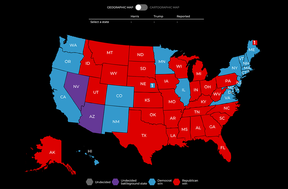
Al Jazeera visualizes the 2024 U.S. election results using cartogram and choropleth map graphics on a dark background (like the “dark mode”). The choropleth map looks similar to The Hill’s and Politico’s, with state labels showing abbreviations and no highlighting of flipped states. In addition, it highlights Nebraska and Maine’s split electoral votes. Hovering doesn’t display additional information, but clicking a state on the choropleth or cartogram represents results for the top two candidates above the graphic.
Al Jazeera’s project also enables viewing previous U.S. presidential results from 2020, 2016, and 2008 on the choropleth map, although these historical election maps are not interactive.
Data source: AP.
Drill-Down Choropleth and Cartogram in Single Dashboards
#15. The Telegraph: Drill-Down Choropleth Map with Basic Cartogram
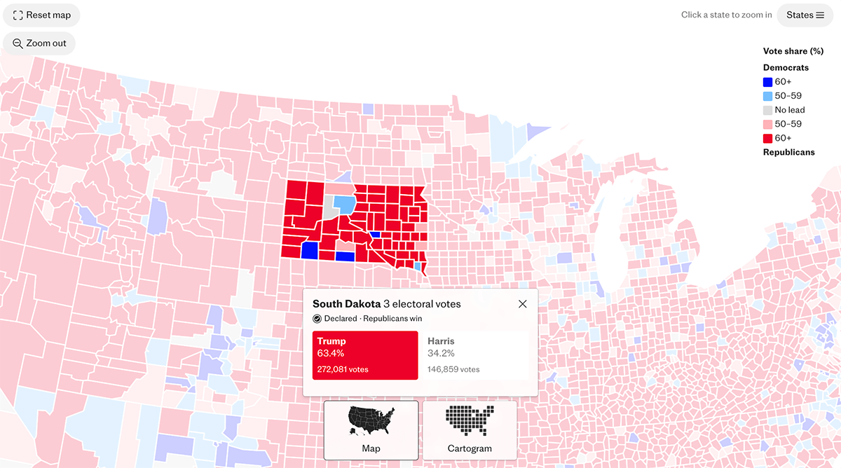
The Telegraph’s dashboard offers unlabeled basic cartogram and choropleth map visuals, with colors indicating winners (and flips on the choropleth map). No tooltip appears on hover. However, clicking on a state reveals vote and percentage results for the top two candidates in a hint window. In the choropleth map view, clicking also zooms into county-level results, additionally visualizing the winner’s vote share using a color scale.
Data source: Edison Research and The National Election Pool (NEP).
#16. The Times: Drill-Down Choropleth Map with Basic Cartogram
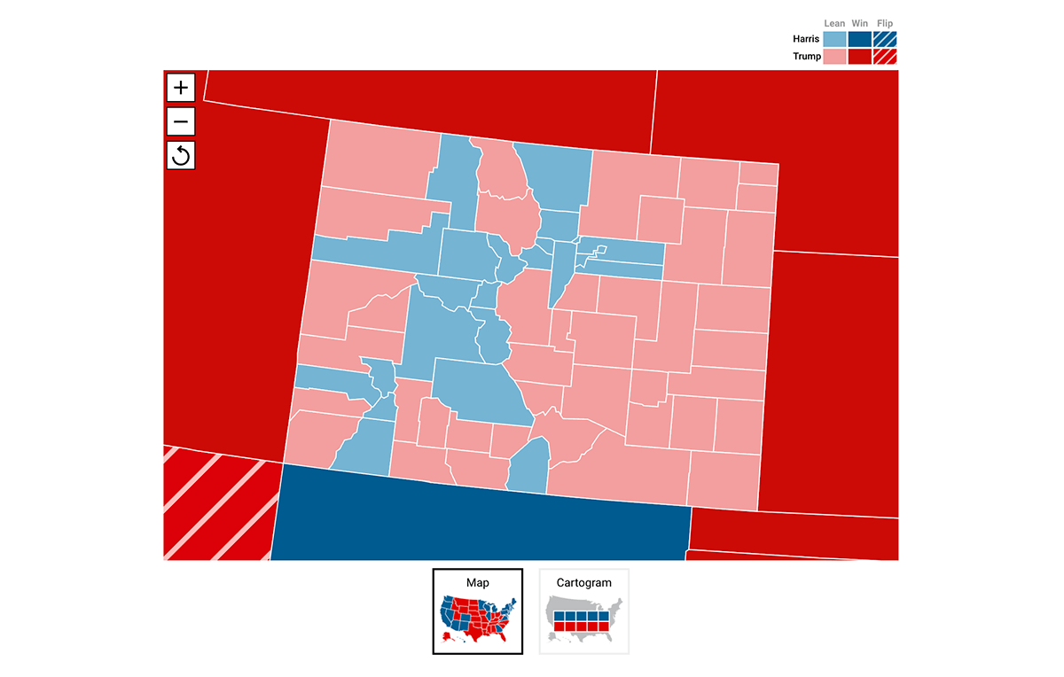
The Times provides similar visuals to The Telegraph‘s: a choropleth map and cartogram without labels, but The Times’s cartogram also distinguishes flipped states. Both support tooltips on hover, displaying more details, including vote numbers and percentages. Clicking the choropleth map triggers zooming into that state, revealing county results also represented in choropleth style.
Data source: AP.
#17. WSJ: Drill-Down Cartogram and Drill-Down Choropleth Map
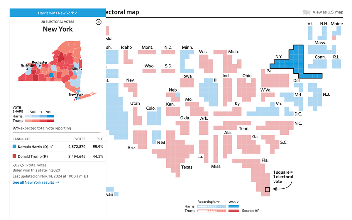
The Wall Street Journal’s election visuals, as opposed to The Telegraph’s and The Times’s, label states with names on both the cartogram and choropleth map and also show tooltips on hover with votes and percentages for up to three leading candidates. Drilling into states in any view reveals the county-level situation: a separate window appears with more details on the left, including who won in the 2020 election, and a choropleth map of the respective state representing county colors according to the 2024 winner’s vote share using a color scale similar to The Telegraph’s choropleth map.
Data source: AP.
Bubble Maps of U.S. Election Results in Dashboards
Bubble maps are a powerful tool for visualizing numerical data on maps by using circles (bubbles) of varying sizes and colors to represent quantities like vote counts or margins. When combined with cartograms and choropleth maps, bubble maps provide additional layers of insight, highlighting not just who won where, but by how much, and where the most votes are concentrated.
? Learn how to create a bubble map using JavaScript (and how to visualize election results in a bubble map with JS).
Below are examples of dashboards that effectively integrate bubble maps alongside cartograms and choropleth maps, offering a more nuanced view of the 2024 U.S. presidential election results — from The New Yorker, NBC News, Time, France24, Associated Press, The Guardian, and Reuters.
Bubble Maps with Cartograms and Choropleth Maps
#18. The New Yorker: Cartogram and Choropleth Maps with Bubble Maps for Drill-Down
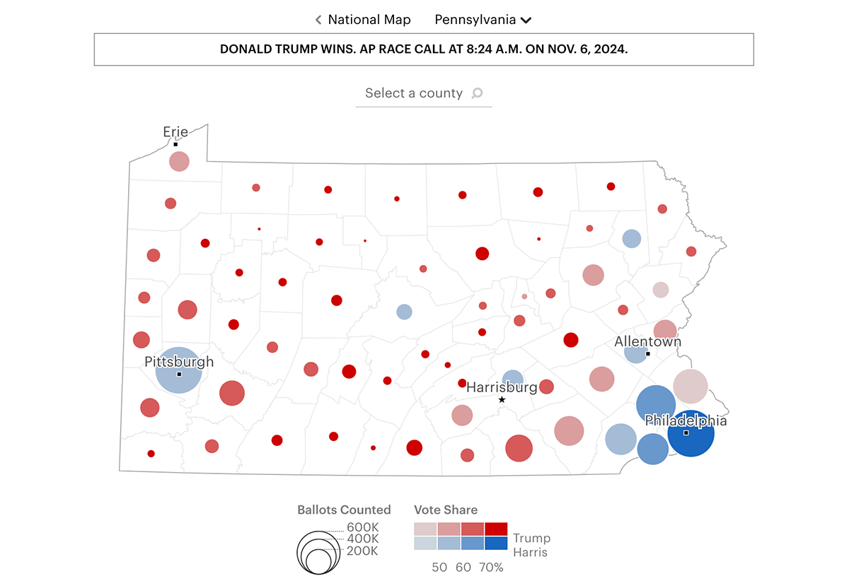
The New Yorker presents the 2004 race results using traditional geographic (choropleth) and electoral (cartogram) maps like many we’ve already seen. Both have no labels like The Telegraph’s but without highlighting flipped states. Hovering shows results for up to three candidates. Clicking a state drills down into a county-by-county view, where bubble maps come into play. County results are displayed with bubbles — one for each county — colored by the winner (based on vote share using a color scale) and sized by ballots counted.
Data source: AP.
#19. NBC News: Bubble Maps with Cartogram and Choropleth Maps
NBC News also uses a choropleth map and a cartogram as primary visualizations. These resemble Axios’s in terms of how states are represented: battleground states are highlighted, states are named, but electoral votes are not seen at first glance. Both display state results on hover, showing up to five leading candidates in votes and percentages. There’s also a switcher to view only battleground states. Clicking on a state opens a detailed page that includes a county-level choropleth map and two more map tabs with bubble maps: Size of Lead and Estimated Remaining Votes.
Data source: Edison Research and The National Election Pool (NEP).
#20. Time: Bubble Maps with Cartogram and Choropleth Maps
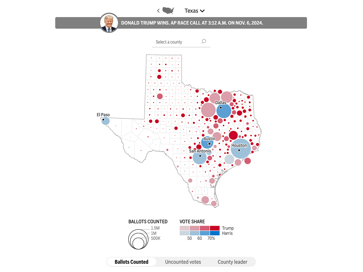
Time provides a choropleth map for the geographic view that looks similar to The Telegraph’s — it shows state abbreviations and colors states by the winner’s party color without highlighting flip stats — and a cartogram for the electoral perspective, similar to Le Monde’s but with more detailed tooltips. On both presentations, hovering brings up details including votes and percentages for up to three top candidates in each state. Clicking on a state on either map drills down into state details on the same page. At the county level, you are offered three maps to explore:
- Ballots Counted: A bubble map with color highlighting the vote share for the leading candidate and size representing ballots counted.
- Uncounted Votes: Another bubble map showing uncounted vote estimate.
- County Leader: A choropleth map displaying the county leader with a color scale indicating the vote share between the top two candidates.
Data source: AP.
#21. France24: Bubble Maps with Cartogram and Choropleth Maps
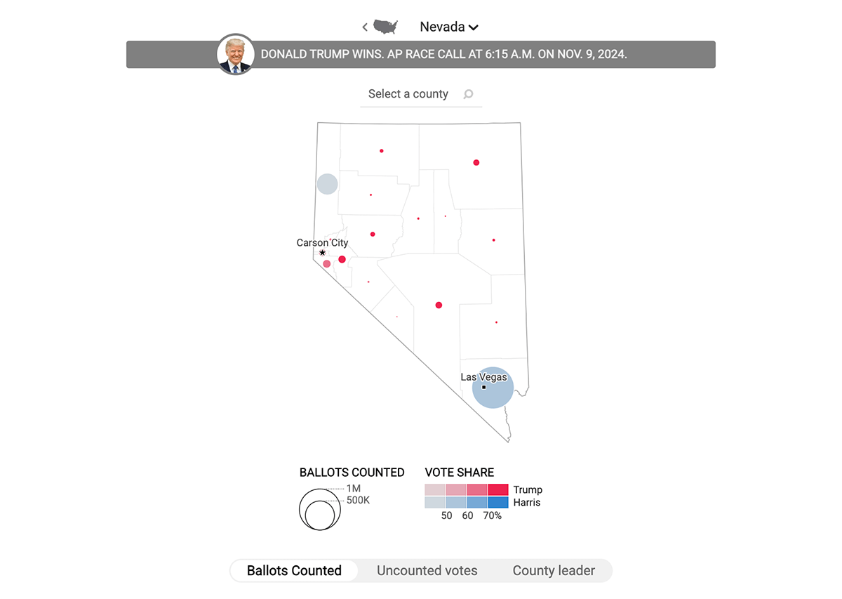
France24’s election map dashboard closely resembles Time’s, with minor differences like the exact shades of red and blue used. On hover, both key visuals — the choropleth map and cartogram — display votes and percentages for the top two candidates, then “Other candidates” combined, and then the top of those “others” depending on the state competition landscape. Clicking states drills down into the same bubble maps for counted (with vote share) and uncounted ballots, as well as a choropleth map for county leaders.
Data source: AP.
#22. AP: Bubble Maps with Cartogram and Choropleth Maps
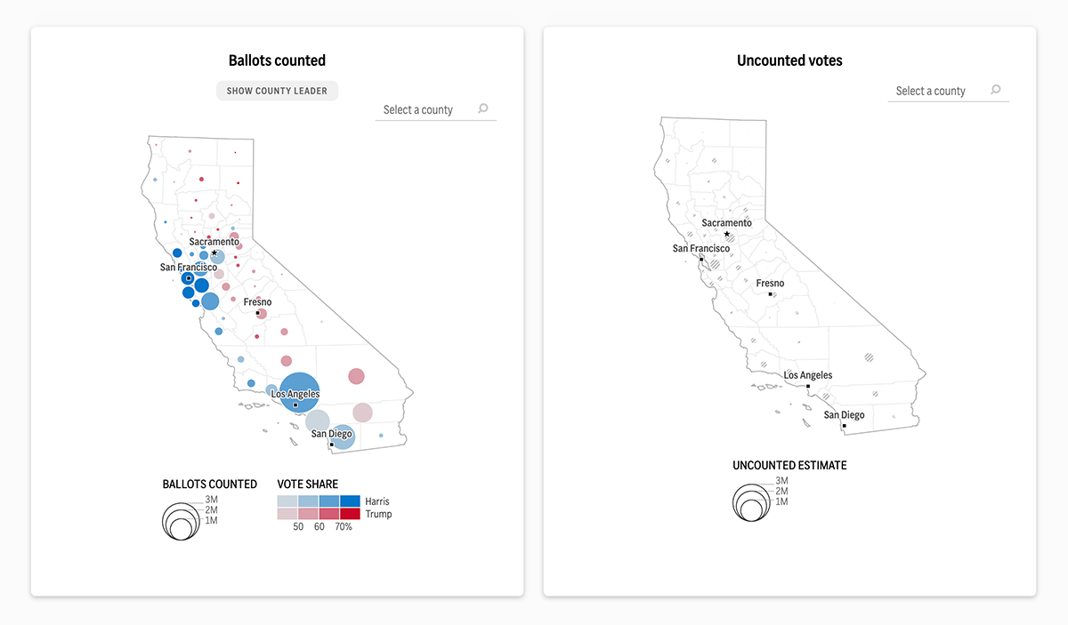
The Associated Press (AP) is one of the top U.S. election data providers. Along with their data, they offer ready-to-use yet customizable pre-built graphics. It’s no surprise that AP’s dashboard is similar to several we’ve already reviewed.
AP’s election results mapping project begins with a cartogram where one square equals one electoral vote, grouped by state and displayed within the state’s geographic borders. These groupings are arranged to visually resemble each state’s shape. The choropleth map is simple yet effective, coloring states by the leaders without emphasizing flipped states. Hovering and clicking behaviors are the same as in the projects by Time and France24.
Data source: AP.
#23. The Guardian: Bubble Maps with Cartogram and Choropleth Maps
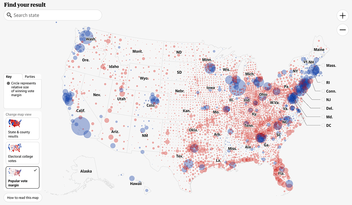
The Guardian, using AP‘s election data products too, provides similar choropleth and cartogram maps. However, the choropleth map also shows flipped states, as well as displays choropleth maps of county divisions on click instead of bubble maps, making it look closer to CNN‘s. The cartogram comprises hexagons instead of squares, resembling NBC News’s.
What makes The Guardian’s dashboard stand out from all the previous ones is a bubble map featured prominently alongside the choropleth and cartogram. It represents popular vote margins across counties nationwide through bubbles sized by the winning vote margin and colored by the winner’s party color.
These maps don’t have hover functionality, but you can view results by clicking on a state or county to see detailed vote results, including vote counts and percentages for all candidates, along with county composition when zoomed in — all available in the choropleth and bubble maps.
Data source: AP.
#24. Reuters: Bubble Maps with Cartogram and Choropleth Maps
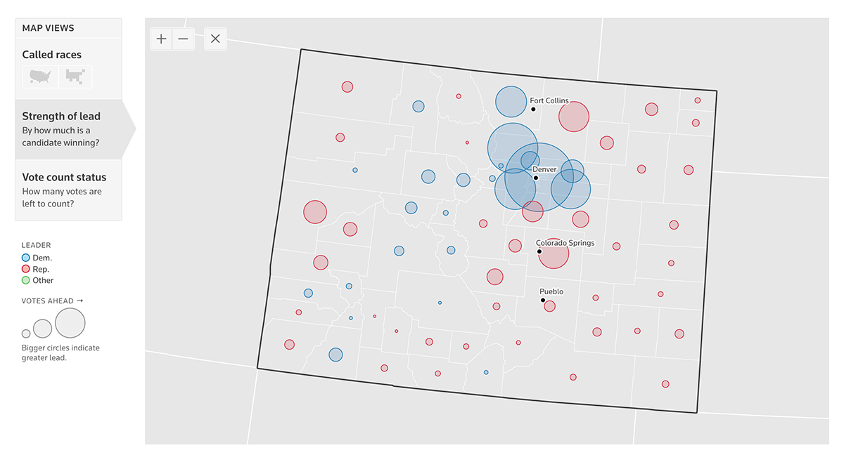
Reuters, the exclusive distributor of Edison Research and The National Election Pool’s (NEP) 2024 General Election data, offers four national 2024 U.S. presidential voting maps:
- Called Races (1–2): Visualizes called races data directly, available as a choropleth map and a hexagon cartogram, both similar to The Guardian’s. Hovering reveals votes and percentages for up to three top candidates. Clicking on a state in the choropleth zooms into county-level results.
- Strength of Lead (3): Shows by how much a candidate won using a choropleth map with a color scale of blue and red shades indicating the vote margin. Hovering displays this margin value (the difference between the votes for the leader and the second top candidate) in addition to the candidates’ results.
- Vote Count Status (4): A choropleth map representing how many votes are left to count by state. Clicking on a state drills down into a bubble map view. Hovering shows the number of expected votes left to count, visualized by the size of the bubbles.
Data source: Edison Research and The National Election Pool (NEP).
Dashboards with Custom Marker Maps of U.S. Election Results
Using custom markers as pivotal map elements can effectively visualize specific trends and patterns. Two main marker map types are often used:
- Spike Maps: Utilize shaded triangle peaks, following a peaks-and-valleys metaphor, illustrating changes in data magnitude.
- Arrow Maps: Employ shaded arrows, similar to a wind metaphor, indicating the direction in addition to the magnitude of shifts.
? Learn how to create a marker map using JavaScript (and how to set a custom marker).
Below are examples of dashboards where such types of election maps are effectively leveraged, contributing to making them the most impressive among all we’ve seen (though personal preferences may vary) — from Bloomberg News and The New York Times.
Custom Marker Maps with Cartograms and Choropleth Maps
#25. Bloomberg: Spike Maps with Cartogram and Choropleth
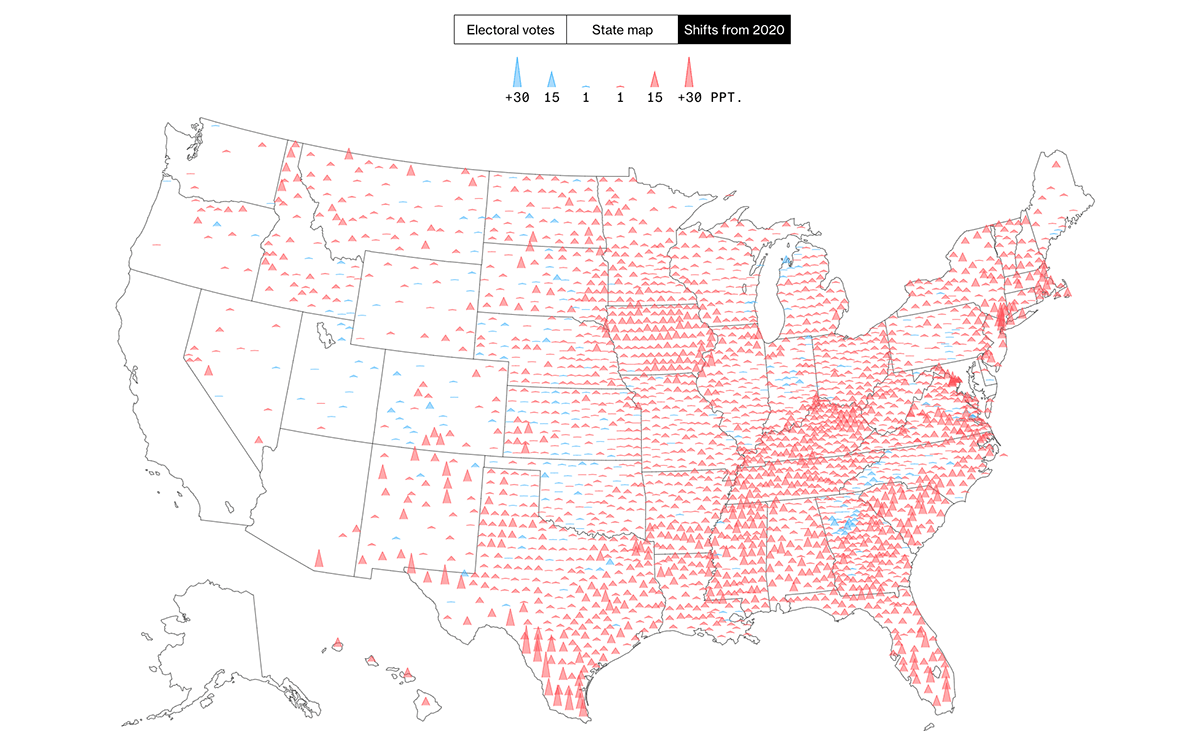
Bloomberg News presents three national maps at the front of its election dashboard:
- Cartogram: Consists of groups of nested square tiles, with each group representing a state and named respectively. The squares are arranged to resemble the geographic shape of the state, and each tile stands for one electoral vote.
- Choropleth Map: Displays the winners in each state and highlights flipped states compared to the previous election with diagonal line fills.
- Spike Map: The highlight of Bloomberg’s election dashboard, this map shows presidential margin shifts from 2020. It uses shaded triangles colored according to the current election winner, with the height reflecting the magnitude of the change. Each triangle corresponds to one county.
On all these three maps, hovering over an area brings up a tooltip with more details, including vote and percentage results for the top two candidates, Trump and Harris. Clicking on a state in the choropleth map or cartogram opens a dedicated state page with additional details:
- Vote Share of the Leader: Presented in a choropleth map with a color scale indicating the percentage of votes for the leading candidate.
- Size of Lead: Displayed using varied-sized squares acting like bubbles in a bubble map, where the size conveys the difference in votes between the two leaders.
- Shift from 2020: Illustrated in a spike map similar to the national one, showing how the margin has shifted since the last election.
Data source: AP.
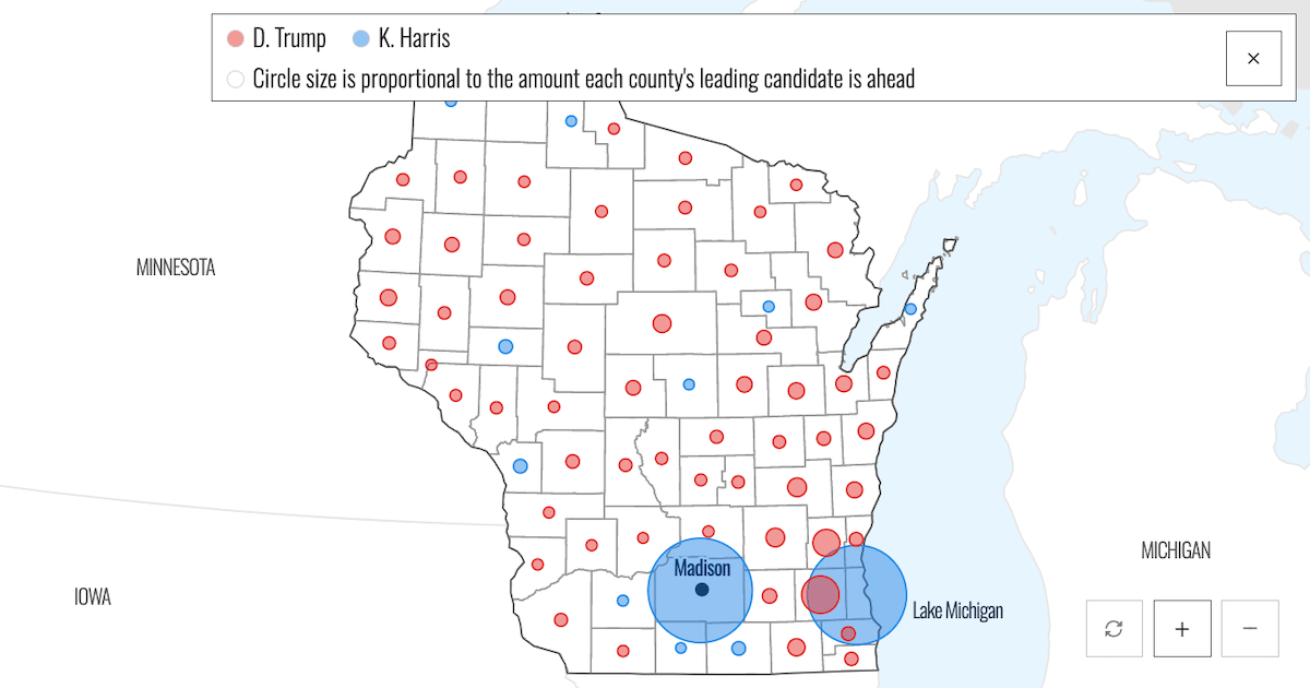
#26. NYT: Arrow Maps with Cartogram, Choropleth, and Bubble Maps
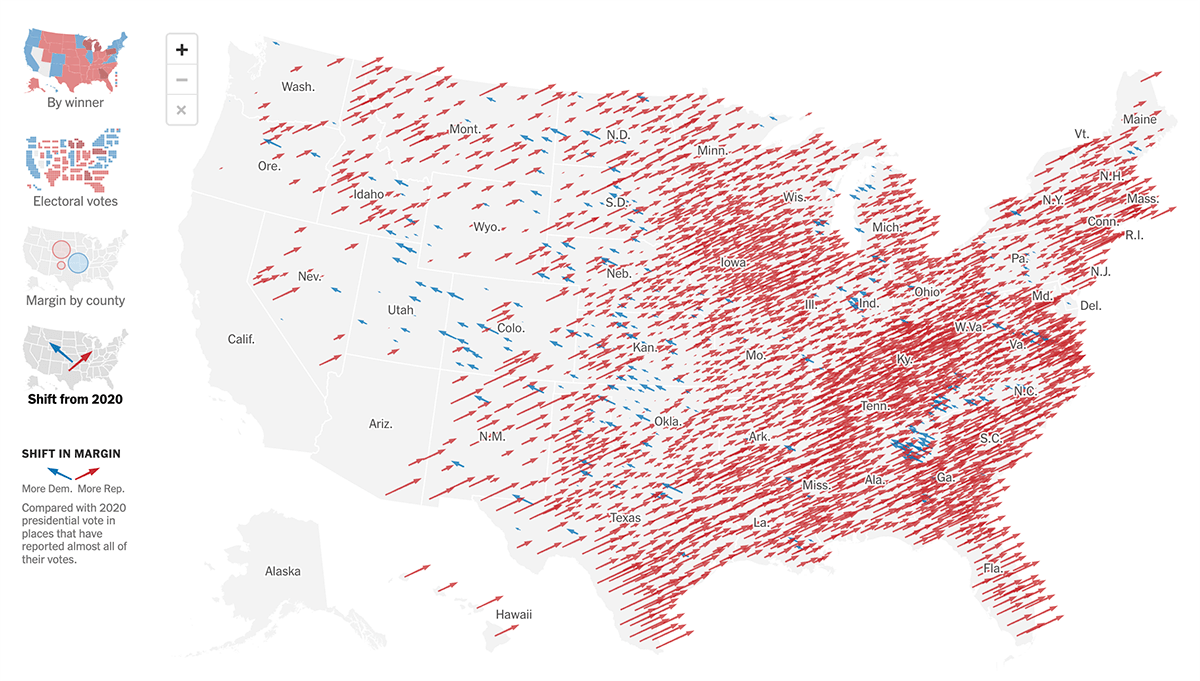
The New York Times features four main maps representing the 2024 U.S. presidential election results. Its choropleth and cartogram views are similar to Bloomberg‘s in terms of data visualization approach, including captions. The bubble map displays the margin by county, with bubble size proportional to how much each county’s leading candidate is ahead.
The arrow map is last but certainly not least — and moreover, the star of The New York Times‘s election map showcase. Also known as a swing map or hedgehog map, it conveys shifts in margin from 2020. Arrows are shaded in blue or red based on whether the change is more Democratic or more Republican. The size of the arrow corresponds to the magnitude of the shift, and the direction of the arrow reinforces the trend.
In all these maps, hovering over an area reveals details including votes and percentages for the top candidates. On the choropleth map, you can click on a state to zoom into the county level, where results are shown with bubbles — colored by the leader and sized by the leading margin.
Data source: AP.
? #27. Choropleth-to-Cartogram Map Animation by Karim Douïeb
For what it’s worth: an alternative view on the 2024 U.S. Election Map ?️
This map scales states by electoral weight, preserving the U.S. shape for recognition. Voronoi-based shapes within each state show exact elector counts.#Election2024 #DataViz #Cartogram #ElectoralCollege pic.twitter.com/WmKcAI8wKd— Karim Douïeb (@karim_douieb) November 6, 2024
While The New York Times‘s map was initially intended to be the last in our review, we couldn’t resist highlighting this as the cherry on top. Belgian designer Karim Douïeb from Jetpack.AI presents the 2024 U.S. presidential election results with a compelling map animation. The visual starts with a traditional choropleth map and then scales the states by their electoral weight — the number of Electoral College votes — transforming the map into a non-contiguous cartogram tiled with Voronoi shapes. This transition beautifully illustrates how the balance changes between these two major types of U.S. election map visualizations.
Top 2024 U.S. Election Data Sources
Before we wrap up, let’s take a quick look at the key data sources used in these U.S. election maps:
- AP: Used in 16 projects.
- NEP & Edison Research: Used in 8 projects.
- Decision Desk HQ: Used in 2 projects.
Wrapping Up
These diverse visualizations demonstrate the many ways vote data can be represented. From choropleth maps and cartograms to bubble maps, spike maps, and arrow maps, each approach offers unique insights into the 2024 U.S. presidential election. We hope this collection inspires you in your data viz endeavors!
Stay tuned for more data visualization highlights in our next, regular edition of DataViz Weekly.
Interested in making a cool interactive map for a web page or app? Check out our JavaScript charting tutorials to get started easily. Or head directly to our JavaScript Maps Documentation for comprehensive guidance. Don’t miss out on exploring our JS Maps Gallery for more interactive map examples with full source code.
- Categories: AnyMap, Dashboards, Data Visualization Weekly
- No Comments »