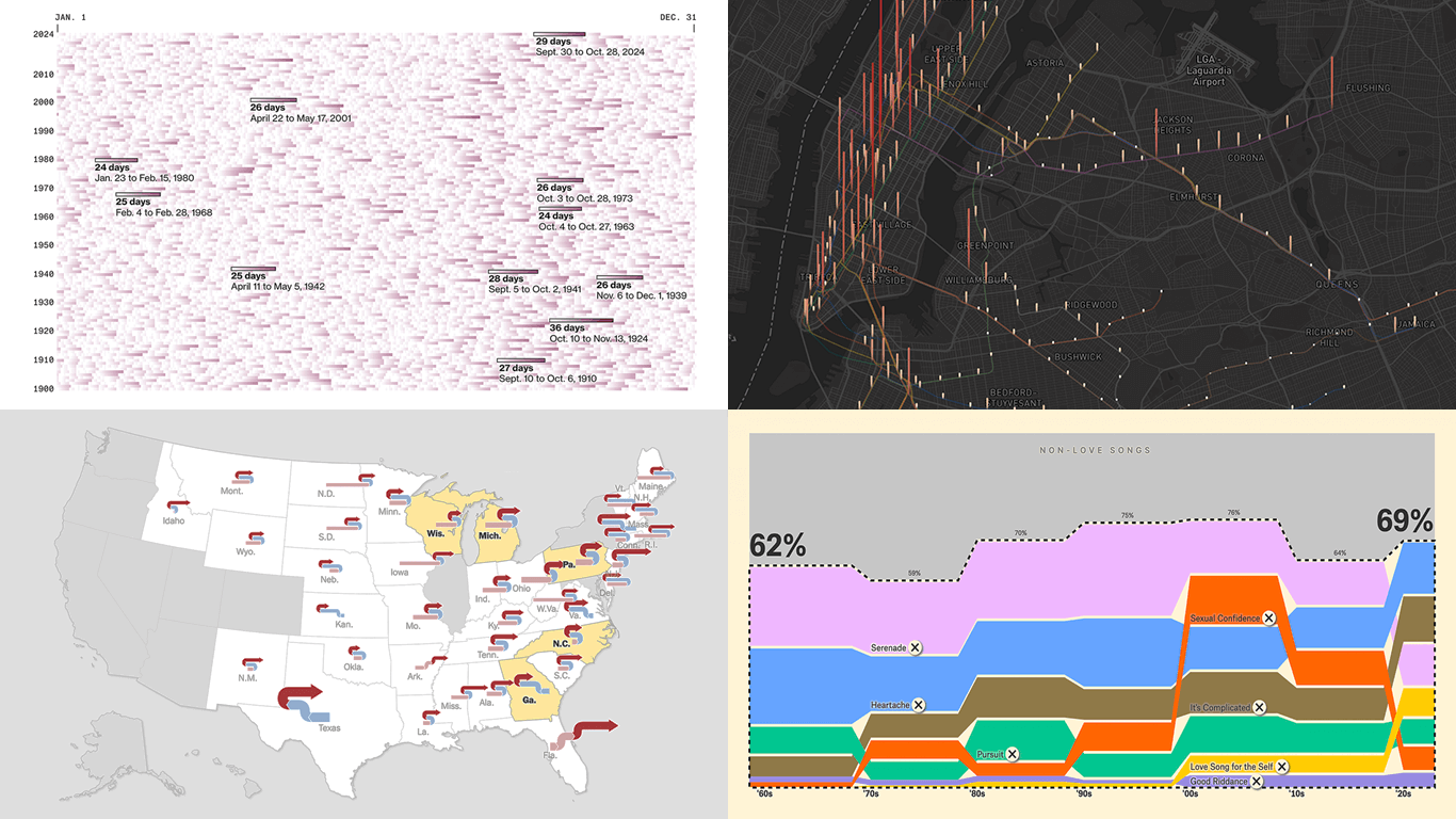
 Welcome back to DataViz Weekly, where we spotlight the most awesome data visualization works we have recently come across. Check out the projects we’re diving into this time:
- Love songs: death or evolution? — The Pudding
- Historical dry streaks in NYC — Bloomberg Green
- NYC subway ridership in detail — Subway Stories
- Vote swings in U.S. presidential elections — NYT
Data Visualization Weekly: November 8, 2024 — November 15, 2024
Love Songs: Death or Evolution?
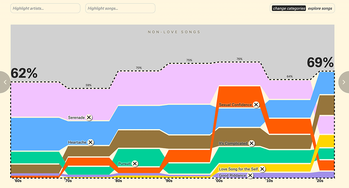
Some argue that the love song as a music genre is fading. But is it really? Or is it simply evolving?
The Pudding tackles this question with a visual story by David Mora and Michelle Jia, investigating the fate of love songs. The authors analyzed all 5,141 Billboard Top 10 hits from 1958 to September 2023, marking each song with a bubble sized by its time in the Top 10. Highlighting love songs, they explore trends through beeswarm and alluvial diagrams, ultimately showing that everything depends on perspective — in this case, how one defines a love song. Data was sourced from the Billboard Hot 100 rankings archived by UT-Austin’s School of Journalism and Media on GitHub, and the songs were categorized using hand-labeling and ChatGPT assistance.
Explore the story on The Pudding.
Historical Dry Streaks in NYC
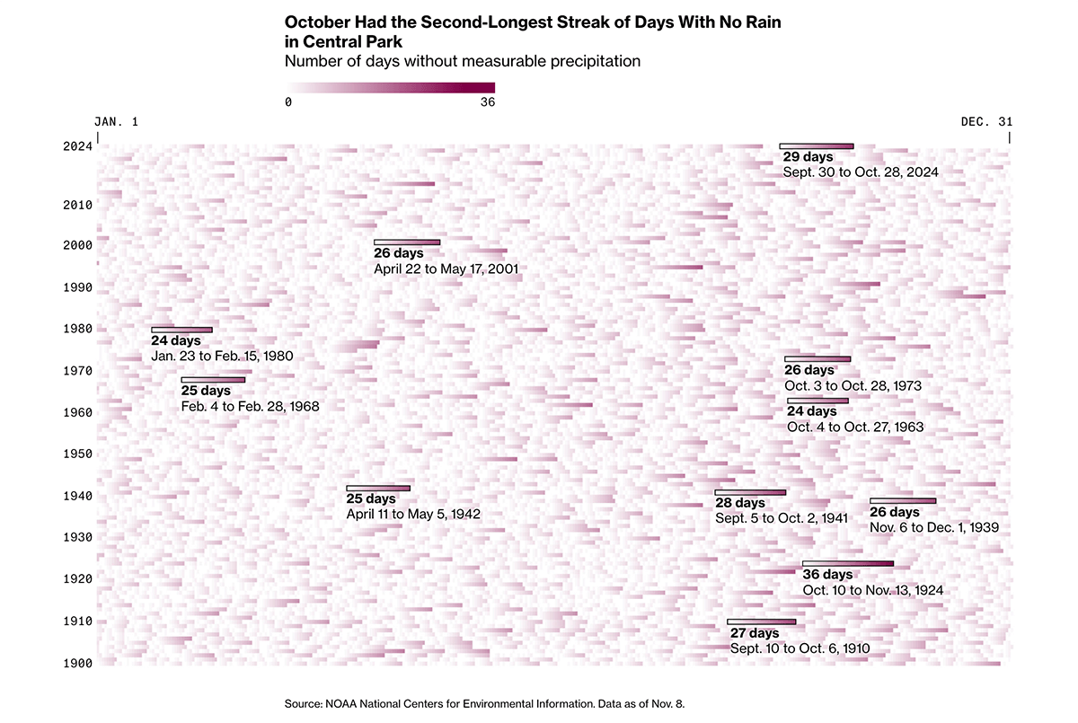
This fall, New York City has experienced its driest period since weather records began in 1869. From September 30 to October 28, not a single drop of measurable rain was recorded.
Bloomberg’s Denise Lu places this 29-day streak in historical context with a heatmap visualizing consecutive dry days since 1900. Darker shades represent longer streaks. This year’s streak is highlighted, along with the top 10 longest ones previously recorded, led by a 36-day drought in the fall of 1924. The piece also features a dot map showing the number of rainless days across the U.S. as of October 31, 2024. Data is sourced from NOAA’s National Centers for Environmental Information.
Check out the piece on Bloomberg Green.
NYC Subway Ridership in Detail
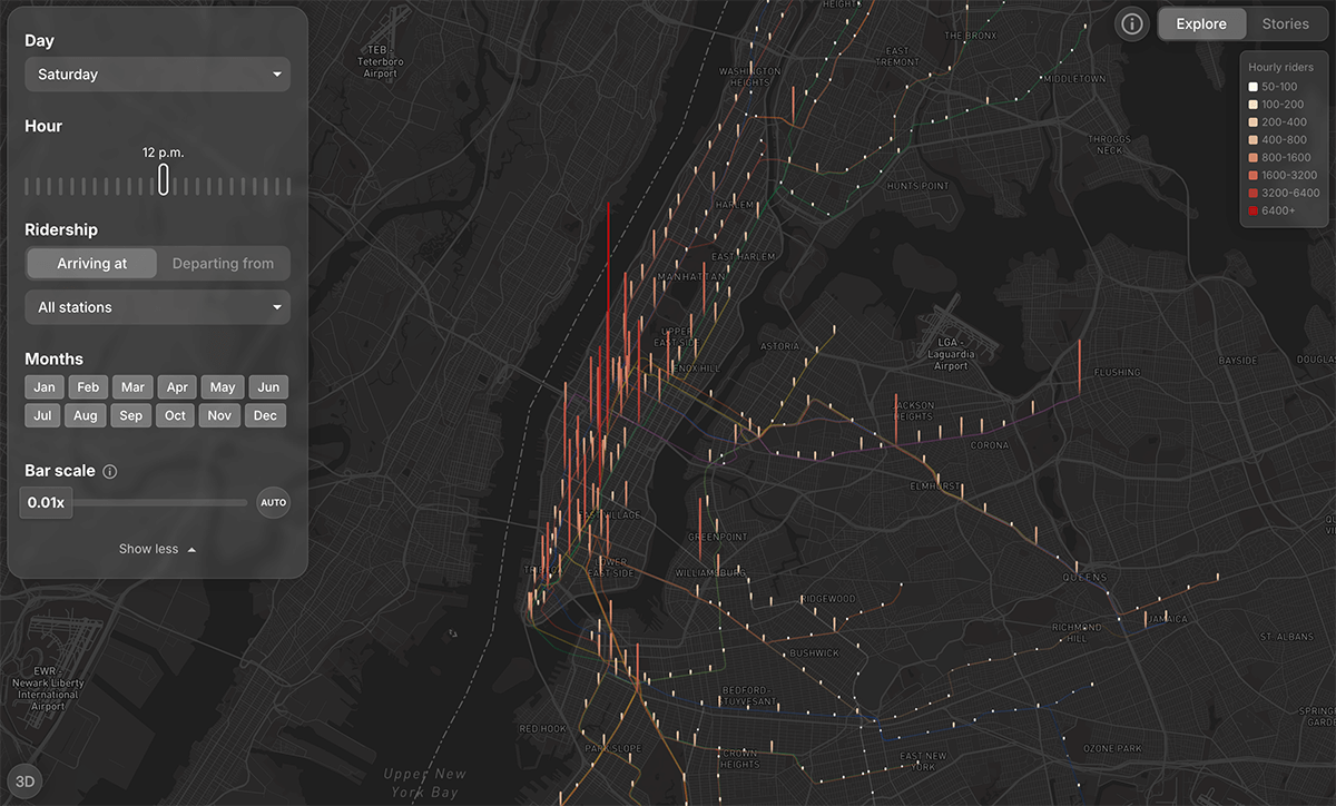
Every year, New Yorkers take over a billion trips on the subway — a true portal into the city’s heartbeat.
For the 2024 MTA Open Data Challenge, Jediah Katz, Julia Han, and Marc Zitelli created Subway Stories, mapping how riders flow between stations at every hour. Using the MTA’s Subway Origin-Destination Ridership dataset (complete 2023 data), the project presents five stories that uncover how New Yorkers move through their city, revealing the subway’s distinct rhythms and community connections. The Explore tab allows you to dive into the data yourself, filtering by time, day, and month to analyze ridership shifts linked to work, events, as well as neighborhood patterns.
Explore the project at subwaystories.nyc.
Vote Swings in U.S. Presidential Elections
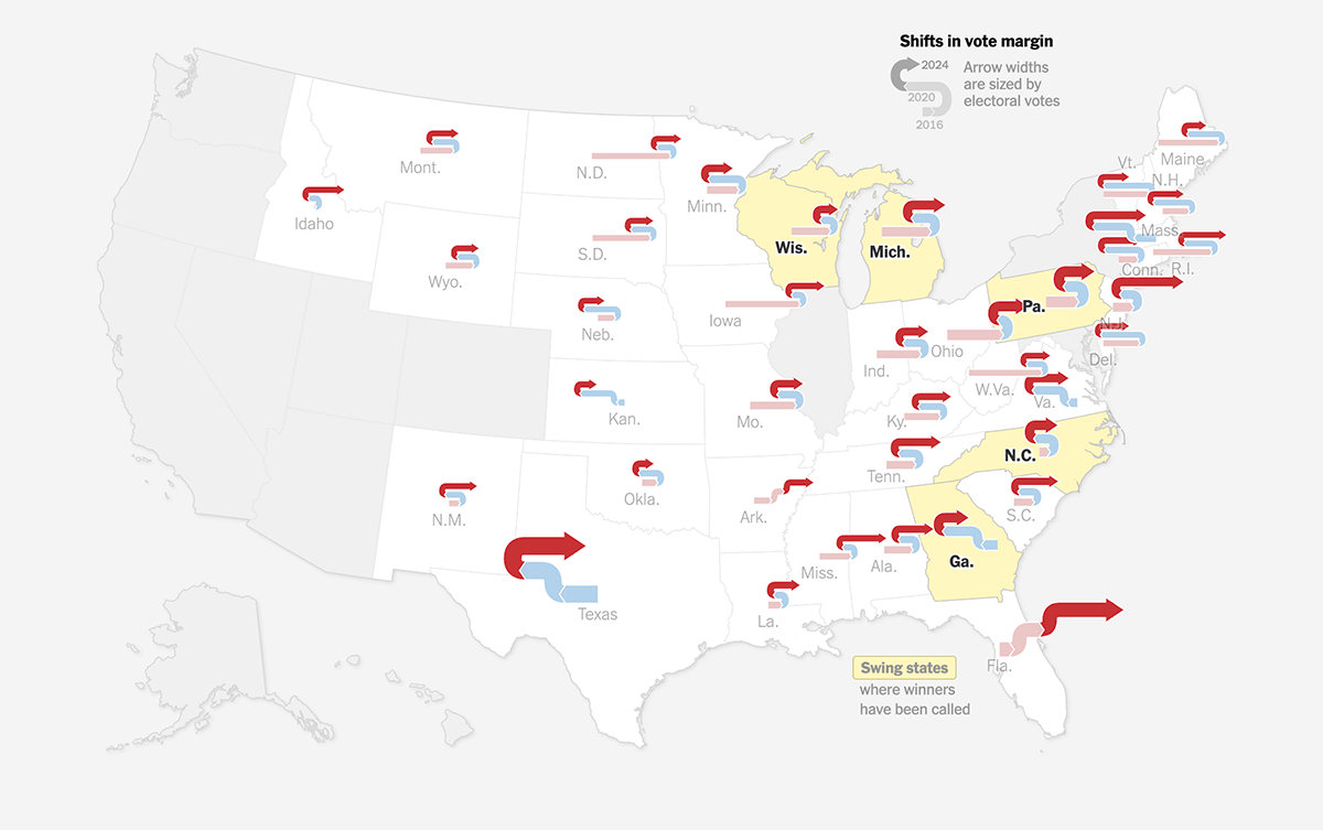
Ah, we tried to avoid election topics after last week’s special edition curating U.S. election maps. But we couldn’t resist highlighting an extraordinary new map from The New York Times.
The NYT uses curved arrows to visualize shifts in voting patterns for the U.S. elections held in 2024, 2020, and 2016. Each arrow represents a state and is segmented to show sequential shifts: blue sections (Democrat) curve left, and red sections (Republican) curve right. The arrow size reflects the state’s electoral vote weight. This fresh approach provides a clear view of voting shifts over time on a geographic map.
See the article on The New York Times, by Zach Levitt, Keith Collins, Robert Gebeloff, Malika Khurana, and Marco Hernandez.
Wrapping Up
That’s all for this week’s Data Visualization Weekly. We hope these works have brought you fresh insights and inspiration for your own charts, maps, and dashboards. Stay connected for more in the next edition!
- Categories: Data Visualization Weekly
- No Comments »